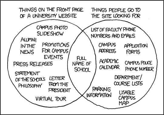
This diagram from the xkcd.com blog about the disconnect between what features and information are prominently displayed on many University websites and what visitors to the site are actually looking for is quite amusing, and likely pretty accurate:
I think the general premise of the chart could also fit many of the workforce systems organizations deploy, and even many of the interactions managers and leaders have with their teams.
Just a few that come to mind -
Company intranet or employee portal - How prominently is the Payroll schedule displayed? You know everyone cares about that. What about the holiday calendar? The menu in the company cafeteria? I bet these are some of the most popular and searched for items on the portal, make them easy to find.
Corporate job site - Is the 'apply now' or 'send your resume' button or link clearly featured? Or is it effectively buried by that super awesome video of your CEO in a shirt and tie (no jacket because he is sending off a 'hip' vibe) about how fantastic it is to work at your company.
Quarterly senior management 'all hands' meeting - Are we all still on track to get our bonuses? Can we work half days on Fridays during the summer? Sure, go over the financials, but once the company gets to a certain size, recitation of financials often devolves into an arcane review of accounting acronyms like EBIDTA. Talk bonuses, raises, is the company holiday party still on?
What else? Where else is there a disconnect between the information that you want to provide, and what the intended recipients really want to receive?
Probably 85% of the conversations with my 9 year old, but that is another story entirely.