Most HR or Recruiting functions calculate and report on standard metrics such as turnover rate, voluntary separations, turnover rate broken out by company function or location, source of applicants, source of hires, and other common measures of organizational effectiveness in the recruiting and retention process.
Many organizations also try to do a reasonably thorough job of tracking the reasons why employees leave the organization, often through the use of exit interviews. Better opportunity elsewhere, lack of promotion chances, hating the boss, etc.
Aggregating, combining, distilling, and analyzing this kind of 'coming and going' data, when supplemented with analysis of individual and company performance can be a powerful differentiator, providing the organization's leaders with important competitive insight to inform hiring, development, and operational strategies.
That is, if the HR organization has the tools (possibly), analytical capability (maybe), and an understanding of the best way to present this kind of information in a method that is relevant, consumable, and engaging (oh boy).
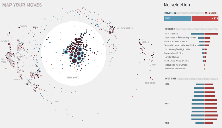
Take a look at the image below, the infographic maps more than 4,000 moves both in and out of New York from over 1,700 people in the past decade based on an informal survey by New York public radio’s the Brian Lehrer Show.

The interactive chart captures the destination zip code for the move, whether the move was 'in' or 'out', the date of the move, and even the reason for the move to or from the particular zip code.
The chart also provides the ability to deep-dive into specific zip codes to analyze the overall patterns of migration as well as drilling into individual movements. We can see, for example, that in 2001 someone relocated from NYC 10014 to Tampa, Florida 33602 because the 'Rent was getting too high to stay'.
It is not a stretch for HR to re-invent this kind of graphic as the 'comings and goings' of new employees, and recently separated colleagues. The zip codes in the chart could be replaced by company regions, locations, even senior leaders. Examining the inflows and reason codes (curious how many people join and leave for the very same reason) in a graphical manner somehow energizes the information normally presented on simple report, or a bar chart.
While most HR organizations don't have the luxury of graphic or web designers on staff (too bad) to create these kinds of interactive tools to review, interact with, and even re-imagine data, it would benefit most of us in the business of providing and acting upon workforce and organizational information to do a better job of presenting the data in ways that help the data tell its story.
The full infographic can be found here - and be warned, it is a fun and engaging chart that you are likely to spend some time playing with to, and ultimately a kind of curiosity begins to set in as you try and get a closer look at the decisions and motivations of the real people whose experiences make up the data for the graphic.
Compelling, engaging, fun, and informative. How many of those adjectives can you ascribe to the last report on turnover you sent up the chain, or that you received?