One of my favorite 'non-HR' reads is a blog called Box Vox, which is dedicated to the art and craft of product packaging design. It is a really interesting site to learn more about innovations in packaging science and to understand a bit more about how the package design attempts to influence buying behavior. Almost invariably, the package designers attempt to balance design, function, the physical requirements imposed on the package composition by the product itself, as well as the branding and promotional elements that often contribute significantly to the ultimate purchase decision.
Packaging design is big business, and in particular package re-designs of existing products can be very risky, take a look at this story from 2009 about a colossally botched re-design by Tropicana orange juice. A few seemingly simple changes to the graphics and type on the Tropicana carton sent long-time customers into a rage, eventually causing the company to revert to its time-tested and likely way more important to customers than they ever realized package design.
But since consumer product packaging, and even the more ethereal messaging, digital content, or even simple verbal conversations that pass for a kind of 'packaging' that we place around our projects in the workplace are mostly centered around positive actions - we want to incent people to do something, we sometimes don't have a great handle on how to communicate or package something for circumstances where we want to stop or at least reduce a behavior or the use of a certain product or practice.
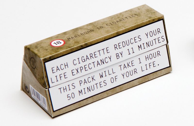
We are all familiar with the printed warnings that have been places on cigarette packaging here in the USA for many years, but the sense we get from those is that while true and sobering, they really don't make the habit and practice of smoking significantly more difficult than if there were no warnings on the packages. I bet long time smokers don't even notice these warnings any more. But what if the packaging itself could dis-incent smokers from the actual action of smoking? Again from the Box Vox site, take a look at this re-imagined cigarette package:
 Image from Boxvox.net
Sure the tired old warning message still appears, but when you examine the packaging a little more closely, you'll notice the non-traditional shape, a very intentional design that has some interesting implications. According to the package designers Jennifer Noon and Sarah Shaw:
'Our primary aim was to change the structure of the pack making it less ergonomic. The pack was developed to be difficult to use and carry, it is hard to fit into pockets due to its triangular shape and the angled inner means the cigarettes are hard to get out. The lid is designed so that it closes efficiently but after a few uses it becomes weak,meaning the cigarettes can fall out if being stored in a ladies handbag.'
Boom. By going beyond simply advising cigarette customers about the potentially disastrous health outcomes from their habit, this new package makes the practice of the habit itself much more unpleasant and difficult than before, and at least theoretically places an additional burden on the smoker that perhaps some of them will not want to deal with.
Telling smokers, or really anyone that is doing something in a way that the manager, the organization, or even society would like to see stopped is often not as effective as we'd like it to be. Employees, partners, kids, whomever - keep doing silly things. Even when they have been told not to. But making the practice and exercise of these undesirable behaviors much more difficult and unpleasant via packaging or design or through use of physical space can often offer us more opportunities to promote change and to achieve the desired outcomes.
What do you think? What else can we do when simply telling people to behave differently is not enough?