Note: I am on vacation and while away this week I will be re-running a few old posts that for whatever reason I think deserve a second chance. Hope everyone has a great week!
-----------------------------------------------------------------------------------
(originally posted in November 2011)
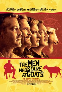
Take a look at the promotional posted for the 2009 movie 'The Men Who Stare at Goats' :
 I didn't see it eitherNot a bad looking promotional effort most would say - edgy, creative kind of typeface, clever use of the actual goat in the series of profile images, stars of the film staring out wisfully into the middle distance.
Some big time names in the form of George Clooney, Jeff Bridges, Ewan McGregor, and Kevin Spacey also help the piece achieve a little bit more wow factor.
I am pretty sure the movie was not what you'd call a smash hit, or even a 'hit', (the IMDB page for the movie indicates about a $32M gross on an estimated $25M budget). But surely any disappointment in the eventual box office receipts for the movie would not be attributed to the poster that you see on the left, after all, while perhaps not being incredibly artistic and memorable, it certainly is a solid, 'B' kind of effort.
But take another look at the 'Men Who Stare at Goats' poster, this time in a larger context of very similar looking pieces, (courtesy of the Daily Inspiration site):
Look closely at the 'collage' image on the right - the 'Goats' poster is in there, (second row, third from the left).  Keep looking
Weird how alike so many movie posters seem to be in terms of design, layout, color schemes, etc. If you take a longer look at the Daily Inspiration piece you'll see more examples of how similar movie genres, (Action, Romance, etc.), have consistently spawned similar looking promotional posters.
What might be interpreted as interesting, attractive, and well-executed when approached individually, (like the 'Goats' poster), takes on a slightly different tone and feeling when viewed through this lens. When thrown together dozens of other pieces informed with the same mindset and sensibility, the 'Goats' poster simply vanishes into the sea of sameness, (and safety, I suppose).
The point to all this? Not much of one admittedly, I saw the Daily Inspiration piece and it simply seemed interesting to me. I guess if there MUST be a point, (I think the Blogging for Dummies Book I read five years ago mentioned something about each post having some kind of point), it's that understanding context, and the ability of your audiences to compare the work we produce, the systems we design, and the strategies we devise and deploy with what else is being created, designed, and deployed is an important, and sometimes overlooked component of our success.
It can be really easy to spring something out to our internal customers with the mindset that they are a kind of captive audience, without the ability to make free choices from competing alternatives. Kind of like a movie-goer whose multiplex has the same film running on all 12 screens. And for many workplace systems or policies that is indeed true. Employees can't choose their own HRIS if they don't like the one the company has deployed, and they can't create and elect their own medical or dental plan coverage if yours are not to their liking.
But what they can do, and what has become increasingly easier in the age of social networking and open communication is have a much, much better understanding of competing alternatives and what is possible outside of your own organization. It has never been easier to compare almost everything about one organization's operations with others that are potential competitor's for a good employee's services.
The 'Goats' poster is fine. There is nothing wrong with it. It just looks like every other one you've ever seen. Whether or not that is good enough is really the question.