Note to readers: As I have had a really busy Summer and early Fall preparing for the now recently concluded HR Technology Conference, the posting frequency here has been pretty diminished lately. Additionally, I find myself well behind my regular number of 'sports' posts that form the basis of my contribution to the annual 8 Man Rotation E-book on sports and HR. So I have declared this week of October 21 to be 'Sports Week' on the blog. I'm shooting for 5 days of sports-themed posts to make sure I don't get dropped from the 8 Man crew. So if sports takes are not your thing, check back in a week of so, when I will probably have another equally inane theme working.
Onward..
As I wrap up 'Sports Week' on the blog I figured for a Friday I would keep it simple take the easy way out and point your attention to the always interesting, frequently amazing Information is Beautiful site where the contenders for their annual Information is Beautiful awards are being featured.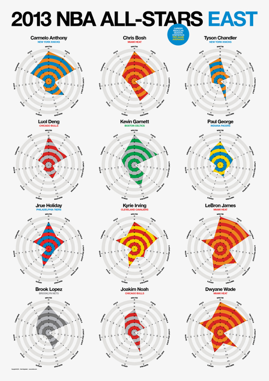
The awards are meant to showcase and honor excellence in data visualization, infographics, interactive data presentation, and tools with which to analyze and interpret data and information. And, as luck would have it, several of the submissions in the Data Visualization category have sports themes, as sports continues to be a ripe area for advanced data analysis, and for new ideas about how to examine and interpret existing data sets.
The chart on the right side of this post, a graphic that presents some analysis and comparisons of the playing statistics of the 2013 NBA All-Stars naturally caught my attention, and there are similarly well-crafted and visually appealing submissions about soccer, bike racing, baseball, and more.
But beyond the mundane world of sports, there are more serious and probably more important visualizations and tools that you should check out over on the Information is Beautiful site.
With the seemingly endless amounts, types, and increased speed with which we are becoming inundated with data about our business, our workforces, our labor market and more, it has become more and more important that the ability to understand and present complex data in a relevant, meaningful, and accessible manner is a skill set any successful modern leader will need to possess.
Sure, the charts and tools that are over at the Information is Beautiful site might be a little bit beyond your capabilities with design, and might be a little too much for the presentation of the more banal kinds of data we often deal with as HR and Talent pros, but there is certainly lots in terms of ideas and inspiration that anyone can take from such visually stunning displays.
Ok, that's it, 'Sports Week' is wrapped, be sure to come back next week for an equally hard hitting series on the types and properties of the various Halloween candies and treats.
Have a great weekend!