If you are a data/design/visualization mark like I am, then I apologize in advance for the half hour or so you are about to waste on the amazingly cool A Handsome Atlas site.
The clever folks at Handsome Atlas have taken several old government and census documents from the late nineteenth-century, (primarily The Statistical Analysis of the United States, published from about 1870 - 1920), and breathed new life into them, by creating a user-friendly tool for viewing the old works close-up, and in high resolution. New York, 1870
Don't really get why this is cool?
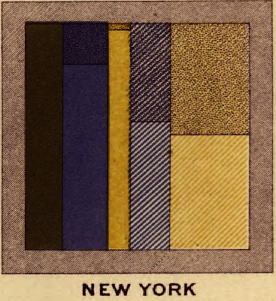
Then spend a few minutes looking at this beautiful chart/infographic titled 'Gainful Occupations and also as Attending School' , a look at employment and education across the states taken from the 1870 census data, (a small snippet of this graphic appears on the right of this post).
The Handsome Atlas site is full of amazingly interesting and detailed data tables, charts, graphics, and visual analyses of demographic, statistical, and economic data that was compiled in the census and published in The Statistical Analysis of the United States. With a big assist to the technology and presentation developed at Handsome Atlas, this data serves to remind us that the current fad and fascination with infographics and data visualization have their roots in the past.
Infographics and other visualizations help us, mostly, to make more sense of the world - breathing life and creating dimension, contrast, comparison, and most importantly, interest in data sets.
We want to better understand the world around us certainly, and that longing and need for understanding is definitely not only a modern phenomenon.
If you take a few minutes to play around on the Handsome Atlas site, please let me know what you think.
Have a great weekend!