I know that I definitely have hit Labor Force Participation a few times in the past in the often imitated but never exceeded CHART OF THE DAY series here on the blog, but now thanks to some really excellent work out of the Federal Reserve Bank of Atlanta I think we have the best source yet for digging into Labor Force Participation.
From the Fed Atlanta's Labor Force Participation Dynamics micro-site, check out just a couple of examples of what the data shows with respect to Labor Force Participation, that encompasses some important measures of who is actually working, looking for work, or unable to find work from the labor force.
Chart 1 - The Big Picture - By mid-2014 Labor Force Participation was at its lowest rate since 1978
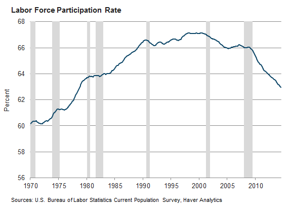
Chart 2 - What accounts for this steep decline since the start of the financial crisis and ensuing recession in about 2007? Well, lot's of things, but mostly it is just the population getting older.

Chart 3 - But what about people in their 'prime' working years? Are they still in the Labor Force in the same proportions history would suggest? Turns out not really.
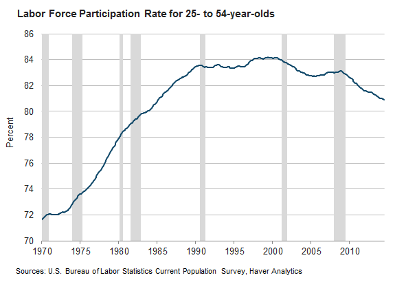
Chart 4 - But most of the decline in Participation for 'prime' workers has to be the bad economy, right? Most of the folks in the 25-54 group that are not in the labor force are missing not by choice I bet. They are probably just frustrated but still want to work. Actually, no.
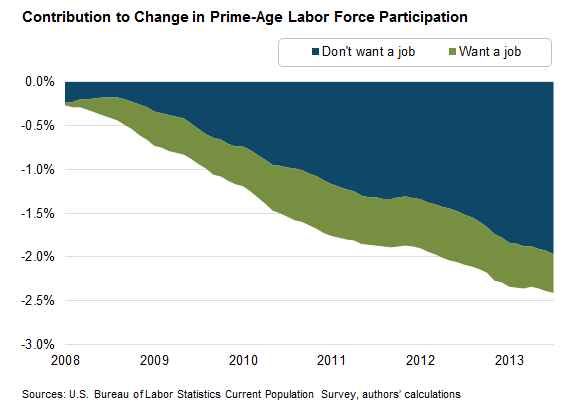
Turns out that the decrease in labor force participation among prime-age individuals has been driven mostly by the share who say they currently don’t want a job.
I know that it can be really hard to see the link from this kind of macro labor force data and the trends in participation to your day-to-day or even year-to-year workforce planning and talent management initiatives. But I am convinced it is important for any business leader to be at least cognizant of the macro trends and dynamics that your organization and your current and future labor force operate in. Plus, charts are fun!
But ok, enough charts for now, you can check out the Fed Atlanta's Labor Force Participation Dynamics site for even more data and analysis on this topic.
Have a great Thursday!