I saw this clever post yesterday, titled Computer Science Courses That Don't Exist But Should, and one suggested course in particular really stood out:
CSCI 3300: Classical Software Studies
Discuss and dissect historically significant products, including VisiCalc, AppleWorks, Robot Odyssey, Zork, and MacPaint. Emphases are on user interface and creativity fostered by hardware limitations.
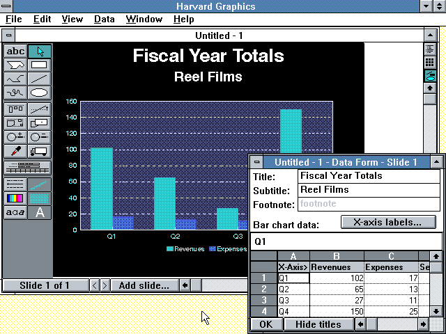
While I am not nearly geeky enough to know all of those old products, (the only one I recognize is VisiCalc, and I never even used that), it made me think back on my introduction to software and workplace technology more generally. Pretty slick UI, right?
And the one 'classic' piece of workplace tech that I remember most fondly, for reasons I will share in a second, is Harvard Graphics, the first general use charting and data visualization tool to gain acceptance in the office. In the late 80s and maybe a little into the early 90s, Harvard Graphics was the go-to tool for creating at that time were really amazing bar, pie, line, and other types of charts that today we would just laugh at for their simplicity. But pretty soon Microsoft Office took over the office, and Harcard Graphics pretty quickly fell out of fashion.
But I loved my time with Harvard Graphics. Back in the day, when the first colorful stacked bar chart of regional sales broken out for the last 4 quarters emerged from the plotter, (look that one up, kids), and I marched it in to the CFO's office, suddenly I was looked at not like the 22-year-old kid who knew nothing, but as the 22-year-old kid who created something cool.
After getting a glimpse of what the HG program could do, the CFO started setting me off to make more and different kinds of graphical representations of our financials that would be used in exec meetings, sent out to the regional presidents, and often tacked up on the wall in the CEO's office. No one would ever tack a boring looking income statement on their wall, but a 3-D multi-colored bar chart of gross profit margin by product segment? That was high art to some of these guys, and I was the only person in the office, (probably because I could not add much value anywhere else), that was able at that time to produce these charts.
That simple little program, and the rest of the office's reluctance to embrace anything new or seemingly complicated, helped me cement a reputation as someone clever, useful, and for being what then passed for technically savvy - which make no mistake helped out your career as much back in those days as it does today.
Harvard Graphics got me at least two raises I am pretty sure.
Ok, the walk down memory lane is over. Have a great weekend and think about this little tale the next time some new and scary and complicated technology shows up in the office.
It just might be the one that gets your work tacked up on the CEO's wall.