Quantcast
Subscribe!


Enter your email address:

Delivered by FeedBurner


E-mail Steve
This form does not yet contain any fields.

    free counters

    Twitter Feed

    Entries in design (54)

    Thursday
    Dec062018

    Color of the Year 2019

    In the continuing tradition of 'If it interests me, it must be interesting to other people too' that explains just about everything that gets covered on this blog, it is once again time to examine one of my favorite and recurring topics - Pantone's 'Color of the Year' choice.

    I continue to be completely, and probably irrationally fascinated with Pantone's 'Color of the Year' designation and process.

    In case you are unfamiliar (shock!), with Pantone and the Color of the Year designation here is all you need to know. Pantone is the world's leading authority on color, color systems, and publishes the industry standard definitions of colors. In other words that nice new orange shirt you just bought is not just 'orange' it is 'Pantone Persimmon Orange 16-1356 TPG'. Pantone provides guidelines and definitions for thousands of variations of colors, and it is the standard by which colors are classified.

    Each year the color experts at Pantone declare one specific shade the 'Color of the Year'. This specific color, (in 2018 it was 'Ultra Violet' in case you did not know), is meant to be a kind of reflection of trends in art, design, fashion, movies, popular culture, and branding and often will subsequently become more common in actual products like clothing and jewelry as a result of the Color of the Year designation. So perhaps if you think back on 2018 and think you have seen a lot of Ultra Violet around - sort of a vibrant shade of deep purple you have Pantone to thank or blame for that.

    So this week Pantone announced its choice for Color of the Year for 2019 a bright and animated shade of I guess pink called 'Living Coral' - aka Pantone 16-1546.

    The rationale behind this choice of Living Coral for color of the year?

    Here's what Pantone's color experts had to say about the selection: (side note, isn't 'Color Expert' one of the coolest job titles ever?)

    In reaction to the onslaught of digital technology and social media increasingly embedding into daily life, we are seeking authentic and immersive experiences that enable connection and intimacy. Sociable and spirited, the engaging nature of PANTONE 16-1546 Living Coral welcomes and encourages lighthearted activity. Symbolizing our innate need for optimism and joyful pursuits, PANTONE 16-1546 Living Coral embodies our desire for playful expression.

    Representing the fusion of modern life, PANTONE Living Coral is a nurturing color that appears in our natural surroundings and at the same time, displays a lively presence within social media.

    PANTONE 16-1546 Living Coral emits the desired, familiar, and energizing aspects of color found in nature. In its glorious, yet unfortunately more elusive, display beneath the sea, this vivifying and effervescent color mesmerizes the eye and mind. Lying at the center of our naturally vivid and chromatic ecosystem, PANTONE Living Coral is evocative of how coral reefs provide shelter to a diverse kaleidoscope of color.

    So what, if anything, should any of us care about what Pantone says about culture, trends, society, fashion, and how we all are collectively feeling - expressed through the colors we are seeing and using more and more?

    I suppose the main thing to think about is right in the verbiage Pantone used to describe their thinking processes behind the selection. The words authentic, optimism, and joyful all show up in the description. Pantone is suggesting that the colors (and feelings) we will seek in 2019 will be ones like Living Coral, a color that (if such a thing is possible), will help to make us feel more open to fun, immersive, and in the real world (as opposed to just on Instagram), social experiences - like actually diving to a coral reef.

    What kind of a year was 2018?

    Kind of good I suppose, and kind of strange at the same time. Business and the economy are still seeming pretty strong, but as 2018 winds to a close there have been a few cracks developing in what has been an almost decade-long recovery. 2019 does seem a little bit uncertain, at least from my point of view.

    Pantone thinks/hopes that Living Coral will help people who are "craving human interaction and social connection, the humanizing and heartening qualities displayed by the convivial Pantone Living Coral hit a responsive chord."

    Let's hope.

    The colors we choose to wear to decorate our homes to use in art and other creative endeavors say plenty about us, about who we are, how we feel, and perhaps how we want to feel.

    What do you think? Ready to rock plenty of Living Coral in 2019? I think it would make an excellent tie, (in case you have not shopped for my Christmas present yet).

    Have a great day!
    Wednesday
    Dec272017

    An example of how 'good' user experience changes over time

    Quick shot for a 'I'm not really working but not quite on vacation either' Wednesday.

    Like many folks, I am dabbling with some new technology over the holidays and after messing around with a newly acquired device, the Amazon Fire Stick, (for those not familiar, the Fire Stick is a small device that plugs in to a TV's HDMI port to enable streaming content like Netflix, SlingTV, and my favorite, the NBA League Pass App).

    It's a cool, inexpensive, and highly capable little piece of tech. I do believe I am just days away from cutting the cable cord for good. It is really just the phone call I have to make that I am dreading at this point.

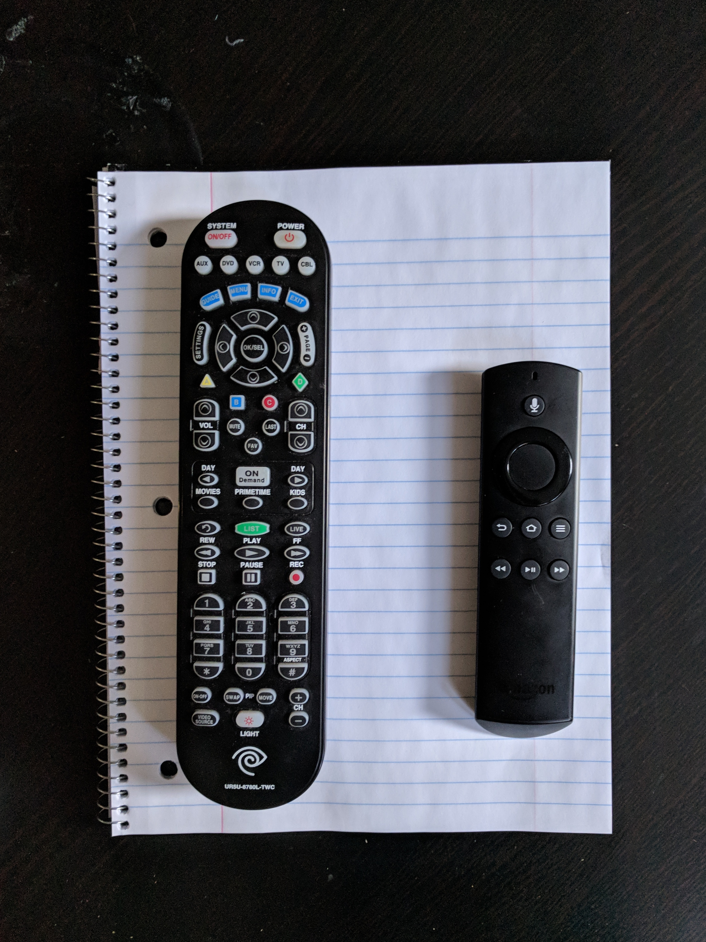
    But as I was setting up the Fire Stick, I couldn't help but notice the size, setup, and UX elements of the Amazon remote. Take a look at the pic below. The remote on the left is my current Spectrum Cable TV remote, and on the right, the Fire Stick remote.

    In case you're scoring at home, the Spectrum reomote has 59 buttons and is easily over twice the size and weight as the Fire Stick remote, which has a total of 7 buttons and a kind of tactile navigation wheel.

    Three quick observations on these two remotes, and what we might be able to apply to our own work and workplace tech decisions from thinking about how UX and tech expectations change over time.

    1. What we consider 'good' in terms of design and UX is a fluid, changing thing. The first time I got a hold of the Spectrum remote I am sure I was excited, happy, if a bit overwhelmed with all the functions. This remote could do 'everything' and I am sure I thought that the tradeoff in size, complexity, usability in order to do everything was worth it. Sure, most of the buttons are really tiny, are jammed too close together, but that's the price of a super-powered piece of tech. Eventually, you figure it out.

    2. The most important of the seven buttons on the Fire Stick remote is the little one at the top of the device with the microphone image. It's used for the remote voice command capabilities akin to how one issues commands to Amazon Alexa enabled devices. Think, 'Alexa, open Netflix'. Or 'Alexa, fast-forward three minutes'. Or, 'Alexa, play The Real Housewives of New Jersey' (that last may or may not have been the one I tested for this piece).

    I recently wrote about Alexa here on the blog, so I won't repeat all those takes again, but with Amazon reporting that the single most popular item on Amazon.com this holiday shopping season was its Echo Dotdevice, it seems certain that tens of millions of US households will be experimenting, learning, and becoming familiar with the power of voice-activated tech in 2018. These tens of millions of folks are also your employees, using your workplace tools and tech, and will begin to press for more and better voice capable tech at work. No doubt.

    3. Probably the obvious take on these two devices, their design, and how they make the user feel, but here it is. More is not better with UX and with tech in general. Better is better. I know the tendency, especially with workplace technology is to continue to add features, functions, processes, and in our example, buttons to the solution in order to cast the widest possible net. Tech providers are guilty of this, but so are organizations that issue 846 page RFPs for a Performance Management solution evaluation. And so many of the tech providers respond, especially for a large, Fortune 100 size customer, to add whatever features and functions that the customer claims they 'need'. This cycle spins and repeats over time, and that is how you end up with the 59 button Spectrum remote. Let's hope in 2018 both providers and customers alike will think a little harder about what they really need to get done, how their tools should support them and not overwhelm them, and provide employees with the simplest solutions possible that enable their success at work.

    Happy holiday week. Hope you are staying warm!

    Friday
    Dec152017

    Steve's Holiday Gift Recommendation #5 - For the corporate design geeks like me

    We are grinding down to the end of the year pretty quickly, and glancing at the calendar I think this will be the penultimate one of these holiday gift recommendation Friday posts. Then we can get back to the normal important things we do around here like ranking types of food and making even more connections between work and the NBA.

    This week's recommedation is slightly different, in that the actual gift won't be available until the Spring, but once I heard about it and checked it out I had to include it as one of the recommendations. Maybe you can order it for that distant relative or friend you won't actually see during the holidays, but wanted to make sure you did not totally forget them. Or maybe you just want to get this one for yourself (or your favorite blogger), and won't mind the delay.

    Anyway, on to the gift recommendation...

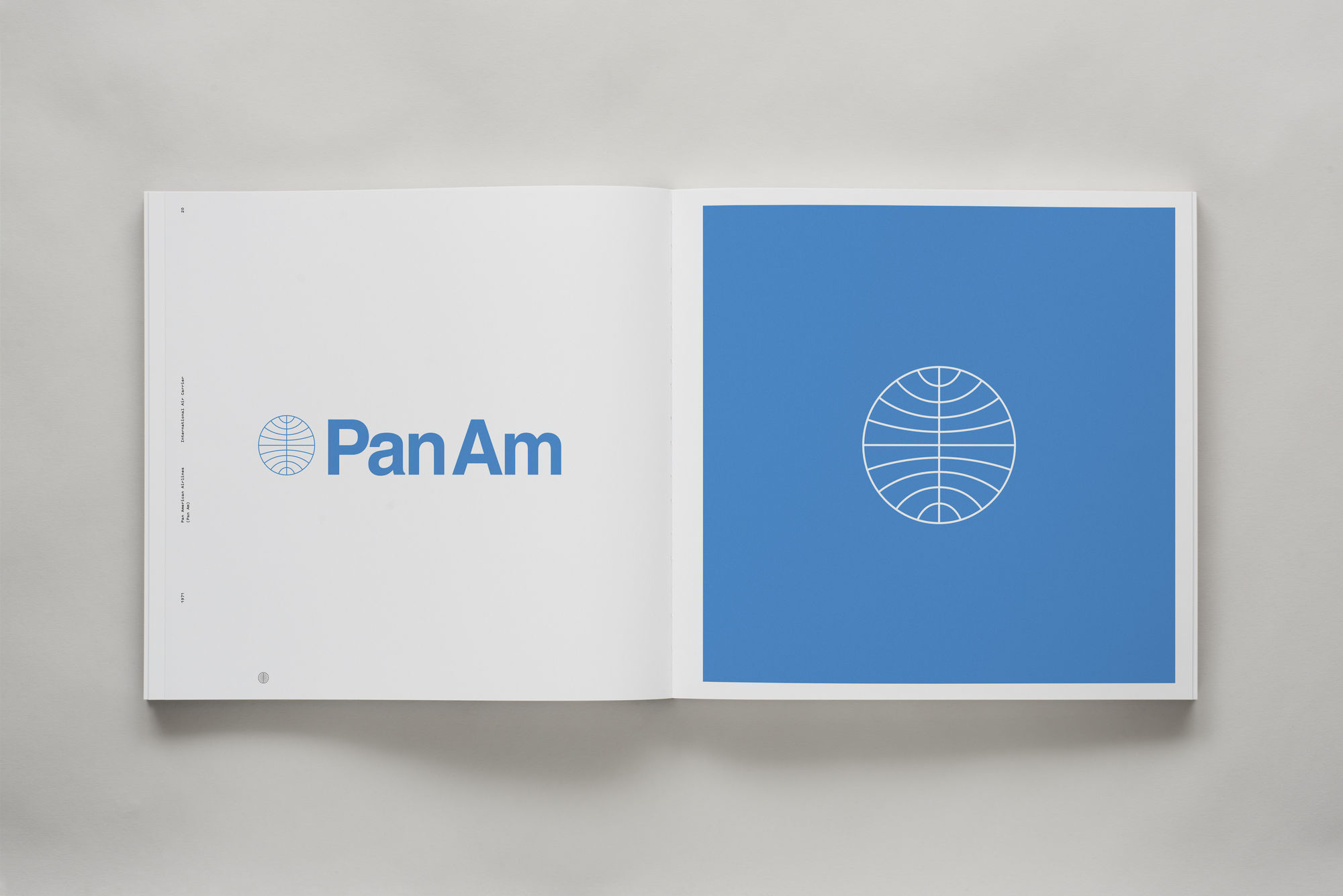
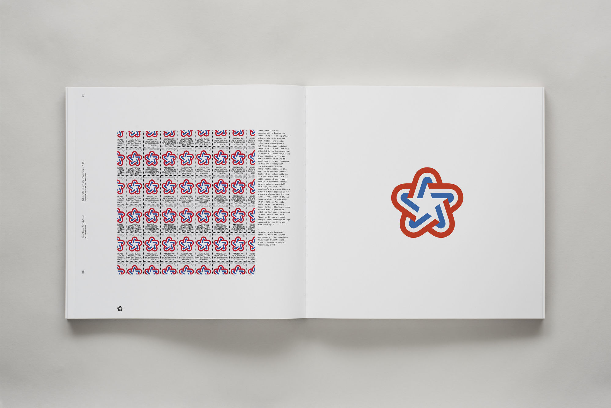
    You may not know Chermayeff & Geismar & Haviv by the name of their firm, but you certainly know them from their work. This is the design firm who have created dozens if not hundreds of iconic corporate logos, trademarks, and identity programs. The NBC 'peacock', the US Bicentennial branding, Chase Bank, and the still popular even though the company is no more, Pan Am Airlines are just a few of the images and brands that Chermayeff & Geismar & Haviv have created since the firm was founded in 1957.

    To recognize, celebrate, and commemorate the firm's 60 years at the forefront of corporate identitity and design, they have created a new book titled 'Identity: Chermayeff & Geismar & Haviv' which features over 100 case studies of their work, including some of the brands I mentioned above, as well as others you know and recognize like PBS, Mobil, and the Smithsonian. The book itself will be fantastic to look at and page through, as befitting the firm's focus and commitment to the image, the book is mostly images - examples of the amazing and iconic work this one firm has produced that has had an outsized impact on workplaces and business over the last 60 years.

    You can pre-order 'Identity: Chermayeff & Geismar & Haviv' here and it is expected to ship in May. You can be patient. I am sure the design lover in your gift list will be happy too.

    Why is this stuff important for anyone in business?

    I think this quote from Ivan Chermayeff sums it up - “Symbols don’t make clear what you do; it makes it clear who you are."

    Reminder, I have no affiliate relationships with any of the gift recommendations. I just think they are cool.

    Have a great weekend!

    Thursday
    Dec072017

    Color of the Year 2018

    In the continuing tradition of 'If it interests me, it must be interesting to other people too' that explains just about everything that gets covered on this blog, it is once again time to examine one of my favorite and recurring topics - Pantone's 'Color of the Year' choice.

    I continue to be completely, and probably irrationally fascinated with Pantone's 'Color of the Year' designation and process.

    In case you are unfamiliar (shock!), with Pantone and the Color of the Year designation here is all you need to know. Pantone is the world's leading authority on color, color systems, and publishes the industry standard definitions of colors. In other words that nice new orange shirt you just bought is not just 'orange' it is 'Pantone Persimmon Orange 16-1356 TPG'. Pantone provides guidelines and definitions for thousands of variations of colors, and it is the standard by which colors are classified.

    Each year the color experts at Pantone declare one specific shade the 'Color of the Year'. This specific color, (in 2017 it was 'Greenery' in case you did not know), is meant to be a kind of reflection of trends in art, design, fashion, movies, popular culture, and branding and often will subsequently become more common in actual products like clothing and jewelry as a result of the Color of the Year designation. So perhaps if you think back on 2017 and think you have seen a lot of Greenery around - sort of a vibrant shade of medium green, you have Pantone to thank or blame for that.

    So this week Pantone announced its choice for Color of the Year for 2018 a deep, intense, and saturated  hade of purple called 'Ultra Violet' - aka Pantone 18-3838.

    The rationale behind this choice of of Ultra Vilet for color of the year?

    Here's what Pantone's color experts had to say about the selection: (side note, isn't 'Color Expert' one of the coolest job titles ever?)

    A dramatically provocative and thoughtful purple shade, PANTONE 18-3838 Ultra Violet communicates originality, ingenuity, and visionary thinking that points us toward the future.

    Complex and contemplative, Ultra Violet suggests the mysteries of the cosmos, the intrigue of what lies ahead, and the discoveries beyond where we are now. The vast and limitless night sky is symbolic of what is possible and continues to inspire the desire to pursue a world beyond our own.

    Enigmatic purples have also long been symbolic of counterculture, unconventionality, and artistic brilliance. Musical icons Prince, David Bowie, and Jimi Hendrix brought shades of Ultra Violet to the forefront of western pop culture as personal expressions of individuality. Nuanced and full of emotion, the depth of PANTONE 18-3838 Ultra Violet symbolizes experimentation and non-conformity, spurring individuals to imagine their unique mark on the world, and push boundaries through creative outlets.

    So what, if anything, should any of us care about what Pantone says about culture, trends, society, fashion, and how we all are collectively feeling - expressed through the colors we are seeing and using more and more?

    I suppose the main thing to think about is right in the verbiage Pantone used to describe their thinking processes behind the selection. The words awareness, mindfulness, and creative inspiration all show up in the description. Pantone is suggesting that the colors (and feelings) we will seek in 2018 will be ones like Ultra Violet, a color that (if such a thing is possible), will help to make us feel more open to creative expression, reflection, experimentation, and non-conformity and more inspired to take on the world perhaps.

    No matter your personal point of view, it is pretty fair to characterize 2017 as a kind of an unusual year. The US economy continues its amazing recovery 2008 lows (the recession now seems so long ago it is hard to remember it at times), unemployment seems likely to move under 4.0%, and measures like the stock market and corporate profits seem to indicate the good times are not yet close to ending.

    But lots and lots of folks are not sharing equally, if at all, from this recovery and growth. And of course the things that are happening in politics and with corporate/business scandals (looking at you Matt Lauer), remind us all that even in seemingly 'good' times that there will always be work to do.

    Pantone thinks/hopes that Ultra Violet will 'take our awareness and potential to a higher level. From exploring new technologies and the greater galaxy, to artistic expression and spiritual reflection, intuitive Ultra Violet lights the way for what is yet to come.'

    Let's hope.

    The colors we choose to wear to paint our homes in to use in our creative endeavors say plenty about us, about who we are, how we feel, and perhaps how we want to feel.

    What do you think? Ready to rock plenty of Ultra Violet in 2018? I think it would make an excellent tie, (in case you have not shopped for my Christmas present yet).

    Have a great day! 

    Thursday
    May182017

    Google and the interface of everywhere

    Google's big I/O event happened this week, and in customary fashion the search and technology giant made a bunch of interesting product announcements and made public for the first time some brand new solutions and innovations. Folks in the HR/Recruiting space will largely be most interested in and perhaps concerned by Google's announcement that it intends to launch 'Google for Jobs', a consolidated job search tool (powered by Google's search technology at the core), for job seekers that will surface job listing from a number of sources like LinkedIn, Facebook, and CareerBuilder. And while that announcement certainly was interesting, and needs to be top of mind for folks who run or heavily promote their jobs on job boards like Indeed, to me, it was not the most interesting thing to come out of I/O.

    First, Google announced the forthcoming Lens app, a tool that essentially makes a smart phone camera more intelligent by allowing you to learn about a product by taking a picture of it, find out information about a performance by taking a photo of the name of the band, or connect to a wifi network by snapping a photo of the login and password information. This app is a nod to the increasing use of the camera/photo as not just a means of recording an image, but as a method for navigating the world and its objects and experiences around us.

    Second, Google announced additional places (beyond its Home device and its Pixel phone) and tools where its 'Assitant' app will be available - on iPhones for the first time, on more Android devices, and soon, in cars, refrigerators, and more. Google's near-term vision is to make Assistant available essentially everywhere, and to (ultimately), disconnect or break the bond between the smart phone, (and Android for that matter), and the Assistant capabilities.

    These two announcements combine to form the basis and the beginnings of a powerful service (Assistant), that eventually will seem "interface-less", or said differently, will be accessed via a variety of devices and methods - voice, images, touch screens, and sure, if you must, by typing commands into a keyboard. Who knows, maybe the next iteration of Google Glass, (remember that?), will be to largely function as a lens and continuous input stream to the Assistant. As you stroll around with Glass you can ask it for advice and information about where you are, the restaurant you are walking by, and who knows - maybe see a list of open jobs at the Cafe you are sitting in having a coffee.

    What is interesting about all this, to me, is the longer term implications it has for the tools and technologies that we use at the workplace. Consumer-driven technology innovation has been driving enterprise tech for a while now. You were using a smart phone or a tablet at home, before you ever did so for work. And I think the same thing will become true for this future world of the 'everywhere' interface to smart tools and services designed to help us navigate the world, and get things done.

    Smart phones exploded for work applications because (in part), we didn't want or need to be trapped to a desk and a computer in an office in order to get things done. Now, we are beginning to see what is coming 'next' - after the smart phone, when the technologies are all around us, in our ears, in the devices we interact with, and never more than a spoken 'Ok Google' away. What will be the first HR system to be fully integrated and accessible via voice, image, and even wearable tech? 

    I think it is tremendously exciting and fun. And way more interesting and powerful than a new website that aggregates online job listings. But if you have to talk about that, it is ok. I get it.

    Have a great day!