Quantcast
Subscribe!


Enter your email address:

Delivered by FeedBurner


E-mail Steve
This form does not yet contain any fields.

    free counters

    Twitter Feed

    Entries in data (149)

    Tuesday
    Nov282017

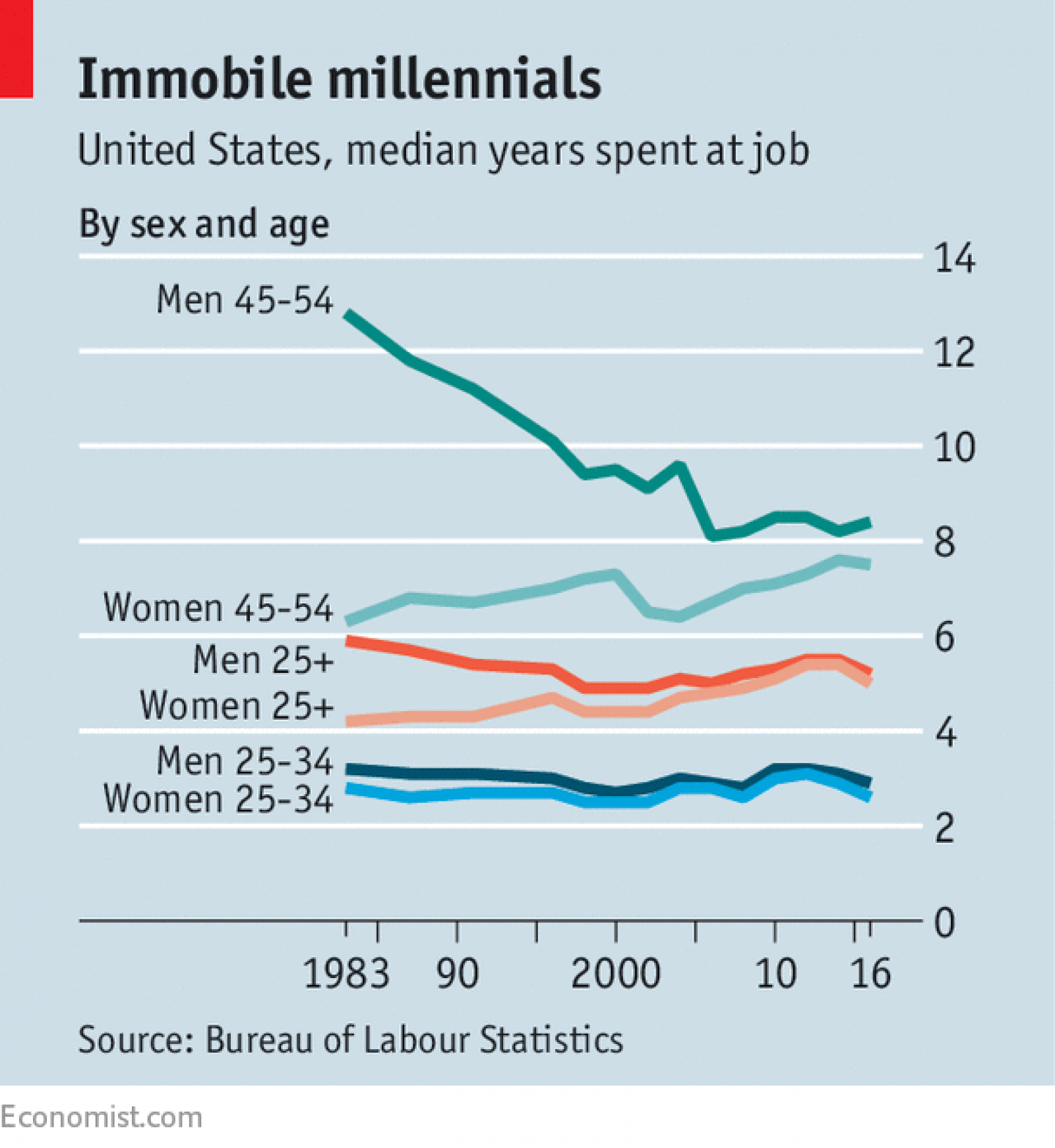
    CHART OF THE DAY: We're all getting pretty old

    A recurring topic on these Chart of the Day posts for some time now has been the impacts and effects on work and workplaces of an aging population. While in the US the demographic 'time bomb' is not expected to be as extreme as it will be in a place like Japan, there still will be some impact, mainly due to the large Baby Boomer generation exiting the workforce en masse.

    Population pyramids are a cool way to visualize the demographic mix in a place and at a point in time, and the below GIF courtesy of Visual Capitalist presents a moving image of the past and expected US population by age from 1980 - 2050. Have a look (or two or three) at the chart, and then some FREE comments and observations after the data.

    Pretty neat, right?

    A couple of things stand out from the data. In 1975, the median age in the United States was just 28 years old. However, it’s been rising fast as the Baby Boomers age, and it’s expected to break the 40 year mark by 2030. And just watch in the chart how life expectancy and average age both keep creeping up. Feels like that is a good thing but even still, these trends have some important implications for workplaces, governmental policies, and society overall.

    An older population by default means more older workers. Whether it is by need or choice or even employer choice, more and more older workers will be a feature or more and more workplaces. And what older workers, say ones in their later 50s and up will want, need, and expect from work and from employers is by definition much different from what the newest group of college graduate recruits will be looking for.

    And while that has probably always been the case, the numbers and increasing age of an organization's oldest workers make that problem or challenge a little tougher than in the past. The mix of ages of the workforce is skewing older, and that has implications for all areas of HR - from training, to benefits, to workforce management and more. And not to mention the need for organizations to be really aware and cognizant of more younger managers, many who lack adequate training and experience in management, wo will be asked to lead and coach more of their older colleagues.

    I remain endlessly interested and fascintated by how these macro demographic trends will impact work and workplaces. And this one in particular, as sadly, I, like you, am getting older every day.

    Friday
    Oct272017

    What do you think you know about job hopping?

    Probably my favorite movie of the last few years is The Big Short, the adaptation of the Michael Lewis book detailing the run-up to the financial crisis/meltdown in 2007 - 2008.

    If you have not seen it, take some time this weekend and do so, you will be glad you did.

    But why I bring it up is that the movie opens with an on screen quotation, which is attributed to Mark Twain and that reads as follows:

    It ain't what you don't know that gets you into trouble. It's what you know for sure that just ain't so.

    If you know the story of The Big Short you'll know why the Twain aphorism resonates. Again, take some time this weekend and catch the film if you haven't.

    But back to the point, or, rather, here's the point I want to make and why I thought of that quote this week.

    What do you think you know about job hopping? Meaning, do you think, as I suspect most of us do, that younger generations of workers, (younger Gen X, Millennials, etc.), are more likely to 'job hop', i.e., have shorter average tenures in their jobs than prior generations?

    I mean, that seems to be the convential wisdom, that the Millennials in particular have shorter job tenures, are much more likely than us older types were to leave a job that either is not working out for them, or for what they perceive is a better opportunity, and overall are less attached to workplaces and employers than we were in the past.

    Do you think that is more or less true?

    I admit, I did, (without ever looking it up), until I caught this piece in the Economist recently, Workers are not switching jobs more often. Here is a quick chart and excerpt from the piece:

    EVERYBODY knows—or at least thinks he knows—that a millennial with one job must be after a new one. Today’s youngsters are thought to have little loyalty towards their employers and to be prone to “job-hop”. Millennials (ie, those born after about 1982) are indeed more likely to switch jobs than their older colleagues. But that is more a result of how old they are than of the era they were born in. In America at least, average job tenures have barely changed in recent decades.

    Data from America’s Bureau of Labour Statistics show workers aged 25 and over now spend a median of 5.1 years with their employers, slightly more than in 1983 (see chart). Job tenure has declined for the lower end of that age group, but only slightly. Men between the ages of 25 and 34 now spend a median of 2.9 years with each employer, down from 3.2 years in 1983.

    And here is a quick chart showing tenure not really moving, at least at younger cohorts, over time.

    So yes, Milennials switch jobs more frequently than older workers. Younger workers have always switched jobs more frequently than older workers. The data shows that the phenomenon hasn't really changed much over the last 30 years.

    What's really striking from the chart is not just that the 25 - 34 age cohorts is basically exhibiting the same characteristics with respect to changing jobs than they did 20 or 30 years ago, but that the largest and steepest declines in job tenures are seen in the Men aged 45 - 54 group. That group's average job tenure has declined from 12.8 years in 1983 to 8.4 years by 2016.

    There are tons of possibly reasons for this, primarily how the events so well portrayed in The Big Short put so many of this group into unforeseen unemployment, as well as how technology, automation, and outsourcing have seem to affected this group more significantly than other labor cohorts.

    But that is a post for another day.

    The main reason this one stood out for me is that the data shows pretty clearly that what we think we know for sure, that Milennials are job hopping, low attention span miscreants, probably really isn't true.

    What else about work, and careers, and employees do we know for sure that might be, in the words of Twain, 'Just not so?'

    Have a great weekend!

    Thursday
    Oct262017

    CHART OF THE DAY: This labor market data point just hit a 44-year low (and low is good)

    It feels like its been awhile since I have busted out a new Chart of the Day post so what better to dust off the fan favorite feature than another look at one of my pet subjects, namely, the US labor market.

    While I have posted a ton of labor market charts over the years, I am pretty sure I have not talked about today's data point - Weekly Initial Jobless Claims. This data point is the total number of people making new claims for unemployment assistance for the weekly measurement period. And as you can surmise from the definition, lower is better with this metric. The fewer folks making unemployment claims the better.

    So here's the data, initial weekly jobless claims for the last 10 years or so, courtesy of our pals at the St. Louis Federal Reserve, then some comments from me after that. As always, my comments are absolutely free of charge but sadly, are non-guaranteed.

    The data please...

    Three quick thoughts about the data...

    1. The number of people filing for unemployment benefits for the first time totaled 222,000, the lowest since March 31, 1973. That's a long time ago. So long ago that the Knicks were about to win the NBA title in a few weeks.

    Lower initial claims leads to lower (over time) unemployment rates, fewer people truly out of work, and the need for HR and recruiting to essentially have to make two arguments when attempting to fill open roles. One, that the role itself presents the candidate great opportunity and value. And two, that the new opportunity and value somehow are better, more compelling than their current set up. Fewer and fewer of your candidates and prospects are going to be desperately seeking something new. You job continues to get harder.

    2. I know you, or more likely your CFO, won't want to hear this. But if you have persistently hard or long to fill roles you are working on, you have to sweeten your offering. And for the most part that means compensation. Fewer unemployed folks, more candidates already not sure they want to leave the good thing they have, and like the real estate market in San Francisco, potentially juggling multiple good offers. All that adds up to you left with empty chairs if you can't/won't compete on compensation.

    3. In a tightening labor market you know what else becomes important? Yep, retention. At the same time you are scouring LinkedIn profiles of people working at your competitors to see who you can poach, their recruiters are doing the same with your folks. What can/are you doing to strengthen your own value prop to try and build a moat around your best people? Because with each passing week, it is going to get harder and tougher to fill the spots of the faithful departed.

    When talent gets scarce, and their options multiply, the HR/recruiter role becomes that much more important in the organization.

    In fact, you might be getting offers yourself right now.

    Because in a really tight, competitive market the only thing that might be more valuable than talent to the organization are talented HR and recruiting people.

    Happy hunting.

    Tuesday
    Sep262017

    CHART OF THE DAY: What do employee health benefits cost anyway?

    In between arguing with sports teams, players, owners, and fans on Twitter, one of the other things that the US government's leaders have spent a bunch of time on in 2017 are the attempts, (and so far, 'attempting' is all that has been done), at revising, reforming, or replacing the Affordable Care Act, aka Obamacare.

    And while I, or no one else as far as I can tell, has any clue what is going to happen with the ACA and whatever might come next, I have been thinking about benefits, in particular employer sponsored health benefits lately, for reasons that are both boring and not really that important.

    While on a internet foray on this topic over the weekend, (I know, my life is REALLY exciting), I landed on an excellent resource for this kind of data, Kaiser Family Foundation/Health Research & Educational Trust (HRET) 2017 Employer Health Benefits Survey, which was recently released.

    The annual survey is a joint project of the Kaiser Family Foundation and the Health Research & Educational Trust. The survey was conducted between January and June of 2017 and included 3,938 randomly selected, non-federal public and private firms with three or more employees (including 2,137 that responded to the full survey and 1,801 others that responded to a single question about offering coverage).

    So to get back to the title/question of the post, here is today's CHART OF THE DAY, a quick look at just what employer sponsored health care benefits cost, (the premium) and how much the average employee contributes to that cost. Here's the data, then some comments from me after the chart:


    Some thoughts...

    1. Wow, that chart is harder to read than I hoped for. Here is a link to the in a much larger size.

    2. In case you still have trouble making out the details, for 2017 the average cost (premium) for employer-based family coverage was $18,764 annually with the employee contributing, on average, $5,714, or about 30% of the premium.

    3. This split, or ratio of employer funding to employee contribution varies a bit by company size. According to Kaiser Family Foundation, companies larger than 200 employees contribute about 72% of the annual premium, while smaller employers (fewer than 200 employees), only contribute 64%. This difference equates to about an extra $1,600 annually that the employee would have to contribute.

    4. Surprisingly, the rate of premium increases has slowed in recent years. According to the survey, annual family premiums for employer-sponsored health insurance rose an average of 3 percent to $18,764 this year, continuing a six-year run of relatively modest increases.

    5. There are about 151 million Americans who are covered via an employer-sponsored healthcare plan. That makes the employer market by far the single largest source of health care coverage for folks in the US.

    Really interesting data, and there is lots more to dig into at the KFF site.

    As I said, I have no clue what is going to happen with ACA, or whatever might come next. But I do think the more you know about how many Americans access and pay for health care the better informed you will be and the better prepared to make decisions for yourself, your family, and your organization.

    Tuesday
    Sep052017

    Learn a new word: Goodhart's Law

    Happy 'First-day-of-the-rest-of-the-year'. I suppose every day is the first day of the rest of the year, but for some reason on the Tuesday following the long Labor Day weekend that feeling is much more acute.

    Quick shot for your cram five days of work into four week. Another installment of your favorite series here on the blog - Learn a new word, where I share a word, term, phrase, or concept that I had not been familiar with previously, and for some reason seemed interesting/important/cool enough to share.

    So here goes - and this one is especially for the 'You can't manage what you can't measure' types out there.

    Our submission - Goodhart's Law

    (from our pals at Wikipedia)

    Goodhart's law is an adage named after economist Charles Goodhart, which has been phrased by Mary Strathern as: "When a measure becomes a target, it ceases to be a good measure." This follows from individuals trying to anticipate the effect of a policy and then taking actions which alter its outcome.

    Actually Goodhart himself stated the 'law' just a little bit differently, theorizing that "When a measure becomes a metric, it ceases to be a good measure.”

    Either way, the key point by Goodhart is still sound (and pretty obvious, even if you have never heard of our friend Goodhart).

    Make a measurement - say time to fill open jobs, percent of new hires who stay longer than 6 months, or even number of new patents filed by the R&D department - doesn't matter, the sole or even a primary metric of success and evaluation and things tend to get a little strange.

    The effected people pretty quickly learn how to manage/game the measurement, they start thinking, maybe too much, about how to drive that specific measurement in a manner that is positive for them, and they stop thinking so much about other, perhaps more cross-functional or strategic measurements.

    And even worse, too many managers or leaders focusing too much on measurements can sometimes be an excuse for not exercising good judgement, a method that corporate bureaucrats use for CYA and holding on to territory, and an imperfect way to try and describe people and relationships in a numerical manner.

    'You can't manage what you can't measure' is a fun thing to say. And sort of easy to agree with. But like Drucker's other widely quoted maxim, 'Culture eats strategy for breakfast' it definitely deserves more and closer scrutiny than it is typically given.

    We manage the unmeasurable all the time. And reducing everything to something we can measure, to a number, is probably the fast path to inflexibility, failure to adapt, and a workforce conditioned to respond and behave to the movements of numbers on a spreadsheet.

    Have a great week!