Quantcast
Subscribe!


Enter your email address:

Delivered by FeedBurner


E-mail Steve
This form does not yet contain any fields.

    free counters

    Twitter Feed

    Entries in chart (85)

    Tuesday
    Sep262017

    CHART OF THE DAY: What do employee health benefits cost anyway?

    In between arguing with sports teams, players, owners, and fans on Twitter, one of the other things that the US government's leaders have spent a bunch of time on in 2017 are the attempts, (and so far, 'attempting' is all that has been done), at revising, reforming, or replacing the Affordable Care Act, aka Obamacare.

    And while I, or no one else as far as I can tell, has any clue what is going to happen with the ACA and whatever might come next, I have been thinking about benefits, in particular employer sponsored health benefits lately, for reasons that are both boring and not really that important.

    While on a internet foray on this topic over the weekend, (I know, my life is REALLY exciting), I landed on an excellent resource for this kind of data, Kaiser Family Foundation/Health Research & Educational Trust (HRET) 2017 Employer Health Benefits Survey, which was recently released.

    The annual survey is a joint project of the Kaiser Family Foundation and the Health Research & Educational Trust. The survey was conducted between January and June of 2017 and included 3,938 randomly selected, non-federal public and private firms with three or more employees (including 2,137 that responded to the full survey and 1,801 others that responded to a single question about offering coverage).

    So to get back to the title/question of the post, here is today's CHART OF THE DAY, a quick look at just what employer sponsored health care benefits cost, (the premium) and how much the average employee contributes to that cost. Here's the data, then some comments from me after the chart:
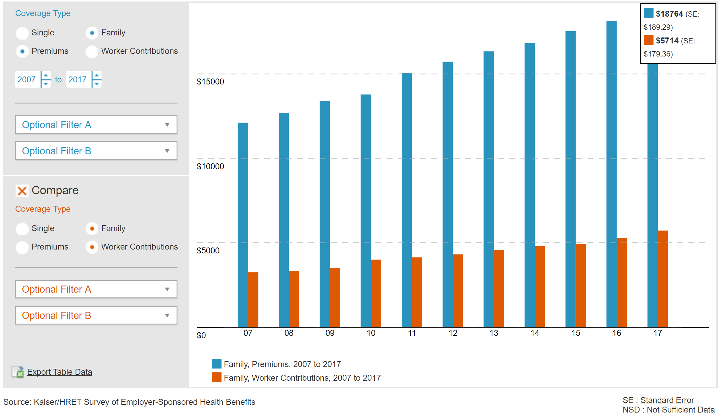
     

    Some thoughts...

    1. Wow, that chart is harder to read than I hoped for. Here is a link to the in a much larger size.

    2. In case you still have trouble making out the details, for 2017 the average cost (premium) for employer-based family coverage was $18,764 annually with the employee contributing, on average, $5,714, or about 30% of the premium.

    3. This split, or ratio of employer funding to employee contribution varies a bit by company size. According to Kaiser Family Foundation, companies larger than 200 employees contribute about 72% of the annual premium, while smaller employers (fewer than 200 employees), only contribute 64%. This difference equates to about an extra $1,600 annually that the employee would have to contribute.

    4. Surprisingly, the rate of premium increases has slowed in recent years. According to the survey, annual family premiums for employer-sponsored health insurance rose an average of 3 percent to $18,764 this year, continuing a six-year run of relatively modest increases.

    5. There are about 151 million Americans who are covered via an employer-sponsored healthcare plan. That makes the employer market by far the single largest source of health care coverage for folks in the US.

    Really interesting data, and there is lots more to dig into at the KFF site.

    As I said, I have no clue what is going to happen with ACA, or whatever might come next. But I do think the more you know about how many Americans access and pay for health care the better informed you will be and the better prepared to make decisions for yourself, your family, and your organization.

    Monday
    Jul312017

    CHART OF THE DAY: The World's Most Valuable Brands

    Happy last-day-of the-month Monday!

    Quick shot for kicking off a busy summer week. Courtesy of our pals at Visual Capitalist, let's take a look at the list of the corporations owning the world's most valuable brands:

    The 'brand value' methodology is referenced on the infographic above, but the essential element is that it it is the intangible asset that exists in the minds of consumers, which is usually an image forged over time through exposure to branding, ads, publicity, and other types of personal experiences. Attaching a dollar value to this intangible asset is perhaps more art than science, but while the specific dollar values can be debated, it probably can't be debated that there is at least some value to the brand.

    So while the top companies for brand value are likely the ones that you'd expect, after I saw this chart I couldn't help noticing that these companies also seem to be the ones that show up on the various 'Best or Top of Most Awesome Companies to Work For' lists that float around on the internet.

    Take a look at just one example, from our friends at LinkedIn, on the '40 Most Attractive Companies in the World' (according to LinkedIn)

    I cut the Top 40 List off at 7 due to space concerns and also because that is all I needed to make my point

    Hey, what a surprise! The Top 5 Global Brands in terms of value, (Google, Apple, Microsoft, Amazon, Facebook), all show up inside the Top 7 of the LinkedIn 'attractiveness' list.

    And you'd find similar kinds of results on most of the other types of 'Best Places' lists - they are dominated by these mega-tech brands that make the coolest products, have the most incredible corporate campuses, and often are led by influential and charismatic leaders.

    All of this to make the point you already know - the thing we like to call 'employer brand' is inextricably tied up in what most people will call the consumer or public brand. The most powerful, valuable, and well-known consumer brands have such an advantage in the employer brand category that it is almost laughable.

    If you are one of the companies on the 'most valuable' list, congrats, things are always going to be easier for you to attract and recruit. If you are not one of those global, mega-brands, you have to know you are starting any competition for talent at a disadvantage. 

    Some brands have all the luck, I guess.

    Have a great week!

    Wednesday
    Jul052017

    Who we spend our time with

    Quick one for a first day back after a long weekend Wednesday.

    Wanted to share a really interesting chart I saw over the weekend from The Atlas who took a look at data from the American Time Use Survey to see how who we spend our time with, (co-workers, family, no one), changes over time. Or more clearly, how who we spend our time with changes as we get older.

    Take a look at the chart, then one or two comments from me.

    Nothing too surprising here, I guess. As we get older we spend less time each day with co-workers, (we may not even have any), children, (on to their own lives), and siblings, (the same). We tend to spend relatively more time with a partner, (if we have one), and most troubling, more and more time alone.

    I guess that is the natural way of things, but it still feels a little sad. We look forward to the time when we don't have to go to the office to deal with our annoying co-workers. To the time when the kids finally move out of the house so we can have our space. To the day when we don't have anyone really chasing our time and attention. 

    But pretty quickly that can turn into something else, something not so fun, something we probably don't think about too much right now when our lives are so full, so busy, so crowded.

    Look at the charts above again. Look at the 'Alone' chart. Up and to the right. Up and to the right. 

    It's the only chart wth that trend line. Until the line ends of course.

    Wednesday
    Jun142017

    CHART OF THE DAY: The Aging Global Population

    I am just back from an extended trip that included stops in China for HR Tech China as well as Japan - two places, Japan in particular, who are dealing with the economic and social challenges of an aging population.

    Usually the 'aging' statistics of a country's people is represented by two statistics. One, the percentage of the population age 65 or older. And two, the ratio of people aged 18-64, (and expected, mostly, to be in the workforce), to people 65 and up, (who, mostly, are no longer in the workforce). This ratio is called the 'dependency ratio' and reflects about how many workers and contributors to a country's social insurance schemes are there for each possibly retired person, many of who need income support from these social programs. 

    Said differently, the higher the ratio, the more workers for each older person, the easier it is for a country to keep their social insurance programs funded and solvent.

    With all that said, I was thinking about this more lately after spending time in Japan, where this challenge is especially acute. But as the data below shows, this challenge of an aging population is more widespread than you might think - and, in time, will surface here in the US as well.

    Take a look at the data below on the dependency ratio worldwide, courtesy of Visual Capitalist, then some FREE comments from me after the chart:

    While many countries face obstacles with aging populations, for some the problem is becoming severe.

    A dependency ratio below 5.0 is generally considered to be the mark by which a country has an 'aging' challenge. Countries like Japan, Italy, Germany, Canada, France, and the United Kingdom all fall below this level.  The United States sits in a slightly better situation with about 27.9% of its population expected to hit 65 or higher by the 2050 – and a dependency ratio of about 9, but in time the US (and the 2nd largest global economy, China), will both face looming demographic issues.

    What does this mean or suggest for organizations and for HR pros?

    Well, depending on the location, industry, and global nature of your business, chances are pretty good that the average age of the workforce is trending up. And it is also likely that since your competitors will be facing these same kinds of challenges that the competition for newer/younger workers to replace retirees or folks transitioningto fewer working hours will become more intense. Lastly, you may sooner than later be forced into thinking about and implementing changes to work practices, structures, and technologies that can better support an older workforce.

    It is an interesting time for sure. I am feeling a little older each day. Good to know it is not just me.

    Have a great day!

    Tuesday
    May302017

    CHART OF THE DAY: Which matters more, Google or Facebook?

    Apologies for not being more clear on the question in the post title, a better way to phrase it would be this:

    Which source send the most/best referral traffic to your online content - Google or Facebook?

    The answer, and the consultant in me loves this, is really 'It depends.'

    And what it depends on is the kind/type of content you are publishing, and is the subject of today's Chart of the Day.

    As always, and by popular demand, first the data, then some pithy, wise, and FREE comments from me:

    Here goes...

    Interesting, no?

    (Let's pretend it is interesting and proceed).

    1. I have to admit being a little surprised at the edge Facebook has over Google as a source of referral traffic for many of these categories. This surprise is driven and clouded by my own personal media consumption habits I guess. I would never imagine using or relying on Facebook as a source of information for anything other than family/close friend news. And I barely use it for that. Said differently, it is a good reminder that the way you/me consume content may not be the way most people consume content. I barely use Facebook, but I have to remember most of the rest of the world does.

    2. If you are pushing any kind of mainstream, general consumption type content, and you care about how many folks consume said content, you might need to think more about how you can up your presence/reach on Facebook, and maybe be a little less concerned about SEO, (which you never really understood anyway, but that is another story).

    3. BUT... Take a look at the last content category on the above chart - Job postings. In this category Google still dominates with 7x the referral traffic as Facebook. And it even dominates 'other' (sorry other). It seems like if you are in the Recruiting business you still do need to worry about SEO after all. And you probably need to get a handle of what Google is up to with its recent and early forays into the recruiting and job search space.

    This is totally fascinating data I think. And a reminder that job postings are not (yet) the same as the rest of the content on the internet. People look for them, and find them, much, much differently than many of the other forms of content that are all over your Facebook feed.

    Interesting stuff for sure.

    Have a great week!