Quantcast
Subscribe!


Enter your email address:

Delivered by FeedBurner


E-mail Steve
This form does not yet contain any fields.

    free counters

    Twitter Feed

    Entries in chart (85)

    Thursday
    Feb082018

    CHART OF THE DAY: There are too many open jobs, (or not enough people to fill them)

    A really quick shot for a busy Thursday - from the most recent JOLTS report (that's the Job Openings and Labor Turnover Survey and you should have this page on permanent bookmark), the most recent (as of December 2017) data on the ratio of Unemployed workers to job openings in the US.

    Here's the data...


    The actual chart on the BLS site is interactive if you want to play around with it, but I will save you the time and let you know that as of the end of December 2017 the ratio of unemployed workers to open jobs was down to 1.1. Basically, the US economy is closing in on having nearly the same number of unemployed workers, (about 6.3 million ) as there are job openings (about 5.8 million) as of the end of 2017. The ratio of 1.1 has been steady for most of 2017 and ties the all-time low in the this data series' history.

    I have not much else to add to this, beyond what you already know. The labor market continues to be at or near record levels of 'tightness'. It will be really interesting (and fun if you are a data geek like me), to see of the ratio goes below 1 at some point, a situation where even if every open job in the US was suddenly filled by an unemployed person, there still would be open jobs remaining. I guess then we will have to build more robots to fill those jobs.

    Have a great day!

    Thursday
    Jan112018

    CHART OF THE DAY: The Changing Composition of the US Workforce

    There are only two websites you need. Actually three, if you count this one. And hint, none of them are Facebook. I promise you that one day you will regret all the time you wasted with Facebook. But I digress.

    One is BLS.gov, the Bureau of Labor Statistics site where all the employment, industry, productivity, time use, compensation (and more) information you need on the US labor force is located.

    The other is the Federal Reserve of St. Louis' fantastic FRED site, where you can download, graph, and track over 500,000 data series covering the economy, employment, demographics and much, much more. Data geeks like me can get lost in the FRED site for hours.

    I was using these two sources to update my notes and perspective on US aggregate employment across industry groups, useful information that helps me guide and shape the specific industry focus that results in both the content for this blog, topics for the HR Happy Hour Podcast, and the program for the HR Technology Conference.

    This data is also useful to consider in a larger sense - like when thinking about governmental policies and investments, the focus of secondary and higher education and training, and even when answering questions like 'Just what is our country good at?' from a business/economy perspective.

    Have a look at today's Chart of the Day - (built at the FRED site) aggregate US employment since 1980 in the largest category components of the labor force, then some comments from me..

    We all know that 100 - 120 years ago the US shifted from a largely agricultural economy/labor force to a manufacturing, shipping, and trading workforce. And then, slowly but surely, beginning in about 1980, a shift started to occur. Manufacturing employment began to decline while professional services, health care, and retail began to climb.

    Here's the snapshot of latest employment numbers for the categories in chart, (Nov 2017).

    Manufacturing, while pretty apparent to most casual labor market observers, has fallen below professional services, health care, leisure and hospitality, even retail employment in terms of its overall share of US employment. For some perspective, as of November 2017 total US non-farm employment was about 149 million. At that level, manufacturing now represents only about 8.5% of US employment.

    In terms of where most observers see these trends continuing out into the future, the aging US population seems to clearly indicate that health services and health care will be the largest growth area moving forward. Retail jobs are under threat from automation, online shopping (and the efficiencies and lower labor costs associated), and by the constant chase for less expensive goods produced and shipped in lower cost countries. The same threats also impact manufacturing. Even the largest, new manufacturing plants require far fewer workers than the ones of just 10 - 20 years ago.

    There's lots more to think about when looking at this data. I encourage anyone interested to join me in a deep dive on BLS.gov and the St. Louis FRED.

    Monday
    Dec112017

    CHART OF THE DAY: When does work usually get done?

    A few years ago I wrote about a study that concluded that the optimal day/time to conduct a job interview was exactly 10:30AM on Tuesday.

    Back then, I wrote:

    Even without data to back up that claim, it at least makes intuitive sense to me. Mondays are terrible for everything. Many folks mentally check out by Fridays. That leaves Tuesday - Thursday as options for any kind of important meeting, like a job interview. Let's automatically remove anything after lunch, as you never know how a heavy meal, quick workout, or a couple of shots and a Schlitz are going to have on the interviewer.

    So that leaves Tuesday, Wednesday, and Thursday mornings. Let's rule out Thursday since it is close enough to Friday to catch a little of the 'Is it the weekend yet?' shrapnel. Now we are in a tossup between Tuesday and Wednesday mornings. And since even by only Wednesday, lots of folks might already be thinking 'How can it only be Wednesday, this week is taking forever?', Tuesday seems like a safer choice. As for a time - use the Goldilocks approach - not too early, not too late (and too close to lunch), which lands you at 10:30AM.

    Made sense back then I guess. We (the Royal 'We', your mileage may differ), are at our peak of attention, focus, energy, and mental capacity at 10:30AM on Tuesday. So schedule that important meeting, interview, presentation - whatever you need to be at your best for, at that time and you increase your chance for success.

    Remind yourself to check back on that at 10:30AM tomorrow, (assuming you read this on a Monday, which is when it is getting posted).

    I came across a slightly different version of the 'When are we at our best?' question over the weekend via some research results posted on the Redbooth (a provider of project management software) blog titled 'At what time of day do people complete the most tasks?'.

    Redbooth studied anonymized data from its user base - over 1.8 million projects and 28 million tasks to try and determine when does work actually get done? Take a look at the chart below that shows what they found about how much work gets done during the typical day.

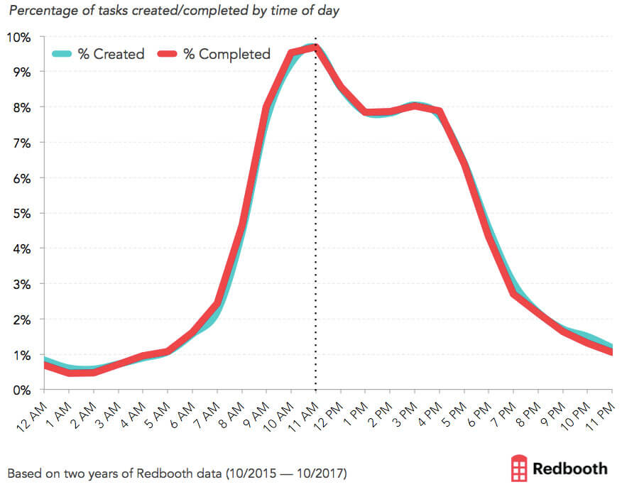
    Kind of makes sense, right? The day starts kind of slow, productivity begins ramping up steeply as the work day progresses and peaks at about 11AM local time (time zones of users were taken into account). Then there is a dip in productivity during the 'normal' lunch break hours that does not really recover as the rest of the day pans out. And around 4PM productivity drops off the proverbial clip and does not recover.

    Again, not totally surprising like the answer to the 'When should we schedule the big meeting/interview/presentation?' question.

    But a couple of things to note in the Redbooth data that might have an impact on how we plan and perform our work, (and how we manage the folks on our teams).

    One, we probably should try no to interrupt our own and our people's most productive times with unnecessary meetings, interruptions, emails, and phone calls. If the sweet spot for productivity is from say 9:30AM - 12:30PM or so, then we should do just about whatever we can to keep that block of time free from distractions and other events that can cause conflicts. Take that standing 10AM Tuesday meeting and think about moving it to 3PM on Thursday, (or consider scrapping it altogether).

    Two, the productivity drop is so sharp staring at about 4PM (and continuing through the night and weekends), that we all really need to be honest with ourselves about how much we and our teams are really getting done if we are the kinds that see 12 - 14 hour days and working at least some of the time on the weekends as the norm. The data from the Redbooth platform makes it pretty clear that despite whatever great work we think is getting done at 11PM on Wednesday, it does not add up to much in the data.

    And finally, this data suggests or hints at something that many of us have known and research has suggested is true - sustained high productivity over such a large block of time - 8, 10, 12 hours, is really hard for most people to pull off. If we remain committed to the 'standard' working schedule that has dominated for decades, (M - F, 8 hour days, etc.), we should be thinking harder about how we architect work, tasks, meetings, interactions, etc. to try and get the most out of these long days - while not burning out ourselves and our people in the process.

    Really interesting data, I think and hopefully helps us to think about how to be better at what we do and what we are trying to do.

    Have a great week!

    Tuesday
    Nov282017

    CHART OF THE DAY: We're all getting pretty old

    A recurring topic on these Chart of the Day posts for some time now has been the impacts and effects on work and workplaces of an aging population. While in the US the demographic 'time bomb' is not expected to be as extreme as it will be in a place like Japan, there still will be some impact, mainly due to the large Baby Boomer generation exiting the workforce en masse.

    Population pyramids are a cool way to visualize the demographic mix in a place and at a point in time, and the below GIF courtesy of Visual Capitalist presents a moving image of the past and expected US population by age from 1980 - 2050. Have a look (or two or three) at the chart, and then some FREE comments and observations after the data.

    Pretty neat, right?

    A couple of things stand out from the data. In 1975, the median age in the United States was just 28 years old. However, it’s been rising fast as the Baby Boomers age, and it’s expected to break the 40 year mark by 2030. And just watch in the chart how life expectancy and average age both keep creeping up. Feels like that is a good thing but even still, these trends have some important implications for workplaces, governmental policies, and society overall.

    An older population by default means more older workers. Whether it is by need or choice or even employer choice, more and more older workers will be a feature or more and more workplaces. And what older workers, say ones in their later 50s and up will want, need, and expect from work and from employers is by definition much different from what the newest group of college graduate recruits will be looking for.

    And while that has probably always been the case, the numbers and increasing age of an organization's oldest workers make that problem or challenge a little tougher than in the past. The mix of ages of the workforce is skewing older, and that has implications for all areas of HR - from training, to benefits, to workforce management and more. And not to mention the need for organizations to be really aware and cognizant of more younger managers, many who lack adequate training and experience in management, wo will be asked to lead and coach more of their older colleagues.

    I remain endlessly interested and fascintated by how these macro demographic trends will impact work and workplaces. And this one in particular, as sadly, I, like you, am getting older every day.

    Thursday
    Oct262017

    CHART OF THE DAY: This labor market data point just hit a 44-year low (and low is good)

    It feels like its been awhile since I have busted out a new Chart of the Day post so what better to dust off the fan favorite feature than another look at one of my pet subjects, namely, the US labor market.

    While I have posted a ton of labor market charts over the years, I am pretty sure I have not talked about today's data point - Weekly Initial Jobless Claims. This data point is the total number of people making new claims for unemployment assistance for the weekly measurement period. And as you can surmise from the definition, lower is better with this metric. The fewer folks making unemployment claims the better.

    So here's the data, initial weekly jobless claims for the last 10 years or so, courtesy of our pals at the St. Louis Federal Reserve, then some comments from me after that. As always, my comments are absolutely free of charge but sadly, are non-guaranteed.

    The data please...

    Three quick thoughts about the data...

    1. The number of people filing for unemployment benefits for the first time totaled 222,000, the lowest since March 31, 1973. That's a long time ago. So long ago that the Knicks were about to win the NBA title in a few weeks.

    Lower initial claims leads to lower (over time) unemployment rates, fewer people truly out of work, and the need for HR and recruiting to essentially have to make two arguments when attempting to fill open roles. One, that the role itself presents the candidate great opportunity and value. And two, that the new opportunity and value somehow are better, more compelling than their current set up. Fewer and fewer of your candidates and prospects are going to be desperately seeking something new. You job continues to get harder.

    2. I know you, or more likely your CFO, won't want to hear this. But if you have persistently hard or long to fill roles you are working on, you have to sweeten your offering. And for the most part that means compensation. Fewer unemployed folks, more candidates already not sure they want to leave the good thing they have, and like the real estate market in San Francisco, potentially juggling multiple good offers. All that adds up to you left with empty chairs if you can't/won't compete on compensation.

    3. In a tightening labor market you know what else becomes important? Yep, retention. At the same time you are scouring LinkedIn profiles of people working at your competitors to see who you can poach, their recruiters are doing the same with your folks. What can/are you doing to strengthen your own value prop to try and build a moat around your best people? Because with each passing week, it is going to get harder and tougher to fill the spots of the faithful departed.

    When talent gets scarce, and their options multiply, the HR/recruiter role becomes that much more important in the organization.

    In fact, you might be getting offers yourself right now.

    Because in a really tight, competitive market the only thing that might be more valuable than talent to the organization are talented HR and recruiting people.

    Happy hunting.