Making Data Come Alive
Yes, this is yet another 'sports' post. Kind of. Actually it is another in the occasional series of posts centered around innovative presentations of information -examples that highlight ways where a variety of organizations have managed to move beyond the expected and routine - 'Look, sales trends for the last 5 years in a bar chart!', to create interesting, engaging, and increasingly interactive tools that really transform both the data and the user experience. One of the best signs that a data presentation tool is effective is not just the initial reaction from users, but rather that the tool or technology makes users want to learn more, see more, and continue to engage with the solution. Patrick working the analytics
I came across such a solution this past weekend at the Baseball Hall of Fame and Museum in Cooperstown, NY. On Saturday the museum unveiled a brand new exhibit - One for the Books: Baseball Records and the Stories Behind Them. The new exhibit tells the story baseball's most cherished statistics and records through more than 200 artifacts in the most technologically advanced presentation in the Museum's history.
Any fan, or casual observer of baseball knows that numbers, stats, records, etc. are as much a part of the game's history as the players themselves. Iconic records like Joe Dimaggio's 56 game hitting streak, Cy Young's 511 career pitching victories, and Ted Williams .406 batting average can be cited easily by baseball aficionados. Baseball is truly a numbers game - no other sport, (and few other businesses I bet), measure, track, analyze, and report statistical information about the games at the level of detail that major league baseball does.
But raw statistics, be they describing normal business or workforce data, or even the data produced by such a compelling an activity as baseball, can still fall flat, feel one-dimensional, and fail to completely tell the story buried in the figures if the presentation and interface for interaction with said data is mundane, fully expected, and one-way. Tools that not only present the raw numbers, but allow the user to not only choose the data they want to see, but to also experience the data and really engage with it are the future of information presentation.
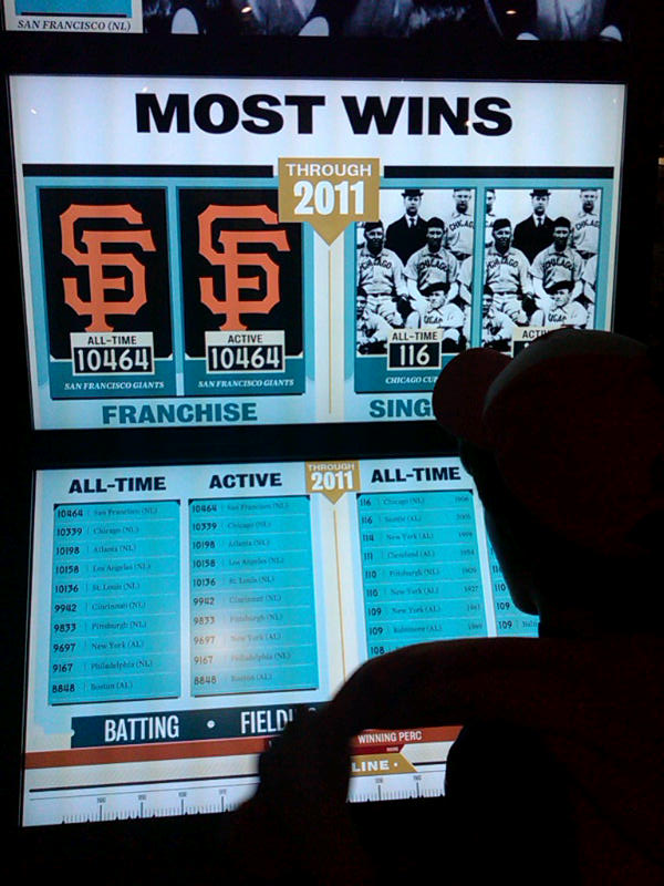
Case in point the Baseball Hall of Fame and Museum's new 'Top 10 Tower' interactive information display at the new 'One For the Books' exhibit. The Top 10 Tower, in true iPad-like fashion, is a touch activated series of screens and displays that allow the baseball fan to learn about some of the classic and lesser-known statistical history of the game. By selecting variables such as Pitching or Batting, choosing specific focus areas to drill into, and using a cool 'timeline' slider to see how the results and records have moved over time, the Top10 Tower created a fully immersive and engaging interactive presentation of what are really 'just' numbers.
Make selections on the lower display of the tower, and the large video screens on the upper section automatically update, showing not only figures and images, but also allowing touch access to additional multi-media content about the record holder, of the timeframe the recored was established. The Top 10 tower also presents data in different dimensions, even ones not expressly requested by user, as the designers of the tool know that context matters in the review and analysis of baseball statistics, as it is likely equally important in the business and workforce metrics we produce and review all the time.
I know what you are saying, the Top 10 tower is really just a fancy way to present some simple lists, and it really is not a big deal, and certainly has no meaning to the business world that has to be concerned with 'real' data, not just batting averages.
Sure, keep telling yourself that. Your data is important, and baseball is just a game.
Have any idea with the batting average of your hiring managers is? For this season? For all-time?

 Steve
Steve
Reader Comments