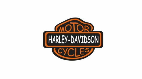
Comic Sans and Getting the Details Right
At a prior job I worked with a colleague that had changed her default email message font to Comic Sans.
The first time I received a message from her, and drank in all the Comic Sans goodness, I thought it must have been some kind of a joke, or a mistake, or a little bit of fun, as I am 99% sure the contents of the message were along the lines of 'Welcome to the group, I am looking forward to working with you.' Not the same, is it?
But as time passed and the ensuing communications I received from this colleague became much more traditional, mundane, and efficient, the Comic Sans persisted. Eventually, I could not take it anymore, and in the nicest way I knew how, (which was probably not very nice, I admit), I gave her some unsolicited advice, to drop the Comic Sans from her outgoing message template, as it was pretty hard to take anything she wrote very seriously when presented in the puerile font of a 3rd grader.
I probably didn't use the word 'puerile' in my note. Well maybe I did.
I can't remember exactly how she took my advice, other than her obvious failure to take heed of it - until I left that position, she never dropped the Sans from her routine.
So this is clearly a blatant example - no one in business I have ever encountered before or since wrote emails in Comic Sans. But when I think about this former colleague, it is truly the only thing about her I remember. She may have been very smart, capable, an industrious team member - maybe not.
But I would not be able to separate the work, the quality, and her ability from the baffling way she chose to present much of that work, and her failure to grasp how she was coming across to her audiences.
What's the point of this story, (aside from the fact that I found this really cool post on the favbulous blog that renders a bunch of famous corporate logos in Comic Sans and wanted to write about it).
I guess that in communication everything, every last detail matters. And while you can't use that as an excuse to refine, review, and over think things endlessly, it also means that you have to nail the basic, essential bits or you and your message will never be heard.
Seemingly small things, like the choice of a font, often have much larger and more significant implications than we think. And I guess if it doesn't 'feel' right, then it probably isn't.
Happy Wednesday all - I am off to HR Tech Europe in a couple of hours, if you are in Amsterdam this week, please make sure to say hello!

 Steve
Steve
Reader Comments