Quantcast
Subscribe!


Enter your email address:

Delivered by FeedBurner


E-mail Steve
This form does not yet contain any fields.

    free counters

    Twitter Feed

    Entries in Information (7)

    Friday
    Mar232012

    Off Topic - Stop me if you think that you've heard this one before

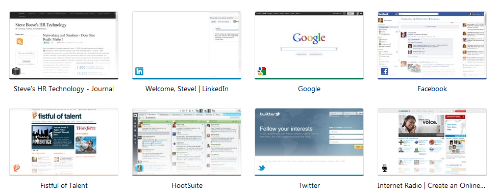
    If you are a user of the Google Chrome browser, then you are certainly famiiar with the way Chrome displays your Top 8 'most visited' websites when you click to open a new browser tab. For me, these Top 8 most visited sites, (see image on the right), never seem to change all that much if at all. And I am not sure if that is a good thing quite honestly. Whether it is a list of most frequently visited sites, a familiar and kind of static collection of blogs in a RSS reader, or the tendency many of us have in social media to follow and connect with thousands of people but actually converse with about 20, it is really easy to fall into an information rut, seeing the same kinds of content from the same sources, or as the author Eli Pariser has described it, a filter bubble.
    A filter bubble can occur when we either proactively choose to limit the number and diversity of our information sources, or, as is a key feature of the social network Facebook, a system and algorithm determines what content and information it thinks we should see, based on our past preferences and behaviors. But by explicit choice, or more passive acceptance of smart filters, the end result can be, paradoxically, in a networked, connected world of almost unlimited information, that our consumption and exposure to content becomes pretty narrow. We read things we already know, from sources we access every day, and that are shared with us by the same small group of people we know well, (and who, mostly, think like we do).

    So here are the questions for today - what do you do to try and ensure you are seeing a wide enough range of viewpoints and sources of information? Do you try and seek out new and different, (perhaps divergent), writers and thinkers to supplement the same five blogs you read every day? How do you seek out people that might disagree with you?

    And finally, who is out there doing amazing work that you think the rest of your community might not know about?

    Have a Great Weekend!

    Friday
    Oct282011

    Are Pictures Better than Words?

    Here's a question for a Friday: Have infographics already jumped the shark?

    If you spend even moderate time and energy reading online news, blogs, commentary, etc.; no doubts you've ran into your fair share of infographics in the last couple of years. And like any other art form/data presentation medium some of these infographics are awesome, and some are, well, kind of sad attempts and enlivening thin data sets that would be better communicated in a simple data table, or even a paragraph.

    And while infographics may now seem kind of familiar and even a little played out on the web, they have not really entered the day-to-day flow inside most organizations. I bet no one reading this post has ever responded to the boss' request for some HR or Financial data with an infographic, even if we think that when well executed, the infographic form might help us not only present the data, but tell the story as well.

    Might infographics begin to enter the world of work and become as typical as the Excel-based pie chart copied onto a PowerPoint slide?

    Maybe.

    A new company called Visual.ly is building out a service that will allow people to create custom infographics using information from their own databases and APIs. The service will be automated, which means users will only need to indicate the kind of information they want to display visually to produce the infographic. You can see some samples of what these infographics look like here.

    Pretty neat right? And even the most jaded web natives among us would probably admit that even the simplest of these infographics are often an improvement in presentation and 'interestingness' than the spreadsheets and data tables we have all been working from for ages.

    Visual.ly has produced thousands of infographics to date, mostly for big media companies and online news services like the Wall Street Journal and The Economist; and has plans to go public with its service in December. Until then, you can experiment a bit with the self-creation process by creating a simple infographic of your own Twitter persona, (mine is below).

    What do you think - do you see a time where simple, created with a few points and clicks type infographic presentations of enterprise data will become as common place as the pie chart?

    Should enterprise systems build in this kind of capability, or is this better left for getting attention on the web?

    FYI - Here is my little infographic experiment:


     Have a great weekend!

    Page 1 2