Visualizing Performance
The excellent blog Hoopism manages to successfully combine two of my favorite subjects, basketball and data into an interesting and unique blend of hoops nerd detailed analysis and engaging visualizations. Image - hoopism.com
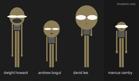
Recently on the site the folks at Hoopism created a set of NBA player statistical data visualizations, that were developed by mapping player statistics to physical attributes of simple, cartoon, caricatures (more blocks equals longer arms, more rebounds results in longer legs etc.)
An example of one of the NBA player data visualizations is at right.
The simple representative player caricatures can be evaluated visually, (long arms on the figure indicate a high number of blocked shots), and in comparatively, (the larger the mouth on the figure, indicates relatively more technical fouls assessed against the player).
While the actual statistics taken into account on the player data visualizations do not offer what could be considered a total view of statistical performance, or complete insight into what makes for successful and more importantly winning players, the approach the visualizations themselves take offer a couple of important lessons for anyone in the game of understanding and evaluating individual and comparative performance.
1. Context and Dimension
These visualizations provide some insight to a player's individual contributions (how big is the player's head), and the relative position of the player compared to his teammates, peers, or competitors. A quick glance at the image above informs the viewer that David Lee scores at a high rate, but compared to Marcus Camby, blocks a relatively low number of opponents' shots. Understanding and assessing performance for individuals, and in the context of the departmental and organizational units in which they reside is often an important and challenging task in traditional employee performance management. The simple characterizations of the NBA players in the visualizations make a better attempt at this than most workforce systems I have seen.
2. Eliminates Irrelevance
While certainly not perfect, or complete, the crude data visualizations do an excellent job at eliminating irrelevant or largely less important information. Facts like where the player went to college, the number of neck tattoos, or the really subjective 'look' of the player are not included. If in this case what 'matters' is the actual statistical performance on the court, then anything that is not directly related, and possibly subject to bias (Big 10 players are slow), is left out of the analysis. Again, there are many, many factors to consider in evaluating NBA performance, but I submit that often we allow unimportant factors to cloud our assessments. In the workplace it is probably no different. Do we sometimes, almost unconsciously factor in the number of crazy cat pictures that a colleague has in her cube to influence how we evaluate her work and contribution?
3. Fun
I simply like how the data visualizations introduce a novel and fun way to look at very traditional and typically flat data. By creating the caricatures and linking the familiar stick figure forms with the player statistical information, the creators make this performance data much more accessible. You don't have to know too much about basketball to be able to quickly grasp the performance information, and begin to gain an understanding of individual and relative player strengths and weaknesses. And finally, it is simply cool to look at this data in a new way.
We have loads of data in the organization. Truly, there is no shortage of financial, operational, and employee data. The challenge is finding ways to make the data meaningful, relevant, accessible, and perhaps even fun. The ideas from some simple NBA player data caricatures I think offer some clues as to how we may approach these challenges.

 Steve
Steve
Reader Comments (7)
Great article Steve. Really appreciate your take on our visualization. Never thought about what a caricature would look like for my job performance. Hopefully not too much like Rasheed Wallace :-) Thanks again for your thoughtful take on the visualization.
Jason, your basketball performance is definetly reflected by your appearance.
Steve, really appreciate the thoughtful analysis. I'll be following along in the future.
Cheers.
That's a great visualization for performance. I think we ought to get rid of the standard charts and graphs and put caricatures in our statistics.
Steve, great post! Like you, basketball is a passion of mine as well. I just posted this article the other day. Enjoy.
http://itsabouttime.kronos.com/2010/11/30/lessons-from-the-hardcourt-%e2%80%93-self-evaluation-for-a-coach-or-a-workforce-manager/
Really appreciate your take on our visualization.
Making a combination of basketball and data with such effects seems fun.
Will check the info later.