

The Logo
 Steve
Steve![]() The National Basketball Association's (NBA), league championship series commences tonight, with the Los Angeles Lakers facing the Boston Celtics. It should be an epic series, matching the league's historically most successful franchises.
The National Basketball Association's (NBA), league championship series commences tonight, with the Los Angeles Lakers facing the Boston Celtics. It should be an epic series, matching the league's historically most successful franchises.
The picture on the right is the official NBA logo, an iconic image that has represented the league since 1969. Even casual fans probably recognize the logo, but many don't realize that the silhouette in the image is actually based on a real player, the legendary Jerry West, one of the best players to ever wear an NBA uniform.
In addition to West's original nickname, 'Mr. Clutch', given for his uncanny capability to perform at a high level in the most important games, he is perhaps more widely known, at least to the generation of fans that never actually saw him play live, as 'The Logo'.
The image of West, purposefully advancing the ball was meant to represent the real essence of the NBA game, fast paced, athletic, and highly skilled. In the 1990's the league got away from this essence and style of play when the pace of the game slowed remarkably, the emphasis was placed on punishing and physical defense, and scoring and excitement waned.
Fans and observers generally hated this slow, plodding, and overly physical style, as it ran contradictory to what the NBA always stood for and the dynamic and exciting type of play that is suggested by 'The Logo'.
Over time the league began to realize that changes needed to be made to try and inject more open and exciting play back into the game, to play to the long term strengths of the league and the brand, and frankly to try and bring the game back, at least philosophically to its position when the logo was created. The just-concluded NBA Western Conference Finals between the Lakers and the Phoenix Suns was evidence of this shift in approach, the games were high scoring, energetic, and not marred by excessive physical play that can detract from the flow of the game.
The larger issue in all of this is I think, how did the league, and organizations in general, allow themselves to stray so far from their essence, those defining characteristics that they were founded upon, that distinguish them from their competition, and define the types of talent that will be attracted to their ranks? How did the NBA let the game deteriorate so far that the lingering memories of that era are 72-63 playoff games and bench clearing fights?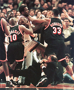
If the organization believes in something - a philosophy, a strategy, or a set of values strongly enough to imbue them in your organizations' logo, then it is probably a good idea to take a look back at that logo from time to time, especially when things seem to be straying. Are the decisions we are making, the behaviors that we are rewarding, and the messages we are sending to employees, customers, and the community consistent with 'The Logo'?
Jerry West confidently gliding up the court to hit a winning shot is a much more telling image than Jeff Van Gundy clinging to the leg of an enraged Alonzo Mourning.
Oh and by the way - my pick for the Finals is the Lakers winning in seven games.


Reader Comments (5)
I agree with almost all of what you say. I think the NBA strayed when they went for the short-term money gains of merchandising over product development & improvement. The move toward a superstar structure hurt the NBA much more than the sales they gained on Shaq jerseys. My take.
And I appreciate the reminder. I put lots of time & effort into making my logo representative of what I wanted my business to convey. I think I'll spend some time looking and thinking about that this week as life and business changes make for straying away from the original intent.
You are however wrong about the outcome...Celtics in 6!
Ah, that's what that red, white and blue logo stands for. It appeared on my BB after the last upgrade and I was wondering what the heck it was for :)
@Leanne - Thanks so much! I hope that the series plays out well for sure.
@Lisa - See I am here to educate!
Abercrombie Fitch Tees is an American brand, which initially started to advertise its articles alone in the markets of America, but now it has become Abercrombie Fitch Tee in targeting the markets of Europe and Asia.
A Logo is the most important part of your business or organization, it's your identification somehow logo represents who you are and what you doing. You should have done maximum effort for creating a logo and if you can't do it by yourself then you should hire someone to do this.