Monday
Feb072011
Scalies
Scalies.
Likely you have seen them. In real-estate development drawings, architectural renderings, or even on a school projects, or aging enthusiasts model train layouts. Aside - not to pick on model train hobbyists, but if there ever was a hobby that really seemed to be in need of a freshening up, it is this one. If model railroading disappears, we will have lost not just a rich history and part of our expansionary culture, but the markets for tiny fake trees, wrangler jeans, and suspenders will also take a huge, perhaps devastating blow.
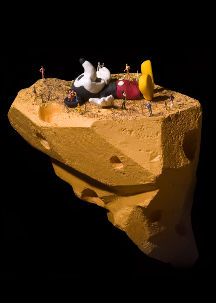
Scalies is one of the terms that architects have used to describe images and models of people and objects to inhabit, provide scale and context, and to ‘humanize’ and make more accessible drawing and models. The scalies help to allow us to see ourselves inhabiting the abstraction. What have we here?
Pitching your renderings and ideas for a new shopping mall? Better depict the mall parking lot full of cars, the shops busy with interested patrons, while making sure to incorporate the right mix of people, ages, races, and so on. Why is it important, beyond the practical value of setting context and making the abstract more familiar?
I suppose one could argue that we no longer construct buildings, we provide the physical framework for experiences. A new store is not just a vessel to facilitate the exchange of value, but rather a conduit for storytelling, and even, in the best examples, an edifice that becomes immersed in the culture and identity of a place.
But as described in this recent New York Times piece on the use of these human images and forms in the design and sales process, the scalies need always to remember their proper place in the importance heirarchy. According to the article ‘the most important factor is making sure any individual (scalie) isn’t so remarkable as to distract from the scene as a whole.
The scalies inhabit but don’t manipulate, they support but do not challenge, they are familiar enough, but never threaten or confront - whether the scene is an office park, condominium tower, or a new publicly subsidized professional sports palace. Designers and architects imbue ‘humanity’ onto a scene by the addition of a collection of formless, unfeeling, indistinguishable images of people that conform to our pre-conceived ‘non-offensive while being suitably diverse’ checklist. Make sure we have a guy in a hoodie with an iPod, a business dude talking on a cell phone, and a few women and kids to balance the entire scene out. After all, the individuals don’t matter, what matters is the entirety of the presentation, and the vague notion of fit, balance, and perhaps event conformity that a carefully curated collection of scalies imparts upon the scene.
We have reached the part of this post where I (attempt to) make a telling and apt comparison to the architect’s use of these inhuman scalies to the world of work - maybe to our surface attempts at diversity hiring and development programs; or our marketing and communications departments strident efforts to ensure that all of out corporate communications use suitably diverse but non-offensive stock photography. Truth is I can’t really make a convincing argument or even conjure a profound or even pithy metaphor here. Truth is I just wanted to see if I could write 600 words about ‘scalies’.
But I will just leave it at this - the next time I see one of those ‘What is it like to work here’ videos on a corporate career site that features an employee working in a low-wage, low-skilled job, that may or may not have had a couple of run-ins with the law in the past, has a ‘look’ that might cause you to wait for the next train on the subway, but has worked hard to overcome some shaky decisions and get back on a better path, helped in no small part by working at XYZ Corporation, it will probably be the first. That kind of thing might be a little too real I suppose.
Likely you have seen them. In real-estate development drawings, architectural renderings, or even on a school projects, or aging enthusiasts model train layouts. Aside - not to pick on model train hobbyists, but if there ever was a hobby that really seemed to be in need of a freshening up, it is this one. If model railroading disappears, we will have lost not just a rich history and part of our expansionary culture, but the markets for tiny fake trees, wrangler jeans, and suspenders will also take a huge, perhaps devastating blow.
Scalies is one of the terms that architects have used to describe images and models of people and objects to inhabit, provide scale and context, and to ‘humanize’ and make more accessible drawing and models. The scalies help to allow us to see ourselves inhabiting the abstraction.
 What have we here?
Pitching your renderings and ideas for a new shopping mall? Better depict the mall parking lot full of cars, the shops busy with interested patrons, while making sure to incorporate the right mix of people, ages, races, and so on. Why is it important, beyond the practical value of setting context and making the abstract more familiar?
I suppose one could argue that we no longer construct buildings, we provide the physical framework for experiences. A new store is not just a vessel to facilitate the exchange of value, but rather a conduit for storytelling, and even, in the best examples, an edifice that becomes immersed in the culture and identity of a place.
But as described in this recent New York Times piece on the use of these human images and forms in the design and sales process, the scalies need always to remember their proper place in the importance heirarchy. According to the article ‘the most important factor is making sure any individual (scalie) isn’t so remarkable as to distract from the scene as a whole.
The scalies inhabit but don’t manipulate, they support but do not challenge, they are familiar enough, but never threaten or confront - whether the scene is an office park, condominium tower, or a new publicly subsidized professional sports palace. Designers and architects imbue ‘humanity’ onto a scene by the addition of a collection of formless, unfeeling, indistinguishable images of people that conform to our pre-conceived ‘non-offensive while being suitably diverse’ checklist. Make sure we have a guy in a hoodie with an iPod, a business dude talking on a cell phone, and a few women and kids to balance the entire scene out. After all, the individuals don’t matter, what matters is the entirety of the presentation, and the vague notion of fit, balance, and perhaps event conformity that a carefully curated collection of scalies imparts upon the scene.
We have reached the part of this post where I (attempt to) make a telling and apt comparison to the architect’s use of these inhuman scalies to the world of work - maybe to our surface attempts at diversity hiring and development programs; or our marketing and communications departments strident efforts to ensure that all of out corporate communications use suitably diverse but non-offensive stock photography. Truth is I can’t really make a convincing argument or even conjure a profound or even pithy metaphor here. Truth is I just wanted to see if I could write 600 words about ‘scalies’.
But I will just leave it at this - the next time I see one of those ‘What is it like to work here’ videos on a corporate career site that features an employee working in a low-wage, low-skilled job, that may or may not have had a couple of run-ins with the law in the past, has a ‘look’ that might cause you to wait for the next train on the subway, but has worked hard to overcome some shaky decisions and get back on a better path, helped in no small part by working at XYZ Corporation, it will probably be the first. That kind of thing might be a little too real I suppose.
Picture credit - Marcus Hoffko. For more information about his work please click here.

 Steve
Steve
Reader Comments