Technology Quiz -What Platform am I talking about?
Here is a Technology quiz for a Wednesday - Name That Platform.
Some background - this platform can be considered very similar to an employee information portal, where a user logs in, and is presented with a combination of user-specific and tailored content as well as 'organizational' content and information.
Here are some of the key features:
Extremely easy to use - in fact inexperienced users often learn all the necessary functions with no 'formal' training, and only occasional reference to the available online help.
Cool User Interface - one or two click access to all the most important and commonly used functions, layout is intuitive, and consistent. Users can efficiently conduct a wide range of transactions and processes in just a couple of steps.
Interactive elements - animated 'guides' are utilized to describe certain platform features, and provide extra help and assistance. These 'guides' help the user navigate some of the newly introduced features of the platform.
Educational Content - interactive learning, quizzes, and tons of information on a wide variety of topics, rewards for completing educational modules built right in to the platform
Staff Profiles - quick access to detailed profile information on your network, with pictures, their current status, and links to connect with them in numerous ways
Connection to other users - embedded chat, 'following' or 'friending' capability, and opportunities to interact with other users for mutual benefits.
Engaging - users of this platform consistently indicate the platform is fun, they get the information they need, and they actually enjoy working with it.
Lightweight - It is 100% deployed over the web, it supports hundreds of thousands of users all over the world, and while I do not have statistics, the uptime and reliability is first-class.
Okay, any ideas yet?
The information platform I am describing is Webkinz World. If you are not familiar with Webkinz, they are small toy stuffed animals that come with a unique code that can be used to 'register' your Webkinz in the online interactive platform Webkinz World.
Once the user logs in to the platform, they 'manage' their pets (think employees) they can take online quizzes (educational content), interact with other users (internal social networking), and review and optionally respond to Webkinz messages (intranet, or information portal).
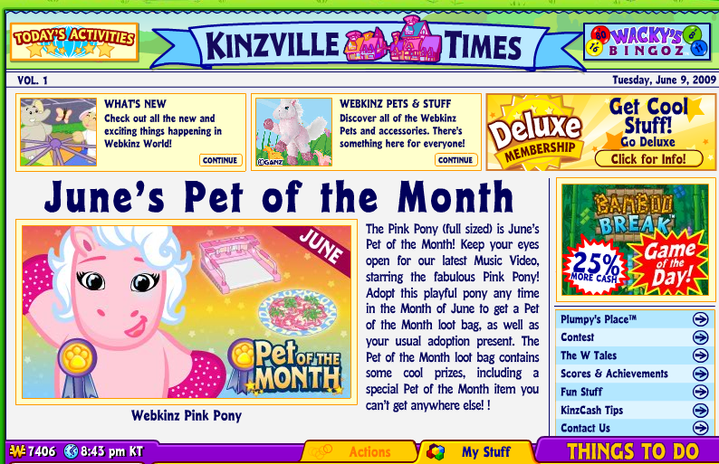
Home Page - A nice information portal welcome page, a little busy maybe (we are dealing with a target user between 6 to 9 years old). News from the company in the center and right, and links to the user specific information along the bottom menu bar. Note the large 'Things To Do' button on the lower right which opens up a menu of all the actions the user can take from here.

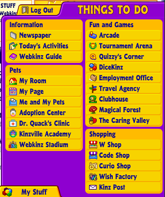
Here is the 'Things To Do' menu. All the important options, information, and functions can be launched from this menu.

Think about many corporate systems and portals that require the user to navigate through a byzantine menu structure to find the correct link to launch the desired function. In Webkinz World, launching the desired function is typically never more that two clicks away.
And these functions are grouped nicely into various categories according to their use and even include some colorful icons to help describe the function (potentially a good idea if you have users that may not have English as their native language).
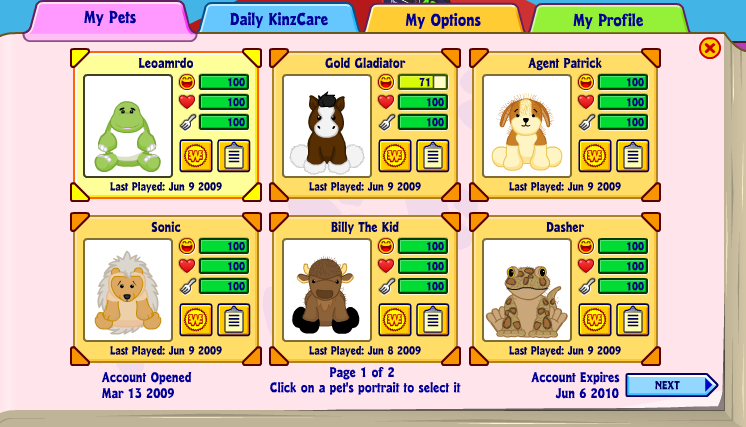
The last cool feature of Webkinz World that I think has parallels to many of the newer HR portals and Talent Management Systems is the Profile Page. In Webkinz World, the 'profile' page displays to the user information on each of their registered pets, in the corporate systems environment this kind of profile page would potentially display your direct reports, your project team members, or the search results from some kind of an expertise query.
Profile Page
Here is the main profile page, think of a page like this one displaying rich employee profile information instead of some of my son's 'pets'.
At a glance the profiles show information on pet 'happiness, health, and hunger', perhaps in a corporate environment these could be 'availability, performance review score, or recommendations'. Clicking on your 'pet', launches yet more information and the ability to interact. In Webkinz this may be feeding or playing a game, in the corporate environment this could be an IM, e-mail, or request for a video chat. More details of the employee's past assignments or projects can be captured, to facilitate staffing of new projects or initiatives.
Conclusion
What can we learn from all this? The layout, design, and user experience of an informational and interactive portal aimed at 7 year olds does have some applicability to the HR portals and systems you use today, or may be interested in using in the future. I mean, if the system can be 'learned' by little kids, with no help or training, provides a wealth of information, functions, and is somewhat tailored to each user then why can't the portals and systems that we make available to our workforces have all those things?
If you have a child, grandchild, niece, nephew, etc. in the 6-10 demographic ask them if they can give you a demo of Webkinz World, you just might pick up some ideas you can use in your corporate HR systems.
Thanks to Patrick for giving me the demo!

 Steve
Steve

