Quantcast
Subscribe!


Enter your email address:

Delivered by FeedBurner


E-mail Steve
  • Contact Me

    This form will allow you to send a secure email to Steve
  • Your Name *
  • Your Email *
  • Subject *
  • Message *

free counters

Twitter Feed

Entries in Users (7)

Monday
Jan132014

Chromebooks and when technology gets too capable

Recently I needed to replace my personal laptop as my old trusty netbook (remember those?), that had like most aging computers, arrived at that place of only occasional and mostly unreliable service. Lots of system freeze ups, a battery that won't hold a charge, and on operating system that was more or less a dog from the day it was new.

But the reasons I bought the original netbook a few years back to be a kind of backup, and secondary device, (lightweight, easy to pack for travel, great battery life, etc.), hadn't diminished or really changed that much for me. I used the little netbook to check my Google Reader (the old days), write on the blog, do some basic web surfing. It didn't really matter that the netbook didn't have a full MS Office suite. I did (and still do), 'real' work that is most often translated via Word documents and PowerPoint decks on my 'real' work machine. Which no matter where I have worked over the last few years seems to consistently have been one of those massive Dell 'enterprise' laptops.  Big, sturdy, heavy, has way too much hard drive storage, and takes about 28 minutes to boot up each day. But it has everything I need and is probably not much different than what 90% of the folks who are reading this are using for their primary work computers.

But for the netbook replacement I didn't need all the things that make the Dell, well, a big old Dell work machine. I didn't need MS Office, didn't need a ton of storage, (thanks to Google Drive and Box), didn't need anything big and super fast and heavy - in fact just like the old netbook small and light is what I was looking for in something new. I wanted to be able to occasionally leave the giant Dell at home when I am out on the road. Lugging the big Dell through the Detroit airport while running to make a connection has not exactly been a joy over the last few years.

So since what I really wanted was a new Netbook, and no one really makes Netbooks any more, I settled on the 'new' Netbook so to speak, namely, one of the new Google Chromebooks - mine is made by Acer. You've probably heard about Chromebooks for a while now, they are lightweight, super fast, run the Google Chrome operating system, and essentially are only useful when they are connected to the internet via WiFi, (but think about it, when was the last time you were NOT on WiFi when you needed to get something done). 

Chromebooks are on a roll as we head into 2014. Over the holiday season, two of the top three best-selling PCs on Amazon.com were Chromebooks. And Chromebooks have begun to get enough traction that mighty Microsoft, whose Windows and MS Office business is potentially really threatened by Chromebooks, has put out a series of attack ads that knock the Chromebook, (including one featuring the stars of my favorite reality show Pawn Stars), as machines that are only good for one thing - getting online. And if you can't get online for some reason, then the Chromebook is more or less a shiny brick.

Some of that FUD from Microsoft is close to the truth, even though the Chromebooks are a little more capable, (even offline) than the attack ads make them out to be. But even if they were completely true it wouldn't really matter at all to the Chromebook's primary value proposition, and it wouldn't change the essential truth about technology that the increasing popularity of the Chromebooks help to reveal.

Namely, that really often mature and established technologies, (like PCs), are way too capable and complex than is really required by the vast majority of their users. With all the extra capability that traditional Windows-based PCs deliver, they also bring lots of additional and potentially excess that marks a trade off or really a balance between actual user need, technology capability, and price/value. And most of us, particularly when considering technologies that we will use for work or in the workplace, are pretty bad and making these kinds of value judgements optimally.

Why?

Because we fall into the trap of only considering the situation on two variables - capability and price. 

Technologies generally get better, i.e. can do more things, support more processes, have more options to consider that will enable even more capabilities, etc. as they climb up the price ladder. And the less expensive technologies, like the Chromebook, well, they can do less things. Pretty simple and pretty much how we make technology decisions.

But what we miss, and I definitely see this from bouncing back and forth between the big old Dell and the simple Chromebook, is that how much that extra capability translates into complexity which when it is not really needed, actually detracts from the overall user experience.

Right now, for me, the tasks and activities that the Chromebook supports can all be done on the Dell PC as well, and the Dell is fine at all of them. But all the excess of the Dell, the 10 minute boot time, the messy file system, the constant 'Installing update 1 of 57, please do not unplug the PC' messages when you really, really need to pack up - they actually detract from the overall user experience, at least some of the time.

We often make the mistake, whether it is assessing the utility of something like a Chromebook, or evaluating a more complex enterprise technology like an LMS or ATS, of assuming that having the maxmimum amount of capabilty is always inherently better than the alternative, i.e., having some subset of that capability.

But that extra capability, even if we think it benign since it usually goes unused and consequently ignored, can often make what we actually do want and need to use that much more difficult, and ineffiecient, and complex.

With the Chromebook less is starting to seem more and more like, well, more

I wonder if we will start seeing the same kinds of effects in our enterprise technology too.

Have a great week!
Friday
Jul192013

Vacation Week - Read this instead #5

Note: The blog is on vacation this week, so you should read this instead...

‘Oh, I’m So Good at Math’: Lessons From the Jay-Z Business Model

From the piece:

The nature of those rules was revealed in the spot’s final second, when the words SAMSUNG GALAXY flashed on the screen. Viewers were directed to a website, where they could make out—amid stylized redactions—directions that allowed Samsung users to download a free app, which would in turn give them the album five days ahead of its general release. Samsung paid $5 each for a million digital copies, assuring the album of platinum status before it even appeared, while also giving Jay-Z the benefit of free advertising. The Wall Street Journal valued the partnership at $20 million—a figure that shocked an industry battered by piracy and declining revenues.

The deal was about much more, however, than solving a distribution problem. Before the release, the free app worked as a machine for data-mining and promotion, trading scraps of information, like lyric sheets and cover art, for access to users’ social networks. Though some critics objected to the crass intrusiveness—“If Jay-Z wants to know about my phone calls and e-mail accounts,” the Times’ Jon Pareles groused, “why doesn’t he join the National Security Agency?”—it didn’t much affect his standing with fans. A total of 1.2 million people downloaded the app, creating a mailing list at the very least and potentially offering something more, like the core audience for a music-streaming service.

Read the rest here...

Have a great weekend!

Thursday
Mar082012

Choice and Cookies: Why are Oreos so popular?

This week marked the 100th Birthday of the venerable Oreo Cookie, that most familiar staple of cookie jars and milk-and-cookie breaks all over the world. The simple chocolate and cream filled cookie continues to grow in popularity, despite having not changed much in its 100 years of existence, managing to weather a century of constant changes in attitudes and preferences about food. Chances are pretty good if you are reading this post, you have yourself had many an Oreo over the years, your parents likely had them in the house at least sometimes, and if you are a parent, you have bribed provided them to your own kids from time to time. Go ahead, take two

I find it interesting sometimes to think about what makes products and companies so enduringly popular, especially in a time where companies and products can rapidly rise into public consciousness and success, and at times, crash, burn, and disappear almost as quickly. Ten years ago there was no Facebook, iPhone, and 'live Tweeting' would have been a term you might have been to get away with using among your bird watching buddies, (if they didn't banish you from the group for being too dorky). But here we are, 100 years later, and the Oreo is the world's most popular cookie. How did they manage that?

Certainly it is at least partially a marketing and branding story. Nabisco, the owner and manufacturer of the Oreo brand has long been a powerhouse in the consumer goods space. They know design, messaging, and how to continually reinforce the emotional connection that many consumers have with the Oreo cookie. But where does this emotional connection and attachment come from in the first place? Marketing is powerful, but is it that powerful to actually create and sustain consumer attachment for 100 years?

There is another theory about the success of the Oreo that is more interesting than advertising, it is about, for lack of a better word, user experience. As anyone who has ever eaten an Oreo knows that despite the cookie's simplicity, there are a few different ways to actually eat an Oreo. There is the dunk, the split, the split and lick, and more. All the while taking a stance and defending your preferred method of consumption with your fellow Oreo connoisseurs.  The emotional attachment to the product derives at least in part from this creative freedom to consume the treat in the way you prefer. In fact, a 1981 article titled “Creative Eating: The Oreo Syndrome,” by folk historian Elizabeth Mosby Adler contends that part of the Oreo's appeal is that it allows people to bring their own personal style to experience. I suppose one could argue that Oreo was doing DIY and embracing to a small extent the 'maker' mindset that has grown in popularity in recent years.

Why is any of this important, (yes, here is the 'what can we learn' part of the post).

It is really easy when we design technology systems or new work processes to want to force, coach, or guide people to use the new tools or interact with the new system in a specific way, or in a certain, proscribed manner. We apply best practices, we do surveys, we do A/B studies, all to arrive at the 'right' way to use the system - optimized for efficiency, productivity, and utility. And truly if our users do follow these rules they probably will become more efficient and productive. But it is also likely, if they have not been offered the ability and permission to explore a little, to seek out ways of interacting with the tools or processes in a more personal way, or to find a solution that resonates with them as individuals, then an emotional connection will never be made.

And that might be perfectly fine. After all, who needs an emotional connection to be made between users and a system designed for work, not for fun? I suppose no one.

But who really needs a specific brand of chocolate and cream filled cookies either? After all, they are all pretty much the same.

Just don't tell that to a committed Oreo fan.

Monday
Aug092010

Have a better idea?

Over the weekend I read an interesting post on the User Interface Engineering blog titled 'Please, let me redesign your airline for you' that chronicles some well-known, (and some lesser-known), attempts by unaffiliated designers to suggest improvements to American Airlines' website, Delta Airlines boarding cards, and the main portal page for Delta's Sky Club. Redesigned Delta Sky Club Portal by Zach Evans

In all cases these re-designs and suggestions for improvement to existing systems and processes were unsolicited by the airlines that 'own' them, but were put forth by customers, the true end users of these tools and products.  In some cases, the designers are extremely dedicated and loyal customers, and by offering up their talents and time to contribute these ideas and improvements, they are almost begging American and Delta to please improve the user and customer experiences to a level that is commensurate with the dedication and loyalty they have demonstrated over the years.

Sure, the AA home page and the Delta boarding card as they currently exist probably do need an upgrade. And yes, as is noted in some of the comments on the UIE blog it is pretty easy for any designer to slap together a mock up for a new web page or to offer up an improved user portal design without having to consider any of the real and practical restraints that the actual designers and administrators of these systems simply have to contend with.

But the fact that these redesigns were developed independently and offered up to the organizations freely indicates three things about the current situation with these systems:

1. There are passionate and loyal customers

2. The systems themselves are lacking in some important ways

3. There are many users able and willing to offer improvements and new ideas

Loyal customers, systems that are lacking somehow, and a population of users some of which able and willing to assist, especially since as frequent, even constant users of the systems and processes can likely tell you exactly what is working and what can use some rework.

I think that the same can be said for many of the systems and processes that HR organizations present to their user communities.  

The redesigns for the airline industry tools and sites tend to focus on making things simpler, identifying and presenting the most important information more plainly and clearly, and finally serving to make the actual business transaction better and more efficient.  No one buys a ticket on AA for their cool website, but they want the website to help make their ultimate goal, getting to their destination safely and on time, easier.

I think the same could be said for most workforce technologies. They exist primarily to make employees and managers jobs easier, but often they get lost in a stew of features, links, and help text serving eventually to frustrate and confuse users.  I would bet that many of your employees and managers have some great ideas about how your systems could be redesigned to support them in their jobs more effectively.

That's my challenge for you today - ask one employee or one manager how they would change one of the key workforce systems that they use every day.  You just may get an incredibly useful and powerful suggestion. 


Print


Wednesday
Jun102009

Technology Quiz -What Platform am I talking about?

Here is a Technology quiz for a Wednesday - Name That Platform.

Some background - this platform can be considered very similar to an employee information portal, where a user logs in, and is presented with a combination of user-specific and tailored content as well as 'organizational' content and information.

Here are some of the key features:


Extremely easy to use - in fact inexperienced users often learn all the necessary functions with no 'formal' training, and only occasional reference to the available online help.

Cool User Interface - one or two click access to all the most important and commonly used functions, layout is intuitive, and consistent. Users can efficiently conduct a wide range of transactions and processes in just a couple of steps.

Interactive elements - animated 'guides' are utilized to describe certain platform features, and provide extra help and assistance. These 'guides' help the user navigate some of the newly introduced features of the platform.

Educational Content - interactive learning, quizzes, and tons of information on a wide variety of topics, rewards for completing educational modules built right in to the platform

Staff Profiles - quick access to detailed profile information on your network, with pictures, their current status, and links to connect with them in numerous ways

Connection to other users - embedded chat, 'following' or 'friending' capability, and opportunities to interact with other users for mutual benefits.

Engaging - users of this platform consistently indicate the platform is fun, they get the information they need, and they actually enjoy working with it.

Lightweight - It is 100% deployed over the web, it supports hundreds of thousands of users all over the world, and while I do not have statistics, the uptime and reliability is first-class.


Okay, any ideas yet?


The information platform I am describing is Webkinz World.  If you are not familiar with Webkinz, they are small toy stuffed animals that come with a unique code that can be used to 'register' your Webkinz in the online interactive platform Webkinz World.

Once the user logs in to the platform, they 'manage' their pets (think employees) they can take online quizzes (educational content), interact with other users (internal social networking), and review and optionally respond to Webkinz messages (intranet, or information portal).

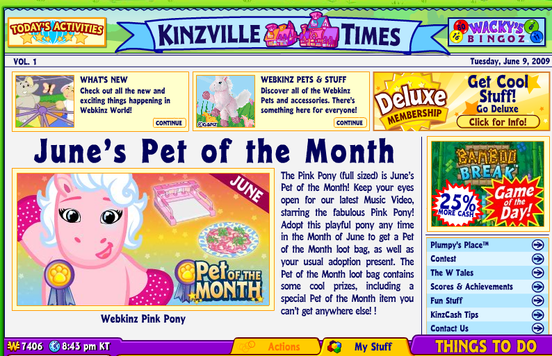
Home Page - A nice information portal welcome page, a little busy maybe (we are dealing with a target user between 6 to 9 years old).  News from the company in the center and right, and links to the user specific information along the bottom menu bar.  Note the large 'Things To Do' button on the lower right which opens up a menu of all the actions the user can take from here.


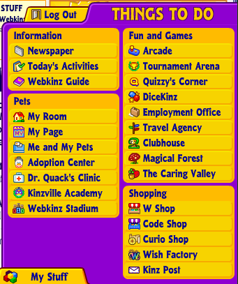
Here is the 'Things To Do' menu.  All the important options, information, and functions can be launched  from this menu.

Think about many corporate systems and portals that require the user to navigate through a byzantine menu structure to find the correct link to launch the desired function. In Webkinz World, launching the desired function is typically never more that two clicks away.

And these functions are grouped nicely into various categories according to their use and even include some colorful icons to help describe the function (potentially a good idea if you have users that may not have English as their native language).

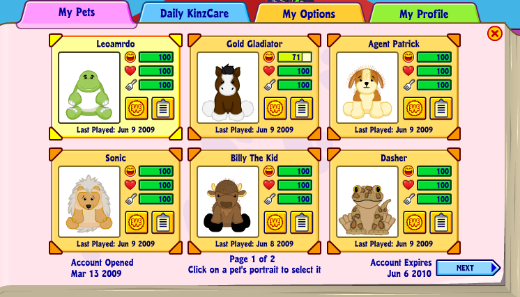
The last cool feature of Webkinz World that I think has parallels to many of the newer HR portals and Talent Management Systems is the Profile Page. In Webkinz World, the 'profile' page displays to the user information on each of their registered pets, in the corporate systems environment this kind of profile page would potentially display your direct reports, your project team members, or the search results from some kind of an expertise query.


Profile Page

Here is the main profile page, think of a page like this one displaying rich employee profile information instead of some of my son's 'pets'.


At a glance the profiles show information on pet 'happiness, health, and hunger', perhaps in a corporate environment these could be 'availability, performance review score, or recommendations'. Clicking on your 'pet', launches yet more information and the ability to interact. In Webkinz this may be feeding or playing a game, in the corporate environment this could be an IM, e-mail, or request for a video chat. More details of the employee's past assignments or projects can be captured, to facilitate staffing of new projects or initiatives.

Conclusion

What can we learn from all this? The layout, design, and user experience of an informational and interactive portal aimed at 7 year olds does have some applicability to the HR portals and systems you use today, or may be interested in using in the future. I mean, if the system can be 'learned' by little kids, with no help or training, provides a wealth of information, functions, and is somewhat tailored to each user then why can't the portals and systems that we make available to our workforces have all those things?

If you have a child, grandchild, niece, nephew, etc. in the 6-10 demographic ask them if they can give you a demo of Webkinz World, you just might pick up some ideas you can use in your corporate HR systems.

Thanks to Patrick for giving me the demo!