Quantcast
Subscribe!


Enter your email address:

Delivered by FeedBurner


E-mail Steve
This form does not yet contain any fields.

    free counters

    Twitter Feed

    Entries in usability (3)

    Wednesday
    Nov252015

    HRE Column: Thinking about HR Tech User Experience

    Here is my semi-frequent reminder and pointer for blog readers that I also write a monthly column at Human Resource Executive Online called Inside HR Tech and that archives of which can be found here.

    As usual, the Inside HR Tech column is about, well, HR Tech, (sort of like I used to write about all the time on this blog), and it was inspired by the several vendor events I have recently attended, (Achievers, iCIMS, Kronos, Oracle). At each of these events, and I am pretty sure every other event I attended in 2015, HR technology companies talk A LOT about User Experience or UX.  Since the subject of UX comes up so often these days, on the latest Inside HR Tech column I offer some suggestions for HR leaders and pros on the right things to think about and questions to ask when assessing your HR technology provider's approach to and ability to deliver great User Experiences.

    I once again kind of liked this month's column, (I suppose I like all of them, after all I wrote them), but felt like sharing this one on the blog because it touches upon what has been in the past a pretty popular topic with HR leaders today - how to understand UX and how to evaluate UX to make the most of their HR technology investments.

    Here is an excerpt from the HRE column, 'Getting Your Arms Around the Experience':

    In almost every demonstration, someone from the provider organization talks about being focused on something called the "user experience" (aka "UX"). This term almost always follows the descriptor "great," so what I hear all the time from providers -- and you've probably heard it, as well, during a recent HR- software demo -- is, "We are focused on creating a great user experience." Literally every vendor says this exact same thing.

    The reason they all say this is that UX is actually really important. You probably realize this -- even if you are among those who have never heard the actual term before -- because you are making decisions and choices around technology at least partially based on UX. The apps you like to use on your phone, including those for email, weather, sports scores, shopping, listening to podcasts, etc. -- were likely chosen for two main reasons: One is based on the actual functionality of the app (aka, the "what"); and the second is based on the input methods, characteristics, work flow, design, look and interaction style of the app (aka, the "how").

    That how is the most significant part of the concept of UX.

    It is important to note, as well, that user experience is more than just colors, fonts and buttons. It encompasses a wide range of aspects and elements that define how users feel about the technology.

    So now that we have an idea of what the user experience consists of -- and that it is key when evaluating technology -- what are some of the questions that you should ask your current or prospective HR-technology solution providers when evaluating the UX of their solutions?

    Here are a few ideas. First, some questions about the organization itself:

    What does UX mean to your organization?

    This is mostly about getting solution providers to talk about UX generally and share their philosophies of the importance of UX to their organizations. It's also about trying to get a sense of their approaches in building their solutions. When they talk about their products and future road maps, how much time is spent on UX topics compared to basic functionality and capability? Essentially, you are trying to get an overall feel for, and comfort level with, the provider's commitment to UX.

    What is the title of the most-senior person in the organization who is dedicated to UX? How many staffers are on the UX team? Has that part of the development organization grown in the last two years?

    These questions are meant to help you dig a little deeper to see if the solution provider is backing up its stated commitment to UX with the proper investments and resources.

    Read the rest over at HRE Online...

    Good stuff, right? Humor me...

    If you liked the piece you can sign up over at HRE to get the Inside HR Tech Column emailed to you each month. There is no cost to subscribe, in fact, I may even come over and rake your leaves or dig your car out of the snow  for you if you do sign up for the monthly email.

    Have a great day and a great long, Thanksgiving weekend in the USA!
    Thursday
    Mar082012

    Choice and Cookies: Why are Oreos so popular?

    This week marked the 100th Birthday of the venerable Oreo Cookie, that most familiar staple of cookie jars and milk-and-cookie breaks all over the world. The simple chocolate and cream filled cookie continues to grow in popularity, despite having not changed much in its 100 years of existence, managing to weather a century of constant changes in attitudes and preferences about food. Chances are pretty good if you are reading this post, you have yourself had many an Oreo over the years, your parents likely had them in the house at least sometimes, and if you are a parent, you have bribed provided them to your own kids from time to time. Go ahead, take two

    I find it interesting sometimes to think about what makes products and companies so enduringly popular, especially in a time where companies and products can rapidly rise into public consciousness and success, and at times, crash, burn, and disappear almost as quickly. Ten years ago there was no Facebook, iPhone, and 'live Tweeting' would have been a term you might have been to get away with using among your bird watching buddies, (if they didn't banish you from the group for being too dorky). But here we are, 100 years later, and the Oreo is the world's most popular cookie. How did they manage that?

    Certainly it is at least partially a marketing and branding story. Nabisco, the owner and manufacturer of the Oreo brand has long been a powerhouse in the consumer goods space. They know design, messaging, and how to continually reinforce the emotional connection that many consumers have with the Oreo cookie. But where does this emotional connection and attachment come from in the first place? Marketing is powerful, but is it that powerful to actually create and sustain consumer attachment for 100 years?

    There is another theory about the success of the Oreo that is more interesting than advertising, it is about, for lack of a better word, user experience. As anyone who has ever eaten an Oreo knows that despite the cookie's simplicity, there are a few different ways to actually eat an Oreo. There is the dunk, the split, the split and lick, and more. All the while taking a stance and defending your preferred method of consumption with your fellow Oreo connoisseurs.  The emotional attachment to the product derives at least in part from this creative freedom to consume the treat in the way you prefer. In fact, a 1981 article titled “Creative Eating: The Oreo Syndrome,” by folk historian Elizabeth Mosby Adler contends that part of the Oreo's appeal is that it allows people to bring their own personal style to experience. I suppose one could argue that Oreo was doing DIY and embracing to a small extent the 'maker' mindset that has grown in popularity in recent years.

    Why is any of this important, (yes, here is the 'what can we learn' part of the post).

    It is really easy when we design technology systems or new work processes to want to force, coach, or guide people to use the new tools or interact with the new system in a specific way, or in a certain, proscribed manner. We apply best practices, we do surveys, we do A/B studies, all to arrive at the 'right' way to use the system - optimized for efficiency, productivity, and utility. And truly if our users do follow these rules they probably will become more efficient and productive. But it is also likely, if they have not been offered the ability and permission to explore a little, to seek out ways of interacting with the tools or processes in a more personal way, or to find a solution that resonates with them as individuals, then an emotional connection will never be made.

    And that might be perfectly fine. After all, who needs an emotional connection to be made between users and a system designed for work, not for fun? I suppose no one.

    But who really needs a specific brand of chocolate and cream filled cookies either? After all, they are all pretty much the same.

    Just don't tell that to a committed Oreo fan.

    Tuesday
    Dec062011

    Notes From the Road #4 - Ice Buckets and Usability

    I've stayed in plenty of hotels these last few years, and have found that fewer and fewer standard hotel rooms come equipped with in-room refrigeration of any kind. First the stocked mini-bar started to fall out of fashion in most rooms a couple of years ago, often to have the empty space replaced with one of those mini, college dorm-sized refrigerators. Which was to me, a far better deal anyway. The days of casually dropping $7.25 on a can of mini-bar Miller Lite or $3.75 for a Snickers bar have came and went with the pressure faced by organizations and people to carefully watch travel expenses. At least with an in-room refrigerator, one could store some extra beverages or snacks without having constantly hit the vending machine or wonder in the morning if it is ok to drink orange juice that has been sitting on the table all night, (it probably is not ok.)It needs a cold beverage.

    But lately most hotels I've been in seem to have dropped the mini-refrigerators as well. I imagine it was simply a cost/usage decision. Many hotel guests were apparently not using the refrigerators all that much, and the energy costs to keep potentially hundreds of these appliances running when compared with their limited use made for what was probably a simple decision - get rid of the refrigerators. Not a big deal really, a convenience sure, but not generally a trip ruining development. Besides, there's always that ever present hotel room ice bucket and industrial ice machine down the hall.

    Yep the ice bucket - that normally utilitarian device that is generally only used in hotel rooms, and typically is designed with about as much thought and care as is to be expected from a tool that for the most part simply needs to keep a pound or so of ice and the one, (maybe two) beverages that can be squeezed into the full bucket. Most hotel room ice buckets are the same - round, flimsy, and cheap. In fact, most of the time the combination of overfilling, (who wants to march down the hotel hallway more than once), the round shape of the bucket making one-hand operation tricky, and the vagaries of hotel room door locks tend to combine to make the entire ice-bucket experiences a bit of a hassle.

    What could solve this little, (and I agree, problems with hotel room ice buckets are squarely a first world problem), conundrum and make the usability about 100x better? Simple: a handle on the bucket.

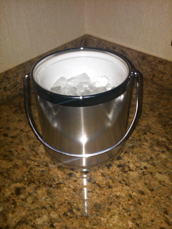
    The picture on the right shows the ice bucket in my room this week at a Marriott in New York. Sturdier than the garden variety model and possessing what I have found to be the rarest and most needed of features - a HANDLE. The handle, a small and probably inexpensive add-on improves and enhances the experience immeasurably. The handle allows you to carry the bucket easily in one hand, (important for those many, many hotel rooms that are about 7 miles from the ice machine), and re-open your room door without having to balance the cold, overfilled bucket against your body or set it on the floor as you fumble with the elecronic lock that may or may not feel like co-operating with you.

    Whomever designed this particular ice bucket realized something very important - that while the bucket's 'job' is to hold a small amount of ice and keep a drink cold for a few hours, that is a passive use case. When the actual users interact with the bucket, they are CARRYING it, half of that time filled with ice and needing to open a door. The designers thought not just the functions, but about the process and the experience of actually using the bucket. Something they could have easily missed if they focused too much on 'ice melt rate' and 'temperature after 3 hours' and not on the environments and challenges inherent on where and how the ice buckets would actually be used. Something they might not have appreciated if they never left the confines of their design lab and ventured out into the environments where their product would be used.

    Have a made too much about this? About 800 words about an ice bucket? Probably so. But to me the handle on the ice bucket reinforces a great lesson no matter what you are in charge of building - tools, technologies, or processes. 

    You'll never know if they will work until you try them in the field. Better to do that when designing and not after you've contracted with a Chinese supplier to build a few hundred thousand units.