

A User Interface Lesson from the Produce Department
 Steve
SteveI have always been a huge proponent and implementer of Employee and Manager Self-Service systems for the enterprise. These systems come with lots of promises, easy access to information, reduced administrative burden on the HR department, and the opportunity to give 'ownership' of HR data to the employees and managers.
It's a win all around, right?
But the problem with many self-service solutions is that they inherit the user interface and design elements from the core enterprise systems that they sit on top of. Boring or ugly design, lots of menus to navigate though to get to what you are looking for, and terminology that is straight out of the programmer's manual.
HR Self-service systems need to be simple, easy to understand with no training (and by people who may not even read English all that well), and extremely efficient.
They need to work more like this:
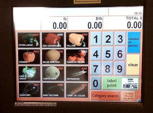 Wegmans - Pittsford, NY
A simple self-service kiosk for weighing and printing price labels for produce. Bag up your items, place them on the scale, enter your code, and get the price label.
Look at the key elements, large and colorful action buttons, graphics that help users (especially ones with limited English skills) to make the correct choice, and a speedy, simple transaction.
The current most popular items are prominently featured with large, color pictures, giving the shopper one-touch access to complete their transaction. I bougt some Green Peppers, and with one touch, I had my label and was on my way.
Why is this important for HR Systems?
Think about how in your employee self-service system, the online Pay Slip is almost certainly the most frequently accessed function. Is the link displayed prominently, like the Green Pepper? Is a shortcut available to provide one-click access? Or do the employees have to endure something akin to this:
Employee Self-Service - Employee Payroll Data - Payslip Information - Current Payslip
In the grocery store kiosk I kind of expect to have to punch a few choices, even look up a code to buy something exotic like a kiwi. But for tomatoes, peppers, or corn, I expect a quick and painless process.
So how do your employee self-service systems stack up? Do you make it easy for employees and managers to do what they need to, especially for the most common transactions?
Or is every interaction with the system like trying to find the right code for kiwis?

Reader Comments (6)
Steve you sound like my husband. He freqently gets aggrevated at websites that force him to dig and dig for information. I expect that coming from him since he's in IT but I find myself doing the samething with our HRIS. I feel like a Mac ad, I just want it to work like it should and be easy.
Great post and so true. I don't think I have ever seen anyone implement out of the box Manager or Employee Self Service from the legacy ERP vendors. Custom front end pages that hide the administrative navigation (Employee Self-Service - Employee Payroll Data - Payslip Information - Current Payslip) are usually required along with some tweaking of the UI or business logic to make it more self service friendly. I'm beginning to see the tide changing on this as new vendors such as Workday build their applications from the ground up with Self Service as the core of the product. I would expect to see Oracle Fusion take a similar approach.
April - I totally agree with you, far too many enterprise systems seem to put 'ease of use' too low on the list of design principles. Almost all the complaints I see, especially from 'casual' users are all around ease of use and look and feel.
Michael - I have seen that same thing. In fact we have started a similar project to strip lots of functionality out of the enterprise ATS to make it more user friendly and simply 'nicer' looking. I know Workday has this at the top of their design approach and it does seem likely most vendors like Oracle will try and copy that.
Thanks for reading and commenting!
Steve, you hit the big time with spammers posting on your blog. Congrats!
I love this post and haven't had a minute to reply. I would love to see something just like the grocery store for our benefits. Say, you have to have a colonoscopy. You head to the kiosk, press the appropriate button, it tells you how much it costs, your contribution, follow up, etc. Wouldn't that be great?
Here's dreaming.
Thanks Dee, if I ever need to start moderating and approving comments that I will have truly arrived!
I love the idea of a self-service benefits kiosk, except for one thing: what kind of colorful picture would be used to illustrate the colonoscopy? We want to make sure we don't scare people away!
Thanks for reading and sharing your thoughts.
All it certainly is interesting but how to live further?