Be careful when evaluating for user experience
 Steve
SteveOver the weekend I read an interesting discussion online about one organization's software selection process, i.e., should we select solution 'A' or 'B'. In the end the company went with solution 'B', and the decision was largely based on the idea of 'user experience' or usability. The specific details don't matter here, (which is why I am not linking to the source), but it made me think that I should write about UX this week. And that made me think that I have written about UX a dew times before, and it might make sense to re-run a couple of those posts this week. So here goes - more from the archive on UX and usability....
----------------------------------------------------------------------
From November 2014 - There's more to User Experience than usability
Here is a quick take and a diagram on UX that I wanted to share on a cold, kind of snowy Wednesday in my part of Western NY, (and thankfully not too snowy, lake effect snow is a funny thing, one side of town can get buried in snow, while a mile away sees hardly anything at all).
I was plowing through my Feedly last night, (while watching my Knicks fail, admirably however in Milwaukee), and I came across this really interesing piece on API design from the Nordic APIs site.
I know what you might be thinking: Really, you must have a terribly exciting life, reading about API design and watching basketball. And you would be right! It is terribly exciting.
You don't have to read the entire piece about API design, (I admit, it gets a little ponderous near the end if you are not really, really into APIs), but I wanted to share what I thought was the most interesting and perhaps relevant part of the piece, a diagram called the UX Honeycomb, originally developed by Semantic Studios. The diagram is meant to portray the facets or elements of User Experience, and as you will see, there is much more than 'usability' at play here.
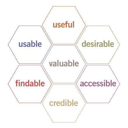
The point of the UX Honeycomb is to make sure that designers understand the various components that encompass UX, and to also emphasize the center element - 'Valuable'. So while for UX professionals, 'usability' remains important to overall UX, it is not by itself sufficient. And it is also a great reminder that the elements like 'useful', 'accessible', and perhaps most importantly for HR readers, 'credible' remain critical.
And the way that the elements of the UX Honeycomb seem to have really close applicability to lots of what HR in general and HR technology projects in particular is the primary reason I wanted to share the diagram. Whether it is a traditional HR-led initiative like training, or performance coaching, or rolling out a employee wellness program, or a straight up HR systems implementation, evaluating your approach against these UX elements I think makes a ton of sense.
Is what you are doing, or trying to get others to do, useful, usable, desirable, credible, valuable, etc.?
I think you have to be able to check 'Yes' on just about every one of the elements on the UX Honeycomb no matter what the project is, in order to have a chance to capture the attention and the time of your users, employees, and leaders. I am going to keep the Honeycomb in mind moving forward, and I think you might want to as well.
Anyway, that's it.
Stay warm out there today.
---------------------------------------------------
I probably should have updated that last line to say 'Stay cool out there today' - have a great week!