Transforming Data into Information
Quick one for today, but aimed for anyone in a management or leadership role that has been handed a report, chart, spreadsheet, or pretty much any common or standard style collection of data that is meant to be informative, but really only leaves you asking, 'Just what am I looking at here?'
I have written previously about incorporating more creative and visually appealing approaches to what is typically flat, and even mundane data, data that really could tell a more interesting, evocative, and relevant story if only it was packaged in a more compelling manner. So for your consideration, from the always entertaining Information is Beautiful blog, a re-imagining of the simple medical blood test results report checking for c-reactive protein, or CRP.
The kind of report that contains critical data, that needs to be interpreted, understood by non-experts, and offer the right kinds of recommendations and call to action. Not unlike the headcount, turnover, and performance management process results that you may read every day.
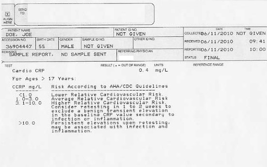
The typical CRP test report and the starting point for the redesign looks something like this:
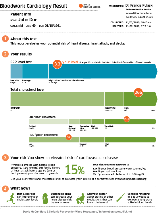
The redesigned and re-imagined report looks like this:
All of a sudden, the dull, difficult to interpret, and really sterile data is transformed to a bold, eye-catching, super-informative, piece of actionable information. The re-designed report accomplishes some simple, but important objectives where the old version of the report simply fails to do much of anything except confuse.
With the new report the patient now can better understand the background and purpose of test, visualize their result compared to norms and averages, provide context to other related and relevant metrics, and finally recommend a course of action (with expected and positive outcomes) based on the results.
Clearly the redesigned report is an improvement in every way. I know I have said before, but it bears repeating - most organizations and Human Resources professionals are not suffering from a shortage of data, but rather a shortage of understanding. Maybe the next 'critical hire' you can get approved shouldn't be another HR Generalist or Recruiter. Maybe a really good graphic designer is what the HR department needs.

 Steve
Steve


Reader Comments (5)
Steve-
This is a great example of what could be. I have seen a gradual shift toward this type of report with investment reporting, like 401(k) reports. This is so important as companies expect employees to be more self-reliant with their financial planning. Finding ways to make information clear to the broadest audience possible is a challenge, but it is one we must face.
In your example, if that's my report it is now clear to me that there are very specific things I can do to decrease my chance of problems. A similar 401(k) report could tell me the likelihood of my savings reaching a target amount by a specified age, and give me some suggestions for what I could do about that.
Such a great example. ! can't tell you how many times I've looked at my blood test results squinting for relevant info.
--
It's this dilemma we are solving in the "talent" space - helping business leaders understand their talent. How can we visually make talent data "pop" so it turns into information non-statisticians can consume and make sense of. (PS - not to be confused with talent management data).
Data can be great but if business leaders can't make sense of it it doesn't matter how great it is.
Love this topic. Thanks for posting.
@Tim - That is a great point about 401(k) reports. Very similar application I think. Thanks for sharing that.
@Greta - Thanks Greta, I am not sure I have the graphic talents myself, but I think a good project to try and take a common HR type report or metric and transform it like the blood test example above to see the impact. Thanks very much for your comments.
There are some functiojnal steps to transfering data information which are: 1-doing data collection, process the data, manage the data properly, control the data accordingly, information is been generate from the data input.
website melbourne
The kind of report that contains critical data, that needs to be interpreted, understood by non-experts, and offer the right kinds of recommendations and call to action. Not unlike the headcount, turnover, and performance management process results that you may read every day.