Quantcast
Subscribe!


Enter your email address:

Delivered by FeedBurner


E-mail Steve
This form does not yet contain any fields.

    free counters

    Twitter Feed
    Friday
    Aug272010

    Redesigning Everything

    I am totally fascinated with a contest called the 'Dollar ReDe$ignProject'.

    The project, organized by brand strategy consultant Richard Smith, is a tongue-in-cheek attempt  to revitalize the American economy via a 're-branding' of some of our most visible and tangible manifestations of economic activity, the set of US Federal Reserve notes.

    From the 'About' section of the Project site:

    It seems so obvious to us that the 'only' realistic way for a swift economic recovery is through a thorough, in-depth, rebranding scheme – starting with the redesign of the iconic US Dollar – it's the 'only' pragmatic way to add some realistic stimulation into our lives! Therefore, you must take part and we really want to see what YOU would do.

    Various designers, students, folks that like to play around with Illustrator and Photoshop have offered their suggestions for redesigning the set of bank notes that for the most part still maintain their basic design structure from the 1930s.

    One interesting example from the contest, submitted by the graphic design firm Dowling Duncan is on the right.  Their designs for the various notes and denominations attempt to link the face value of the note to an historically significant figure or event. In the example on the right, the re-imagined $100 note refers to President Franklin Delano Roosevelt's famous 'First 100 Days', when a number of significant legislative actions were approved to combat the economic depression of the 1930s.

    Besides the collection of really engaging, creative, and amusing submissions (somewhere in there you can find a 'Steve Jobs' $50 bill), the project and the enthusiasm of the design community to participate reveal some interesting lessons that I think could be relevant in an organizational setting as well.  

    Sacred cows - What 'wrong' with the $1, $5, or $100 bills?  Well I suppose nothing.  But could they be improved? Absolutely.  Could that improvement actually drive downstream benefits far beyond the redesign itself?  Quite possibly. But unless the attempt is made, you'll never know.  

    The crowd - Sort of an obvious conclusion, and one that doesn't need to be pointed out yet again.  Or does it?  It still seems to me that more organizations and even smaller divisions in organizations don't do a great job soliciting ideas from their version of the 'crowd' for improvements, creative ideas, and even feedback. Making the submissions public, improves the process as well.  The better ideas surface more readily, more people can get involved in improving the ideas, and the entire process gains more relevancy and a larger degree of trust. For almost every issue, someone out there is passionate about it, and likely would want to get involved if given the opportunity.

    Fun - Looking at the redesigned currency is fun. Creating the designs certainly had to be fun for the firms and individuals that have participated.  Even judging the contest I imagine is going to be a blast. What is wrong with a little fun in the organization? Unless you are in one of the lucky (or smart) organizations that has managed to navigate the last few years unscathed, introducing a bit of fun into the routine would be most certainly welcome.

    What do you think?

    Is redesigning the dollar bill a good idea? 

    Thursday
    Aug262010

    Smarter than you

    Yesterday Shauna Moerke, the HR Minion, posted a thought provoking and really interesting piece about the nature of the online HR community, and examined whether or not this community (like pretty much every community from middle school, to sports teams, to the workplace) possesses its own share of cliques or sub-communities.

    It is an excellent post, and if you are at all interested in taking a closer look at this (still tiny) micro-community of Human Resources folks that travel, circle, and populate this space it is very illuminating. The many comments as well shed some light on what some of the most active and well-regarded folks in the space feel about the discussion.

    The inspiration for the piece seems to be the idea that some people, especially people new to the world of blogging, tweeting, attending the seemingly limitless conferences that are in turn live-blogged and live-tweeted, can find the notion of getting involved, in participating, in contributing very intimidating.

    And I guess in some ways it is.

    To some of the many HR professionals just getting their feet wet in this whole online blogging/social media world it can be kind of disarming.  And I think there will be many, many more great HR pros getting involved.  Look at pretty much every HR conference from SHRM National, to state SHRM councils, to HR Technology - all of them are bringing in 'HR/social media' types to help educate and spread the message. Dive in, participate, engage, etc. - that is the gist of the message being carried far and wide.

    For someone new to the space it can be easy to look at 'Blogger XYZ' and see that they have years worth of posts racked up, scores of comments, hundreds of Facebook fans and thousands of Twitter followers, and feel a bit intimidated, and even uncertain about their own ability to make an impact.

    But to let fear or uncertainty, or shyness hold anyone back from diving in, adding their unique and personal perspective, and contributing to the community (such as it is), is exactly the worst possible outcome of all.  We can't have a growing, vibrant, interesting, and valuable community without a constant influx of new voices and ideas.

    To anyone, seasoned pros, recent grads, or students - you know who is smarter than you?  No one.

    And everyone.  

    Everyone has something to offer and it would be sad to think that anyone, be design or by accident holds you back from joining in.


    Tuesday
    Aug242010

    I'd like a calculator that plays music, please

    Everything keeps getting more and more complex even at the same time as technology is meant to make our lives easier.

    Compare the TV remote control you use today to the earliest ones you remember.  Today's remotes have enough buttons and functions to select, pause, rewind, fast forward, slow mo, super slo mo, record, mute, and probably a dozen more things I can't remember. And that is just for the TV itself.  

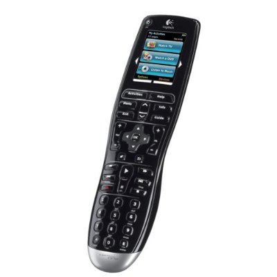
    The latest in remote control technology, such as the Logitech Harmony One, can support up to 15 separate devices, 'making it easy to control even the most complex home entertainment systems'.

    That's pretty cool, I guess.  I mean who really wants 15 separate remotes scattered about.  Let's not quibble over the details like what happens if the 'can control 15 different devices' remote malfunctions, or goes missing, or the dog chews it up and chaos ensures when you can't access your recorded TV shows, play tunes, or close the garage door. And is there anyone that actually has 15 separate devices that could stand remote controlling anyway?  No you can't count your kids/animals/in-laws in that reckoning.

    But cynicism aside, we know that technological advances in consumer as well as enterprise technology generally do make our lives easier and more enjoyable even while introducing progressively more of a burden on our capacity to understand and adopt to them.

    Having access to the controls of 15 different devices at once is truly fantastic but if all you do with that power and capability is tune into the latest installment in the misadventures of The Situation and Snooki, then the promise of the technology is largely wasted, and you likely overpaid to boot.

    But the problem is that simpler is not always better. Having to get up off the sofa to change the TV channel was a royal pain, and arguments to my 9 year old to the contrary, it did not make us better people.  

    As KD pointed out today on the HR Capitalist, more and better technology doesn't always deliver the kind of essential capability that the organization requires. The technologies certainly help us and the organization 'do' things better, more efficiently, etc, but we still need to know what things to do in the first place. 

    The real innovation in remote technology won't just control more and more devices, it will help bubble the best shows up to the top of the list, and not just the ones I have watched in the past, but maybe the ones I could use to round out my overall game.

    Once again, a post without a real point, but I can't take the time to sort one out.  I think my smartphone is finally charged back up and I need to get back to email, texting, Tweeting, reading the news, and watching a few YouTube videos.

    As for the title of this post - it was inspired by the image on the left, proving that as far back as the 70s we wanted our gadgets to do more and more. 


    Monday
    Aug232010

    Going Graphic

    Almost every day we are faced with some communication materials or other informational resources that for one reason or another are difficult to slog through, that seem to have no real point or call to action, or that simply bore us to tears since we are so tired of their style, format, or delivery mechanism.

    At work it could be the quarterly company newsletter, the Annual Benefits Open Enrollment packet, or the organization's bereavement policy - How many days for a second cousin? But we were very close, more like first cousins really.

    Last week I posted about a new and innovative technology for delivering Benefits information, and for helping employees to make the best decisions for themselves and their families, the Jellyvision Benefits Counselor interactive video application. The tool transforms the presentation and delivery of potentially dull, and likely confusing information into an engaging and effective format.

    This weekend I came across another example of a new and innovative approach to a classically boring and imminently forgettable medium: the college textbook.

    Jeremy Short, Texas Tech University professor of management, has taken the traditional and staid textbook, and re-imagined it in a format that students find more appealing, and certainly more relatable - the graphic novel. Short has created two novels for his undergraduate and MBA classes chronicling the adventures of a young entrepreneur named Atlas Black.  In the titles, Atlas Black: Managing to Succeed, and Atlas Black: Management Guru?, students follow Atlas' journey while exploring the concepts of management, organizational behavior, strategic planning, and entrepreneurship.

    You can get a bit of the flavor of the textbook graphic novel in the trailer video below (email subscribers will need to click through).

    Pretty cool, right?  I mean way more entertaining than the formal text book that it replaces. Can you ever imagine a traditional textbook even having a trailer? 'And then Chapter 7 - with more of the same, long paragraphs and black and white charts!'.

    Sure, this re-imagination of the classic management textbook would not work for every course, subjects like statistics and the hard sciences are too data driven, but for courses that are really mostly about ideas and concepts, why not?  Surveys of Short's students at Texas Tech report that 86% feel the Atlas Black graphic novel  "compares favorably" to other management textbooks they've had. 

    Oh and one other thing, in a world where a college management textbook runs somewhere north of $100, the Atlas Black graphic novels only set the students back $14.95.

    But to me, the best message here is the way the professor has created an alternative to long standing tradition, developed a product designed to appeal to his audience, while taking into account that tastes, preferences, and technology have all changed.  He is still teaching the necessary course material, but by letting go of 'the way it's always been done', has created an environment that is quite different, distinctive, and memorable.

    The kind of thing we are all striving for in every communication we create.

    Friday
    Aug202010

    Presentations and Props

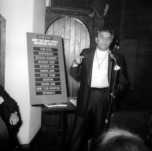
    If you are like most professionals when you have a client, prospect, conference, or even an internal presentation to prepare, you start thinking about the tools you will bring to the show even more than the content and insight you are meant to be delivering. Jimmy 'The Greek' Snyder

    Admit it, when you first hear about the venue or room that your treatise is to be delivered from, your mind starts processing questions like:

    1. Is there a projection screen?

    2. Do I need to bring my own laptop? 

    3. How is the audio? Will they be able to hear me in the back?

    4. How about wifi? There had better be wifi or all bets are off.

    And so on.

    Unless you are presenting some incredibly complex material, chances are you'll walk into the room armed with more than you really need to make your points. In fact, the 47 powerpoint slides (yes, even the cool ones that have nothing on them but one large black and white image and one big word like 'Strategy' or 'Impact') may not even be necessary.

    The 'show' is meant to be you, not the props (apologies to Carrot Top).  

    The Greek understood this. Take a look at the image on the right. Sure he had his prop as well, the seriously cool 'Pro Football Analysis' chart, but he is clearly the star of the show, and the focus of attention.  Admittedly, the 'turtleneck/big gold medallion' look certainly helps, but the Greek definitely seems to strike the right balance between presenter and prop.

    I imagine the Greek breaking down that week's big game, running through his analysis of each team's strengths and weaknesses, all leading up to the payoff, the recommendation of what team to place your bet on (of course factoring in the point spread).

    The fact that his entire set of presentation materials is open and on display the entire talk doesn't matter. The audience has to pay attention because the conclusion, ('take the Eagles and lay the seven'), is not displayed, you have to listen to the talk to get to the payoff.

    A good approach I think, a single chart/slide/drawing on the whiteboard, then just talk from that point on. I am going to try that in my next presentation, I just need to shop for a big gold medallion.

    What do you think, could you present 'Greek' style?