Quantcast
Subscribe!


Enter your email address:

Delivered by FeedBurner


E-mail Steve
This form does not yet contain any fields.

    free counters

    Twitter Feed

    Entries in analytics (19)

    Thursday
    Mar012012

    Before You Know You Want One

    Did you catch this fantastic piece from the New York Times last week - 'How Companies Learn Your Secrets', an inside look at how the major retailer Target has combined it's extensive data collection efforts with insight into shopper's tendencies and habits in order to better tailor promotions and outreach efforts, and match them more accurately with with what products that shoppers are likely to want? The focus of the Times article was Target's work around using data and analytics to attempt to predict which shoppers might be pregnant, and with that knowledge, send them more focused ads and offers for things like prenatal vitamins and maternity clothing.

    It is an incredibly interesting piece, and I'd encourage everyone to read it, as it offers not just a peek behind the curtain at a multi-billion dollar merchandising machine, but also suggests other ways that the ability to capture, analyze, interpret, and make actionable copious amounts of data presents an area of opportunity for organizations and disciplines of all kinds. A quick read provides three important takeaways from the piece that are worth remembering:

    1. Timing is everything. From the Times

    Consumers going through major life events often don’t notice, or care, that their shopping habits have shifted, but retailers notice, and they care quite a bit. At those unique moments, Andreasen wrote, customers are “vulnerable to intervention by marketers.” In other words, a precisely timed advertisement, sent to a recent divorcee or new homebuyer, can change someone’s shopping patterns for years.

    2. If you're not thinking about how to manage and derive value out of all this data, you might be already a step behind your competition.

    Almost every major retailer, from grocery chains to investment banks to the U.S. Postal Service, has a “predictive analytics” department devoted to understanding not just consumers’ shopping habits but also their personal habits, so as to more efficiently market to them. “But Target has always been one of the smartest at this,” says Eric Siegel, a consultant and the chairman of a conference called Predictive Analytics World. “We’re living through a golden age of behavioral research. It’s amazing how much we can figure out about how people think now.”

    3. But having all this data, and ability to extract meaning and opportunity from the data, doesn't absolve an organization of thinking hard about how it has collected the data, and the expectations and possible reactions of the consumers, (or candidates), about how the data is used.

    At which point someone asked an important question: How are women going to react when they figure out how much Target knows?

    “If we send someone a catalog and say, ‘Congratulations on your first child!’ and they’ve never told us they’re pregnant, that’s going to make some people uncomfortable,” Pole told me. “We are very conservative about compliance with all privacy laws. But even if you’re following the law, you can do things where people get queasy.”

    Is there an equivalent or at least approximate set of takeaways for the HR and Talent professional?

    Definitely. Hitting a top performer with a high-profile and challenging assignment before they drop their two-weeks on your desk, understanding where the next set of company stars and leaders are likely to come from based on your assessment of the data on the current team, while making sure the data you're digging up on employee, candidates, and competitors doesn't make you too uncomfortable are all applicable takes from the Times story on Target.

    It's all Predictive Analytics these days. Maybe you need a refresher course.

    It's only the next big thing if you've never thought about it much. Then it might be the latest thing you just missed.
    Tuesday
    Aug232011

    Need better information for business decisions? It might not be a technology problem

    Recently the MIT Sloan Management Review in partnership with the IBM Institute for Business Value released some preliminary results from a project called 'The New Intelligent Enterprise'. The MIT and IBM researchers conducted an inquiry into how organizations are using analytics for competitive business advantage. The study was comprised of a survey of more than 4,000 executives, managers and analysts from around the world and across a wide range of industries.

    Understanding how peers and competitors are leveraging analytics and new tools and technologies to increase competitiveness and make better business decisions has long been a concern of leaders across the organization, certainly in process-heavy aspects of the business like supply chain management, but increasingly in the Human Capital Management space as well. And while there are lots of tools and solutions that are on the market that can help organizations in these efforts to better capture and assess analytical data, some of the MIT/IBM study results suggest focusing on the technology alone may be a mistake.

    While the full report and analysis of the research findings are still to be released, several of the study's raw data points were shared by the researchers, and I think the most interesting results were the first and last chart from the piece on Sloan Review site:

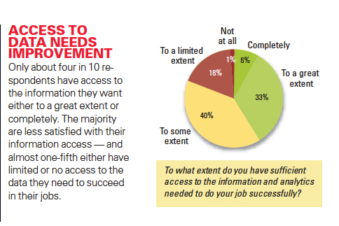
    Figure 1 - Access to Data Needs Improvement

    Source - MIT/IBM

    Nice. Most of your key players, the ones you are counting on to make the right decisions, and make them quickly, and often under pressure probably don't have easy access to all the information they need. and almost 20% claim limited or no access to the data they need to success. Ouch. But you know that right? And that's why you are trolling the web, attending webinars, talking to consultants, and hitting the trade shows to find a software solution to address this problem. Sounds simple, get the right tools in, get them in the hands of the right people, and bam! - problem solved.

    Except it might not be that easy.

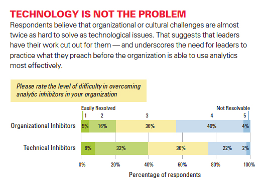
    Figure 2 - Technology is not the problem

    Source - MIT/IBM

    This chart is a little busy, but essentially says that when considering the deployment of better analytics solutions in the enterprise, the survey respondents felt organizational and company culture issues were perceived to be twice as hard to resolve as technology issues. Or perhaps said differently, finding and purchasing a technology solution might only 'solve' about a third of the overall problem.

    Perhaps not ground-breaking findings, but worth remembering no matter what workplace technology solutions we try to apply to help solve business problems. We can recognize we have a problem, buy a solution to address the problem, but until and only when the organization is committed to making the kinds of important changes that these projects often require, we will not realize the full potential of the technologies and more importantly, of our people.

    Wednesday
    Jun012011

    Making Data Come Alive

    Yes, this is yet another 'sports' post. Kind of. Actually it is another in the occasional series of posts centered around innovative presentations of information -examples that highlight ways where a variety of organizations have managed to move beyond the expected and routine - 'Look, sales trends for the last 5 years in a bar chart!', to create interesting, engaging, and increasingly interactive tools that really transform both the data and the user experience. One of the best signs that a data presentation tool is effective is not just the initial reaction from users, but rather that the tool or technology makes users want to learn more, see more, and continue to engage with the solution.Patrick working the analytics

    I came across such a solution this past weekend at the Baseball Hall of Fame and Museum in Cooperstown, NY. On Saturday the museum unveiled a brand new exhibit - One for the Books: Baseball Records and the Stories Behind Them. The new exhibit tells the story baseball's most cherished statistics and records through more than 200 artifacts in the most technologically advanced presentation in the Museum's history. 

    Any fan, or casual observer of baseball knows that numbers, stats, records, etc. are as much a part of the game's history as the players themselves. Iconic records like Joe Dimaggio's 56 game hitting streak, Cy Young's 511 career pitching victories, and Ted Williams .406 batting average can be cited easily by baseball aficionados. Baseball is truly a numbers game - no other sport, (and few other businesses I bet), measure, track, analyze, and report statistical information about the games at the level of detail that major league baseball does.

    But raw statistics, be they describing normal business or workforce data, or even the data produced by such a compelling an activity as baseball, can still fall flat, feel one-dimensional, and fail to completely tell the story buried in the figures if the presentation and interface for interaction with said data is mundane, fully expected, and one-way. Tools that not only present the raw numbers, but allow the user to not only choose the data they want to see, but to also experience the data and really engage with it are the future of information presentation.

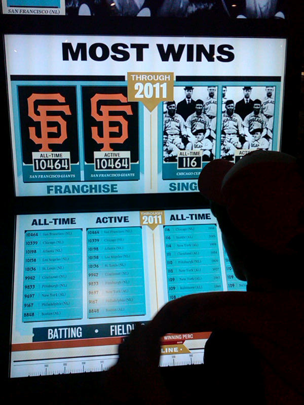
    Case in point the Baseball Hall of Fame and Museum's new 'Top 10 Tower' interactive information display at the new 'One For the Books' exhibit. The Top 10 Tower, in true iPad-like fashion, is a touch activated series of screens and displays that allow the baseball fan to learn about some of the classic and lesser-known statistical history of the game.  By selecting variables such as Pitching or Batting, choosing specific focus areas to drill into, and using a cool 'timeline' slider to see how the results and records have moved over time, the Top10 Tower created a fully immersive and engaging interactive presentation of what are really 'just' numbers.

    Make selections on the lower display of the tower, and the large video screens on the upper section automatically update, showing not only figures and images, but also allowing touch access to additional multi-media content about the record holder, of the timeframe the recored was established. The Top 10 tower also presents data in different dimensions, even ones not expressly requested by user, as the designers of the tool know that context matters in the review and analysis of baseball statistics, as it is likely equally important in the business and workforce metrics we produce and review all the time.

    I know what you are saying, the Top 10 tower is really just a fancy way to present some simple lists, and it really is not a big deal, and certainly has no meaning to the business world that has to be concerned with 'real' data, not just batting averages.

    Sure, keep telling yourself that. Your data is important, and baseball is just a game. 

    Have any idea with the batting average of your hiring managers is? For this season? For all-time?

    Tuesday
    May242011

    The Employee Loyalty Card - Notes from Aquire Structure 2011

    Good morning from Fort Worth, Texas!

    I have been attending the Aquire User Conference called 'Structure 2011' the last two days, and first off I wanted to express my thanks and gratitude to Aquire CEO Lois Melbourne for inviting me not only to attend, but to also present to Aquire's customers, partners, and staff.  A copy of my presentation, about some of the challenges and opportunities that the dynamic, hybrid, and ever-changing workforce presents to organizations, is loaded on Slideshare here, and embedded below, (email and RSS readers will need to click through).

    But more interesting than my presentation, was an idea that sprang from a presentation on analytics from Aquire's Andrew Courtois, and was later kicked around a bit on a special 'Live from Aquire' broadcast of the HR Happy Hour Show, (the part of the show where Andrew joins is about 30 minutes in).

    Listen to internet radio with Steve Boese on Blog Talk Radio

    Andrew talked about how casino companies leverage analytics to drive revenue and (hopefully) improve customer experience and loyalty via the use of what are called 'Player Loyalty Cards'. The basic premise is a player signs up for a casino loyalty or reward card, agreed to have their playing history tracked by the casino, and in exchange the casino offers different rewards and incentives for regular or additional play.

    Seems like a pretty good deal, right? The player gets the occasional reward or bonus and feels a little more attached to the casino and process. The casino gets access to detailed data on playing trends and history.  But what Andrew shared about one of the ways HOW the casino uses this data was the interesting part.

    By analyzing playing data both in aggregate, and at the player level, the casino comes to 'know' a given player's 'pain point', i.e., the general amount of playing losses that causes to given gambler to quit playing and walk away. By looking at the 'Player Loyalty Card' data, and comparing real-time casino floor information with the data from previous experiences, the casino can, again in real-time, send a host or hostess over to see a player that the data says is about to get up and leave and offer the player a free dinner, a discounted room, or some other reward or incentive to stay a bit longer and (hopefully) continue playing. Sort of devious and also a really smart way to use analytics to drive business outcomes.

    So after Andrew's talk, and on the radio show, we floated around the idea of a similar construct in the workplace, something called 'The Employee Loyalty Card'. What if as an organization, we could create a way to capture all the activities, actions, interactions, projects, contacts, etc. that an employee undertakes inside the company and then somehow find a way to analyze that data against actual historical outcomes in order to take both preventative and corrective actions?

    We all have those anecdotal organizational stories about the 'client from hell' or that manager that is really hard to work with, but sometimes we don't really know the deleterious effect they have on the organization's people. Do high-performing people suddenly start performing worse after getting assigned to a particular project or manager? Do they leave six months later in higher numbers?

    Conversely, we often have a great leader or two that we all feel does a good job of developing and coaching staff, but can we more accurately predict their ongoing impact on the people in the organization, and better still - can we use data to understand how to create more of these great managers? Do we know that 40% of our best performing sales people might have taken training from the same sales manager?

    Could you imagine an 'Employee Loyalty Card?'. A way to trigger HR and organizaitonal leadership when employees hit that tipping or pain point?. A process or technology to collect, analyze, and act on all these diverse employee interactions and actions and then make more informed decisions?

    It was an interesting conversation and I would love to know what you think.

    Thanks again to everyone at Aquire!

    Page 1 ... 1 2 3 4