Quantcast
Subscribe!


Enter your email address:

Delivered by FeedBurner


E-mail Steve
This form does not yet contain any fields.

    free counters

    Twitter Feed

    Entries in design (54)

    Monday
    Jun072010

    The Talent Wheel

    Yesterday Mike VanDervort sent me a link to this, a really powerful, yet simple graphical and interactive World Cup schedule calendar tool.
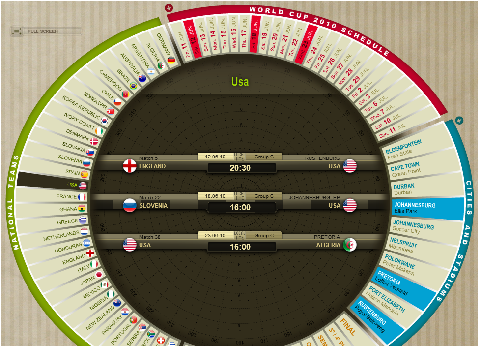
    The image at right is a screen shot from the interactive tool, but the image alone really does not do it justice, I recommend taking a minute or two to check out the site and try out the graphical calendar.

    In a simple, one page display the calendar allows the user to display data about the World Cup schedule in several dimensions - by participating country, by Group, by date, location of the stadiums, and by stage of the tournament.

    For example, clicking on a country name on the left hand side of the wheel displays that team's scheduled games with date and time information, highlights the locations of the games and their dates.  Alternatively, selecting a specific date on the wheel will display all the games for that date, with teams, time and location information highlighted.  

    For a World Cup fan, the calendar is a bit addictive.   

    After playing with the tool for a bit I wondered if the ideas from the powerful, simple, and kind of fun application of the World Cup calendar could be applied in the workforce technology context. Imagine the sections and spokes on the wheel begin populated with organizational dimensions like functional department or region, core competencies or specific skill sets, current or future major organizational initiatives or projects, and perhaps details like past performance appraisals or position in talent pools for succession plans.

    As a project manager or business leader looks to staff a project, or find a potential candidate to fill an important new role, he/she could navigate the 'Talent Wheel', highlighting the relevant skills, experiences, or other important information from the spokes of the Talent Wheel.  The tool would then present the relevant information in the center of the wheel for display or optional export. 

    Or perhaps the Talent Wheel could be configured to better reflect and display organizational reporting relationships in today's large and much more complex matrix structures.  Since organizations and workforces are much more complex than the schedule of a sports tournament, perhaps the wheel could be designed to accept a few input parameters before the display is actually generated, allowing the user to narrow or more precisely design the Talent Wheel.

    Either way, I think the main points to consider are these - the World Cup calendar presents moderately complex, multi-dimensional data in an interesting, powerful, interactive, and fun manner.

    Can you say the same thing about the systems that you are using to analyze workforce data?

    Or if you are a designer of such systems, are the tools you are creating as engaging to use as the World Cup calendar?

    Do your users actually have fun using your solution?

    Thanks Mike for pointing this out - it is surely an addictive site!


    Print


    Thursday
    May272010

    The Vernon Farm Calculator

    For the last few years there has been much said and written about the importance of accurate, timely, and relevant workforce data to support and guide managerial decision making and to ensure that human capital strategy is aligned with and can enable the execution of business strategy.

    It is an easy argument to make, but certainly a much more difficult promise to deliver. In large organizations workforce data tends to be scattered across a wide set of disparate systems, from ERP, to ATS, to possibly Talent Management tools. Not to mention the scores of offline spreadsheets and databases maintained by HR and and line managers.  How many mid-size to large organizations out there are still calculating and processing employee annual salary updates on a slew of manually distributed Excel spreadsheets?  Go ahead and admit it, you are certainly not alone.

    And even if the organization does have the technical capacity to collect and begin to analyze this information, it can be a challenge to present, communicate, and deliver the data in a meaningful way to the people that the information benefits the most - the line managers, supervisors, and front-line in the trenches folks.  Their need to make better informed decisions about how to leverage existing capability and how they may need to develop new capability to deliver customer service, create opportunities, engage employees is essential, and all the best data collection and and analysis tools will fail if the delivery mechanism does not resonate with these key users.

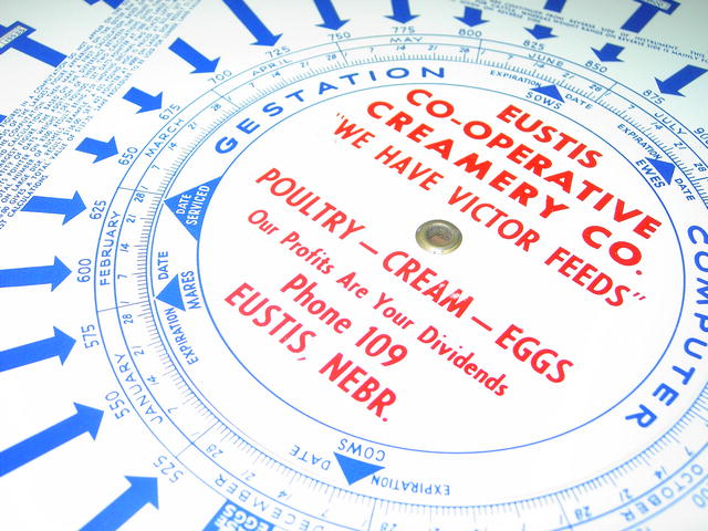
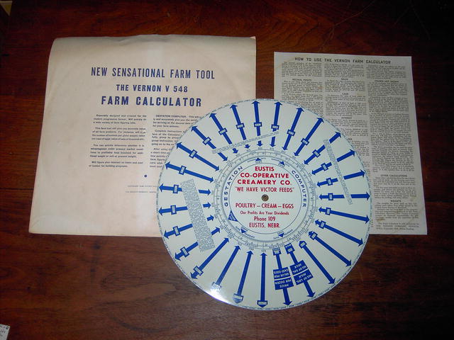
    The image at right is something called The Vernon Farm Calculator.  It was manufactured in the 1940s as a tool to provide farmer's with ready access to important information about crop sizes, unit of measurement conversions, yield calculations, and a host of other important data points that the average out in the trenches farmer would need to analyze, assess, and then execute his or her strategies to arrive at the best possible outcome.  Sounds a bit like what today's managers need to do as well, just substitute mares, bushels of corn, and the combine's last service date with employees with a certain skill, production schedules, and historical sales data.

    I think as designers and implementers of information systems we can learn a few things about the delivery of essential intelligence to our users from the design of the Vernon Farm Calculator.

    Portable

    The calculator is designed to be a portable, carry along with you or toss it on the front seat of the truck kind of tool. When the farmer is out at the barn or in the fields and needed to do a quick calculation about pigs, or wheat or whatever, he or she did not need to stop what they were doing, drive back to 'Farm HQ' or even worse, put in a request to the Farm's HR or IT department to run a report.  And as an added bonus, the calculator was made of tin, not cardboard, which ensured it would stand up to the rigors of the farm environment, and not need to be 'upgraded' or 'maintained' all that often.

    Multi-use

    The calculator did not just serve one purpose, it informed the farmer across a wide range of important data types that all taken together were going to be critical to the overall success of his enterprise.  He or she did not need to carry around one 'tool' for assessing crop amounts and another tool to calculate the expected marketplace value of the new set of pigs.  The folks at Vernon had to have consulted with real farmers and gotten to know the wide range of information that they would need to make the calculator a useful and practical resource.

    Simple

    The Vernon Farm Calculator came with a one-page user guide.  Sure, the print was kind of small, but all the essential information for the average farmer to be able to get information and insight to help run the farm was on one page.  And better still, important operational instructions for some of the more complex features of the tool were printed directly on the face of the tool itself.  So in many instances there was no need to refer back to the one-page guide.  I think that this kind of simplicity in operation, the ability to distill the important features and instructions to their base level, and the capacity to put the most needed 'help' information in plain sight are all lessons in design that can be taken from the farm calculator.

    Relevant

    The farm calculator was only about one thing, providing the farmer with easy access to information that would help him or her have a better chance at succeeding in their business.  That's it.  There is no extraneous functionality, no clutter, nothing that detracts from the design and the ultimate delivery.   I think we can also take a lesson here, it the information or the hot new feature that we think, as designers or implementers think is wonderful, if it truly does not directly assist the managers in making decisions needed to execute their business, then it surely is superfluous.

    That's it - the end of a too long post about a 1948 Farmer's tool.  Those farmer's were on to something for sure.


    Print


     ___________________________________________________________________________________

    Note - The Vernon Farm Calculator is an example of what is called a Volvelle.  Volvelles have been around for hundreds of years, you can learn a bit more about them here.

    Wednesday
    Mar102010

    Telling Stories with Technology

    Or perhaps rather letting people share their story when interacting with technology.

    I recently read this post, 'Mad Libs Style Form Increases Conversion 25-40%', on the LukeW Ideation and Design blog.

    The main point of the post, which is short and an easy read, is that by altering a typical 'Request for Information' web form asking for Name, email, address, subject of inquiry, etc., to a 'Mad Libs' style form that frames the information in a kind of simple story, and allows the respondent to fill-in-the-blanks of the story with their personal and relevant information.

    An example of the before and after versions of a typical 'information request' web form is here:

    Usage tests on both versions of the form above (and similar forms on other sites), revealed increases in conversion, i.e. that percentage of visitors to the site that completed the form, anywhere from 25% to 40%.

    While the designers don't know for sure what to attribute the increased conversion rate to, something in the more narrative style of the revised form was successful in capturing more information.

    I think that workforce technologies could also likely benefit from a similar approach. Think of some of the typical programs that an organization rolls out, like paycheck direct deposit, enrollment in 401(k) retirement plans, or participation in company-sponsored wellness programs, that to the administrators seem like they should be no-brainers for employees to sign up for. But maybe for some reason the participation rate continues to fall short of expectations.

    Some organizations might react by simply requiring participation, (at lease for direct deposit), or sweetening the incentives, (free pedometers!), but I wonder of simply making some subtle adjustments to the actual process of registering could help.

    Consider taking a bland form (whether on paper or online) for direct deposit that asks for name, address, bank name, bank routing number (come on, you know lots of people have no idea what that is), and so on and replacing it with something like this:

    Hi, my name is ___________, and I work in the _____________ Department.  I like the idea of getting my pay faster and not having the hassle of going to the bank every two weeks.  Please sign me up for paycheck direct deposit.  My bank is named ________________ and the little 9-digit number printed on the bottom of my checks is _________. In two weeks the deposits will have started, and I will be able to check my paysubs online and with my bank.

    I know it isn't perfect, I am not a professional communicator, but to me it humanizes the process a little, and connects the employee just a little bit more to the process and to the outcomes. The same impersonal field-by-field forms that they have seen a million times can't do any of that.  It also re-inforces the key messages as to the benefits of the process right as the employee is signing up.

    Could you alter the 401(k) registration materials in such a way to let the employees (if they care to) share more about their retirement goals and hopes? 

    How about the process where an employee adds a new child to their medical coverage, perhaps providing a place to share their excitement and even a picture of their new addition?

    What do you think?  Would framing these type of employee calls to action in this way actually be successful?

    Tuesday
    Sep152009

    The Essence of Technology

    I saw a post on the User Interface Engineering blog about the 'Essence' of software program design. The key concept in thinking about the essence of a system is an understanding that a program is more than just processes and widgets. From the article:

    Interaction with a product is more than how it’s used or how it behaves. It’s about a connection between two sides. One side is the customer, but the other side is much more than a product or service. To many people, the character and essence of a product and its company are identical. So, what is the essence of your product?

    The post is in the context of software design but I think it also could certainly apply at a macro level to an organization or HR department, and I  suppose also at a micro level, to an individual's 'essence' of what they offer in the workplace. In HR Technology I think these concepts are especially important, as HR solutions typically impact the entire organization, not just the 'back-office' made up of power users.

    So how can a designer of HR software, or an HR Technology professionals in an organization 'loosen up' and show a bit of humanity? 

    Humor - Can you inject a bit of humor into the product, in the design, or in the user interface? If you can't or are not willing to really strive for humor, can you at least work towards a design that attempts to incorporate some fun into the experience? For powers users that spend the majority of their workday using the system, or for line managers that may only interact with the technology periodically, injecting Flickr - brian corsan element of fun to the process and design can go a long way towards increased satisfaction and adoption. While it usually is not appropriate to copy design and process flow from popular consumer sites, at least review the ones you enjoy using the most, and see what elements or attributes you may be able to re-purpose into your HR Technology solution.

    Personality - It has been said that for software companies the culture of an organization permeates the software the company designs and markets. Since so many organizations purchase HR Technology solutions from the same dozen or so vendors, how can you ensure that the design and look of the solutions you deploy to your employees adequately reflect your culture? Take a look at a few large company recruiting sites, chances are you will find some that look and feel almost exactly the same since the largest companies tend to all buy ATS solutions from one of the same half dozen vendors.

    We did an an experiment in HR Technology class that showed the job search pages for Neiman-Marcus and Delta Dental are almost exactly the same and many more of these examples can be found. Don't settle for the vendor 'template' unless you are comfortable with a bland interface that lots of other companies use.

    Emotion - How does your technology solution actually make your users feel? Angry, confused, frustrated, or perhaps bored? Users want to feel good about their work, and for many information workers the way the systems they must interact with all day are a primary driver of this feeling.  Strip away all unnecessary elements that can detract from the user's ability to complete the task, get the information, contribute to the knowledge store, etc.  If possible, allow more experienced users the ability to bypass 'extra' steps, and help text or tutorials once they have demonstrated a level of proficiency.

    Connection - The very best designed technologies can foster a sense of connection between users and the organization.  This can be done with the incorporation of 'social' tools in enterprise systems, (tools like instant messaging, tagging, or real-time collaboration) are one way to develop connection, in this example with other people.  Alternatively, a sense of connection to the system can be enhanced by empowering  the users with increased ability to customize the interface according to their own needs, presenting lists of frequently used functions in more prominent positions, and giving more visible and auditory feedback throughout the process. Think about popular consumer sites like Amazon or Ebay, that 'remember' what you have been interested in in the past, and automatically present you similar choices on your next visit. 

    Many HR Technology solutions are getting more sophisticated, fancy, and full of the latest in design elements to make the interface more attractive, functional, and fun. That generally is a good thing.  But that may not be always what is needed, as many data intensive, high-volume functions might be better served with a simply, bare-bones design reminiscent of the old green screen days.  The key point is to evaluate the HR Technology systems you use, or are considering in the context of who will actually use them, and the impact the design will have on these users, whether they be managers, staff, or candidates.

    What great HR Technology design examples should I be checking out?  Hit me up in the comments.

    Page 1 ... 7 8 9 10 11