Quantcast
Subscribe!


Enter your email address:

Delivered by FeedBurner


E-mail Steve
This form does not yet contain any fields.

    free counters

    Twitter Feed

    Entries in design (54)

    Monday
    Aug012011

    Colors and Getting Change Management Right

    Feels like ages, since I had a good sports-themed take on the blog. With the NBA in a combined offseason/lockout, and the current Major League Baseball season for some reason seeming incredibly uninteresting to me at the moment, I have been hunting high and low for a good sports related topic on which to pontificate. After all, next year's edition of 'The 8 Man Rotation' e-book is not going to write itself.

    And then over with weekend I found this gem from one of may favorite sites, the Uni Watch blog, 'Rooting for Laundry'; a piece about some of the recent transactions and changes from the world of sports. One of those changes was the report of uniform redesign of the iconic New Zealand National Men's Rugby Team jersey. The team, one of the most successful and legendary sides in international rugby is known as the 'All Blacks', named after their well-known and traditional black jerseys and uniforms. The All Blacks are generally one of the top teams in international play year in and year out, and if they could be compared to an American football side, some combination of the Pittsburgh Steelers and the New England Patriots might come close to approximating thier history and their success over the years.Tim Sackett's Monday AM staff meeting

    So back to the Uni Watch piece - the All Blacks have just introduced a new set of team jerseys, and in addition to the expected information about new-age performance fabrics, and lighter and more moisture absorbing materials, the article also includes this quote from New Zealand team captain Richie McCaw:

    “It’s pretty awesome to be involved in creating a new All Blacks jersey,” says McCaw. “People all over the world recognise the jersey, and of course Kiwis feel extremely strongly about it, so to make a change to it is a big deal. This new jersey is revolutionary – but it’s still very much an All Blacks jersey. It’s still something I’m very proud to wear.”

    From a piece on the official New Zealand Men's Rubgy site, Allblacks.com, we learn that the new jersey was 'designed and tested in conjunction with several senior All Blacks including captain Richie McCaw'.

    I know what you might be thinking - big deal, so a sports team changed its jersey, happens all the time, and usually it is for the sole reason to drive increased memorabilia sales. Perhaps. But in the details of this All Blacks jersey redesign we can take several lessons that I think can be more broadly applied to many other organizational change initiatives.

    1. Memory and Tradition

    Key in the jersey redesign efforts is a firm grasp and appreciation of the legacy and the history of the team. It can be pretty easy to advocate 'blowing everything up' and starting over in organizational change efforts, but also forgetting the values, people, and culture of what came before can be a mistake. The fans and players of the All Blacks are all well versed in the history and tradition of the side, so launching a major redesign effort from a completely blank page might have resulted in failure. Think of McCaw's comment about still being proud to wear the new jersey. At least part of that pride has to stem from the new jersey's honoring the long and revered tradition of the side.

    2. Involvement

    Team Captain McCaw and several other of the senior team members were pretty heavily involved in the design and testing process for the new jersey. For initiatives like this to have the best chance for success, the front-line individuals that stand to be most impacted by the change should be included in the process as early and often as is feasibly. While the new design might look good on the website, and may be more lucrative to sell in the team shop, if the players on the pitch are not able to continue to perform at their highest level while wearing the new jersey, then the change initiative would be a failure. Too often we like to proscribe change, and assume we know what the 'real' implementers need, but unless they are involved more intimately and fully in the process, we are mostly guessing.

    3. Performance

    While keeping cognizant of history and tradition, and securing organizational buy-in by involving the most impacted team members in the process are both important and valuable, the redesigned jersey itself has to meet the intended performance goals set out by the designers as well. Simply 'involving' staff in a change process does no good if the results are unsatisfactory. Some highlights from the piece on Allblacks.com:

    (manufacturer) Adidas believes it’s the best rugby jersey in the world. It’s the lightest, ‘fastest’ and closest-fitting rugby jersey ever made

    It’s 50 per cent lighter than the last jersey - but just as strong

    Because it’s so light and aerodynamic it has less weight and drag, allowing players to go fractionally faster. At the elite level of the game, the slightest advantage can make a difference to the result

    Now we won't know for sure until the team competes in these new jerseys if the expected performance improvements will pan out, but initial results from training and testing seem to bear out these expectations.

    What can we learn about change management from a sports team jersey redesign?

    Apparently quite a bit when it is done well.

    P.S. -Hi to my friends at Sonar6, that I hope will keep me honest in the comments!
    Wednesday
    Jul272011

    Packaging and Disincentives

    One of my favorite 'non-HR' reads is a blog called Box Vox, which is dedicated to the art and craft of product packaging design. It is a really interesting site to learn more about innovations in packaging science and to understand a bit more about how the package design attempts to influence buying behavior. Almost invariably, the package designers attempt to balance design, function, the physical requirements imposed on the package composition by the product itself, as well as the branding and promotional elements that often contribute significantly to the ultimate purchase decision.

    Packaging design is big business, and in particular package re-designs of existing products can be very risky, take a look at this story from 2009 about a colossally botched re-design by Tropicana orange juice. A few seemingly simple changes to the graphics and type on the Tropicana carton sent long-time customers into a rage, eventually causing the company to revert to its time-tested and likely way more important to customers than they ever realized package design.

    But since consumer product packaging, and even the more ethereal messaging, digital content, or even simple verbal conversations that pass for a kind of 'packaging' that we place around our projects in the workplace are mostly centered around positive actions - we want to incent people to do something, we sometimes don't have a great handle on how to communicate or package something for circumstances where we want to stop or at least reduce a behavior or the use of a certain product or practice.

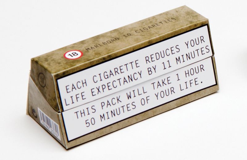
    We are all familiar with the printed warnings that have been places on cigarette packaging here in the USA for many years, but the sense we get from those is that while true and sobering, they really don't make the habit and practice of smoking significantly more difficult than if there were no warnings on the packages.  I bet long time smokers don't even notice these warnings any more. But what if the packaging itself could dis-incent smokers from the actual action of smoking?  Again from the Box Vox site, take a look at this re-imagined cigarette package:

    Image from Boxvox.net

    Sure the tired old warning message still appears, but when you examine the packaging a little more closely, you'll notice the non-traditional shape, a very intentional design that has some interesting implications. According to the package designers Jennifer Noon and Sarah Shaw:

    'Our primary aim was to change the structure of the pack making it less ergonomic. The pack was developed to be difficult to use and carry, it is hard to fit into pockets due to its triangular shape and the angled inner means the cigarettes are hard to get out. The lid is designed so that it closes efficiently but after a few uses it becomes weak,meaning the cigarettes can fall out if being stored in a ladies handbag.

    Boom. By going beyond simply advising cigarette customers about the potentially disastrous health outcomes from their habit, this new package makes the practice of the habit itself much more unpleasant and difficult than before, and at least theoretically places an additional burden on the smoker that perhaps some of them will not want to deal with.

    Telling smokers, or really anyone that is doing something in a way that the manager, the organization, or even society would like to see stopped is often not as effective as we'd like it to be. Employees, partners, kids, whomever - keep doing silly things. Even when they have been told not to. But making the practice and exercise of these undesirable behaviors much more difficult and unpleasant via packaging or design or through use of physical space can often offer us more opportunities to promote change and to achieve the desired outcomes.

    What do you think? What else can we do when simply telling people to behave differently is not enough?

    Wednesday
    Jun012011

    Making Data Come Alive

    Yes, this is yet another 'sports' post. Kind of. Actually it is another in the occasional series of posts centered around innovative presentations of information -examples that highlight ways where a variety of organizations have managed to move beyond the expected and routine - 'Look, sales trends for the last 5 years in a bar chart!', to create interesting, engaging, and increasingly interactive tools that really transform both the data and the user experience. One of the best signs that a data presentation tool is effective is not just the initial reaction from users, but rather that the tool or technology makes users want to learn more, see more, and continue to engage with the solution.Patrick working the analytics

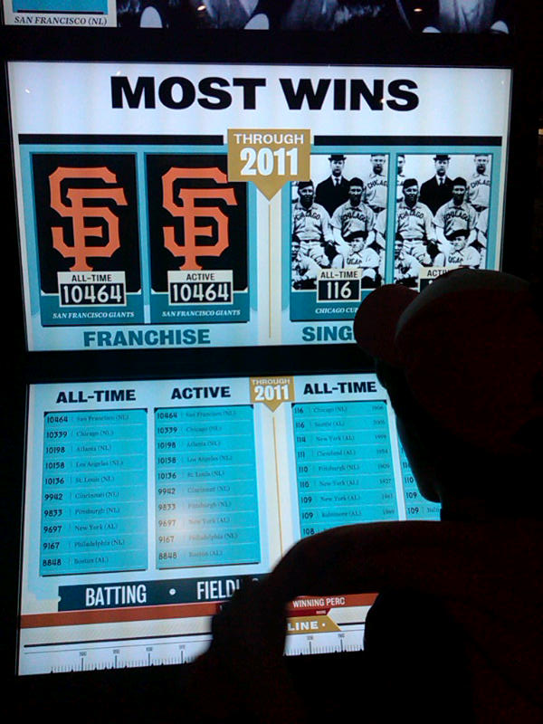
    I came across such a solution this past weekend at the Baseball Hall of Fame and Museum in Cooperstown, NY. On Saturday the museum unveiled a brand new exhibit - One for the Books: Baseball Records and the Stories Behind Them. The new exhibit tells the story baseball's most cherished statistics and records through more than 200 artifacts in the most technologically advanced presentation in the Museum's history. 

    Any fan, or casual observer of baseball knows that numbers, stats, records, etc. are as much a part of the game's history as the players themselves. Iconic records like Joe Dimaggio's 56 game hitting streak, Cy Young's 511 career pitching victories, and Ted Williams .406 batting average can be cited easily by baseball aficionados. Baseball is truly a numbers game - no other sport, (and few other businesses I bet), measure, track, analyze, and report statistical information about the games at the level of detail that major league baseball does.

    But raw statistics, be they describing normal business or workforce data, or even the data produced by such a compelling an activity as baseball, can still fall flat, feel one-dimensional, and fail to completely tell the story buried in the figures if the presentation and interface for interaction with said data is mundane, fully expected, and one-way. Tools that not only present the raw numbers, but allow the user to not only choose the data they want to see, but to also experience the data and really engage with it are the future of information presentation.

    Case in point the Baseball Hall of Fame and Museum's new 'Top 10 Tower' interactive information display at the new 'One For the Books' exhibit. The Top 10 Tower, in true iPad-like fashion, is a touch activated series of screens and displays that allow the baseball fan to learn about some of the classic and lesser-known statistical history of the game.  By selecting variables such as Pitching or Batting, choosing specific focus areas to drill into, and using a cool 'timeline' slider to see how the results and records have moved over time, the Top10 Tower created a fully immersive and engaging interactive presentation of what are really 'just' numbers.

    Make selections on the lower display of the tower, and the large video screens on the upper section automatically update, showing not only figures and images, but also allowing touch access to additional multi-media content about the record holder, of the timeframe the recored was established. The Top 10 tower also presents data in different dimensions, even ones not expressly requested by user, as the designers of the tool know that context matters in the review and analysis of baseball statistics, as it is likely equally important in the business and workforce metrics we produce and review all the time.

    I know what you are saying, the Top 10 tower is really just a fancy way to present some simple lists, and it really is not a big deal, and certainly has no meaning to the business world that has to be concerned with 'real' data, not just batting averages.

    Sure, keep telling yourself that. Your data is important, and baseball is just a game. 

    Have any idea with the batting average of your hiring managers is? For this season? For all-time?

    Monday
    May232011

    Kid Business Cards and the Permission to Dream

    The most popular post on this blog over the last couple of months was a take on a job application cover letter written by a 6 year-old boy.  I liked the post, (or I would not have published it), but I was really shocked how popular it was. So in the grand tradition of pandering, grasping, and shamelessly playing the 'kid' card again, once I came across this piece, about a Brazilian Ad Agency's project to design and print business cards for the 'dream jobs' of a bunch of schoolkids, I figured, why not share?

    Here is the backstory - Red Balloon, an English School for kids in Brazil, asked the students at the school what they wanted to be when they grow up. Certainly a question we have been asking kids since well, there was potentially a different answer than 'chase saber-toothed tigers and try to kill them with stones in order to survive'.

    Based on the children's answers, the ad agency Ogilvy Brazil designed personalised Kids Business Cardsa few examples you van see in the images  below. The answers, combined with a bit of information and insight about the kids, created a really amazing set of artifacts and a kind of tangible, phyiscal representation of the kids dreams. These cards say - 'your dream is not just in your mind, it can be real, here is a bit of what it might look like'.

    Below is a close up view of one of the cards - for a girl whose dream is to be 'the most pretty ballerina in the world.'

    After the project was completed reps from the ad agency gave this assessment of the outcomes  -

    Result: more kids believe in their dreams and more parents believe in the importance of English for their kids' future."

    I posted about this project mainly because I really loved the creativity and artistic qualities of some of the kids business cards - quite honestly they just look cool.

    But I do think there is a larger point to this, we do ask our kids, nieces, nephews, cousins, students, etc. all the time 'What do you want to be when you grow up?' And we know that 99% of kids won't actually pursue the 'dream job' they identified at 9 years old. While that is certainly normal and expected, I also think that we as parents/teachers/adults sometimes jump too quickly to downplay, discourage, or even fail to even consider these childhood dreams. We are old. We know better. We know that we did not become astronauts, runway models, or relief pitchers for the Mets, (that last one was mine), so it is only responsible and realistic to assume that the random 4th grader won't become any of those things either.

    But in our haste to be 'adults' I think we can forget what it was like to see the world as kids do, a world where still, mostly, anything was possible. Becoming a pop star, soccer hero, or a great inventor with a mansion - these are not at all unreasonable or unreachable dreams. Having these dreams is still 'allowed'. I thought about that when I read about these 'kid business cards'. A quick scan through them shows rock stars, sports legends, captains of industry.  

    All things that for our kids are fantastic and possible.

    Even if we did not become those things ourselves.


    Monday
    Apr252011

    Mass Customization

    Have you ever designed your own, personalized M&M's candies?

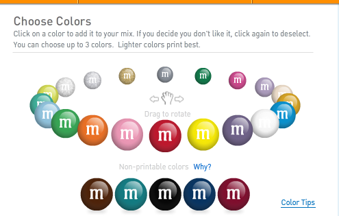
    It's a pretty neat idea, choose the colors and combinations you like the best, have your own personalized message printed on the candy, have your creation shipped to your door.  Sure, it costs a bit more that simply heading over to the grocery store and buying 'standard' M&M's, but you end up with exactly what you want.  The end result, while sharing some essential commonality with all other M&M's candy, (they are not changing the recipe for you), has just enough personalization to be simultaneously distinctive and recognizable. The folks at M&M's are able to design for this ability to customize and personalize by carefully controlling just exactly what aspects of the product offering are personalizable, (color selections and messages), and what are not, (size and shape of the product, ingredients).

    By offering this personalization service, M&M's can take some small steps towards making a commodity product into something more, and in so doing, forge closer connections with customers for which this ability to participate in the design of their M&M's is worth the price premium the company requires. At a transactional level, everyone wins.

    Increasingly consumers appreciate, and in some markets and product segments, are coming to expect the ability to tailor and customize product offerings. A recent post on the Forrester Consumer Product Strategy blog argues that, 'Current and emerging digital technologies are turbo-charging mass customization, breathing new life into the product strategy', and that 'The time is now for product strategists in all industries to consider adding mass customization – including true build-to-order products – to their product portfolios.'

    Forrester then offers a four-step framework that product designers and marketers should consider following in order to ensure that their personalization strategies are both meeting customer's needs, as well as being sustainable, supportable, and profitable for the organizations. You can read the Forrester piece for more details on the framework, but essentially it consists of:


    1. Determining the context for personalization - what can and can't be defined or altered by the customer.
    2. Creating a great user experience that allows customers to see and understand their options, and the consequences of selection from among their choices
    3. Designing to solve a real need, not just the perception of a customer need
    4. Remaining flexible to adapt to changing conditions, and to predict what customers will want for personalization options in the future


    Whether or not Forrester is correct in predicting an increase in product personalization capability through more powerful web technology, and in their advice to organizations to consider pursuing personalization capability more broadly remains to be seen. But if they are right, or at least directionally correct, could there be implications more broadly for organizations, specifically in the design of work and in the value proposition employers make to employees and candidates.

    Traditionally employers offer the 'job', the discrete unit of duties, responsibilities, etc. that they expect and require employees and candidates to meet and (mostly) fulfill. The components of the job tend not to vary too much over time, and are generally not particularly malleable or personalizable.  In recruiting, organizations tend to match the requirements of the job with the documented and demonstrated capability of the candidate, while considering whether or not the 'gaps' in experience or skills are significant enough to move on to the next candidate. Fail to have enough of the required traits, or even one of the most critical ones, and well, no match. Move on to the next candidate.

    We tell candidates that we will keep their resume on file in case something more suited to their skills turns up, but in reality in the majority of circumstances that 'miss' represents their one and only chance. 

    But what if the organization approached the recruiting and job design process more like our friends at M&M's, and if Forrester is correct, how more and more product marketers will address their markets? What if we could identify for a role, or really a role type, some essential and non-negotiable components or skills (size and shape of the candy), and then a more flexible and fluid set of variables (color, messages), that could be combined to create a more customized, personalized opportunity for the candidates? Might this be a step in addressing the 'skills gap' that might not actually solely a skills gap, but the results of a lack of institutional flexibility?

    If a company could figure out a way to do this, they might get the benefit of discovering more committed and engaged candidates and employees (since they had some input into the design of the job), and also to lose less of their really talented candidates and employees because of really kind of slight and relatively unimportant mismatches between skills, interests, and job requirements.

    Is it crazy to think organizations could be mature enough in their understanding of workforce capability needs to offer the ability for more personalization in the design of work?

    Is it crazy that I can order twelve pounds of orange M&M's that say 'Steve is my hero?'