Quantcast
Subscribe!


Enter your email address:

Delivered by FeedBurner


E-mail Steve
This form does not yet contain any fields.

    free counters

    Twitter Feed

    Entries in design (54)

    Monday
    Dec272010

    Transforming Data into Information

    Quick one for today, but aimed for anyone in a management or leadership role that has been handed a report, chart, spreadsheet, or pretty much any common or standard style collection of data that is meant to be informative, but really only leaves you asking, 'Just what am I looking at here?'

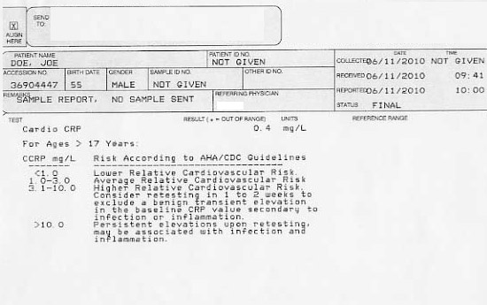
    I have written previously about incorporating more creative and visually appealing approaches to what is typically flat, and even mundane data, data that really could tell a more interesting, evocative, and relevant story if only it was packaged in a more compelling manner.  So for your consideration, from the always entertaining Information is Beautiful blog, a re-imagining of the simple medical blood test results report checking for c-reactive protein, or CRP.

    The kind of report that contains critical data, that needs to be interpreted, understood by non-experts, and offer the right kinds of recommendations and call to action.  Not unlike the headcount, turnover, and performance management process results that you may read every day.

    The typical CRP test report and the starting point for the redesign looks something like this:

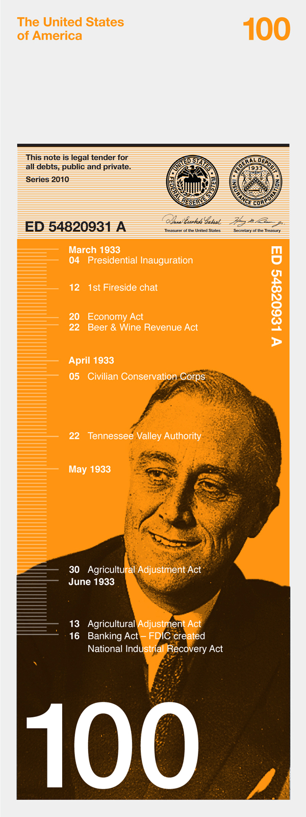
    The redesigned and re-imagined report looks like this:

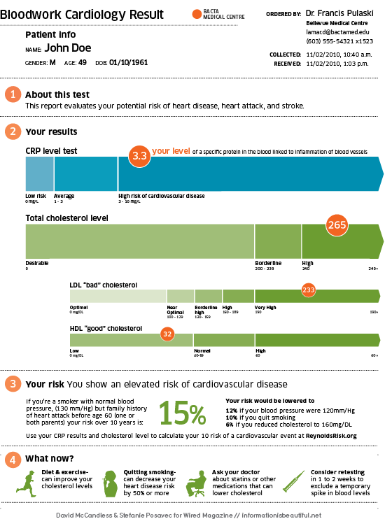
    All of a sudden, the dull, difficult to interpret, and really sterile data is transformed to a bold, eye-catching, super-informative, piece of actionable information. The re-designed report accomplishes some simple, but important objectives where the old version of the report simply fails to do much of anything except confuse.

    With the new report the patient now can better understand the background and purpose of test, visualize their result compared to norms and averages, provide context to other related and relevant metrics, and finally recommend a course of action (with expected and positive outcomes) based on the results.

    Clearly the redesigned report is an improvement in every way.  I know I have said before, but it bears repeating - most organizations and Human Resources professionals are not suffering from a shortage of data, but rather a shortage of understanding.  Maybe the next 'critical hire' you can get approved shouldn't be another HR Generalist or Recruiter. Maybe a really good graphic designer is what the HR department needs.

    Friday
    Dec172010

    Cards of Change

    I came across the site Cards of Change, a collection of images of business cards uploaded by people in some kind of career transition or crossroads, usually caused by a layoff or other involuntary circumstance.

    Participants take one of their former business cards and imaginatively and creatively edit, adapt, and improve the card's content in a kind of 'rite of passage' that visually and tangibly helps to mark the passage from one career stage to the next.

    The site's mission is 'to collect as many business cards and stories of positive change of people who have recently been laid off and connect them with new opportunities from potential employers, business partners and people who make the effort to look on the bright side of life.'

    Of the many hundreds of cards loaded to the site, there is most often seen an excitement, optimism, and enthusiasm from the recently separated workers.  In many cases reading their adapted cards, cards that with a few pen strokes and cross outs they have turned from 'business' cards to personal ones, we get the sense of relief and release.  We can feel along with the card owner the weight of stress or pressure of having to be someone else for business, and the lightening of their spirit once they saw that weight removed.

    Of course the stress and pressures of being out of work had not likely set in yet as the card owners took to constructing these new creations, but still, I imagine the physical act of transformation of the old into something new has to be seen as at least starting the transition process on the right note.

    The other observation I had from reading through the card collection was that there were and still are a lot of unhappy people out there and when presented with a better and more enriching (both financially and emotionally), opportunity, many of seemingly productive and happy workers will race to the door.

    I wonder if many of us were provided the opportunity or the necessity to design our own cards would they look at all like our 'official' ones? Or if we could, would we start crossing out words and phrases, replacing them with ones that match our truer selves?  

    I recommend checking out Cards of Change, I bet you will spend at least a few minutes looking at the cards and tiny stories.


    Thursday
    Sep302010

    Simpler Answers

    Get the 'right people on the bus'.

    Align corporate goals and objectives with individual employee's performance standards and development plans.

    Ensure the organization is using it's compensation budget to reward the right employees and encourage the desired behaviors.

    These are just some of the many truisms we hear, write, and repeat that attempt to describe what most organizations are striving for in their quest to increase performance, improve financial outcomes, and help sustain and grow the enterprise in the near and long term. Over time numerous technology solutions have been developed to help organizations achieve these and other lofty goals.  And over time, the list of specific features and capabilities of most of the generally available solutions on the market have expanded to encompass more workforce processes, include support for more discrete talent related transactions, and provide better and faster access to analytical data that surrounds and is generated by these processes.

    In fact, if we organized a 'feature and function' scavenger hunt on the floor of the expo hall at the HR Technology Conference there is likely not any specific talent and workforce management capability that some vendor could not support. Dynamic 9-Box generation with variable axis?  Check.  Standard reports describing cost and quality per hire?  No problem.  Integration of the traditional applicant tracking system with the social web?  Everyone is doing that now.

    No, the arms race for 'features' in some respects is pretty much over.  The result? Everyone won. Or soon will. No doubt about it, the set of solutions available across the spectrum of HR and talent management processes has never been wider, better, and more impressive.  If you can imagine it as an HR or talent pro, you can have it. Ignoring for the moment the very real, and troublesome nits about costs, complexity of integrations, maturity of the organization to actually adopt or at least adapt to the leading practices that many of the current solutions profess to support.

    So in an environment where (almost) anything, and everything is possible, how can organizations and leaders ensure that they are making the best decisions around what technology solutions to invest in, and ultimately deploy? 

    How about by taking a longer and harder look at more simple technology solutions?  What?  Simpler solutions?  Ones that don't necessarily have the ability to check 'Yes' on that 89 page performance management capability RFP you just issued?  Ones that don't always demo the best, that perhaps lack the flash and sizzle of some others?  Solutions that take a 'less is more', or perhaps more accurately a 'only the features that are truly needed are included' approach to development and deployment?

    The fundamental questions that most businesses need to answer are, at their core, relatively simple.  Find the right people for the jobs.  Align their activities with big-picture goals. Give them a chance to develop and grow. Make sure managers and employees can engage in a positive and constructive dialog to not only improve individual performance, but to raise the level of achievement for the organization overall.  They are fundamental questions that usually have pretty simple answers. Sure, I know what you're saying - if the answers were truly that simple, why don't all organizations get it right?  Why are so many workplaces talent management practices lacking?  I think that is perhaps a discussion for another time, but I will say this - applying unnecessary technological complexity to these problems won't make them suddenly easier to solve. The best BI analytic dashboard, if supported by data from sketchy talent management processes, is ultimately worthless.

    Yesterday at the HR Technology Conference I spent time with people from two of the solution providers that I admire most in the industry, Halogen Software in the more 'tradtional' talent management space, and Rypple, who are sort of in a unique (because they pretty much created it) position as a provider of recognition, coaching, and feedback tools. Talking with them again today I was reminded why I admire them so much - their solutions are defined as much by what features are not included as by what ones are included.  They both are focused on providing tools that support these fundamental business needs, while not trying to carpet-bomb the user (or really the buyer), with a litany of excess and largely unneeded features. Both help organizations answer simple questions with simple answers. 

    When considering your business issues, and evaluating potential technology providers, the key questions of 'What features have you killed?' and 'What capabilities have you purposefully omitted?' might prove more valuable that the 89 pages of 'Yes, yes, yes' answers from that RFP.

    Wednesday
    Sep082010

    Coming and Going

    Most HR or Recruiting functions calculate and report on standard metrics such as turnover rate, voluntary separations, turnover rate broken out by company function or location, source of applicants, source of hires, and other common measures of organizational effectiveness in the recruiting and retention process.

    Many organizations also try to do a reasonably thorough job of tracking the reasons why employees leave the organization, often through the use of exit interviews.  Better opportunity elsewhere, lack of promotion chances, hating the boss, etc.

    Aggregating, combining, distilling, and analyzing this kind of 'coming and going' data, when supplemented with analysis of individual and company performance can be a powerful differentiator, providing the organization's leaders with important competitive insight to inform hiring, development, and operational strategies.

    That is, if the HR organization has the tools (possibly), analytical capability (maybe), and an understanding of the best way to present this kind of information in a method that is relevant, consumable, and engaging (oh boy).

    Take a look at the image below, the infographic maps more than 4,000 moves both in and out of New York from over 1,700 people in the past decade based on an informal survey by New York public radio’s the Brian Lehrer Show.

    The interactive chart captures the destination zip code for the move, whether the move was 'in' or 'out', the date of the move, and even the reason for the move to or from the particular zip code.

    The chart also provides the ability to deep-dive into specific zip codes to analyze the overall patterns of migration as well as drilling into individual movements. We can see, for example, that in 2001 someone relocated from NYC 10014 to Tampa, Florida 33602 because the 'Rent was getting too high to stay'.

    It is not a stretch for HR to re-invent this kind of graphic as the 'comings and goings' of new employees, and recently separated colleagues.  The zip codes in the chart could be replaced by company regions, locations, even senior leaders.  Examining the inflows and reason codes (curious how many people join and leave for the very same reason) in a graphical manner somehow energizes the information normally presented on simple report, or a bar chart.

    While most HR organizations don't have the luxury of graphic or web designers on staff (too bad) to create these kinds of interactive tools to review, interact with, and even re-imagine data, it would benefit most of us in the business of providing and acting upon workforce and organizational information to do a better job of presenting the data in ways that help the data tell its story.

    The full infographic can be found here - and be warned, it is a fun and engaging chart that you are likely to spend some time playing with to, and ultimately a kind of curiosity begins to set in as you try and get a closer look at the decisions and motivations of the real people whose experiences make up the data for the graphic.

    Compelling, engaging, fun, and informative.  How many of those adjectives can you ascribe to the last report on turnover you sent up the chain, or that you received?

    Friday
    Aug272010

    Redesigning Everything

    I am totally fascinated with a contest called the 'Dollar ReDe$ignProject'.

    The project, organized by brand strategy consultant Richard Smith, is a tongue-in-cheek attempt  to revitalize the American economy via a 're-branding' of some of our most visible and tangible manifestations of economic activity, the set of US Federal Reserve notes.

    From the 'About' section of the Project site:

    It seems so obvious to us that the 'only' realistic way for a swift economic recovery is through a thorough, in-depth, rebranding scheme – starting with the redesign of the iconic US Dollar – it's the 'only' pragmatic way to add some realistic stimulation into our lives! Therefore, you must take part and we really want to see what YOU would do.

    Various designers, students, folks that like to play around with Illustrator and Photoshop have offered their suggestions for redesigning the set of bank notes that for the most part still maintain their basic design structure from the 1930s.

    One interesting example from the contest, submitted by the graphic design firm Dowling Duncan is on the right.  Their designs for the various notes and denominations attempt to link the face value of the note to an historically significant figure or event. In the example on the right, the re-imagined $100 note refers to President Franklin Delano Roosevelt's famous 'First 100 Days', when a number of significant legislative actions were approved to combat the economic depression of the 1930s.

    Besides the collection of really engaging, creative, and amusing submissions (somewhere in there you can find a 'Steve Jobs' $50 bill), the project and the enthusiasm of the design community to participate reveal some interesting lessons that I think could be relevant in an organizational setting as well.  

    Sacred cows - What 'wrong' with the $1, $5, or $100 bills?  Well I suppose nothing.  But could they be improved? Absolutely.  Could that improvement actually drive downstream benefits far beyond the redesign itself?  Quite possibly. But unless the attempt is made, you'll never know.  

    The crowd - Sort of an obvious conclusion, and one that doesn't need to be pointed out yet again.  Or does it?  It still seems to me that more organizations and even smaller divisions in organizations don't do a great job soliciting ideas from their version of the 'crowd' for improvements, creative ideas, and even feedback. Making the submissions public, improves the process as well.  The better ideas surface more readily, more people can get involved in improving the ideas, and the entire process gains more relevancy and a larger degree of trust. For almost every issue, someone out there is passionate about it, and likely would want to get involved if given the opportunity.

    Fun - Looking at the redesigned currency is fun. Creating the designs certainly had to be fun for the firms and individuals that have participated.  Even judging the contest I imagine is going to be a blast. What is wrong with a little fun in the organization? Unless you are in one of the lucky (or smart) organizations that has managed to navigate the last few years unscathed, introducing a bit of fun into the routine would be most certainly welcome.

    What do you think?

    Is redesigning the dollar bill a good idea?