Quantcast
Subscribe!


Enter your email address:

Delivered by FeedBurner


E-mail Steve
This form does not yet contain any fields.

    free counters

    Twitter Feed

    Entries in design (54)

    Tuesday
    Aug172010

    Made by cows

    This image that I spotted on the excellent Delicious Industries site the other day definitely made me chuckle. It is amusing, well-designed, memorable, and frankly just really cool. Certainly all qualities that can often be lacking in advertising today. I gather the copy writer and artist were trying to emphasize the wholesomeness and adherence to the dairy company’s commitment to quality and freshness. Other images in the series of spots illustrate the cow driving a farm tractor and churning the butter (although I imagine the lack of opposable thumbs would make that feat kind of tricky).
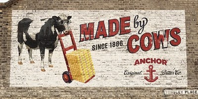
    But after thinking about the images a bit more, I think there is a larger, more general message as well. That is without the cows who provide the essential raw materials for the dairy’s products, then well, there are no products. Sure, farmers look after the cows health and well-being, engineers design systems and machinery to efficiently collect the raw milk and then process it accordingly, and a small army of marketers, salespeople, logistics pros, accountants, HR folks, and all kinds of others move in and around the process making sure the raw milk turns in to end products, the products are packaged, sold, shipped, counted up, paid for, and that the people involved in the process are also paid, trained, and otherwise looked after.

    More and more companies, and consequently increasingly numbers of jobs don’t actually involve making anything tangible like butter or cheese. So the intangible end products and services then must have intangible raw materials as well. The ideas, insights, and eureka moments that can improve, alter, redefine, or reinvent the product or process or simply the way that the all the support people in the organization go about their work, these are the new raw materials, the raw milk if you will of the new enterprise. In the butter making business, acquiring the raw milk really isn’t the hard part, sure capital and some expertise is required, but for the most part the getting the right cows pretty much guarantees a steady supply of raw materials. After a while the business success and survival depends almost totally on what happens after the raw materials arrive. The super stars of the organization often were the ones farthest remove from where the raw milk was produced and came in the door.

    Now success, and the people that might be the most valuable contributors to that success are the ones that provide the raw materials. The ideas. The breakthroughs. It used to be a pretty lousy position to be in, to be strapped to a milking machine a few times a day. Now, if you are someone that can consistently produce the raw materials of the enterprise, you are in a really prime position.

    So which one are you? A cow, or someone who looks after the cows?
    Wednesday
    Aug112010

    Disconnect

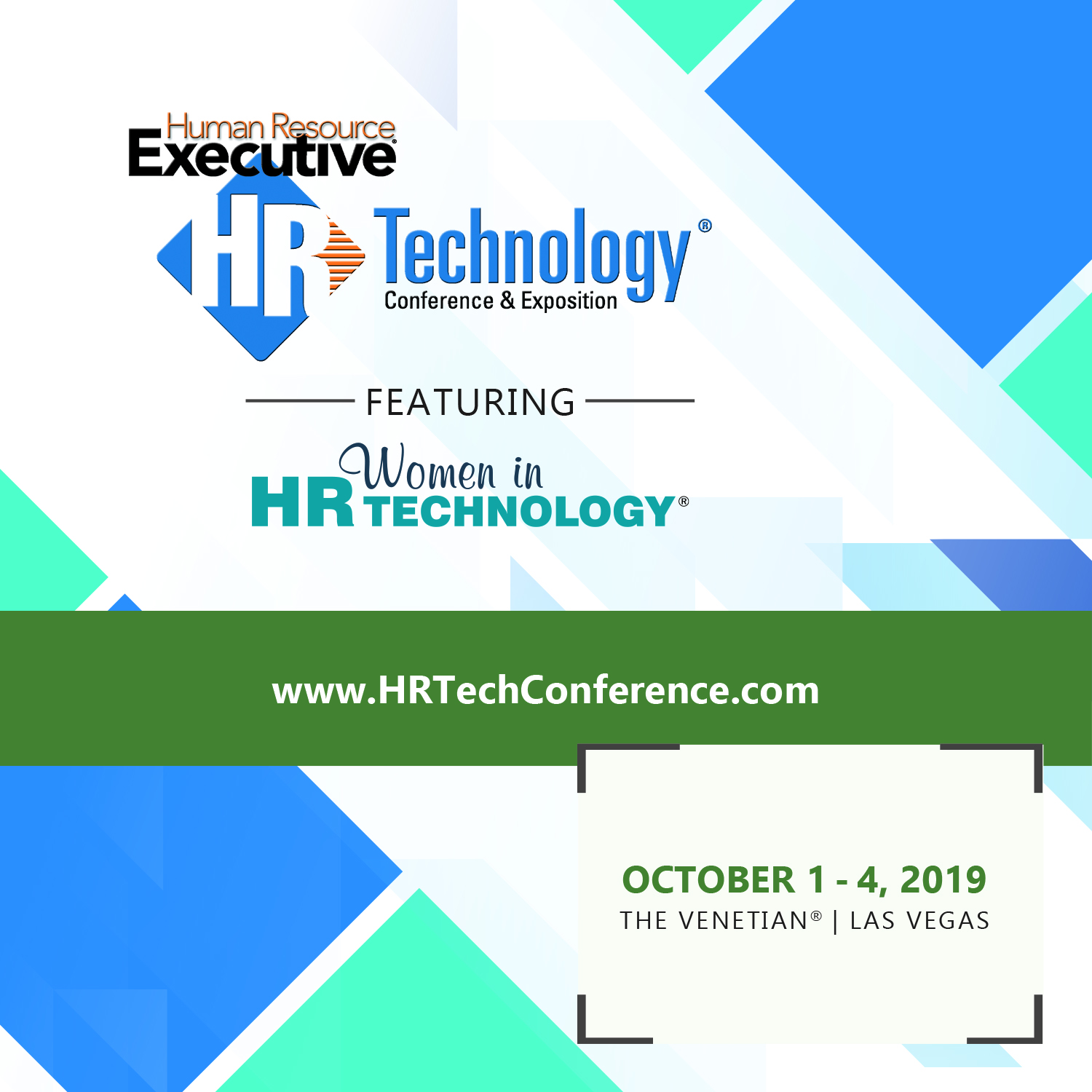
    This diagram from the xkcd.com blog about the disconnect between what features and information are prominently displayed on many University websites and what visitors to the site are actually looking for is quite amusing, and likely pretty accurate:

    I think the general premise of the chart could also fit many of the workforce systems organizations deploy, and even many of the interactions managers and leaders have with their teams.

    Just a few that come to mind - 

    Company intranet or employee portal - How prominently is the Payroll schedule displayed?  You know everyone cares about that. What about the holiday calendar?  The menu in the company cafeteria?  I bet these are some of the most popular and searched for items on the portal, make them easy to find.

    Corporate job site - Is the 'apply now' or 'send your resume' button or link clearly featured?  Or is it effectively buried by that super awesome video of your CEO in a shirt and tie (no jacket because he is sending off a 'hip' vibe) about how fantastic it is to work at your company.  

    Quarterly senior management 'all hands' meeting - Are we all still on track to get our bonuses?  Can we work half days on Fridays during the summer?  Sure, go over the financials, but once the company gets to a certain size, recitation of financials often devolves into an arcane review of accounting acronyms like EBIDTA.  Talk bonuses, raises, is the company holiday party still on?

    What else?  Where else is there a disconnect between the information that you want to provide, and what the intended recipients really want to receive?

    Probably 85% of the conversations with my 9 year old, but that is another story entirely.

    Monday
    Aug092010

    Have a better idea?

    Over the weekend I read an interesting post on the User Interface Engineering blog titled 'Please, let me redesign your airline for you' that chronicles some well-known, (and some lesser-known), attempts by unaffiliated designers to suggest improvements to American Airlines' website, Delta Airlines boarding cards, and the main portal page for Delta's Sky Club. Redesigned Delta Sky Club Portal by Zach Evans

    In all cases these re-designs and suggestions for improvement to existing systems and processes were unsolicited by the airlines that 'own' them, but were put forth by customers, the true end users of these tools and products.  In some cases, the designers are extremely dedicated and loyal customers, and by offering up their talents and time to contribute these ideas and improvements, they are almost begging American and Delta to please improve the user and customer experiences to a level that is commensurate with the dedication and loyalty they have demonstrated over the years.

    Sure, the AA home page and the Delta boarding card as they currently exist probably do need an upgrade. And yes, as is noted in some of the comments on the UIE blog it is pretty easy for any designer to slap together a mock up for a new web page or to offer up an improved user portal design without having to consider any of the real and practical restraints that the actual designers and administrators of these systems simply have to contend with.

    But the fact that these redesigns were developed independently and offered up to the organizations freely indicates three things about the current situation with these systems:

    1. There are passionate and loyal customers

    2. The systems themselves are lacking in some important ways

    3. There are many users able and willing to offer improvements and new ideas

    Loyal customers, systems that are lacking somehow, and a population of users some of which able and willing to assist, especially since as frequent, even constant users of the systems and processes can likely tell you exactly what is working and what can use some rework.

    I think that the same can be said for many of the systems and processes that HR organizations present to their user communities.  

    The redesigns for the airline industry tools and sites tend to focus on making things simpler, identifying and presenting the most important information more plainly and clearly, and finally serving to make the actual business transaction better and more efficient.  No one buys a ticket on AA for their cool website, but they want the website to help make their ultimate goal, getting to their destination safely and on time, easier.

    I think the same could be said for most workforce technologies. They exist primarily to make employees and managers jobs easier, but often they get lost in a stew of features, links, and help text serving eventually to frustrate and confuse users.  I would bet that many of your employees and managers have some great ideas about how your systems could be redesigned to support them in their jobs more effectively.

    That's my challenge for you today - ask one employee or one manager how they would change one of the key workforce systems that they use every day.  You just may get an incredibly useful and powerful suggestion. 


    Print


    Tuesday
    Aug032010

    Designing Experiences

    The Hermitage is a massive museum of art and culture located in Saint Petersburg, Russia. One of the largest and oldest museums of the world, it was founded in 1764 by Catherine the Great and open to the public since 1852. Its collections, of which only a small part is on permanent display, comprise nearly 3 million items, including the largest collection of paintings in the world. It’s close to 2,000 separate rooms make for a daunting proposition for visitors, as simply seeing and finding items and collections of particular interest can certainly be difficult.

    As the museum approaches its 250th Anniversary in 2014, it has engaged the services of renowned architect Rem Koolhaas to ‘modernize the art museum experience’ for visitors, while staying true to the history and tradition of the institution, and also under the constraints that no new buildings will be constructed, and no existing structures will be significantly modified.Kandinsky - Composition VI - 1913

    What does this have to do with business, HR, or technology?  Perhaps not much, but I was looking for an excuse to run a post with a Kandinsky picture.

    Well the three main operating principles that Koolhaas has adopted in his re-design of the museum-goer experience can, I think, be applied to many organizational and system design (or re-design) projects.

    Principle 1 - Understand how customers really use your products – not how they “say” they use your products.

    Whether it is by an over reliance on policies and procedures, deploying internal knowledge management systems that proscribe a rigid hierarchy and taxonomy for information storage, or explicit and detailed enterprise systems user guides that all attempt to define and control employee interactions, many organizations not only fail to see how their products and services are used, they demand or require a specific method of interaction.

    How can HR and IT organizations do a better job at understanding how their products and services are being used? By really observe use patterns in the field, and not just ‘tracking’ them for one. Sure, your latest masterpiece on this year’s Benefits Open Enrollment process has suddenly become the most visited page on the intranet, but is it actually working?  What sections or pieces of information are the most important? Where do employees go immediately after accessing the information? 

    Principle 2 - Create as many opportunities as possible for interaction between the customer and your product

    In a museum setting, we’re not really talking physical interaction, but rather ways to foster more mental and emotional engagement with the collections.  By creating more opportunities for slowing down, contemplating, and in Koolhaas words "do(ing) everything possible to “diminish the obligations of a directed path, the architects are attempting to better connect the customer to the experience.  

    Inside organizations I think there countless opportunities to allow for more exploration, crowd sourcing, and discovery.  Does your culture overschedule people with hour upon hour, day upon day of a seemingly endless series of meetings?  Have you set the expectation that every e-mail has to be opened, read, and responded to immediately? Do you spend the first six months of a new hire’s tenure indoctrinating on ‘This is how we do things here’, rather than ‘Here is what we need to get done, here are the constraints, have at it’.

    Principle 3 - Implement best-in-class practices from around the world

    While chasing ‘best practices’ is not always sound advice, (usually it just puts you in catch-up mode, since once you identify which ‘best practices’ to emulate, and take the time to mimic them, the creators of said ‘best practices’ have already moved again to newer, and better practices, leaving you emulating yesterday’s good ideas). To me the ‘around the world’ angle of this principle is the important one.  It suggests looking beyond the typical sources of inspiration, (companies in the same industry, other local organizations, and competitors offering the same kinds of products and services).  Maybe your large organization can learn a thing or two from a scrappy start-up, your design for a boring B2B product can be energized by the iPad, or your enterprise software can actually look, feel, and be as fun and intuitive to use as Facebook or Amazon. Inspiration and ideas can be found practically everywhere.

    Last thought, often when trying to change anything, we can get caught up in the barriers or constraints. But barriers and constraints will always be there, and in fact can for you to get more creative and focused.  Koolhaas has to take a 250 year old massive institution and re-design the experience in the next few years, while not changing the structure, layout, or much of anything else - I’ll bet your barriers and constraints are not nearly as daunting.

    Note :My friend and fellow blogger Victorio Milian at his Creative Chaos Consultant blog has written about the importance of design and design thinking for HR professionals, and I highly recommend checking out his work on this topic.


    Print


    Monday
    Jul262010

    Infinite Choice

    The other day I was driving in a light to moderate then back to light rain storm.  One minute the rain was quite strong and the car's windshield wipers had to be engaged at almost full speed to assureFlickr - Christine Krizsa somewhat decent visibility, and then a minute later the rain would subside to an extent that the wipers were hardly needed at all.

    Fortunately for me, my car and most cars made in the last forty years or so possesses a feature called 'intermittent wipers', a mechanism that enables the windshield wipers to operate at numerous speed settings, with variable delays between 'swipes' across the windshield.  In an extremely light rain, or mist, or in rapidly changing conditions like the ones I was driving in, the ability to adjust the speed of the wipers to most closely match the outsude conditions is a fantastic improvement of the wipers' original design - simply either 'On' or 'Off'

    In the case of windshield wipers, I think most drivers would agree that having a range of settings, perhaps even an infinite amount of settings is an improvement from 'On' or 'Off'.  But having so many choices in wiper settings can actually make finding just the right setting quite difficult.  On my twenty or so minute drive the other day I must have adjusted the wiper speed fifteen different times. As conditions changed outside, I almost unconsciously reacted by tweaking, ever so slightly, the wiper speed. I have unlimited contol and choice remember, so it is assumed no matter what the rain and wind are doing, I have the ability to set the wipers at the perfect setting. I don't remember anything else about that drive except fussing with the wipers the entire time, and thinking I still have to keep messing with them even though I have far superior technical capability at my disposal.

    I was in discussion with some colleagues about performance management, specifically a discussion of the use of rating systems in the performance appraisal process.  One person favored the use of the classic descriptors for formal ratings ('Exceeds, Meets, etc.), while another favored a numerical scale (1-5).  A third said what they really need was a way to rate employees on a sliding scale, that all '3's' or '4's' are not the same, and what they really wanted in their performance management technology was a sliding scale that they could use to dynamically 'drag' and adjust the ratings between the defined beginning and end points. That way they could rate Sally as a 3.73 and Joe as a 3.21 and so on. Sort of like an 'intermittent wiper' for the performance rating.

    While I think that the capability for more granular assignment of numeric performance ratings is, at least on the surface, an improvement from assigning '3' or '4', it doesn't really change the fundamental exercise all that much, or improve the conditions or environment that effects the eventual outcomes in the review process. Sure, the manager has more choices, even an almost infinite amount of choices, but as sometimes happens when we are presented with so much choice that we spend all our time focused on the alternatives and much less (or not at all) on the outcomes.  Obsessing over the 'choice' and not the results of the choice if that makes sense.

    And no matter how advanced our windshield wiper systems get, it still rains outside.


    Print