Quantcast
Subscribe!


Enter your email address:

Delivered by FeedBurner


E-mail Steve
This form does not yet contain any fields.

    free counters

    Twitter Feed

    Entries in design (54)

    Wednesday
    Jan252012

    How much does the office furniture matter?

    Like most of you, I've worked in all kinds of office layouts over the years. Cube farms, open plan, private offices, 'hotel' desks for more transient workers. I am sure at one time or another I have spent time in all of them.

    And I probably don't have any really strong feelings about any of the office spaces I've worked in. They were, and are, mostly forgettable. Aside from the one consulting project years ago where my 'office' was a telecom equipment closet and an extra door propped up on some boxes was my desk. That one I still remember for some reason.Look like your office?
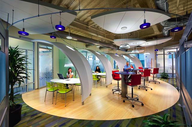
    But there is a growing awareness of the importance of design, intent, and function of things like desks, chairs, conference rooms, and common spaces in the modern office. While some think the future of work will eventually become almost completely virtual, (meaning everyone will work out of a Starbucks or Panera), for most desk jockeys today, the 'office' still is the central and most common place where work gets done.

    So while work is changing a lot, where we do work doesn't seem to be changing quite so rapidly. And while this is seems like it will continue, at least for the time being, creating spaces that are adaptable, comfortable, and effectively support the shifting demands of workers and organizations is still important and still should be something HR and talent professionals think about when designing spaces, creating work environments, and procuring office furniture. And if you are still trying to manage that balance between work that wants to be more fluid, collaborative, and virtual; and workplaces, that want to be more, well, static, rigid, and boring, then I suggest you check out this piece from the Workplace Design Magazine site.

    The article, a take on the challenges facing workplace designers, is valuable not only for some of the practical design ideas it might provide, but for the approach to design decisions it advocates. Namely, to think about design issue as more that tables, offices, and furniture. To think bigger. From the piece:

    In contrast, I believe your job as workplace professional is to support work, wherever and whenever it takes place. And for me “support” means focusing on the work itself, and how it’s being done, almost more than the workplace.

    Nice. A more expansive way to see the job of designer. In a way, it is a good piece of advice for any of the classical support functions - facilities, finance, IT, even HR. Focus on the work and not on the tools you want to bring to the table. 

    It is a really interesting way to look at things, and kind of instructive. If the best workplace designers don't start with blueprints and fabric swatches, what does that say about the way us technologists and talent pros approach our challenges?

    Are you thinking about the work first? Or your toolkit?

    Thursday
    Jan052012

    Elusive Cuteness and Building Approachable Systems

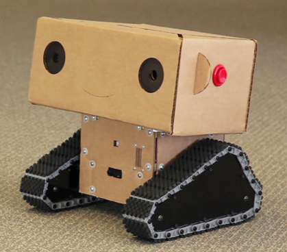
    The smarties at the MIT Media Lab had a problem they were trying to solve - how to create a small, mobile, low-cost, audio and video equipped, and functional robot that could travel the campus and surrounding area on its own, find and approach random people, and get them to answer questions on camera.C'mon, look how cute I am!

    Not such an easy problem to solve - since most people don't really seem to want to engage with other people that they do not know when approached on the street, what luck would the little robot, named Boxie, have with rolling up on passers by and getting them to stop, engage, participate, (and not break or steal), her.  How could the designers build and enable such a robot to successfully meet this goal, while constrained in equal measures by time, cost, and complexity? When you think about it, even though this specific problem is a bit unusual, and unlikely to come up in most of our professional pursuits, the essence of the problem, how to capture attention, engagement, and assistance from audiences that are not always motivated or incented to help is much more common and universal.

    So in part limited in design by practical constraints, but by also skillfully capitalizing on most people's susceptibility to anything perceived to be 'cute', the MIT team, led by Alexander Reben, created Boxie with a soft, cardboard head, (rather than the original cold white plastic prototype), a very simple set of verbal interactions, and programmed her to ask people for help, and to intentionally elicit an emotional response from the ones she engaged with. Turns out being adorable, even in cardboard robots, is a pretty powerful tool in getting what you want.

    The end result was that (most) people did want to help Boxie complete her assignment, helping her when needed, (like lifting her up on a table to get a better camera angle), and taking the time to connect more deeply than is typical with most artificial, task-oriented systems.

    You can see more about the project and see and hear Boxie in the video below, but I wanted to pull out a couple of key quotes from the designers that are worth considering by anyone designing tools, programs, or environments that rely on adoption by an often skeptical world to succeed.

    One - "We hope that this type of interaction that we studied will lead to simpler systems that may be more symbiotic with people instead of just trying to be a cold system without much interaction."

    Two - "We think we can use this simple, emotional tie to create better systems and better interactions for people."

    I like this line of thinking. Even if the MIT lab had the time and money to build a more fully functional, sophisticated, and powerful robot, it seems at least possible that such a robot would not have had any more success than the small, cheap, but likely to tug at the heartstrings Boxie.

    While workplace and enterprise systems can probably never be 'adorable' or even cute, perhaps we could think just a tiny bit less about what we want people to do with our systems and just a little more more about how we want them to feel when using them.

    It seems to be a winning approach for a tiny cardboard robot named Boxie.

    Below is the video I referenced, courtesy of the MIT Media Lab


    Tuesday
    Dec062011

    Notes From the Road #4 - Ice Buckets and Usability

    I've stayed in plenty of hotels these last few years, and have found that fewer and fewer standard hotel rooms come equipped with in-room refrigeration of any kind. First the stocked mini-bar started to fall out of fashion in most rooms a couple of years ago, often to have the empty space replaced with one of those mini, college dorm-sized refrigerators. Which was to me, a far better deal anyway. The days of casually dropping $7.25 on a can of mini-bar Miller Lite or $3.75 for a Snickers bar have came and went with the pressure faced by organizations and people to carefully watch travel expenses. At least with an in-room refrigerator, one could store some extra beverages or snacks without having constantly hit the vending machine or wonder in the morning if it is ok to drink orange juice that has been sitting on the table all night, (it probably is not ok.)It needs a cold beverage.

    But lately most hotels I've been in seem to have dropped the mini-refrigerators as well. I imagine it was simply a cost/usage decision. Many hotel guests were apparently not using the refrigerators all that much, and the energy costs to keep potentially hundreds of these appliances running when compared with their limited use made for what was probably a simple decision - get rid of the refrigerators. Not a big deal really, a convenience sure, but not generally a trip ruining development. Besides, there's always that ever present hotel room ice bucket and industrial ice machine down the hall.

    Yep the ice bucket - that normally utilitarian device that is generally only used in hotel rooms, and typically is designed with about as much thought and care as is to be expected from a tool that for the most part simply needs to keep a pound or so of ice and the one, (maybe two) beverages that can be squeezed into the full bucket. Most hotel room ice buckets are the same - round, flimsy, and cheap. In fact, most of the time the combination of overfilling, (who wants to march down the hotel hallway more than once), the round shape of the bucket making one-hand operation tricky, and the vagaries of hotel room door locks tend to combine to make the entire ice-bucket experiences a bit of a hassle.

    What could solve this little, (and I agree, problems with hotel room ice buckets are squarely a first world problem), conundrum and make the usability about 100x better? Simple: a handle on the bucket.

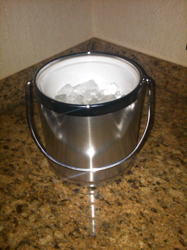
    The picture on the right shows the ice bucket in my room this week at a Marriott in New York. Sturdier than the garden variety model and possessing what I have found to be the rarest and most needed of features - a HANDLE. The handle, a small and probably inexpensive add-on improves and enhances the experience immeasurably. The handle allows you to carry the bucket easily in one hand, (important for those many, many hotel rooms that are about 7 miles from the ice machine), and re-open your room door without having to balance the cold, overfilled bucket against your body or set it on the floor as you fumble with the elecronic lock that may or may not feel like co-operating with you.

    Whomever designed this particular ice bucket realized something very important - that while the bucket's 'job' is to hold a small amount of ice and keep a drink cold for a few hours, that is a passive use case. When the actual users interact with the bucket, they are CARRYING it, half of that time filled with ice and needing to open a door. The designers thought not just the functions, but about the process and the experience of actually using the bucket. Something they could have easily missed if they focused too much on 'ice melt rate' and 'temperature after 3 hours' and not on the environments and challenges inherent on where and how the ice buckets would actually be used. Something they might not have appreciated if they never left the confines of their design lab and ventured out into the environments where their product would be used.

    Have a made too much about this? About 800 words about an ice bucket? Probably so. But to me the handle on the ice bucket reinforces a great lesson no matter what you are in charge of building - tools, technologies, or processes. 

    You'll never know if they will work until you try them in the field. Better to do that when designing and not after you've contracted with a Chinese supplier to build a few hundred thousand units.

    Thursday
    Nov102011

    Notes From the Road - #1 - Technical Instructions

    This is the first in what I hope will be an ongoing series of quick dispatches from the trail - things I pick up from airports, hotels, cabs, meetings - anywhere really, in hopes that at least some of the observations will be interesting and even worthwhile. And also, since being out on the road for work usually throws off the schedule and gives me less time to worry about the little blog here, these Notes from the Road pieces have a internal timer set at 15 minutes. Whatever ideas, no matter how half-baked or thinly developed, get the 'Publish' treatment at the 15-minute mark.  

    Ready, set, go. Fifteen minutes starts now.

    So if you spend any time in hotel rooms you've probably came up against the scourge of many a traveler - the 'in-room coffee maker'. These tiny, devious machines are notorious for being impossible to operate, usually having a series of cryptic line drawings that pass for operating instructions, producing horrible coffee, and generally leading to a disappointing experience overall.Coffee!

    I've had many a run-in with these little devils, and two days ago made a gigantic mess by overfilling the machine and spilling hot coffee all over the place, (sorry Aloft Hotel). So this morning when I cautiously approached the in-room coffee maker at the Sheraton in Reston, VA, I was stunned and grateful to see the little instruction card you see on the right of this post propped up in front of the machine.

    Why are these technical instructions so effective?

    1. They are written in plain language. No jargon, no weird or awkward phrases. They are written like someone would tell you how to use the machine.

    2. They address common concerns without condescending to the user. The pod did seem too big to fit in the machine, but it worked just fine.

    3. They are dirt simple. Making in-room coffee should be easy. And it almost never is. But by combining a well-designed machine with a just-right set of instructions, (and some quality coffee as well), the entire experience was positive.

    Simple, simple, simple. Don't over think your messages, instructions, communications. Write like you'd speak to people, like adults, and like adults that are not necessarily experts in your wonderful new technology or process.

    Well done Sheraton. 

    That's 15 minutes, (give or take), and I am out.


    Friday
    Oct282011

    Are Pictures Better than Words?

    Here's a question for a Friday: Have infographics already jumped the shark?

    If you spend even moderate time and energy reading online news, blogs, commentary, etc.; no doubts you've ran into your fair share of infographics in the last couple of years. And like any other art form/data presentation medium some of these infographics are awesome, and some are, well, kind of sad attempts and enlivening thin data sets that would be better communicated in a simple data table, or even a paragraph.

    And while infographics may now seem kind of familiar and even a little played out on the web, they have not really entered the day-to-day flow inside most organizations. I bet no one reading this post has ever responded to the boss' request for some HR or Financial data with an infographic, even if we think that when well executed, the infographic form might help us not only present the data, but tell the story as well.

    Might infographics begin to enter the world of work and become as typical as the Excel-based pie chart copied onto a PowerPoint slide?

    Maybe.

    A new company called Visual.ly is building out a service that will allow people to create custom infographics using information from their own databases and APIs. The service will be automated, which means users will only need to indicate the kind of information they want to display visually to produce the infographic. You can see some samples of what these infographics look like here.

    Pretty neat right? And even the most jaded web natives among us would probably admit that even the simplest of these infographics are often an improvement in presentation and 'interestingness' than the spreadsheets and data tables we have all been working from for ages.

    Visual.ly has produced thousands of infographics to date, mostly for big media companies and online news services like the Wall Street Journal and The Economist; and has plans to go public with its service in December. Until then, you can experiment a bit with the self-creation process by creating a simple infographic of your own Twitter persona, (mine is below).

    What do you think - do you see a time where simple, created with a few points and clicks type infographic presentations of enterprise data will become as common place as the pie chart?

    Should enterprise systems build in this kind of capability, or is this better left for getting attention on the web?

    FYI - Here is my little infographic experiment:


     Have a great weekend!