Quantcast
Subscribe!


Enter your email address:

Delivered by FeedBurner


E-mail Steve
This form does not yet contain any fields.

    free counters

    Twitter Feed

    Entries in design (54)

    Wednesday
    Dec172014

    Show and tell

    The 'Steve Jobs was an amazingly creative thinker and leader' anecdotes will seemingly not be stopping anytime soon, and that is probably just fine. One of the latest, and that particularly caught my attention was related in this recent piece on Business Insider, Here's the Simple Yet Brilliant Challenge Steve Jobs Posed to Employees During Product Meetings.
    Here is an excerpt from the BI piece:

    Ken Rosen, a managing partner at consulting agency Performance Works, which worked with Jobs at Apple and at NeXT, shared one way Jobs was able to get the NeXT team thinking about design from different angles. 

    The challenge was simple: each person would bring a product he or she respected into their team meeting.

    "It could be anything, [even] a paperclip," Ken Rosen, who worked in marketing at NeXT, tells Business Insider. "People brought in very different products, from electronics to a paper notebook to a jump rope."

    Jobs wasn't interested in criticizing or judging the employee based on what product he or she brought in. Rather, the assignment was about broadening the way the team thought about product design.

    [Jobs] just really wanted to develop an organization where people knew what good products were," he says. "He wanted to develop a vocabulary and a kind of nuanced sense of judgement about what a good product really was."

    I think this story is cool for at least two reasons. One, it shows a willingness and a predisposition to look for ideas, inspiration, and even answers to NeXT's particular product and design challenges from just about anywhere. Notice Jobs did not instruct his team to bring in examples of their favorite competing computers or even broadly similar products in the electronics family. He asked them to bring in any products that resonated with them.

    Good ideas can come from everywhere, anywhere really.

    The other reason this story is cool is that it probably helped Jobs understand better the point of view and the design sensibilities of the members of the NeXT team. It is one thing for a team member to sit in a meeting and offer comments on a design sketch or a prototype, but it is quite another for that same person to carry in an object or a product and explain to the group what it is about that object that they find compelling. The exercise wasn't really about rating or evaluating any of the particular objects that the team brought in, but rather to think and see what good product design really was.

    Fun story for sure. Probably something worth trying sometime in your shop as well. And of course after reading I had to think about what product or object I would bring in for workplace show and tell...

    Hmm. I do love my little Acer Chomebook, (used to write this piece). I also might consider my Adidas Superstars, (classic sneakers for the uninitiated).

    Good question.

    What would you bring in for show and tell?

    Wednesday
    Nov192014

    There's more to User Experience than usability

    Here is a quick take and a diagram on UX that I wanted to share on a cold, kind of snowy Wednesday in my part of Western NY, (and thankfully not too snowy, lake effect snow is a funny thing, one side of town can get buried in snow, while a mile away sees hardly anything at all).

    I was plowing through my Feedly last night, (while watching my Knicks fail, admirably however in Milwaukee), and I came across this really interesing piece on API design from the Nordic APIs site. 

    I know what you might be thinking: Really, you must have a terribly exciting life, reading about API design and watching basketball. And you would be right! It is terribly exciting. 

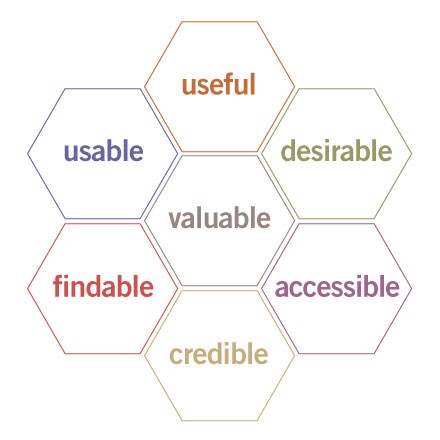
    You don't have to read the entire piece about API design, (I admit, it gets a little ponderous near the end if you are not really, really into APIs), but I wanted to share what I thought was the most interesting and perhaps relevant part of the piece, a diagram called the UX Honeycomb, originally developed by Semantic Studios. The diagram is meant to portray the facets or elements of User Experience, and as you will see, there is much more than 'usability' at play here.


    The point of the UX Honeycomb is to make sure that designers understand the various components that encompass UX, and to also emphasize the center element - 'Valuable'. So while for UX professionals, 'usability' remains important to overall UX, it is not by itself sufficient. And it is also a great reminder that the elements like 'useful', 'accessible', and perhaps most importantly for HR readers, 'credible' remain critical.

    And the way that the elements of the UX Honeycomb seem to have really close applicability to lots of what HR in general and HR technology projects in particular is the primary reason I wanted to share the diagram. Whether it is a traditional HR-led initiative like training, or performance coaching, or rolling out a employee wellness program, or a straight up HR systems implementation, evaluating your approach against these UX elements I think makes a ton of sense.

    Is what you are doing, or trying to get others to do, useful, usable, desirable, credible, valuable, etc.?

    I think you have to be able to check 'Yes' on just about every one of the elements on the UX Honeycomb no matter what the project is, in order to have a chance to capture the attention and the time of your users, employees, and leaders. I am going to keep the Honeycomb in mind moving forward, and I think you might want to as well.

    Anyway, that's it.

    Stay warm out there today.

    Monday
    Aug122013

    The Progressive Service and re-imagining the organization

    There are lots of fantastic aspects of being a college student - the parties, the football games, the almost complete lack of real responsibility when compared to what often comes next - the corporate world, the 9-to-5 grind, and trying reasonably hard not to screw up, (after all, all that fun in college came with a price tag, probably in the form of tens of thousands of student loans to pay off).

    But besides all the obvious fun and cool elements of student life, there is at least one other - the chance to work on projects, develop ideas, and present provocative concepts all safe in the knowledge that these ideas will usually be evaluated mostly on their creativity and inspiration, and not out in the real world where at most organizations they are likely to be met with 'That's not how we do things here' or 'That will never work' or 'Who are you again?'

    And out in the real world massive, transformational organizational re-designs almost never actually happen (and work). There is so much legacy baggage, locked-in contracts and structures, and often a substantial level of resistance to change that the change that anyone tries to make to an entrenched institution is usually incremental and small in nature.  All change is hard. Big change is just about impossible to pull off.

    With all that in mind, I recommend taking a look at a student project that focuses on the kind of massive change that is normally only talked about in the detached, theoretical setting of academia. The below presentation is titled United States Postal Service Thesis, and was created by Tom Calabrese for a Masters program. The deck, which presents some ideas and kind of radical concepts for the US Postal Service of the future, is below, and I'll have a quick comment/challenge after the break.


    Did you click through the deck? What did you think?

    A couple of things stood out to me. One, that providing, for a price, the ability to refine and tailor your own mail delivery preferences is an idea worth pursuing. And two, the more radical idea about somehow connecting the Postal Service social graph to other, more higher value add services and products.

    But the real reason why I decided to post about this was not any of the specific proposals for the USPS, but rather as it was a great reminder that we almost never spend any time thinking about re-imagining our own organizations in a similar manner. Now certainly most of our organizations don't face the same number and type of daunting problems the USPS faces, but it's also certain that we underestimate the problems, (maybe ones that have not yet even manifested), that face our organizations.

    So the challenge is this - what if you could (or had to), completely re-imagine your workplace?

    What if you were to start from a blank sheet, or close to it, and start over?

    What would you keep? What would you let go? What are you doing simply because of inertia and tradition and internal resistance to change?

    What would the 'new' organization look like?

    Have a great week all!

    Friday
    Feb012013

    Off Topic: Infographics of the 1870s

    If you are a data/design/visualization mark like I am, then I apologize in advance for the half hour or so you are about to waste on the amazingly cool A Handsome Atlas site.

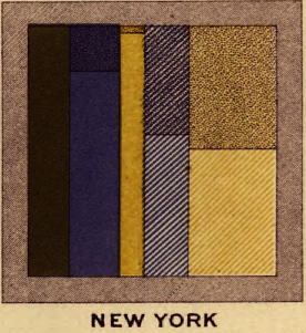
    The clever folks at Handsome Atlas have taken several old government and census documents from the late nineteenth-century, (primarily The Statistical Analysis of the United States, published from about 1870 - 1920), and breathed new life into them, by creating a user-friendly tool for viewing the old works close-up, and in high resolution.New York, 1870

    Don't really get why this is cool?

    Then spend a few minutes looking at this beautiful chart/infographic titled 'Gainful Occupations and also as Attending School' , a look at employment and education across the states taken from the 1870 census data, (a small snippet of this graphic appears on the right of this post).

    The Handsome Atlas site is full of amazingly interesting and detailed data tables, charts, graphics, and visual analyses of demographic, statistical, and economic data that was compiled in the census and published in The Statistical Analysis of the United States. With a big assist to the technology and presentation developed at Handsome Atlas, this data serves to remind us that the current fad and fascination with infographics and data visualization have their roots in the past.

    Infographics and other visualizations help us, mostly, to make more sense of the world - breathing life and creating dimension, contrast, comparison, and most importantly, interest in data sets. 

    We want to better understand the world around us certainly, and that longing and need for understanding is definitely not only a modern phenomenon.

    If you take a few minutes to play around on the Handsome Atlas site, please let me know what you think.

    Have a great weekend!

    Tuesday
    Nov062012

    Mapping the ideal candidate

    Don't worry - this isn't a political post...  

    Just a quick take for one for an Election Day, then we can get back to riling each other up on Facebook.

    I wanted to share this excellent mind map found on the Nordstrom Innovation Lab careers page.  Titled ''What We Want in a Teammate", the mind map is an interesting and novel way for an organization to attempt to communicate what they see are the important traits, characteristics, and behaviors in theor organization.

    Pretty cool, right?  And while I admit to not actually visiting the careers page of every organization in the world, I will state unequivocally that this is the first 'Candidate Profile Mind Map' I have ever seen.

    The Nordstrom Innovation Lab describes itself as "a lean startup operating inside of Nordstrom" and as a place where "We move through ideas quickly, using whichever technologies make sense. Our process incorporates methodologies and practices from Design Thinking, Lean Startup, agile, and lean thinking."

    I don't know much else about the Innovation Lab, including if indeed they are very innovative at all, but I do think it is a smart idea for an older organization in a seemingly un-sexy industry, (retailing), to try and position themselves on their careers site as a place not at all like most potential candidates would expect.

    What do you think - is creating a Mind Map of the ideal candidate a good idea?

    Could you create one for your organization if you tried?

    Note: This Lifehacker piece from a couple of years back has links to several free Mind Mapping tools in case you are interested in playing around with these ideas.