Quantcast
Subscribe!


Enter your email address:

Delivered by FeedBurner


E-mail Steve
This form does not yet contain any fields.

    free counters

    Twitter Feed

    Entries in infographics (3)

    Friday
    Jun212013

    Off Topic: Infographic - Just shut off your stinkin' car already

    What a week.

    SHRM Annual for the first half of the week, then a really gripping and emotionally wringing NBA Finals Game 7 last night. I am pretty much done I think.

    But not so much that I can't spare 5 minutes to share the infographic below courtesy of iturnitoff.com about the costs, and really wastes, of excessive automobile idling.

    I can remember back in the day being told something about how starting a car uses as much gas as a couple of minutes of idling the car - a calculation certainly invented to justify a few Dads of those times wanting to keep the heat or air conditioner on while sitting in the car listening to the end of the ballgame on the radio.

    Check the below inforgraphic for the details of the costs of idling, then I have some comments after the jump:

    From iturnitoff.comThe one element of the infographic that really stood out to me, and the only reason I decided to post it today, is the call-out of the Drive Thru lane as a leading cause of engine idling, and the corresponding pollution, cost, and wastes associated with the practice.

    I hate the Drive Thru lane.

    You have to talk into a clown's mouth, there is almost no chance the person on the headset is paying any attention to you, and chances are pretty good your order will be messed up - but you won't be able to do anything about it because by the time you realize the error you'll be 5 miles down the road.

    I often stop at a local Bruegger's shop near where I live to get coffee and bagels in the morning. Invariably, there is a line of cars snaking around the shop, clogging up the Drive Thru lane. 

    I always park and actually enter the shop, where there is never more than one or two folks in line ahead of me, and since I know all the workers in the shop so well, (from actually going in the store and talking with them so frequently), my order is often already being assembled before I even have to ask for it.

    I am in and out of there in a couple of minutes and meanwhile the line of SUVs and Minivans has maybe, collectively, inched forward a car length or two. Look, I get why people like the Drive Thru. We sometimes have kids in the car, the weather is nasty, or parking is not convenient. But most of the time it is just an excuse to stay in our little cocoons by ourselves a little longer.

    And that is cool, that is a valid reason. I don't always feel like talking to the guys in Bruegger's either. But that decision, that choice to remain tuned out, well that comes with a price measured in wasted gas, wasted time, and wasted opportunity to get to know the folks that live and work in your neighborhood.

    Ok, that's it. Rant off. Time for more coffee.

    Have a great weekend!

    Friday
    Feb012013

    Off Topic: Infographics of the 1870s

    If you are a data/design/visualization mark like I am, then I apologize in advance for the half hour or so you are about to waste on the amazingly cool A Handsome Atlas site.

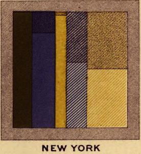
    The clever folks at Handsome Atlas have taken several old government and census documents from the late nineteenth-century, (primarily The Statistical Analysis of the United States, published from about 1870 - 1920), and breathed new life into them, by creating a user-friendly tool for viewing the old works close-up, and in high resolution.New York, 1870

    Don't really get why this is cool?

    Then spend a few minutes looking at this beautiful chart/infographic titled 'Gainful Occupations and also as Attending School' , a look at employment and education across the states taken from the 1870 census data, (a small snippet of this graphic appears on the right of this post).

    The Handsome Atlas site is full of amazingly interesting and detailed data tables, charts, graphics, and visual analyses of demographic, statistical, and economic data that was compiled in the census and published in The Statistical Analysis of the United States. With a big assist to the technology and presentation developed at Handsome Atlas, this data serves to remind us that the current fad and fascination with infographics and data visualization have their roots in the past.

    Infographics and other visualizations help us, mostly, to make more sense of the world - breathing life and creating dimension, contrast, comparison, and most importantly, interest in data sets. 

    We want to better understand the world around us certainly, and that longing and need for understanding is definitely not only a modern phenomenon.

    If you take a few minutes to play around on the Handsome Atlas site, please let me know what you think.

    Have a great weekend!

    Friday
    Jul272012

    Off Topic - A Better Way to Share Your Bio?

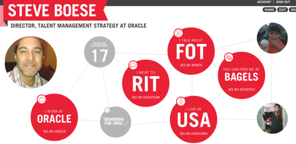
    Grinding to the end of a long week and was close to bailing on the Friday post, (Shock!), and then late last night I caught this piece on Mashable, 'Turn Your Personal Data Into an Interactive Infographic', and clicked through to Vizifiy, a new service that takes your social footprint, (at least the parts on Twitter, LinkedIn, Facebook, and Foursquare), and turns it into a neat, interactive, multi-page infographic.

    Here is the summary page of my Vizify bio: (click for a larger image)

    I've seen a few of these kinds of dynamic, graphical profile builders before, but I think I like Vizify the most of what I have seen so far because it's multi-page design sort of takes the viewer through a bit of a story - from a clickable summary, to professional history, to a set of keywords used frequently on Twitter, and even to a view of the places most frequented as interpreted from Foursquare check-ins.

    Most of the individual pages can be edited by the user, as well as the display order and some of the content of the auto-generated pages, that again are pulled from existing information on LinkedIn, Twitter, Facebook, and LinkedIn. But even with that limited capability to shape or personailze the Vizify infographic, it still does present personal, social network information in a cool and interesting way.

    I know, before you get all up in my grill, I know the traditional resume is a long way from being rendered irrelevant by fancy infographic tools like Vizify, or even the more pedestrian and accepted LinkedIn profile.  But one day, eventually, and maybe because this is just me wanting this to be true so I don't ever have to help my 11-year old son write a ridiculous two-page summary of his life one day, I hope that tools like Vizify, and whatever comes next, will eventually serve as a suitable and more complete personal history/bio/reflection and then all the resume coaches can finally find something better to do with their time.

    Vizify is still in beta, you can sign up for an invite here, let me know if you get a chance to play with the tool and what you think about the dynamic, infographic profile replacing the traditional resume?

    Have a Great Weekend!