Quantcast
Subscribe!


Enter your email address:

Delivered by FeedBurner


E-mail Steve
This form does not yet contain any fields.

    free counters

    Twitter Feed

    Entries in design (54)

    Monday
    Oct172011

    It's great to be alive! Until you're run over by a train.

    The always awesome 'How To Be a Retronaut' blog had another classically amusing piece recently called 'It's Great to Be Alive! Vintage Safety Manual.' The piece, (and you really should go and check it out), features a series of images from a 1940s era safety manual aimed at elementary school age kids. I've placed two of the images (hope that's ok), alongside this post.

    What's interesting about the manual, and probably the reason 'Retronaut' ran a piece about it, is the remarkable and amusing and immediate shift in tone from the cover and title page extolling the wonders of being not just alive but Alive!, to a macabre series of images of destruction, carnage, and death.

    Page after page of accidents, tragedy, and the horrific after-effects of distracted children (mostly on bicycles), having painful encounters with cars, trains, other kids on bicycles - essentially anything and everything a kid in the 40s or 50s could smash a bicyle into. Add in a nice 'creepy stranger in the movie theater' warning, and you've got a nice tight illustrated primer to the dangerous world awaiting any kid crazy enough to venture outside.

    And of course after reading about the 50 ways you can get maimed or killed on your bicycle, the entire (surface at least), purpose and message of the guide, 'It's Great to be Alive!', is completely lost; replaced with the more lasting impression of 'Chances are if you leave the house you'll be horribly injured.' Sure, the authors wanted to try and impress upon kids reading the manual that they needed to be careful and aware, (especially near trains, cars, trucks, power lines, bicycles, other kids, and well, everything), but with the over-the-top and relentless focus on pain and tragedy the entire 'It's Great to be Alive! notion is pretty effectively forgotten. It might be great to be alive, but it's far worse to get run over by a bus and crack your skull.

    Ok, so here's the hook back to the real world, and not the real world depicted in the chaos and mayhem of our little manual, but the one where we have to communicate with colleagues, peers, candidates, customers, anyone really. It could be our external candidate messaging about how fantastic it is to work in our organization followed up with an uneven, non-responsive, and unwelcoming application and communication process. Or perhaps it's a fantastic and high-touch recruitment experience that morphs into a cold, standard, and rote onboarding process that leaves the new joiner wondering if she made the right decision after all. Or it even could be the 'official' employee manual that spends most of its (probably unread) pages telling people what not to do, and the kinds of trouble that await them, (like getting maimed by a wayward delivery truck), if they transgress.

    Truth is, we kind of get used to the negative spin on things. We see it in politics, in the rules and regulations posted all over the place, and it can be easy to see the risk and danger in situations instead of the opportunity and adventure.

    But after a while, maybe even a short while, we start only to see the world in these kinds of negative terms, to see new employees, especially ones with a Twitter account as potential sources of embarrassment.  

    After a while, too much focusing on what bad things might happen, and every bicycle ride starts to look like a flirtation with disaster.

    Monday
    Sep262011

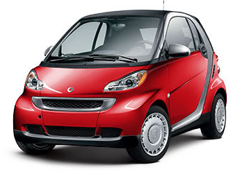
    A Good Idea is Just an Idea, or Why You are Not Driving a Smart Car

    You've probably seen, or if you don't live too close to a major urban area, have at least heard of a relatively new vehicle known as the Smart Car. The Smart Car, designed to be a highly fuel-efficient and easy to maneuver and park utility vehicle, (obviously important in many U.S. cities), debuted in America a few years ago, and reaching its sales peak in 2008, just as domestic gas prices were soaring.

    The Smart Car is not just 'smart', but its also quite small. Almost incredibly, jarringly, and even disorienting small. To put the Smart Car in perspective, the length of a 2011 Honda Accord is about 195 inches , for the Smart Car you are looking at about 106 inches. Or for another frame of reference, Kareem Abdul-Jabbar stands at about 86 inches.

    But from its peak in 2008, Smart Cars have in the last few years seen a gradual, yet steady decline in awareness, interest, and sales. The most recent annual estimate was about 6,000 Smart Cars were sold in 2010.

    The parent company of Smart, Daimler, has recently announced that Smart Cars will be the beneficiary of a new national advertising campaign, and has also indicated the dealer network in the U.S. will expand from 75 to 100. While this is good news for fans and employees of Smart, only time will tell if these measures can turn around the flailing brand. 

    Even for a truck driving, HR Mini scoffing, traditionalist like me the Smart Car seems like it would be kind of fun to drive. So why are sales in a free fall?

    And why should you care about the (short) rise, fall, and uncertain future of the Smart Car?

    Well to me, the story offers a few interesting angles, the foremost one a lesson about how an idea, even an idea that seems like it should succeed, often needs much more than its own cleverness to make any kind of a lasting impact. My most measures, the Smart Car really should be a success. It is extremely economical in purchase and in operating cost, its diminutive dimensions make it a perfect vehicle for urban settings, and its quirky uniqueness caters well to the 'look at me and what I'm driving' constituency among us.  The Smart Car website contains scores of pictures of happy Smart owners, (many with highly personalized modifications of the base vehicle that emphasize its flexibility and fun.

    But even with all these attributes going for it, the Smart Car is in trouble. And the main reason is that the brand managers have allowed pre-perceptions, often inaccurate ones particularly about the vehicle's crash-worthiness, dominate potential customers and the public's views of the car. People look at the tiny car and often reflexively conclude there's no way I'd be safe in a car so small. 

    And that is kind of too bad, because despite what really is a cool idea - economical, agile, quirky urban transportation, the Smart Car might soon become a footnote, albeit a small one, in automotive history.

    The Smart Car was, and I suppose still is, a really good idea. Too bad for Smart, the company has not quite realized a good idea in only step one on the long march to success.

    Monday
    Sep192011

    Used as Delivered: Why Grandma's VCR was always blinking 12:00

    One of the best features of most modern technologies, whether designed for use inside the enterprise, or for consumer or leisure time pursuits, is the flexibility, adaptability, and personalization capability of these solutions or devices.

    Software programs are usually almost infinitely customizable - with a myriad of settings and options that users can manipulate and alter to suit their unique needs. Newer gadgets like smartphones and tablets are replete with their own sets of menu and option settings, and the applications and programs we load onto these devices typically come with their own options and opportunities for us the users to shape the behavior and functionality of these applications to meet our needs. Choice - and the ability to form, create, and adapt our computing and technological environments to our precise needs has never been more within our grasp.

    In fact, particularly in software solutions designed for and sold to enterprise and corporate users, this ability to 'shape' or personalize the technology to meet company, work function, and even individual needs is quite often touted as one of the most attractive and beneficial features of the solution.

    Certainly, enterprise software companies can't predict and thus design for all the potential differences and nuances in organizational processes, practices, and preferences; thus by building in the capability for end users to maintain some control of the operation and interface of said software solutions, they can offer the benefits of almost custom or bespoke applications, but still with the reliability, structure, and process discipline of good enterprise software.

    But does all this flexibility and personalization capability in both enterprise and consumer technologies and devices really get exploited by the majority of end users to tailor their experiences, and be extension, improve the utility of these solutions and gadgets? Well chances are, not so much. Check some of the observations about software users and default settings from a study of Microsoft Word users on the User Interface Engineering blog:

    We asked a ton of people to send us their settings file for Microsoft Word. At the time, MS Word stored all the settings in a file named something like config.ini, so we asked people to locate that file on their hard disk and email it to us. Several hundred folks did just that.

    We then wrote a program to analyze the files, counting up how many people had changed the 150+ settings in the applications and which settings they had changed.

    What we found was really interesting. Less than 5% of the users we surveyed had changed any settings at all. More than 95% had kept the settings in the exact configuration that the program installed in.

    This was particularly curious because some of the program’s defaults were notable. For example, the program had a feature that would automatically save your work as edited a document, to prevent losing anything in case of a system or program failure. In the default settings for the version we analyzed, this feature was disabled. Users had to explicitly turn it on to make it work.

    Of course, this mean that 95% of the users were running with autosave turned off. When we interviewed a sample of them, they all told us the same thing: They assumed Microsoft had delivered it turned off for a reason, therefore who were they to set it otherwise. “Microsoft must know what they are doing,” several of the participants told us.

    I think there is some really useful advice in this little experiment with MS Word users, while building in flexibility and options and choice is certainly important in any modern software solution or new device, those of us involved in building or deploying these kinds of technologies should keep in mind it is likely only a very small minority will leverage the flexibility and personalization features we tout so stridently and spend so much time developing.

    While choice, options, and freedom to adapt technology are all necessary components in the modern enterprise and consumer software age, let's not forget there is quite a lot to commend software and hardware solutions that simply work. Turn them on, activate them, answer a few questions in configuration sure - but the sooner solutions can start solving business problems and delivering positive impact to users, without asking users to morph into armchair software developers is really the hallmark of a great solution.

    So I'll toss the question out to the readers - how important is flexibililty and personalization in your technologies and how important is it to you for them to simply work right away?

    Tuesday
    Sep062011

    How much does differentiation matter?

    When your job is designing and delivering a product or service to the market it is altogether fitting and expected that you'll take an initial and then periodic view of the competitive landscape for said product or service to see how your offering stacks up in the marketplace, and to attempt to find and exploit perceived weaknesses and differences that (hopefully), present your solutions and services in the most positive light.

    It just makes sense, and is typically a fundamental piece of any company's 'go to market' strategy. What is the other guy doing? What features does their product have? Should we build those features too? What does our solution provide that the other guy can't match? And how do we best communicate and reinforce those differences that we 'win' on in the market so that there is no confusion about why our products and services are better?

    But sometimes, perhaps more often that we like to think, we focus too much on what our competitors are doing, saying, building, etc.; and not enough on what our current and potential customers are saying and doing with our products. 

    Last week I caught a really interesting piece on the Fast Company CoDesign site titled 'Think You're An Industry Leader? Not So Fast', that makes an interesting point - that often as product and service designers and implementers, (and that for the most part is everyone working in Human Resources, recruiting, HR Technology, and so on), that this primary focus on competitors detracts from what should really be our true goals - to understand the customers, to empathize with their problems and challenges, and to build systems and solutions to address their needs primarily.

    From the CoDesign piece:

    This is the first mistake organizations make when thinking about digital interactions with their customers. They measure themselves against the competition instead of really understanding what their customers actually need.

    How can you improve your understanding of customer needs? By connecting with customers more deeply and in ways that move the dialog beyond simple check the box RFP exercises.

    Again from CoDesign:

    In short, you gain empathy for them, (customers). Great applications are created by those who fully empathize with the user’s needs. Our team must walk a day in the life of the person they are designing for and act as a proxy for the user in the design and integrations processes. I was once asked, “Is there such a thing as a stupid user?” The answer is no; there are only ignorant designers. Any good designer will tell you there’s no such thing as user error -- anything the user can’t figure out is just bad design.

    It is not easy, I think, to try and lower your sights against your competition. After all, in most purchase decision processes the customers pick one 'winner', while leaving the also-rans to contemplate the reasons why they did not win the contract and secure the customer's business. Perhaps the first step into really thinking more from the customer's point of view is to frame these kinds of post-mortem discussions less in terms of 'Why Did Company 'X' beat us?' and more in terms of 'What customer problem were we unable to solve?'.

    What do you think - would more time being spent on understanding and truly empathizing with your customers and less time worrying about Brand 'X' help your business?

    Tuesday
    Aug092011

    Don't try to be original...

    Browsing through the Google Reader early this morning and came across this piece on the CoDesign blog highlighting a sweet infographic on typography.  Sure I know that infographics are really close to Jumping the Shark right now, but at least this one is actually focused on graphics and typefaces, and not just an elaborate and link-baiting way to show some simple statistics or bar charts that I thought it was worth featuring.

    For many, the selection of fonts or typefaces is kind of a random act - we know we shouldn't choose Comic Sans under any circumstances (you do know that right?), but after that if we occasionally wander from the default Times New Roman font it is usually a crapshoot what choice we land on.  Arial? Verdana? Something something serif?

    Who knows? And does it matter, really?

    Well typefaces can influence your message - and these handy infographics might help you to better understand what effect your choices about type could have upon your content, (these images were pretty big, click the thumbnails below to view the full-size versions).


    What I like about the charts is how the designer managed to simply connect a style of type, say 'Modern Serif', with a feeling or expression of the connotation that style suggests, in this case 'Glamour'. 

    In addition to these relational connotations between typefaces and content, the charts also offer some simple suggestions on the design and layout of documents and displays of text and graphical information.

    But besides all that, and the real reason I decided to post about these charts here, was the closing statement that wraps up the second infographic. I'll repeat it here in case the infographics don't render fully for email and RSS subscribers.

    'DON'T TRY TO BE ORIGINAL, JUST TRY TO BE GOOD.'

    Sort of a different way of saying, don't overthink your choices in design and typography, and it suggests there could be some danger in trying too hard to create something so new and never before seen that a designer or communicator could ultimately detract from the message.  I think it is good advice for more than just font choices - it can be really easy to obsess on 'original' or 'ground breaking' at the expense of 'good'. I know I have fallen into that trap sometimes when designing presentations, getting caught up for hours on the images and the text alignment and fonts. Ultimately if what you have to say or communicate is good, really good, the design stuff probably matters less. 

    If the message and writing connect with your audience in a meaningful way, then it probably doesn't matter too much if the font is geometric or serif or extra chunky. 

    Just as long as you don't choose Comic Sans - no way you are overcoming that.