Quantcast
Subscribe!


Enter your email address:

Delivered by FeedBurner


E-mail Steve
This form does not yet contain any fields.

    free counters

    Twitter Feed

    Entries in innovation (26)

    Thursday
    Jul142011

    Need a Creative Solution? Check out the HR Happy Hour Tonight

    It is just about the middle of summer here in the USA, the Major League Baseball All-Star Game was played earlier in the week, most of the country has been experiencing classic July sunshine and heat, and the latest installment of the Transformers movie franchise, a classic summer action movie, is dominating the box office. Due to staff vacations, distractions caused by the good weather, and from having the kids home from school, summer can also be a time where the pace of business slows down a bit, and individuals and organizations sometimes have a rare chance to reflect, recharge, and strategize about business and even personal problems that will have to be attacked in earnest in the Fall, (if not sooner).

    Summer also gives us some license to explore and experiment. Traditionally TV networks have tested out new programs in the slower, (and less lucrative), Summer season in hopes of sorting out what might work in the Fall and Winter when audiences and ad rates both increase. Simply put, summer is about the only time all year many of us get to take a little breather, take some stock in what we are doing, (or not doing), and think about what we might want to do differently, or what challenges we'd love to address.

    So tonight on the HR Happy Hour Show, we decided to do a bit of 'Summer programming' as well. Instead of another run at recruiting, or HR Technology, or management, or social media in the workplace, we are taking a bit of a diversion with a show called 'Creative Approaches', with our guest Matthew Stillman, author of the fantastic Stillman Says blog.

    Matt offers what he terms, 'Creative Approaches to What You've Been Thinking About', by listening to the problems and concerns of everyday people, and via a process of discussion and exploration, offers what are usually challenging and intriguing options and opportunities to help his 'patients?', try and approach their issues.  The killer idea of Stillman Says, is the venue in which Matt conducts these sessions - a simple table and two chairs in the middle of New York City's Union Square. He then documents some of these conversations on the Stillman Says blog.

    It really is a remarkable and compelling project, read a few of the stories on the Stillman Says blog and see if you don't agree with me.

    So tonight on the HR Happy Hour Show - 8PM EDT / 5PM PDT, Matt will join us for the hour to offer 'Creative Approaches to What You Have Been Thinking About' - this is your chance to call in, tell us about a situation or problem - work, career, school, personal - doesn't matter, and let Matt work a little bit of his creative magic to brainstorm some creative options for you.

    Problems with the boss? Not sure if you should pursue a new career? Have a great idea and just don't know how to execute? Call in tonight and let us know.

    Here are the details to tune in tonight:

    HR Happy Hour Show - 'Creative Approaches' - Thursday July 14, 2011 - 8PM EDT

    Call in to ask a question - 646-378-1086

    Follow the conversation on Twitter - hashtag #HRHappyHour

    Listen live on the show page here, on the call in line 646-378-1086, or using the widget player here:

    Listen to internet radio with Steve Boese on Blog Talk Radio


    This should be a fun and entertaining show, and I hope you can take a break from margaritas on the deck long enough to join us. Actually, you should bring the margaritas, it is the HR Happy Hour after all!

    Monday
    Nov082010

    Where can we find someone that knows...

    Check out the embedded map below (email subscribers may need to click though).

    It is from a free service called Map My Followers, a site that presents a mashup of information about a given user's followers on Twitter, superimposed on a Google Map.

    The image above presents a visual representation of a sample of 100 of the folks that follow me on Twitter, overlaid on the standard Google map, and hovering on the little marker for each person pops up their Twitter name as well.  On the lower right, a tag cloud of common terms from my followers profiles is displayed, which provides additional insight (beyond geography) of these 100 followers interests.

    Sort of neat, kind of cool looking, and quite honestly the kind of capability, presentation, and wow factor usually lacking in the traditional workforce analysis tools that attempt to perform similar functions. 

    Imagine if you were the person in charge of sourcing and staffing a project team to support some new organizational initiatives.  Factors like geography, skills, interests, availability, and prior experience would all come in to account as you attempted to assemble the team. Instead of a map of Twitter followers, your 'map' would be sourced from core HRIS information,  internal talent profiles, internal skills inventories, and perhaps even insight from the CRM system (as to the size and strategic importance of the opportunity), and augmented by your database of external talent (maybe even a custom LinkedIn or boolean search result on top of that).

    Build in more advanced filtering capability and have the tag cloud on the right be user configurable and actionable (let me click on a tag and have the mashup highlight all the people that match that tag), and now you have the start of more dynamic and adaptable tool for insight and action into the workforce (and perhaps even all the available and accessible talent).  Make hovering over the map marker pop up a lightweight bio, with essential information displayed, and include the ability to quickly contact the person via email, IM, or even a Tweet.

    I love checking out all these new and innovative services that seem to be proliferating lately, the cleverness and industry these developers show simply by accessing open APIs and re-imaging the data is outstanding.

    What I don't love is after spending a lunch time playing with a cool site like Map My Followers is having to try to piece together similar organizational insights in an aging set of enterprise tools that were designed in a different age.

    Friday
    Aug272010

    Redesigning Everything

    I am totally fascinated with a contest called the 'Dollar ReDe$ignProject'.

    The project, organized by brand strategy consultant Richard Smith, is a tongue-in-cheek attempt  to revitalize the American economy via a 're-branding' of some of our most visible and tangible manifestations of economic activity, the set of US Federal Reserve notes.

    From the 'About' section of the Project site:

    It seems so obvious to us that the 'only' realistic way for a swift economic recovery is through a thorough, in-depth, rebranding scheme – starting with the redesign of the iconic US Dollar – it's the 'only' pragmatic way to add some realistic stimulation into our lives! Therefore, you must take part and we really want to see what YOU would do.

    Various designers, students, folks that like to play around with Illustrator and Photoshop have offered their suggestions for redesigning the set of bank notes that for the most part still maintain their basic design structure from the 1930s.

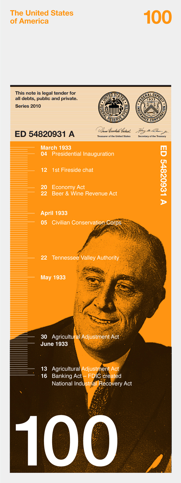
    One interesting example from the contest, submitted by the graphic design firm Dowling Duncan is on the right.  Their designs for the various notes and denominations attempt to link the face value of the note to an historically significant figure or event. In the example on the right, the re-imagined $100 note refers to President Franklin Delano Roosevelt's famous 'First 100 Days', when a number of significant legislative actions were approved to combat the economic depression of the 1930s.

    Besides the collection of really engaging, creative, and amusing submissions (somewhere in there you can find a 'Steve Jobs' $50 bill), the project and the enthusiasm of the design community to participate reveal some interesting lessons that I think could be relevant in an organizational setting as well.  

    Sacred cows - What 'wrong' with the $1, $5, or $100 bills?  Well I suppose nothing.  But could they be improved? Absolutely.  Could that improvement actually drive downstream benefits far beyond the redesign itself?  Quite possibly. But unless the attempt is made, you'll never know.  

    The crowd - Sort of an obvious conclusion, and one that doesn't need to be pointed out yet again.  Or does it?  It still seems to me that more organizations and even smaller divisions in organizations don't do a great job soliciting ideas from their version of the 'crowd' for improvements, creative ideas, and even feedback. Making the submissions public, improves the process as well.  The better ideas surface more readily, more people can get involved in improving the ideas, and the entire process gains more relevancy and a larger degree of trust. For almost every issue, someone out there is passionate about it, and likely would want to get involved if given the opportunity.

    Fun - Looking at the redesigned currency is fun. Creating the designs certainly had to be fun for the firms and individuals that have participated.  Even judging the contest I imagine is going to be a blast. What is wrong with a little fun in the organization? Unless you are in one of the lucky (or smart) organizations that has managed to navigate the last few years unscathed, introducing a bit of fun into the routine would be most certainly welcome.

    What do you think?

    Is redesigning the dollar bill a good idea? 

    Monday
    Jun072010

    The Talent Wheel

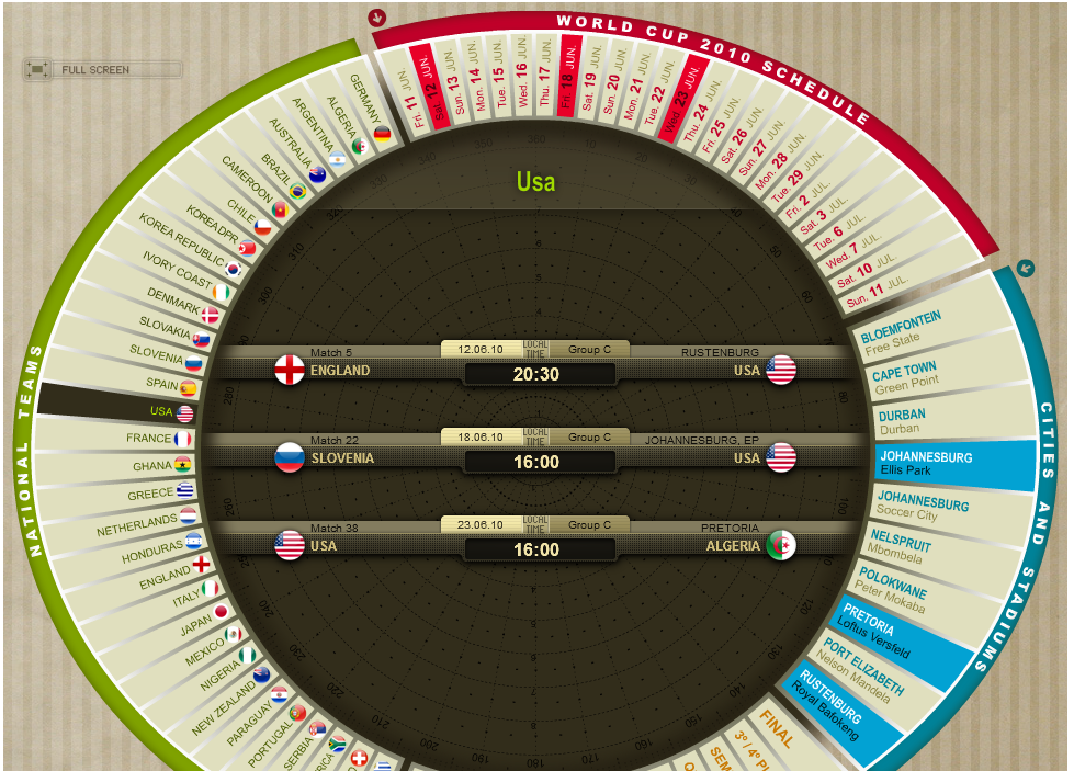
    Yesterday Mike VanDervort sent me a link to this, a really powerful, yet simple graphical and interactive World Cup schedule calendar tool.

    The image at right is a screen shot from the interactive tool, but the image alone really does not do it justice, I recommend taking a minute or two to check out the site and try out the graphical calendar.

    In a simple, one page display the calendar allows the user to display data about the World Cup schedule in several dimensions - by participating country, by Group, by date, location of the stadiums, and by stage of the tournament.

    For example, clicking on a country name on the left hand side of the wheel displays that team's scheduled games with date and time information, highlights the locations of the games and their dates.  Alternatively, selecting a specific date on the wheel will display all the games for that date, with teams, time and location information highlighted.  

    For a World Cup fan, the calendar is a bit addictive.   

    After playing with the tool for a bit I wondered if the ideas from the powerful, simple, and kind of fun application of the World Cup calendar could be applied in the workforce technology context. Imagine the sections and spokes on the wheel begin populated with organizational dimensions like functional department or region, core competencies or specific skill sets, current or future major organizational initiatives or projects, and perhaps details like past performance appraisals or position in talent pools for succession plans.

    As a project manager or business leader looks to staff a project, or find a potential candidate to fill an important new role, he/she could navigate the 'Talent Wheel', highlighting the relevant skills, experiences, or other important information from the spokes of the Talent Wheel.  The tool would then present the relevant information in the center of the wheel for display or optional export. 

    Or perhaps the Talent Wheel could be configured to better reflect and display organizational reporting relationships in today's large and much more complex matrix structures.  Since organizations and workforces are much more complex than the schedule of a sports tournament, perhaps the wheel could be designed to accept a few input parameters before the display is actually generated, allowing the user to narrow or more precisely design the Talent Wheel.

    Either way, I think the main points to consider are these - the World Cup calendar presents moderately complex, multi-dimensional data in an interesting, powerful, interactive, and fun manner.

    Can you say the same thing about the systems that you are using to analyze workforce data?

    Or if you are a designer of such systems, are the tools you are creating as engaging to use as the World Cup calendar?

    Do your users actually have fun using your solution?

    Thanks Mike for pointing this out - it is surely an addictive site!


    Print


    Thursday
    May272010

    The Vernon Farm Calculator

    For the last few years there has been much said and written about the importance of accurate, timely, and relevant workforce data to support and guide managerial decision making and to ensure that human capital strategy is aligned with and can enable the execution of business strategy.

    It is an easy argument to make, but certainly a much more difficult promise to deliver. In large organizations workforce data tends to be scattered across a wide set of disparate systems, from ERP, to ATS, to possibly Talent Management tools. Not to mention the scores of offline spreadsheets and databases maintained by HR and and line managers.  How many mid-size to large organizations out there are still calculating and processing employee annual salary updates on a slew of manually distributed Excel spreadsheets?  Go ahead and admit it, you are certainly not alone.

    And even if the organization does have the technical capacity to collect and begin to analyze this information, it can be a challenge to present, communicate, and deliver the data in a meaningful way to the people that the information benefits the most - the line managers, supervisors, and front-line in the trenches folks.  Their need to make better informed decisions about how to leverage existing capability and how they may need to develop new capability to deliver customer service, create opportunities, engage employees is essential, and all the best data collection and and analysis tools will fail if the delivery mechanism does not resonate with these key users.

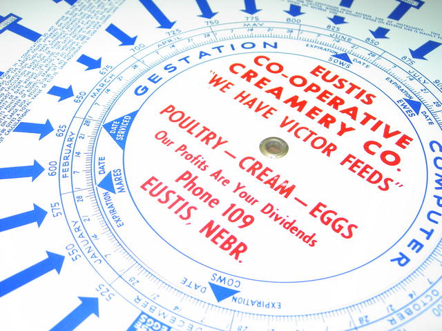
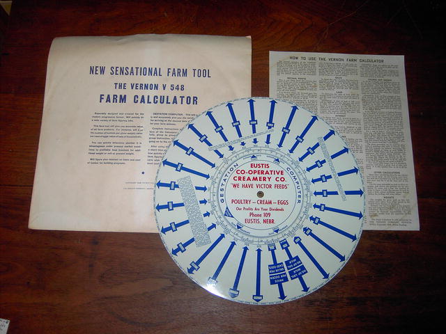
    The image at right is something called The Vernon Farm Calculator.  It was manufactured in the 1940s as a tool to provide farmer's with ready access to important information about crop sizes, unit of measurement conversions, yield calculations, and a host of other important data points that the average out in the trenches farmer would need to analyze, assess, and then execute his or her strategies to arrive at the best possible outcome.  Sounds a bit like what today's managers need to do as well, just substitute mares, bushels of corn, and the combine's last service date with employees with a certain skill, production schedules, and historical sales data.

    I think as designers and implementers of information systems we can learn a few things about the delivery of essential intelligence to our users from the design of the Vernon Farm Calculator.

    Portable

    The calculator is designed to be a portable, carry along with you or toss it on the front seat of the truck kind of tool. When the farmer is out at the barn or in the fields and needed to do a quick calculation about pigs, or wheat or whatever, he or she did not need to stop what they were doing, drive back to 'Farm HQ' or even worse, put in a request to the Farm's HR or IT department to run a report.  And as an added bonus, the calculator was made of tin, not cardboard, which ensured it would stand up to the rigors of the farm environment, and not need to be 'upgraded' or 'maintained' all that often.

    Multi-use

    The calculator did not just serve one purpose, it informed the farmer across a wide range of important data types that all taken together were going to be critical to the overall success of his enterprise.  He or she did not need to carry around one 'tool' for assessing crop amounts and another tool to calculate the expected marketplace value of the new set of pigs.  The folks at Vernon had to have consulted with real farmers and gotten to know the wide range of information that they would need to make the calculator a useful and practical resource.

    Simple

    The Vernon Farm Calculator came with a one-page user guide.  Sure, the print was kind of small, but all the essential information for the average farmer to be able to get information and insight to help run the farm was on one page.  And better still, important operational instructions for some of the more complex features of the tool were printed directly on the face of the tool itself.  So in many instances there was no need to refer back to the one-page guide.  I think that this kind of simplicity in operation, the ability to distill the important features and instructions to their base level, and the capacity to put the most needed 'help' information in plain sight are all lessons in design that can be taken from the farm calculator.

    Relevant

    The farm calculator was only about one thing, providing the farmer with easy access to information that would help him or her have a better chance at succeeding in their business.  That's it.  There is no extraneous functionality, no clutter, nothing that detracts from the design and the ultimate delivery.   I think we can also take a lesson here, it the information or the hot new feature that we think, as designers or implementers think is wonderful, if it truly does not directly assist the managers in making decisions needed to execute their business, then it surely is superfluous.

    That's it - the end of a too long post about a 1948 Farmer's tool.  Those farmer's were on to something for sure.


    Print


     ___________________________________________________________________________________

    Note - The Vernon Farm Calculator is an example of what is called a Volvelle.  Volvelles have been around for hundreds of years, you can learn a bit more about them here.