Quantcast
Subscribe!


Enter your email address:

Delivered by FeedBurner


E-mail Steve
This form does not yet contain any fields.

    free counters

    Twitter Feed

    Entries in trends (16)

    Friday
    Jul272018

    Job Titles of the Future: Chief Non-alcohol Beverages Officer

    A quick dispatch for a middle of Summer Friday from the often-imitated, easily duplicated Job Titles of the Future series. For the latest offering I submit a job title I've never seen before - 'Chief Non-alcohol Beverages Officer'. For details, see this piece from Fortune:

    American beer drinkers keep shunning Bud, and Anheuser-Busch InBev is going to extreme measures to meet their changing tastes.

    The brewer announced Thursday that revenues in the U.S. had slumped by 3.1% in the second quarter as sales of its major brands—Budweiser and Bud Light—continued to drop. U.S. beer sales dropped 5% by volume.

    At the same time, it announced that it will create a new executive position—chief non-alcohol beverage officer—as a response to Millennials and “Generation Z” drinking less than their elders. Lucas Herscovici, currently global marketing VP of strategic functions, will fill the role. Nonalcoholic drinks constitute some 10% of AB InBev’s volumes, and it’s aiming to boost the proportion of low and no-alcohol sales to 20% of the total by 2025, reports theFinancial Times. But in the second quarter, the category fell a damaging 43%, according to The Wall Street Journal.

    This announcement about the new C-Level job role from Anheuser-Busch InBev was interesting to me for three reasons:

    1. It shows, at least at the surface, that the organization needs to react to changes in customer attitudes, tastes, and preferences with a significant and high-level talent/people strategy response. In the past, I guess forever, Anheuser-Busch InBev didn't need to consider this market and this role. Their business was selling beer. Now their business is changing to one that is more about meeting the customer's needs/desires for refreshment - a wider, deeper, (and maybe for them in the long run), a more lucrative market.
    2. This shift in Anheuser-Busch InBev's business is another great example and reminder of the challenges that all kinds of legacy, established businesses have when trying to adapt to shifts in customer attitudes. The company knows that it needs to focus more on non-alcohol beverages moving forward, but at the same time has to try and protect and strengthen its core, legacy regular beer business. Becoming more nimble and agile to chase new markets while at the same time having to rely on declining core businesses for profits and cash flow is the classic big company challenge. I am a fan of many Anheuser-Busch InBev products, so I am hoping they navigate these challenges successfully.

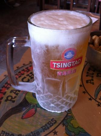
    3. It's the summer, it's just about the weekend, and an article about a beer company essentially just drew me in. Hope you have a great weekend, have a cold one if that's your thing, and Cheers! 
    Thursday
    Dec072017

    Color of the Year 2018

    In the continuing tradition of 'If it interests me, it must be interesting to other people too' that explains just about everything that gets covered on this blog, it is once again time to examine one of my favorite and recurring topics - Pantone's 'Color of the Year' choice.

    I continue to be completely, and probably irrationally fascinated with Pantone's 'Color of the Year' designation and process.

    In case you are unfamiliar (shock!), with Pantone and the Color of the Year designation here is all you need to know. Pantone is the world's leading authority on color, color systems, and publishes the industry standard definitions of colors. In other words that nice new orange shirt you just bought is not just 'orange' it is 'Pantone Persimmon Orange 16-1356 TPG'. Pantone provides guidelines and definitions for thousands of variations of colors, and it is the standard by which colors are classified.

    Each year the color experts at Pantone declare one specific shade the 'Color of the Year'. This specific color, (in 2017 it was 'Greenery' in case you did not know), is meant to be a kind of reflection of trends in art, design, fashion, movies, popular culture, and branding and often will subsequently become more common in actual products like clothing and jewelry as a result of the Color of the Year designation. So perhaps if you think back on 2017 and think you have seen a lot of Greenery around - sort of a vibrant shade of medium green, you have Pantone to thank or blame for that.

    So this week Pantone announced its choice for Color of the Year for 2018 a deep, intense, and saturated  hade of purple called 'Ultra Violet' - aka Pantone 18-3838.

    The rationale behind this choice of of Ultra Vilet for color of the year?

    Here's what Pantone's color experts had to say about the selection: (side note, isn't 'Color Expert' one of the coolest job titles ever?)

    A dramatically provocative and thoughtful purple shade, PANTONE 18-3838 Ultra Violet communicates originality, ingenuity, and visionary thinking that points us toward the future.

    Complex and contemplative, Ultra Violet suggests the mysteries of the cosmos, the intrigue of what lies ahead, and the discoveries beyond where we are now. The vast and limitless night sky is symbolic of what is possible and continues to inspire the desire to pursue a world beyond our own.

    Enigmatic purples have also long been symbolic of counterculture, unconventionality, and artistic brilliance. Musical icons Prince, David Bowie, and Jimi Hendrix brought shades of Ultra Violet to the forefront of western pop culture as personal expressions of individuality. Nuanced and full of emotion, the depth of PANTONE 18-3838 Ultra Violet symbolizes experimentation and non-conformity, spurring individuals to imagine their unique mark on the world, and push boundaries through creative outlets.

    So what, if anything, should any of us care about what Pantone says about culture, trends, society, fashion, and how we all are collectively feeling - expressed through the colors we are seeing and using more and more?

    I suppose the main thing to think about is right in the verbiage Pantone used to describe their thinking processes behind the selection. The words awareness, mindfulness, and creative inspiration all show up in the description. Pantone is suggesting that the colors (and feelings) we will seek in 2018 will be ones like Ultra Violet, a color that (if such a thing is possible), will help to make us feel more open to creative expression, reflection, experimentation, and non-conformity and more inspired to take on the world perhaps.

    No matter your personal point of view, it is pretty fair to characterize 2017 as a kind of an unusual year. The US economy continues its amazing recovery 2008 lows (the recession now seems so long ago it is hard to remember it at times), unemployment seems likely to move under 4.0%, and measures like the stock market and corporate profits seem to indicate the good times are not yet close to ending.

    But lots and lots of folks are not sharing equally, if at all, from this recovery and growth. And of course the things that are happening in politics and with corporate/business scandals (looking at you Matt Lauer), remind us all that even in seemingly 'good' times that there will always be work to do.

    Pantone thinks/hopes that Ultra Violet will 'take our awareness and potential to a higher level. From exploring new technologies and the greater galaxy, to artistic expression and spiritual reflection, intuitive Ultra Violet lights the way for what is yet to come.'

    Let's hope.

    The colors we choose to wear to paint our homes in to use in our creative endeavors say plenty about us, about who we are, how we feel, and perhaps how we want to feel.

    What do you think? Ready to rock plenty of Ultra Violet in 2018? I think it would make an excellent tie, (in case you have not shopped for my Christmas present yet).

    Have a great day! 

    Friday
    Dec092016

    Color of the Year 2017

    I continue to be completely, and probably irrationally fascinated with Pantone's 'Color of the Year' designation and process.

    In case you are unfamiliar (shock!), with Pantone and the Color of the Year designation here is all you need to know. Pantone is the world's leading authority on color, color systems, and publishes the industry standard definitions of colors. In other words that nice new orange shirt you just bought is not just 'orange' it is 'Pantone Persimmon Orange 16-1356 TPG'. Pantone provides guidelines and definitions for thousands of variations of colors, and it is the standard by which colors are classified.

    Each year the color experts at Pantone declare one specific shade the 'Color of the Year'. This specific color, (in 2016 it was actually two colors of the year, 'Rose Quartz' and 'Serenity' in case you did not know), is meant to be a kind of reflection of trends in art, design, fashion, movies, popular culture, and branding and often will subsequently become more common in actual products like clothing and jewelry as a result of the Color of the Year designation. So perhaps if you think back on 2016 and think you have seen a lot of Rose Quartz and Serenity around - sort of a pastel-type pairing of blue and pink, you have Pantone to thank or blame for that.

    So this week Pantone announced its choice for Color of the Year for 2017 a bright, happy, spring-like shade of green called oddly enough 'Greenery'

    The rationale behind this choice of of Greenery for color of the year?

    Here's what Pantone's color experts had to say about the selection:

    Greenery is a fresh and zesty yellow-green shade that evokes the first days of spring when nature’s greens revive, restore and renew. Illustrative of flourishing foliage and the lushness of the great outdoors, the fortifying attributes of Greenery signals consumers to take a deep breath, oxygenate and reinvigorate.

    Greenery is nature’s neutral. The more submerged people are in modern life, the greater their innate craving to immerse themselves in the physical beauty and inherent unity of the natural world. This shift is reflected by the proliferation of all things expressive of Greenery in daily lives through urban planning, architecture, lifestyle and design choices globally. A constant on the periphery, Greenery is now being pulled to the forefront - it is an omnipresent hue around the world.

    A life-affirming shade, Greenery is also emblematic of the pursuit of personal passions and vitality.

    So what, if anything, should any of us care about what Pantone says about culture, trends, society, fashion, and how we all are collectively feeling - expressed through the colors we are seeing and using more and more?

    I suppose the main thing to think about is right in the verbiage Pantone used to describe their thinking processes behind the selection. The words restore, renew, fortifying, and life-affirming all show up in the description. Pantone is suggesting that the colors (and feelings) we will seek in 2017 will be ones like Greenery, a color that (if such a thing is possible), will help to make us feel  - comfortable, vibrant, refreshed, and more inspired to take on the world perhaps.

    No matter your personal point of view, it is pretty fair to characterize 2016 as a kind of mixed bag of a year. The US economy continues to recover from the 2008 lows, unemployment is really low, the stock market as I write this is at another all-time high. But lots and lots of folks are not sharing equally, if at all, from this recovery and growth. And of course the recent election and the aftermath remind us all how fundamentally split this nation can be. 

    Pantone thinks/hopes that Greenery will 'provide us with the reassurance we yearn for amid a tumultuous social and political environment. Greenery symbolizes the reconnection we seek with nature, one another, and a larger purpose.'

    Let's hope.

    The colors we choose say plenty about us, about who we are, how we feel, and perhaps how we want to feel.

    What do you think? Ready to rock plenty of Greenery in 2017? I think it would make an excellent tie, (in case you have not shopped for my Christmas present yet).

    Have a great weekend! 

    Monday
    Feb012016

    Intelligent Technology

    Because my life is much, much less interesting than yours, I am spending my Sunday night doing two things: Watching NBA basketball and reading this - The Accenture Technology Vision 2016 report. 

    There is some really interesting information, research, and conclusions about the most important tech trends for the coming 3 - 5 years in the Accenture report, as well as a (probably unintentional) nod to my friends over at Ultimate Software as their slogan 'People First', is literally all over the Accenture report.

    Accenture identifies 5 big themes in their technology vision for organizations, and there is one in particular, actually Trend #1, 'Intelligent Automation', that I was most interested in, and wanted to explore a little bit. A few weeks ago I posted my 'What HR should be talking about in 2016' piece, and in that piece, (written over the holidays and before I became aware of the Accenture report), I had this to say about 'Intelligent Technology' - pretty much the same thing as 'Intelligent Automation':

    But this year, I hope that HR and HR tech expands not just the capability but the conversation in this area just a bit further, into something more akin to a kind of 'intelligent' set of tools and workflows that will help HR, managers, and employees complete processes, tasks, and hopefully allow them to make better decisions. This technology would not just predict the likelihood of a potential outcome, but would 'learn' from usage patterns, history, preferences, and more about what you (the employee) should do next, given a set of data and process conditions. That could mean surfacing the 'right' learning content when you get assigned to a new project, suggesting you make an internal connection with a specific colleague when you run a search in the corporate knowledge base for a specific topic, or if you are a manger, provide you intelligent recommendations about how to handle coaching conversations with your team members, adapted to their individual profiles and preferences. 

    Pretty heady stuff, right? I spent at least 20 minutes on that post. For real.

    Now let's take a look at the above-mentioned Accenture Technology Vision 2016 report and take a look at a bit of what they have to say about 'Intelligent Automation':

    On the surface it may appear to be a simple transfer of tasks from man to machine. But look a little closer. The real power of intelligent automation lies in its ability to fundamentally change traditional ways of operating, for businesses and individuals. These machines offer strengths and capabilities (scale, speed, and the ability to cut through complexity) that are different from—but crucially complementary to—human skills. And their increasing sophistication is invigorating the workplace, changing the rules of what’s possible so that people and their new digital co-workers can together do things differently. And do different things. 

    Machines and artificial intelligence will be the newest recruits to the workforce, bringing new skills to help people do new jobs, and reinventing what’s possible. 

    Although the two pull quotes are not exactly the same, mine is kind of narrow, and talks about some HR tech-specific use cases while Accenture is talking really big picture kinds of things, at their core they are really talking about the same things. Technology, automation, and intelligent solutions that will do what machines can do best, (collect, analyze, and synthesize large data sets), and which will in the most effective organizations combine with human intelligence, experience, and social understanding to lead to the most effective outcomes.

    I have to admit is was pretty cool to see the Accenture report this weekend and read that Intelligent Automation/Technology was featured so prominently in their take on 2016 as it was on my, HR-centric take from the beginning of the year. It feels kind of validating in a way. Now both Accenture and I could be wrong about this I suppose, but at least I don't feel crazy for positing the idea.

    Ok, enough, the Knicks are about to start. Check out the Accenture Technology Vision 2016 report for more information on this, and after you have checked it out, send a note to your HR Tech provider to see what, if anything they are working on towards a future of 'Intelligent Technology'.

    Have a great week! 

    Friday
    Dec042015

    Color of the Year 2016

    I continue to be completely, and probably irrationally fascinated with Pantone's 'Color of the Year' designation and process.

    In case you are unfamiliar (shock!), with Pantone and the Color of the Year designation here is all you need to know. Pantone is the world's leading authority on color, color systems, and publishes the industry standard definitions of colors. In other words that nice new orange shirt you just bought is not just 'orange' it is 'Pantone Persimmon Orange 16-1356 TPG'. Pantone provides guidelines and definitions for thousands of variations of colors, and it is the standard by which colors are classified.

    Each year the color experts at Pantone declare one specific shade the 'Color of the Year'. This specific color, (in 2015 it is 'Marsala' in case you did not know), is meant to be a kind of reflection of trends in art, design, fashion, movies, popular culture, and branding and often will subsequently become more common in actual products like clothing and jewelry as a result of the Color of the Year designation. So perhaps if you think back on 2015 and think you have seen a lot of Marsala around - a 'subtly seductive shade that draws you in with its embracing warmth', you have Pantone to thank or blame.

    So this week Pantone announced its choice for Color of the Year for 2016 and in a surprise the Color of the Year is actually two colors of the year - 'Rose Quartz' and 'Serenity', also known as sort of a light pink and light blue.

    The rationale behind the choice of two colors of the year, and these two shades in particular? 

    Here's what Pantone's color experts had to say about the selections:

    As consumers seek mindfulness and well-being as an antidote to modern day stresses, welcoming colors that psychologically fulfill our yearning for reassurance and security are becoming more prominent. Joined together, Rose Quartz and Serenity demonstrate an inherent balance between a warmer embracing rose tone and the cooler tranquil blue, reflecting connection and wellness as well as a soothing sense of order and peace.

    The prevalent combination of Rose Quartz and Serenity also challenges traditional perceptions of color association.

    In many parts of the world we are experiencing a gender blur as it relates to fashion, which has in turn impacted color trends throughout all other areas of design. This more unilateral approach to color is coinciding with societal movements toward gender equality and fluidity, the consumer's increased comfort with using color as a form of expression, a generation that has less concern about being typecast or judged and an open exchange of digital information that has opened our eyes to different approaches to color usage.

    So what, if anything, should any of us care about what Pantone says about culture, trends, society, fashion, and how we all are collectively feeling - expressed through the colors we are seeing and using more and more?

    I suppose the main thing to think about is right in the verbiage Pantone used to describe their thinking processes behind these selections. The words soothing, tranquil, reassurance, security, and wellness all show up in the first paragraph. Pantone is suggesting that the colors we will seek in 2016 will be ones like Serenity and Rose Quartz, hues that (if such a thing is possible), will help to make us feel better, safer, more secure, more at home perhaps.

    Recent news events from Paris to San Bernardino and a thousand places in between remind us all too often that the world continues to be a strange, mysterious, and sometimes scary place.

    The colors we choose say plenty about us, about who we are, how we feel, and perhaps how we want to feel.

    What do you think? Ready to rock plenty of Serenity and Rose Quartz in 2016?

    Have a great weekend!