An example of how 'good' user experience changes over time
Quick shot for a 'I'm not really working but not quite on vacation either' Wednesday.
Like many folks, I am dabbling with some new technology over the holidays and after messing around with a newly acquired device, the Amazon Fire Stick, (for those not familiar, the Fire Stick is a small device that plugs in to a TV's HDMI port to enable streaming content like Netflix, SlingTV, and my favorite, the NBA League Pass App).
It's a cool, inexpensive, and highly capable little piece of tech. I do believe I am just days away from cutting the cable cord for good. It is really just the phone call I have to make that I am dreading at this point.
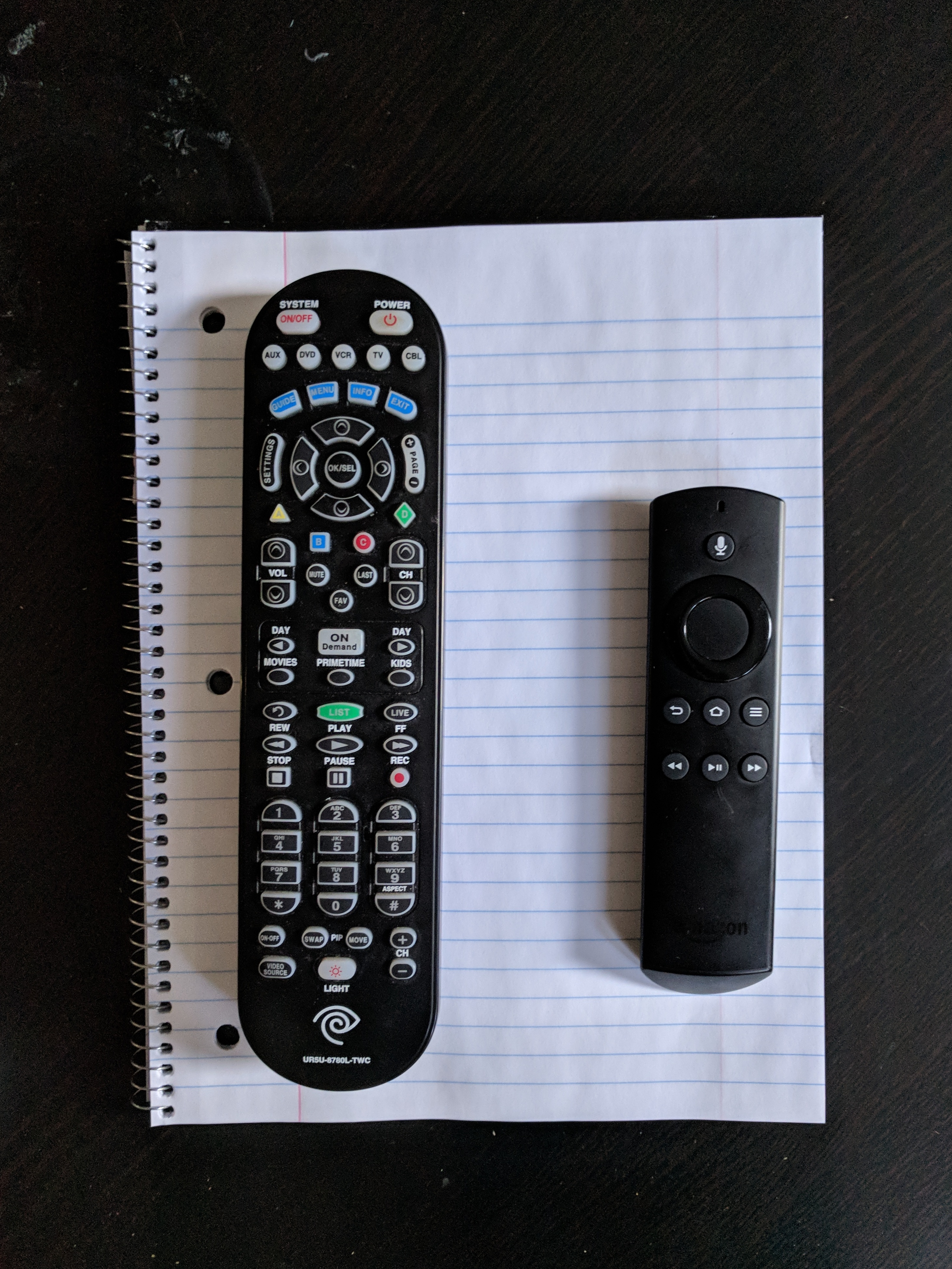
But as I was setting up the Fire Stick, I couldn't help but notice the size, setup, and UX elements of the Amazon remote. Take a look at the pic below. The remote on the left is my current Spectrum Cable TV remote, and on the right, the Fire Stick remote.

In case you're scoring at home, the Spectrum reomote has 59 buttons and is easily over twice the size and weight as the Fire Stick remote, which has a total of 7 buttons and a kind of tactile navigation wheel.
Three quick observations on these two remotes, and what we might be able to apply to our own work and workplace tech decisions from thinking about how UX and tech expectations change over time.
1. What we consider 'good' in terms of design and UX is a fluid, changing thing. The first time I got a hold of the Spectrum remote I am sure I was excited, happy, if a bit overwhelmed with all the functions. This remote could do 'everything' and I am sure I thought that the tradeoff in size, complexity, usability in order to do everything was worth it. Sure, most of the buttons are really tiny, are jammed too close together, but that's the price of a super-powered piece of tech. Eventually, you figure it out.
2. The most important of the seven buttons on the Fire Stick remote is the little one at the top of the device with the microphone image. It's used for the remote voice command capabilities akin to how one issues commands to Amazon Alexa enabled devices. Think, 'Alexa, open Netflix'. Or 'Alexa, fast-forward three minutes'. Or, 'Alexa, play The Real Housewives of New Jersey' (that last may or may not have been the one I tested for this piece).
I recently wrote about Alexa here on the blog, so I won't repeat all those takes again, but with Amazon reporting that the single most popular item on Amazon.com this holiday shopping season was its Echo Dotdevice, it seems certain that tens of millions of US households will be experimenting, learning, and becoming familiar with the power of voice-activated tech in 2018. These tens of millions of folks are also your employees, using your workplace tools and tech, and will begin to press for more and better voice capable tech at work. No doubt.
3. Probably the obvious take on these two devices, their design, and how they make the user feel, but here it is. More is not better with UX and with tech in general. Better is better. I know the tendency, especially with workplace technology is to continue to add features, functions, processes, and in our example, buttons to the solution in order to cast the widest possible net. Tech providers are guilty of this, but so are organizations that issue 846 page RFPs for a Performance Management solution evaluation. And so many of the tech providers respond, especially for a large, Fortune 100 size customer, to add whatever features and functions that the customer claims they 'need'. This cycle spins and repeats over time, and that is how you end up with the 59 button Spectrum remote. Let's hope in 2018 both providers and customers alike will think a little harder about what they really need to get done, how their tools should support them and not overwhelm them, and provide employees with the simplest solutions possible that enable their success at work.
Happy holiday week. Hope you are staying warm!

 Steve
Steve
Reader Comments (7)
Etisal is a leading retailer in Pakistan that provides the latest trouser designs to keep you looking sharp. Etisal has a team of experienced designers who create new trouser designs that are both stylish and comfortable.
Is this information helpful?
Great post ! I am pretty much pleased with your good post. You put really very helpful information 1v1 lol
Regarding the remotes, it's interesting to compare the two. The Fire Stick remote looks sleek and compact, with fewer subway surfers buttons and a simpler design. This may make it more user-friendly for some people, especially those who are not as tech-savvy.
Cable TV remotes shell shockers often come with additional buttons and features specific to cable TV providers, such as channel controls, DVR functions, or interactive features. The design of cable remotes may vary across different providers.
Pakistan's leading store, Etisal, has the latest styles of pants that will keep you looking your best. Etisal has a team of skilled designers who produce new styles of pants that are fashionable and comfortable fnf
Hello everyone, admin. Nice to meet you. Do you want to try playing 2048 cupcakes ? Play with me, it's really fun.