Quantcast
Subscribe!


Enter your email address:

Delivered by FeedBurner


E-mail Steve
  • Contact Me

    This form will allow you to send a secure email to Steve
  • Your Name *
  • Your Email *
  • Subject *
  • Message *

free counters

Twitter Feed

Entries in Design (51)

Wednesday
Feb152012

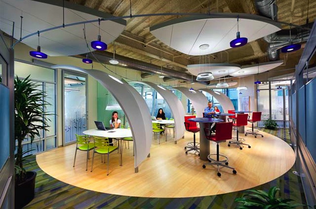
Creating great mobile experiences, accessed from the sofa

I read a super piece over the weekend on Stephane Rieger's site titled, 'Mobile Users Don't Do That', a short, but spot-on and important reminder of the importance of thinking critically and specifically when designing and deploying applications or solutions for use on mobile devices.Source - Yahoo!

The main point of the piece - is that often mobile or tablet design projects get too caught up in bad or at least inaccurate assumptions, namely mobile users are typically 'on-the-go', and lack the time, focus, or ability to maneuver around complex applications or complete multi-step processes because they are hopping in and out of taxis or marching up Seventh Avenue. Rieger correctly points out, and cites several recent studies, that mobile and tablet users are just as likely to be sitting on their sofa, accessing data and applications in a slow pace, often while consuming other content on a PC or a TV. In those 'multi-consumption' scenarios, the challenge for mobile designers is not so much streamlining functionality and navigation due to the user actually being mobile, but to maintain user attention and focus when they are likely doing two or three other things.

I saw a quote online the other day, (not sure who was the actual originator), the posited that the term 'social media' ought to be dropped. The take was that in 2012 all media is social in one fashion or another, and all social networks have inherent in them some kind of media component. If you think about it, that makes perfect sense. Turn on CNN or any of the other major TV news channels and I'll be within 5 minutes you will see and hear calls to 'Find them on Facebook' or 'Post us your questions on Twitter and we will read the best ones on the air'. And obviously the social networks themselves are mostly morphing into media outlets, just look at what happens on Twitter and Facebook when major national or world news breaks.

I mention this because I wonder if the same merging or blending around the edges is going to happen to workplace technologies - i.e. that to users it will start not to matter if their applications and tools they need are accessed on desktop computers in the office, laptops at a client location, tablets while sitting in the airport, or on iPhones while sitting on the sofa. Delivering solutions that work for them wherever, however, whenever they want to need to work, and using whichever device they prefer, (based on lots of factors, only one being their location and mobility), will become the primary design challenge for the next 5 or 10 years I think.  And as Rieger reminds us so well, making erroneous assumptions of what people want to to and what they expect from all these access methods and potential experiences is certainly a trap that has to be carefully avoided.

It certainly isn't an easy problem to solve, but it sure is interesting. And the best solutions will eventually arrive at the point where it doesn't matter to the users where they are and with what device they are using, the solution will simply work.

Wednesday
Jan252012

How much does the office furniture matter?

Like most of you, I've worked in all kinds of office layouts over the years. Cube farms, open plan, private offices, 'hotel' desks for more transient workers. I am sure at one time or another I have spent time in all of them.

And I probably don't have any really strong feelings about any of the office spaces I've worked in. They were, and are, mostly forgettable. Aside from the one consulting project years ago where my 'office' was a telecom equipment closet and an extra door propped up on some boxes was my desk. That one I still remember for some reason.Look like your office?

But there is a growing awareness of the importance of design, intent, and function of things like desks, chairs, conference rooms, and common spaces in the modern office. While some think the future of work will eventually become almost completely virtual, (meaning everyone will work out of a Starbucks or Panera), for most desk jockeys today, the 'office' still is the central and most common place where work gets done.

So while work is changing a lot, where we do work doesn't seem to be changing quite so rapidly. And while this is seems like it will continue, at least for the time being, creating spaces that are adaptable, comfortable, and effectively support the shifting demands of workers and organizations is still important and still should be something HR and talent professionals think about when designing spaces, creating work environments, and procuring office furniture. And if you are still trying to manage that balance between work that wants to be more fluid, collaborative, and virtual; and workplaces, that want to be more, well, static, rigid, and boring, then I suggest you check out this piece from the Workplace Design Magazine site.

The article, a take on the challenges facing workplace designers, is valuable not only for some of the practical design ideas it might provide, but for the approach to design decisions it advocates. Namely, to think about design issue as more that tables, offices, and furniture. To think bigger. From the piece:

In contrast, I believe your job as workplace professional is to support work, wherever and whenever it takes place. And for me “support” means focusing on the work itself, and how it’s being done, almost more than the workplace.

Nice. A more expansive way to see the job of designer. In a way, it is a good piece of advice for any of the classical support functions - facilities, finance, IT, even HR. Focus on the work and not on the tools you want to bring to the table. 

It is a really interesting way to look at things, and kind of instructive. If the best workplace designers don't start with blueprints and fabric swatches, what does that say about the way us technologists and talent pros approach our challenges?

Are you thinking about the work first? Or your toolkit?

Thursday
Jan052012

Elusive Cuteness and Building Approachable Systems

The smarties at the MIT Media Lab had a problem they were trying to solve - how to create a small, mobile, low-cost, audio and video equipped, and functional robot that could travel the campus and surrounding area on its own, find and approach random people, and get them to answer questions on camera.C'mon, look how cute I am!

Not such an easy problem to solve - since most people don't really seem to want to engage with other people that they do not know when approached on the street, what luck would the little robot, named Boxie, have with rolling up on passers by and getting them to stop, engage, participate, (and not break or steal), her.  How could the designers build and enable such a robot to successfully meet this goal, while constrained in equal measures by time, cost, and complexity? When you think about it, even though this specific problem is a bit unusual, and unlikely to come up in most of our professional pursuits, the essence of the problem, how to capture attention, engagement, and assistance from audiences that are not always motivated or incented to help is much more common and universal.

So in part limited in design by practical constraints, but by also skillfully capitalizing on most people's susceptibility to anything perceived to be 'cute', the MIT team, led by Alexander Reben, created Boxie with a soft, cardboard head, (rather than the original cold white plastic prototype), a very simple set of verbal interactions, and programmed her to ask people for help, and to intentionally elicit an emotional response from the ones she engaged with. Turns out being adorable, even in cardboard robots, is a pretty powerful tool in getting what you want.

The end result was that (most) people did want to help Boxie complete her assignment, helping her when needed, (like lifting her up on a table to get a better camera angle), and taking the time to connect more deeply than is typical with most artificial, task-oriented systems.

You can see more about the project and see and hear Boxie in the video below, but I wanted to pull out a couple of key quotes from the designers that are worth considering by anyone designing tools, programs, or environments that rely on adoption by an often skeptical world to succeed.

One - "We hope that this type of interaction that we studied will lead to simpler systems that may be more symbiotic with people instead of just trying to be a cold system without much interaction."

Two - "We think we can use this simple, emotional tie to create better systems and better interactions for people."

I like this line of thinking. Even if the MIT lab had the time and money to build a more fully functional, sophisticated, and powerful robot, it seems at least possible that such a robot would not have had any more success than the small, cheap, but likely to tug at the heartstrings Boxie.

While workplace and enterprise systems can probably never be 'adorable' or even cute, perhaps we could think just a tiny bit less about what we want people to do with our systems and just a little more more about how we want them to feel when using them.

It seems to be a winning approach for a tiny cardboard robot named Boxie.

Below is the video I referenced, courtesy of the MIT Media Lab


Tuesday
Nov222011

Relative Creativity

Take a look at the promotional posted for the 2009 movie 'The Men Who Stare at Goats' :

I didn't see it eitherNot a bad looking promotional effort most would say - edgy, creative kind of typeface, clever use of the actual goat in the series of profile images, stars of the film staring out wisfully into the middle distance.

Some big time names in the form of George Clooney, Jeff Bridges, Ewan McGregor, and Kevin Spacey also help the piece achieve a little bit more wow factor.

I am pretty sure the movie was not what you'd call a smash hit, or even a 'hit', (the IMDB page for the movie indicates about a $32M gross on an estimated $25M budget). But surely any disappointment in the eventual box office receipts for the movie would not be attributed to the poster that you see on the left, after all, while perhaps not being incredibly artistic and memorable, it certainly is a solid, 'B' kind of effort.

But take another look at the 'Men Who Stare at Goats' poster, this time in a larger context of very similar looking pieces, (courtesy of the Daily Inspiration site):


Look closely at the 'collage' image on the right - the 'Goats' poster is in there, (second row, third from the left). Keep looking

Weird how alike so many movie posters seem to be in terms of design, layout, color schemes, etc. If you take a longer look at the Daily Inspiration piece you'll see more examples of how similar movie genres, (Action, Romance, etc.), have consistently spawned similar looking promotional posters.

What might be interpreted as interesting, attractive, and well-executed when approached individually, (like the 'Goats' poster), takes on a slightly different tone and feeling when viewed through this lens. When thrown together dozens of other pieces informed with the same mindset and sensibility, the 'Goats' poster simply vanishes into the sea of sameness, (and safety, I suppose).

The point to all this? Not much of one admittedly, I saw the Daily Inspiration piece and it simply seemed interesting to me. I guess if there MUST be a point, (I think the Blogging for Dummies Book I read five years ago mentioned something about each post having some kind of point), it's that understanding context, and the ability of your audiences to compare the work we produce, the systems we design, and the strategies we devise and deploy with what else is being created, designed, and deployed is an important, and sometimes overlooked component of our success.  

It can be really easy to spring something out to our internal customers with the mindset that they are a kind of captive audience, without the ability to make free choices from competing alternatives. Kind of like a movie-goer whose multiplex has the same film running on all 12 screens. And for many workplace systems or policies that is indeed true. Employees can't choose their own HRIS if they don't like the one the company has deployed, and they can't create and elect their own medical or dental plan coverage if yours are not to their liking. 

But what they can do, and what has become increasingly easier in the age of social networking and open communication is have a much, much better understanding of competing alternatives and what is possible outside of your own organization. It has never been easier to compare almost everything about one organization's operations with others that are potential competitor's for a good employee's services. 

The 'Goats' poster is fine. There is nothing wrong with it. It just looks like every other one you've ever seen. Whether or not that is good enough is really the question.

Monday
Oct312011

The Wall: An Old School Self-Service Example

Over the weekend I spotted out in the wild a classic example of the oldest of old-school Human Resources supplied Employee Self-Service implementations - the Wall of Forms, (see picture on the right and click the image to view full-size).

Years ago, these displays of paper forms to support employee transactions like changes of address, set-up of payroll direct deposit, benefits enrollments, expense reporting, and on and on were once common, particularly prior to the emergence of automation tools designed to simplify these and many other employee initiated processes. If you as an employee needed to get something done, you walked over to HR, picked up a form, filled it out, (hopefully without needing too much help), and turned it in. If you HR or Payroll department was really cool, the person accepting the form whipped out a big red-ink stamper thing and stamped 'Received' on it. Click image for full-size

But as time passed, and more and more HR organizations of all sizes were faced with the insistent pressures to become more efficient, to reduce the risk and impact of errors inherent in manual processes, and often sold the promise of 'chance to do more strategic things' with the decentralization of many manual and administrative tasks, (let's save for a moment the debate of whether and to what extent this has really happened), the 'Wall of Forms' method of employee communication and entry point for HR/Payroll administration seems to be a relic of a bygone age.

And while that is altogether expected and mostly necessary, when I looked at the Wall of Forms pictured above, I couldn't help but be struck by the effectiveness in design from this old-school presentation. Sure, it is not pretty. Sure, it doesn't make one marvel at the amazing use of white space or offer much in the way of personalization or customization, (as far as I can tell, the 'wall' appears and presents exactly the same no matter who is looking at it). And sure, it won't port well to the iPhone or iPad.

However the wall does a few things really well that should not be completely discounted in this age and world of self-service. Here are just a few aspects of this old-school Employee Self-Service portal, (yes I called it a portal), that those of us that design and deploy these kinds of systems should keep in mind:

1. The Wall requires no training. Once the employee knows where the Wall actually is, then no further specialty training is necessary.

2. Maintenance is simple. Once a form is no longer needed, or a new one needs to be added, maybe 15 minnutes of someone's time is required to make the changes to the Wall. Like a good SaaS product, once the Wall configuration changes are made, they are immediately available to all Wall users.

3. Everything you need is there. While many system designers are wondering how to shrink applications and functionality to 'fit' smaller and smaller form factors for mobile and tablet, the Wall happily and unapologetically expands as needed. There are over 30 form containers on the Wall, and room for more as needed. If processes/rules/regulations etc. require that many forms, then why not have a system that puts them all within view?

4. Help is only a few feet away. The door right next to the Wall is the main entrance to the facility's Human Resources department. Can't find something on the Wall? Have a question about something you have found? Take two steps to the right and find someone to ask. Sure, this method of front-line, in person help can't scale really, but for this facility it probably works. Here, like most of the rest of the world, employees really don't want to spend much time at all futzing with HR processes and paperwork. They have better things to do.

In technology, heck even in general life, it can be pretty easy to turn down our noses at our less than enlightened or 'lower-tech' colleagues. It's also common to fall into the trap of thinking that applications and strategies that worked 15 or 20 years ago have no relevance today - after all everything has changed, blah-blah-blah. But I am not so sure about that.

I think we still can learn from organizations and designs of the past and when we work to combine the best ideas from back then with all the amazing capability and potential of our technologies today, then we can really see the greatest impact on our workplaces. 

What do you think? Do you have any 'old-school' practices that still work for you in your organization?

Page 1 ... 2 3 4 5 6 ... 11 Next 5 Entries »