Quantcast
Subscribe!


Enter your email address:

Delivered by FeedBurner


E-mail Steve
  • Contact Me

    This form will allow you to send a secure email to Steve
  • Your Name *
  • Your Email *
  • Subject *
  • Message *

free counters

Twitter Feed

Entries in Design (51)

Friday
Oct282011

Are Pictures Better than Words?

Here's a question for a Friday: Have infographics already jumped the shark?

If you spend even moderate time and energy reading online news, blogs, commentary, etc.; no doubts you've ran into your fair share of infographics in the last couple of years. And like any other art form/data presentation medium some of these infographics are awesome, and some are, well, kind of sad attempts and enlivening thin data sets that would be better communicated in a simple data table, or even a paragraph.

And while infographics may now seem kind of familiar and even a little played out on the web, they have not really entered the day-to-day flow inside most organizations. I bet no one reading this post has ever responded to the boss' request for some HR or Financial data with an infographic, even if we think that when well executed, the infographic form might help us not only present the data, but tell the story as well.

Might infographics begin to enter the world of work and become as typical as the Excel-based pie chart copied onto a PowerPoint slide?

Maybe.

A new company called Visual.ly is building out a service that will allow people to create custom infographics using information from their own databases and APIs. The service will be automated, which means users will only need to indicate the kind of information they want to display visually to produce the infographic. You can see some samples of what these infographics look like here.

Pretty neat right? And even the most jaded web natives among us would probably admit that even the simplest of these infographics are often an improvement in presentation and 'interestingness' than the spreadsheets and data tables we have all been working from for ages.

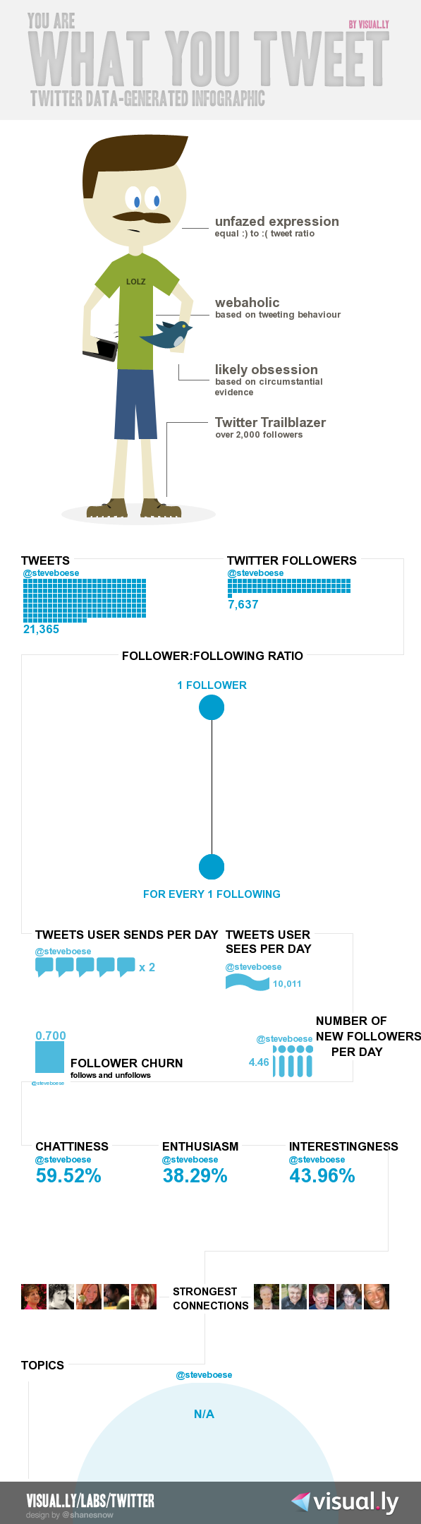
Visual.ly has produced thousands of infographics to date, mostly for big media companies and online news services like the Wall Street Journal and The Economist; and has plans to go public with its service in December. Until then, you can experiment a bit with the self-creation process by creating a simple infographic of your own Twitter persona, (mine is below).

What do you think - do you see a time where simple, created with a few points and clicks type infographic presentations of enterprise data will become as common place as the pie chart?

Should enterprise systems build in this kind of capability, or is this better left for getting attention on the web?

FYI - Here is my little infographic experiment:


 Have a great weekend!

Friday
Oct142011

No manual provided

We are trained from a pretty early age to expect instructions, directions, user manuals, etc. for new gadgets, tools, and technologies we encounter; and even for new processes we are tasked with performing. What are the steps? What do I do first? And next? Where can I get help if it doesn't work? What are the twenty questions that the thousands of users that have come before me have asked, that the company has managed to nicely collect and list in the 'FAQ' section.Good luck with this one

Most of us, when we open the box containing a new little toy almost instinctively continue to dig into the packaging to find the little instruction card (often conveniently written in half a dozen languages), before we are willing to take our first, halting steps with the new gadget or product. I do it all the time myself, and for good reason, depending on the new technology, software program, or electronic toy, not understanding the basic operations and functionality can lead to a long, frustrating slog trying to conjure up the right series of steps to begin to see value from the new device. Who wants to spend time, money, and attention on some new tool or technology and be unable to get the thing to work right away.

But often the instructions, manuals, user guides, or in the workplace purview the tightly written 'do this exactly this way' document sometimes known as a 'job aid' have such a limiting effect on our ability to see and pursue potential alternatives or new use cases, that these documents effectively become limiters on our creativity.  The manual tells us exactly how to use the new tool. The FAQ not only answers all our questions, but makes us feel like there should be no other questions. The process steps become a cake recipe, leave out one item, or add a bit more of another, and who knows what might result - but one thing's for sure, the warranty will not apply.

When very young children get their first sets of building blocks or LEGOS, there usually are no instructions included. The child simply dumps out the collection of large blocks on the floor and starts using them. Sure, the 'designs' are usually simple and repetitive, but at least they are not prescribed. Once kids, particularly with LEGO sets, begin to progress and build more complex structures, detailed and illustrated building instructions are provide, often running hundreds of pages. You need to follow the instructions very closely to 'correctly' assemble the model, and even one small misstep can result in significant error requiring re-work later on to fix. Assembling one of the larger LEGO sets becomes an exercise in determination and discipline, ultimately kind of satisfying, but also sort of deflating, as by the end of the process all you have really done is to do exactly what was proscribed.

Eventually the 1,325 piece LEGO Milennium Falcon starts to fall to pieces from play, or storage or carelessness, and you're left with a massive pile of pieces, (mixed up with other pieces from other sets), and no real hope of re-assembling the model to its original state, as usually the building instructions are long since lost.

But I think we should see that outcome as much more hopeful, holding much more potential. If we did have all the pieces, and all the instruction manuals, most of us would probably just re-build the same model once again. With the instructions, that is all we could do.

Without the instructions, and without knowing if we have all the right parts, we'd suddenly be free to build anything.

Have a Great Weekend!

Monday
Sep262011

A Good Idea is Just an Idea, or Why You are Not Driving a Smart Car

You've probably seen, or if you don't live too close to a major urban area, have at least heard of a relatively new vehicle known as the Smart Car. The Smart Car, designed to be a highly fuel-efficient and easy to maneuver and park utility vehicle, (obviously important in many U.S. cities), debuted in America a few years ago, and reaching its sales peak in 2008, just as domestic gas prices were soaring.

The Smart Car is not just 'smart', but its also quite small. Almost incredibly, jarringly, and even disorienting small. To put the Smart Car in perspective, the length of a 2011 Honda Accord is about 195 inches , for the Smart Car you are looking at about 106 inches. Or for another frame of reference, Kareem Abdul-Jabbar stands at about 86 inches.

But from its peak in 2008, Smart Cars have in the last few years seen a gradual, yet steady decline in awareness, interest, and sales. The most recent annual estimate was about 6,000 Smart Cars were sold in 2010.

The parent company of Smart, Daimler, has recently announced that Smart Cars will be the beneficiary of a new national advertising campaign, and has also indicated the dealer network in the U.S. will expand from 75 to 100. While this is good news for fans and employees of Smart, only time will tell if these measures can turn around the flailing brand. 

Even for a truck driving, HR Mini scoffing, traditionalist like me the Smart Car seems like it would be kind of fun to drive. So why are sales in a free fall?

And why should you care about the (short) rise, fall, and uncertain future of the Smart Car?

Well to me, the story offers a few interesting angles, the foremost one a lesson about how an idea, even an idea that seems like it should succeed, often needs much more than its own cleverness to make any kind of a lasting impact. My most measures, the Smart Car really should be a success. It is extremely economical in purchase and in operating cost, its diminutive dimensions make it a perfect vehicle for urban settings, and its quirky uniqueness caters well to the 'look at me and what I'm driving' constituency among us.  The Smart Car website contains scores of pictures of happy Smart owners, (many with highly personalized modifications of the base vehicle that emphasize its flexibility and fun.

But even with all these attributes going for it, the Smart Car is in trouble. And the main reason is that the brand managers have allowed pre-perceptions, often inaccurate ones particularly about the vehicle's crash-worthiness, dominate potential customers and the public's views of the car. People look at the tiny car and often reflexively conclude there's no way I'd be safe in a car so small. 

And that is kind of too bad, because despite what really is a cool idea - economical, agile, quirky urban transportation, the Smart Car might soon become a footnote, albeit a small one, in automotive history.

The Smart Car was, and I suppose still is, a really good idea. Too bad for Smart, the company has not quite realized a good idea in only step one on the long march to success.

Monday
Sep122011

If you must have a dress code policy...

I know, workplace dress code policies have (mostly), gone the way of the IBM Selectric and the Inter-office mail envelope as relics of a bygone age. In our more modern, progressive, and enlightened workplaces, most organizations have come to understand that with all the many thousands of things to worry about, that articulating specific dress code standards and policies is a colossal waste of time.Love the 70s

The vast majority or workplace dress code discussions have been distilled into short phrases - 'business casual ', seemingly the dominant one these days. What exactly does business casual entail? Who knows for sure, just walk around the office for a day or two and generally you can sort it out. Mostly, dress code standards are arrived at organically and are largely self-policing. Wear something inappropriate to the office some time and chances are someone will tell you about it, if not to your face, in a snarky comment on Facebook.  

Dress code policies are boring, and writing about dress code policies as I am right now, possibly represents the nadir of my adventure in blogging. But I had to come up with a hook to feature some fantastic workplace dress code policy imagery I came across recently. Fantastic workplace dress code imagery? That does not even make sense.

Well, take a look at the image on the right that accompanies this post, as well as the rest of the collection of dress code policy images from the British Postal Museum Archive described on the How to be a Retronaut blog

These dress code policy posters are, quite frankly, awesome. And not only do they look cool, but they also serve the purpose of transforming what would be a typical, boring written policy (that no one ever reads, except as a preface in an employee disciplinary hearing), into a vibrant and effective tool for educating the target workers as to the desired workplace behavior.

Additionally, the dress code posters attempt to connect the policy to real-world examples, demonstrate the potential negative ramifications of violations of the policy, and even have a little fun at the same time. Are these vintage posters really that groundbreaking and meaningful in the overall canon of workplace thought and theory? 

Not really. 

But they do remind us that even the most mundane and tedious parts of the job of Human Resources, the parts that still sometimes include writing and enforcing workplace dress code policies, can still be creative, can still be personal, and can (for shame), still be even a little fun.

No one reads your policies. Maybe it's time to get a little more imaginative in their presentation and communication.

Have a fantastic week!

Tuesday
Sep062011

How much does differentiation matter?

When your job is designing and delivering a product or service to the market it is altogether fitting and expected that you'll take an initial and then periodic view of the competitive landscape for said product or service to see how your offering stacks up in the marketplace, and to attempt to find and exploit perceived weaknesses and differences that (hopefully), present your solutions and services in the most positive light.

It just makes sense, and is typically a fundamental piece of any company's 'go to market' strategy. What is the other guy doing? What features does their product have? Should we build those features too? What does our solution provide that the other guy can't match? And how do we best communicate and reinforce those differences that we 'win' on in the market so that there is no confusion about why our products and services are better?

But sometimes, perhaps more often that we like to think, we focus too much on what our competitors are doing, saying, building, etc.; and not enough on what our current and potential customers are saying and doing with our products. 

Last week I caught a really interesting piece on the Fast Company CoDesign site titled 'Think You're An Industry Leader? Not So Fast', that makes an interesting point - that often as product and service designers and implementers, (and that for the most part is everyone working in Human Resources, recruiting, HR Technology, and so on), that this primary focus on competitors detracts from what should really be our true goals - to understand the customers, to empathize with their problems and challenges, and to build systems and solutions to address their needs primarily.

From the CoDesign piece:

This is the first mistake organizations make when thinking about digital interactions with their customers. They measure themselves against the competition instead of really understanding what their customers actually need.

How can you improve your understanding of customer needs? By connecting with customers more deeply and in ways that move the dialog beyond simple check the box RFP exercises.

Again from CoDesign:

In short, you gain empathy for them, (customers). Great applications are created by those who fully empathize with the user’s needs. Our team must walk a day in the life of the person they are designing for and act as a proxy for the user in the design and integrations processes. I was once asked, “Is there such a thing as a stupid user?” The answer is no; there are only ignorant designers. Any good designer will tell you there’s no such thing as user error -- anything the user can’t figure out is just bad design.

It is not easy, I think, to try and lower your sights against your competition. After all, in most purchase decision processes the customers pick one 'winner', while leaving the also-rans to contemplate the reasons why they did not win the contract and secure the customer's business. Perhaps the first step into really thinking more from the customer's point of view is to frame these kinds of post-mortem discussions less in terms of 'Why Did Company 'X' beat us?' and more in terms of 'What customer problem were we unable to solve?'.

What do you think - would more time being spent on understanding and truly empathizing with your customers and less time worrying about Brand 'X' help your business?

Page 1 ... 3 4 5 6 7 ... 11 Next 5 Entries »