Quantcast
Subscribe!


Enter your email address:

Delivered by FeedBurner


E-mail Steve
  • Contact Me

    This form will allow you to send a secure email to Steve
  • Your Name *
  • Your Email *
  • Subject *
  • Message *

free counters

Twitter Feed

Entries in Design (51)

Wednesday
Oct242012

Comic Sans and Getting the Details Right

At a prior job I worked with a colleague that had changed her default email message font to Comic Sans. 

The first time I received a message from her, and drank in all the Comic Sans goodness, I thought it must have been some kind of a joke, or a mistake, or a little bit of fun, as I am 99% sure the contents of the message were along the lines of 'Welcome to the group, I am looking forward to working with you.'
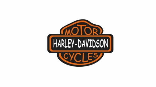
Not the same, is it?

But as time passed and the ensuing communications I received from this colleague became much more traditional, mundane, and efficient, the Comic Sans persisted. Eventually, I could not take it anymore, and in the nicest way I knew how, (which was probably not very nice, I admit), I gave her some unsolicited advice, to drop the Comic Sans from her outgoing message template, as it was pretty hard to take anything she wrote very seriously when presented in the puerile font of a 3rd grader.

I probably didn't use the word 'puerile' in my note. Well maybe I did.

I can't remember exactly how she took my advice, other than her obvious failure to take heed of it - until I left that position, she never dropped the Sans from her routine.

So this is clearly a blatant example - no one in business I have ever encountered before or since wrote emails in Comic Sans. But when I think about this former colleague, it is truly the only thing about her I remember.  She may have been very smart, capable, an industrious team member - maybe not.

But I would not be able to separate the work, the quality, and her ability from the baffling way she chose to present much of that work, and her failure to grasp how she was coming across to her audiences.

What's the point of this story, (aside from the fact that I found this really cool post on the favbulous blog that renders a bunch of famous corporate logos in Comic Sans and wanted to write about it).

I guess that in communication everything, every last detail matters. And while you can't use that as an excuse to refine, review, and over think things endlessly, it also means that you have to nail the basic, essential bits or you and your message will never be heard.

Seemingly small things, like the choice of a font, often have much larger and more significant implications than we think. And I guess if it doesn't 'feel' right, then it probably isn't.

Happy Wednesday all - I am off to HR Tech Europe in a couple of hours, if you are in Amsterdam this week, please make sure to say hello!

Tuesday
Oct022012

The Photographic Truthiness Effect

Check this recent finding reported in a fascinating piece from the British Psychological Society blog on the effects of combining images, even ones that offer the reader no specific information, with statements, and the resulting effect on people's perception of the 'truthiness' of said statements:Everything in this blog is true. Trust me. Here's an unrelated picture.

When we're making a snap judgement about a fact, the mere presence of an accompanying photograph makes us more likely to think it's true, even when the photo doesn't provide any evidence one way or the other. In the words of (researcher) Eryn Newman and her colleagues, uninformative photographs "inflate truthiness".

It is pretty much a given these days about the importance of imagery on the web, (witness the incredible growth and emerging impact of Pinterest and Instagram, both primarily visual platforms), and the need for communicators and marketers of every kind to figure out how to use a combination of visual imagery, video, audio, text, etc. to help their messages stand out in a crowded market for attention. But this research takes the idea a step further, and possibly makes the communicator's job a little simpler, i.e., that it really doesn't matter too much what images are included with the message, just that some kind of image is present.

More from the BPS piece:

Ninety-two students in New Zealand and a further 48 in Canada looked at dozens of "true or alive statements" about celebrities, some of whom they'd heard of and some they hadn't, such as "John Key is alive". As fast as they could, without compromising their accuracy, the students had to say whether each statement was true or not. Crucially, half the statements were accompanied by a photo of the relevant celebrity and half weren't. The take-home finding: the participants were more likely to say a statement was true if it was accompanied by a photo.

Fantastic stuff - slap a semi-related image up along with whatever statement you are trying to pass off as the 'truth', and bam - all of a sudden the 'truthiness' of whatever you are trying to sell is increased. 

Admittedly this is kind of a goofy story, but one I think raises an interesting question, that is, how often are we truly being manipulated, even if subtly, by the mere existence of that well-placed image, or that perfectly Instagrammed and filtered shot that accompanies every other tweet, status update, or web page that we see?

How often are we being tricked into believing something that seems at first read to be wrong, or at least to be a little off, but we get distracted by a fancy image just long enough to lose focus and go along with whatever the savvy communicator wants us to think?

How many blog posts have you read and thought, 'That is a clever picture. That writer really knows their stuff?'


Friday
Sep212012

Off Topic: The acceptance of perfect things

Simple question for a Friday - can something, (or someone, or some abstraction like a process or project), be perfect?

I'm not thinking necessarily about some universal or arbitrary definition of perfection, but more situational and personal. Can something be perfect for you?

Take a look at this piece from Gizmodo - 'This Bowl Will Always Be Exactly the Size You Need it to Be', about a novel kind of bowl called the Stretchy Bowl, (image below) designed to be flexible and adaptable to the level and number of items placed in the bowl.

From the Gizmodo piece

The Stretchy Bowl is the easy-to-store fruit basin that never wants to disappoint. Composed of a white metal base (which requires minimal assembly) and a matching metal hoop wrapped in a layer of breathable, elastic fabric, this bowl is always the right size to accomodate your haul of produce.

As you add more fruit to stretchy fabric disk, the bowl deepens. 

That's pretty cool, right? A bowl that's not just flexible and adaptable, but always exactly the size you need to be.

Seems kind of impossible though, I mean, always exactly the right size?

Could the bowl hold ten oranges, twenty, two hundred? And still be exactly the size you need?

Of course the commenters on the Gizmodo piece are doing the usual - taking apart the idea as not really as described and advertised, bringing up the standard arguments about mass, size, and the pesky laws of physics that make the Stretchy Bowl not really always exactly the size you need it to be.

And while that is the expected and rational reaction - no container can physically be that adaptable, it also kind of disappointing.

Why can't most of us accept that the bowl could be always the right size?

Why do we have to find the flaw, the failing, the imperfection that makes the claims null and void?

Why can't we (usually) accept that there might be perfect things?


Have a Great Weekend!

Friday
Jul272012

Off Topic - A Better Way to Share Your Bio?

Grinding to the end of a long week and was close to bailing on the Friday post, (Shock!), and then late last night I caught this piece on Mashable, 'Turn Your Personal Data Into an Interactive Infographic', and clicked through to Vizifiy, a new service that takes your social footprint, (at least the parts on Twitter, LinkedIn, Facebook, and Foursquare), and turns it into a neat, interactive, multi-page infographic.

Here is the summary page of my Vizify bio: (click for a larger image)

I've seen a few of these kinds of dynamic, graphical profile builders before, but I think I like Vizify the most of what I have seen so far because it's multi-page design sort of takes the viewer through a bit of a story - from a clickable summary, to professional history, to a set of keywords used frequently on Twitter, and even to a view of the places most frequented as interpreted from Foursquare check-ins.

Most of the individual pages can be edited by the user, as well as the display order and some of the content of the auto-generated pages, that again are pulled from existing information on LinkedIn, Twitter, Facebook, and LinkedIn. But even with that limited capability to shape or personailze the Vizify infographic, it still does present personal, social network information in a cool and interesting way.

I know, before you get all up in my grill, I know the traditional resume is a long way from being rendered irrelevant by fancy infographic tools like Vizify, or even the more pedestrian and accepted LinkedIn profile.  But one day, eventually, and maybe because this is just me wanting this to be true so I don't ever have to help my 11-year old son write a ridiculous two-page summary of his life one day, I hope that tools like Vizify, and whatever comes next, will eventually serve as a suitable and more complete personal history/bio/reflection and then all the resume coaches can finally find something better to do with their time.

Vizify is still in beta, you can sign up for an invite here, let me know if you get a chance to play with the tool and what you think about the dynamic, infographic profile replacing the traditional resume?

Have a Great Weekend!

Tuesday
Mar132012

Foundation

As a parent of an 11 year old I have had the fun of building helping to build quite a few Lego sets over the years. Sets ranging from a few dozen pieces for the simplest small projects, to at least one set that consisted of over 2,000 pieces, and that I think took me about a month, working in small batches toLego Taj Mahal complete. A quick Google search masquerading as exhaustive research of the company history indicates the largest Lego set in terms of individual pieces to be the 2008 Taj Mahal set, an amazing likeness of the iconic building checking in at over 5,900 total pieces.

Certainly for anyone that has spent time constructing and playing with Lego building sets over the years would attest to just how more evolved, detailed, and fantastic they have become, (insert the requisite 'Back in my day, we only had plain blocks and could build square houses' lament here). By continuously innovating and expanding the possibilities of what could be re-created and re-imagined with plastic blocks, Lego has carved a unique place in the toy industry, and by some accounts is now the 4th-largest toy manufacturer in the world. 

But the really cool thing about Lego I think is not solely or even primarily the amazing sets like the Taj Mahal, the Tower Bridge, or the almost 4,000 piece Star Wars Death Star. It's the way that the company still recognizes and embraces the elegance and importance of the simple, classic, and foundational Lego brick. You know the one I am talking about right? A simple rectangular building brick, a little Lego version of the real world builder's 2x4, the simplest and yet most fundamental brick of them all. The kind of brick that form the basis for walls, towers, and really for anything that can be imagined by the builder.

On the right is the image of the 1958 patent drawing for the Lego brick, (click on the image for a larger size), and while you might be thinking that the humble brick in the drawing has nothing at all to do with wonders like the Taj Mahal set, I think you might be wrong. Rather than me trying to explain why, let's get the Lego company's take on it - the following is directly from the Lego.com 'History' web page: Lego patent drawing - 1958

The LEGO brick is our most important product. This is why we are proud to have been named twice – “Toy of the Century”. Our products have undergone extensive development over the years – but the foundation remains the traditional LEGO brick.

The brick in its present form was launched in 1958. The interlocking principle with its tubes makes it unique, and offers unlimited building possibilities. It's just a matter of getting the imagination going – and letting a wealth of creative ideas emerge through play.

The folks at Lego have realized that no matter how far they can push the creativity and design that goes into new building sets, the foundation that is the simple brick from 1958 is the source of it all. It makes Death Stars and Taj Mahals possible, but it also does more that that. The 5,900 piece Taj Mahal set is essentially designed to do one thing - to become a miniaturized, detailed, and accurate version of the actual Taj Mahal.

But a pile of simple bricks, the foundation elements that Lego still sees as the most important part of their portfolio, well these are designed to become anything that the builder can imagine. And that is probably why over 60 years later, the 'system' no matter how much it has advanced, still works on a fundamental level. 

When the core of a system is simple, essential, and 'right', well, almost anything is possible from there.