Quantcast
Subscribe!


Enter your email address:

Delivered by FeedBurner


E-mail Steve
  • Contact Me

    This form will allow you to send a secure email to Steve
  • Your Name *
  • Your Email *
  • Subject *
  • Message *

free counters

Twitter Feed

Entries in Labor (10)

Monday
Feb062017

Want a larger piece of the (economic) pie? Look for the most competitive industries

Caught a really interesting piece over the weekend at The Atlantic looking at one potential reason why (relatively speaking) that worker's or labor's share of GDP is decreasing when compared to 'capital's', i.e. ownership's share. This divergence in share has been thoroughly examined as a primary driver of increasing economic inequality, and was the main subject of Thomas Piketty's influential Capital in the Twenty First Century from 2014.

Said differently, and much more simply, today in the aggregate is getting a smaller piece of the overall economic pie than in the past. There are tons of data points you can examine on this, but they all more or less show the same thing - on average, workers are no better off today, and might be worse off, than they were 20 or 30 years ago.

Why The Atlantic piece titled One Reason Workers are Struggling Even When Companies are Doing Well caught my attention is that it shared some insights from a recent NBER research paper on not just that this share divergence is happening, but offered some reasons as to why it is happening.

And the theory is kind of an interesting one, and if true, can help better inform anyone making career/industry decisions moving forward. Best of all, it is a pretty simple idea that boils down to this - The more concentrated an industry is, (fewer competitors and the ones that dominate are all pretty large), the lower labor's share of the income for that industry will be.

Here's some color from The Atlantic piece:

The researchers looked at data from the U.S. Economic Census between 1982 and 2012 for nearly 700 industries in six major sectors, including manufacturing, retail, wholesale, services, finance, and utilities and transportation. Looking at how much the four largest firms in each industry accounted for in terms of total sales in the industry, they found an upward trend in concentration in all of the six sectors, meaning that it was increasingly common that just a few firms accounted for the bulk of sales. Since the U.S. Economic Census reports payroll, input, and employment, the researchers were able to observe a negative correlation between concentration and labor’s share—meaning that this trend of so-called superstar firms tends to mean workers taking home a smaller share of the pie. Moreover, the more concentrated an industry had become, the larger the decline in labor’s share.

Unpack that a little bit to show a pretty straightforward formula:

Industries have tended to consolidate over time --> the more dominant the four largest firms in an industry become --> then decreasing shares of the overall industry profits find their way to workers/labor.

There are a couple of reasons on offer for why more consolidated, big-firm dominated industries are getting worse in terms of share of profits for workers. One is that these companies are simply growing revenues at a faster pace, and labor costs just have not (or do not need to) keep pace. Another is that modern, transparent business practices make it easier for consumers to find and reward the 'best' companies, which drives out competition in the industry faster than before - and reduces the potential number of firms competing for workers.

The takeaways for the average employee?

Probably that it might pay, (no pun intended), to keep on eye on the relative levels of competition in your industry, particularly if you are in a role that feels industry-specific. If your industry has seen consolidation with weaker competitors being driven out of business (or being acquired), the trends suggest a shrinking percentage of profits will find their way to you and your colleagues.  

You might be better off thinking about an industry that seems to have more, and more even competition, where the market share, (and to some extent the demand for labor), is not being controlled by two or three big companies. And one where the threat of competition for your skills can either score you a better offer somewhere else, or give you more leverage and power in your next compensation negotiation with your current shop.

More options might not be better for the owners of your company, but they might be much, much better for you.

Have a great week!

Wednesday
Aug242016

Have to advise your kid on their college major? Here's some data you may want to review

Time to dig into some labor market data!

(Note: all the data referred to in this post can be found courtesy of our pals at the BLS. While their site isn't the easiest to navigate, you can start at the 'Employment, Hours, and Earnings' page to get started with this kind of analyses).

I had a chat with a friend recently who was sending their child off to his or her, (I can't remember which, does not matter), first year of college this month. In the conversation I faked genuine interest by asking what the child was planning to choose as their major. I think the answer was 'Business' or 'Physics', like I said, I was faking interest at this point, but the entire conversation made me think about just what 'should' the child have chosen, forgetting for now what they are interested in/good at. If the child wanted to make a purely rational, economic decision, what might be the direction to head in terms of college major?

I confess to not knowing the answer, but a recent piece from the Nieman Lab about trends in employment in selected information industries, (copied below), at least provides one set of data points to (hopefully), better inform these kinds of economic decisions. Take a look at the Nieman Lab chart, (knowing by accessing the BLS data in the link above, you could create similar charts across other or all industry classifications), and then some comments from me after the data.

The point of the Nieman Lab piece was more or less 'Gee, what a crappy last decade it had been for the newspaper business, and the people working in it', but examining this kind of data a little more broadly can be instructive on a number of levels.  Sometimes this kind of data validates what we think we know or have observed in our own lives - do you know anyone who actually reads a newspaper anymore?

Other times the data can be a bit surprising too. I personally had no idea that employment in Motion Picture and Video Production had just about doubled since 1990. Are there really that many more films being made? Besides the Sharknado series I mean?

Back to the original question raised in the post - what should someone making what they hope to be is a rational, economically sound decision choose for their college major? 

Some topic or subject that maps easily to an industry group we think holds bright employment prospects for the future? 

I still have no idea I suppose. But at least I would tell them to not plan to work for a newspaper after they graduate. 

And then I would take a minute to explain what a 'newspaper' is.

Happy Wednesday. Have fun with the data.

Monday
Nov242014

REVISITED: For American workers, the quits keep coming

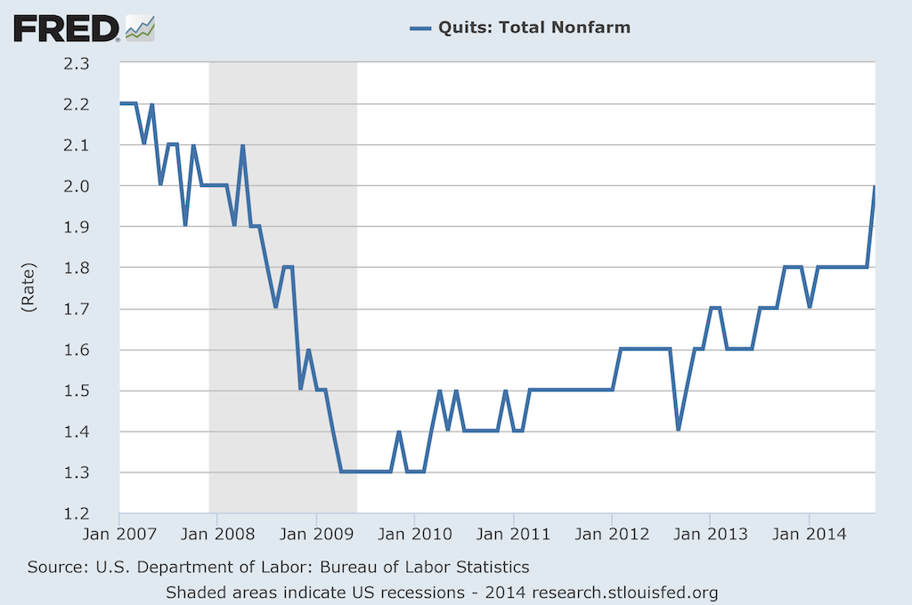
Back in February I posted CHART OF THE DAY: The Return of the Quit, a look at the increasing rate of 'quits', (HR nerds can call them 'voluntary separations' if that makes you feel better), across the American labor market.

Back in February, the news was that quits were rising from the financial recession low point of 2009-2010, reflecting growing individual confidence in the labor market and consequently placing pressure on organizations to develop retention, replacement, succession planning strategies.

Fast forward about nine months to the latest data on quits, (Note: this data comes from the Bureau of Labor Statistics JOLTS (Job Openings and Labor Turnover Survey) report), and the story about quits continues to play out along the same lines as I talked about in February. 

I'm going to hit you with the updated data below, then revisit my (FREE) commentary after the jump. I actually think all the points I made about th February data still apply in November, the question really being if we as organizational talent pros are paying enough attention to this data.

Here is the latest data, showing the Quit rate climbing to about 2%:

Some thoughts:

1. 'Quits' are a function of several factors, (personal circumstances, the magnitude of the jerkitude of your managers, people self-selecting out as not being in the right job, etc.), but most observers of the Quit rate on a macro level ascribe movements in the rate to worker's confidence in their ability to find another, and what they think will be a likely 'better', job.  The rate moving up, to a level that is approaching the pre-recession level, is a signal that overall job market confidence is rising.

2. So while you and many other HR/Talent pros are lamenting about 'hard-to-fill' jobs, simultaneously more of the workforce are thinking of themselves as 'easy-to-place'. I'm not sure how that apparent paradox will work out, (probably very differently depending on location, skills, etc.), but it is kind of interesting and amusing at the same time.

3. How you are thinking about and reacting to news of a good employee quitting is probably changing too. In 2008 or 2009, you might have reacted by thinking, 'What is she crazy? Where is she going to find another job with as good pay/benefits/cupcake Friday like we have here?'. Now? Probably you'd think more along the lines of 'Hmm... She's going to XYZ Corp? I wonder if she could bring me over there too.'

4. Last, while the Quit rate increasing kind of feels like it is a good thing, there is certainly some warning signs as well. For one, those recent quitters might find that their skills and experience are not in as high a demand as they figured, and thus end up spiking the unemployment rate in the short term, (as well as having to take a boatload of grief from people questioning their sanity for quitting a perfectly good job). They might find, even today, that keeping a job is much easier than finding a job. And increasing worker confidence might put pressure on companies to increase wages, which can also have a detrimental effect on growth and profits.

So take a look at the JOLTS report if you are interested in this kind of data, I think it gives a little more color and depth to the more widely reported headline of the total rate of unemployment.

Are you seeing an increase in 'quits' in your shop?

Ready to quit yourself?

Have a great week!

Wednesday
Jul112012

More Data for HR Geeks: Wow, it's getting old around here

Last week Kris over at the HR Capitalist ran a cool piece titled Economics for HR Geeks: The Quitter's Index, where he called out the BLS data indicating that more Americans are now quitting their jobs than being fired/laid off/downsized.  There are lots of possible reasons for this shift, but the takeaway for the talent pro is that more people are open to a voluntary move than in the last few, recessionary years. The climate for recruiting and retention is starting to shift.

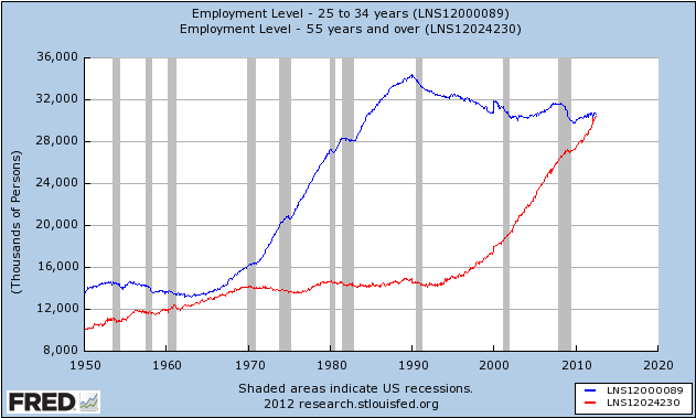
In the spirit of KD's piece, I thought I'd offer a similar, geeky chart for your perusal, first spotted over at Business Insider last week. Have a look at the below graph, that shows the total US employment level for two age cohorts, those from 25-34, and those 55+, and I'll make some (obvious) observations after the data sinks in. 


Yep, really soon, and for the first time since anyone started keeping track, the number of workers 55 and older will exceed those aged 25-34, typically the next generation of talent that so many firms are trying to recruit, develop, and retain.

Many workers north of 55 have seen their retirement plans put on hold, some for a few years, many for longer, as the combination of recession, slowly recovering equity markets, and lots of 20-something kids still living at home as they remain persistently unemployed or underemployed themselves.

Have you walked around the office lately and thought to yourself, 'Wow, when did everyone start to look so old?'. If you haven't noticed, don't worry, you probably will soon. And after you take note, maybe its time to think about the makeup of your specific workforce, in total and in important segments, to see whether or not you are seeing this trend play out for your company, industry, and region.

And then maybe take a few minutes more to think about what that all means for your 3, 5, and 10 year plans for recruiting, retention, benefits, work assignments, facilities, management succession, and more.

Gettind old can be a drag. It can be a real drag when it happens to everyone at once.

FYI - the chart was originally created on the FRED site, which is an absolute gold mine of information. Check it out sometime.

Friday
Apr202012

Guess which labor market?

Here's a quick game for a Friday, I'll give you three lines from a recent article titled, 'Workforce shortage a structural problem', that assesses macro labor market conditions and you try and guess which labor market the article is referring to.

1. "A lack of skilled technical workers coexists with the difficulty most students and recent graduates have experienced in finding full-time employment, because few of them possess the technical skills required."

2. "Graduates are finding it difficult to get jobs and many enterprises are facing problems in recruiting workers and technicians, revealing structural problems in the employment market, said (redacted to make it harder for you to guess)".

3. "Even then, it is still not easy to attract experienced, skilled workers. So, we have now signed an agreement with some technical training schools so that we get first choice of the best students to become interns in our company. We hope that cooperation such as this will help to develop a talent pool for us." 

So what's your guess?

Could be most any type of technical or skilled manufacturing type job in the USA, right? It possibly could be some areas of healthcare, as the aging population places more demands on the healthcare industry to supply trained workers at the same time many college nursing programs are straining under budget costs constraints and still have long waiting lists for student admission. Maybe it is the US auto industry, that seemingly has emerged from near-death to post robust sales and profits as this classic American industry continues to rebound and confound (hat tip to Walt Frazier).

All good guesses, and all could be correct in the right context, but the actual correct answer is the Chinese labor market, and all three of the above quotes were take from a piece titled 'Workforce shortage a structural problem', on Chinadaily.com.

You should click over and read the entire piece, but the short summary is that many of the same types of problems that we often read and hear about in the US labor markets - the skills gap, the lack of technical training that matches industry demand, the problems with shifting labor pool demographic composition, etc.,  seem to be just as important and profound in China as they are here in the USA.

I am certainly not going to offer '5 tips for solving your Chinese market labor problems', here on the blog, and in fact, if you truly are looking to a blog to try and solve those kinds of problems, well, I'd say you have bigger things to worry about.  

But I will offer this observation, that no matter where in the world you look to source labor and locate production, issues with skills training, development opportunities, and the best talent having lots of options besides yours to choose from seem to be pretty much the same no matter where you end up. I'd offer that you as a talent professional can try to run from talent shortages and skills gaps, but no matter where you run to, you'll probably find the same problems. 

Only you might need an interpreter to help you understand them.

Have a great weekend!