Quantcast
Subscribe!


Enter your email address:

Delivered by FeedBurner


E-mail Steve
  • Contact Me

    This form will allow you to send a secure email to Steve
  • Your Name *
  • Your Email *
  • Subject *
  • Message *

free counters

Twitter Feed

Entries in workforce (30)

Thursday
Dec102015

More on the performance curve

About a year ago I published a piece called 'The Performance Curve', a quick look at how in professional baseball decades of analysis of player performance reveal a very typical average performance curve. Player performance, (hits, home runs, wins for a pitcher, etc.), almost universally 'peaks' at about age 29 or 30, and almost always begins to decline, sometimes steeply, at about age 31. The chart I used in that post is below:

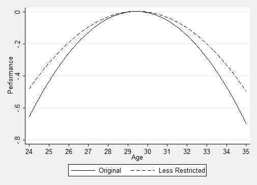
The specifics of the Y-axis values don't really matter for the point I am after, (they represent standard deviations from 'peak' performance', but simply looking at the data we see for both the original study sample (veteran players with 10+ years of data), and 'less restricted' players, (more or less everyone else), that performance peaks in the late 20s and declines, predictably, from there. Keep this data in mind the next time your favorite team drops a 7-year, $125M contract on your best 31 year old slugger. 

Last year my point in running the post was that these kinds of performance curves likely exist, and are becoming more discoverable, in all kinds of jobs due to the increase and improved capability of tools and technologies to better manage, track, and analyze performance. I still think those conclusions to be true a year later.

But what got me thinking about that post from last year was yet another chart I saw this week, this one excerpted from the bank HSBC on the macro-impact of changing demographics, particularly in the workforce of industrialized countries. Take a look at the chart below, on the generalized productivity (as defined by output), across the typical worker's life-cycle:

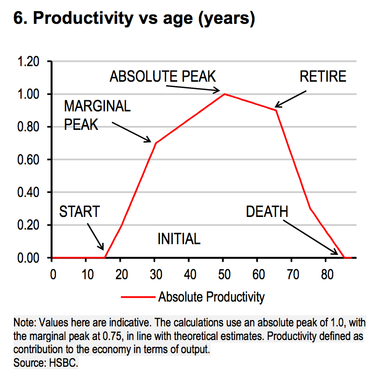
According to HSBC, and unlike the data we see with baseball players, 'performance', (again, in this case limited to a measurement of productivity), continues to climb during a worker's life, peaking at around age 50 or so. And worth noting, even though the productivity peak hits at about 50 and this average worker still has about 15-18 more years of work ahead, that the relative productivity in that last decade+ is still relatively high.

Said a little differently, HSBC is saying that a workforce made up of 50 - 65 year-olds would be, on aggregate, more productive than one made up of 30 - 45 year-olds, all other things being equal. Obviously, this is data that should be taken in a very general sense, as we have seen from the baseball example, there are many roles whose physical requirements negate the increased productivity effects of age/experience have on other roles. So while a 55 year-old first baseman will never be able to compete physically with a 28 year-old one, change the role from 'first baseman' to 'accounting manager' and we may have a very, very different outcome.

Last thing I want to leave you with on this, and the thing to take away and really think about is what is happening, (again, in a general way), in labor forces across the industrialized world, and what will continue into the next 10 years or so. Here is another chart that shows how the workplace and workers are skewing older, courtesy of Jed Kolko:

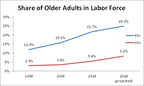
The combination of more rapid population growth and increasing labor force participation among older workers are expected to result in about one-quarter of the workforce by 2024 being aged 55+. That is a huge increase from only 20 years prior, (1994), when the percentage of workers aged 55+ was only about 12%.  And workers 65+ are expected to make up almost 10% of the workforce by 2024, up from less than 3% just 20 years prior.

There is plenty to think about here for sure, and as usual, no simple answers. The workforce is certainly skewing older, that seems to be indisputable. But what that means to organizational performance is not as clear, unless you are managing baseball players. For the rest of us, thinking about how these changes will or at least should impact how we hire, develop, coach, train, and mentor employees in the next 10 -15 years is probably one of the most important human capital challenges we will face. Think about it.

Ok, that's it - I'm out. I need to get back to being super-productive (judging on where I sit on the curve).

Wednesday
Mar182015

VIDEO: Fun with the quantified workplace

The coolest thing you will see on the Internet today, (excepting for cats, bunnies, and 'which superhero would you be' quizzes), comes to us courtesy of the Sid Lee Agency in Paris who have Arduino-powered sensors hooked up throughout their office, and they brought the data together in a single dashboard.(click for a giant version of the dashboard)

The result is a really interesting and clever view into the inner workings of the workplace in real-time.

Check out the video below, (Email and RSS subscribers will need to click through), but better still, just head over to the live dashboard to see the real-time updates.

Pretty neat, right?

And I think the best HR/Talent play in the dashboard is on the lower right, where Sid Lee has a tile showing current number of job openings at the agency. Clicking that tile takes you to the firm's career site, (which, not for nothing, is woefully unappealing to look at compared to the activity dashboard. Come on HR/Recruiting, pay attention to UX would you?)

I totally dig this, and I am not even sure why. It's just cool to look at I suppose. Like cats and bunnies and superhero quizzes.

Have a great Wednesday.

Friday
Feb132015

VIDEO: Unconscious Bias at Work

Save this one for the long weekend maybe, as it is about one hour long, (a 45 minute talk, followed by some Q&A), from Google's Director of People Analytics Brian Welle on the subject of Unconscious Bias in the Workplace.

Link the video is here, it is also embedded below (Email and RSS subscribers will need to click through)


From Google's description of the piece, and of unconscious bias more generally:

There is a growing body of research – led by scientists at Google – surrounding unconscious bias and how we can prevent it from negatively impacting our decision making. The goal is to teach ourselves how unconscious bias can affect our perceptions, decisions, and interactions. It is aimed at raising awareness, sparking conversation, and initiating action. We’re hopeful that this will help us to create workplaces that are not only fun and innovative, but allow each of us, no matter our background, to achieve more than we could anywhere else.

I definitely recommend the talk from Google's Welle, as it not only lays out a simple to follow 4-part plan for addressing unconscious bias at work, but as in typical Google fashion, his recommended approaches are all backed and supported by research, many of which are cited in the piece, (and in the accompanying notes).

For me, the part that stood out the most was the research that showed that two identical resumes would be assessed completely differently when the first resume had a 'male' name attached to it, and the second had a 'female' name. Take the names off of the resumes, and suddenly this unconscious bias slips away.

Anyway, take some time this weekend to check out the talk - if you are in the half of the country where it is about -5 degrees outside you are probably not going anywhere and have plenty of time!

Have a great weekend!

Thursday
Dec182014

The disconnect between the skills that get you hired and the jobs most workers have

Wow, that was a long post title. Sorry. The post won't be that long at all, trust me.

All I want you to do is look at two charts and then draw your own conclusions about the significance, if any.

The first, courtesy of the world's largest professional network, LinkedIn, who published some data they call 'The 25 Hottest Skills That Got People Hired in 2014', (from an analysis of member skills, employment changes, and recruiter interest on LinkedIn). 

Here is the chart:

Now for the second chart I'd like to bring to your attention, from the Bureau of Labor Statistics a look at the Top 10 occupations with the highest employment (dated from May 2013, so it is slightly older than the LinkedIn data, but it was the latest I could find after about 5 minutes of exhaustive research)

Here goes:

See any differences between what gets people hired, at least people on LinkedIn, and the kinds of jobs that are held by the largest numbers of people in the USA? These Top 10 occupations make up about 22% of overall US employment, in case you were wondering.

Wonder how far down on the BLS list (and you can check the full list of occupations as defined by the BLS here), you have to go before you run in to 'Statistical Analysis and Data Mining', the top 'hot' skill for 2014 as per LinkedIn. I will save you a click and let you know that all the occupations that the BLS rolls up into 'Computer and Mathematical Operations', (where most of LinkedIn's Top Hot skills would likely map), account for about 3.7M workers, that is just under 3% of all the jobs in the country.

Ok, since I said I was going to just show the charts and leave it up to you to think about, I better shut up.

Have a fantastic day. And don't spend so much time on LinkedIn.

Tuesday
Dec162014

UPDATE: The ADP Workforce Vitality Index

Back at the HR Technology Conference in October, the folks at ADP introduced their latest measurement of the pulse and health of the American workforce and labor market, called the ADP Workforce Vitality Index.

The Index is compiled by the professionals at the ADP Research Institute and provides quarterly measure of U.S. workforce dynamics that looks at key labor market indicators, such as employment growth, job turnover, wage growth and hours worked. This free report yields insights into workforce dynamics and trends than previously available -the index includes lots of key metrics on employment, workforce strategy and human capital management.

Since HR Tech in October, most of the reporting on 'macro' labor market trends all seem to be signaling a tightening labor market, upward pressure on wages, and an environment where workers (at least the ones with the 'right' skills), have more and better options than they have had in years. 

The ADP data seems to bear this out, with an increase in overall 'Vitality' (a measurement of the total wages paid to workers across a number of dimensions), across regions, industries, and income levels.

Take a look at the latest report embedded below (Email and RSS subscribers may need to click through).

Infographic: ADP Workforce Vitality Index Shows Real Wages Accelerating

Overall, the data show real wages accelerating - the total real wages paid to the US private sector workforce, is Indexed to 110.6 in the third quarter of 2014 (2Q2011=100, Seasonally Adjusted), an increase of 0.77% from the previous quarter.

There is plenty more to dig into in the ADP data, especially if you are a data geek like me, and more information and complete data sets that can be downloaded can be found here.

One of the greatest potential benefits that the massive data sets that are available to the largest HCM solution providers make possible is the ability to analyze, synthesize, and derive insights from the aggregated data from thousands of employers and millions of employees. The ADP Workforce Vitality Index is a great example of this and hopefully, soon other providers with similarly robust HCM data sets will create their own unique reports and indices for use by HR and organizational leaders.

Page 1 ... 2 3 4 5 6