Quantcast
Subscribe!


Enter your email address:

Delivered by FeedBurner


E-mail Steve
This form does not yet contain any fields.

    free counters

    Twitter Feed

    Entries in apps (5)

    Thursday
    Dec032015

    My favorite app is going away - 5 reasons why it was so great

    I knew this day was coming, but for quite some time I was able to delude myself into pretending it might not actually ever come to pass. But in the 'all good things must come to an end' department, I sadly share the news that news and discovery app Zite is shutting down, finally becoming completely absorbed into its acquirer, the similar-but-nowhere-near-as-good app Flipboard.

    For those who never knew Zite, it was simply the best, most interesting, most engaging of all the 'magazine-style' apps that seemed to emerge from everywhere in the last few years. In Zite, you would follow topics like 'Technology', 'Business' or 'Human Resources', and Zite would serve up relevant articles from a wide variety of sources - big mainstream sites, blogs, even really obscure blogs like this one. You could 'thumbs up' or 'thumbs down' an article and over time Zite would learn about your content preferences and show you more of the things you tended to like and fewer of the things you tended to dislike. Was its learning algorithm perfect? No. But was it pretty good? You bet. So much so that in the four or so years I have used Zite it is almost always the first app I look at every day to try and catch up on the topics that I am most interested in.

    While I pour one out in memory of my beloved Zite, let me share 5 reasons why the app was so great - lessons that I think are relevant not just for the narrow category of news apps, but for all kinds of workplace and consumer technology.

    Here goes...

    1. It was an app used by millions, but it seemed like it was built just for me

    Zite never 'made' me see anything it wanted me to see before I could get to the content I was interested in. It never made me follow a topic that I was not explicitily interested in. It never created some kind of 'sponsorsed' layer on top of the content I was looking for. It felt like a blank slate more or less, that I could build upon over time to get it to work like I wanted it to. I would guess that the 25 or so topics I was following in Zite were likely unique across millions of users. I mean, I was following 'Human Resources', 'Graphic Design', and 'Barbecue', among lots of other things. It just felt so personal.

    2. It was remarkably easy to use

    No effort, no training, no heavy lifting to get Zite to begin to add value. See an article you like? Tap 'thumbs up' and you will see more like that one. See a topic you like? Tap the tag for the topic and it is added to your list of topics you are following. And those two interactions are about all you needed to know to use Zite and get plenty of value in return. The folks at Zite seemed to show remarkable restraint in building and enhancing the app in order to keep it so easy to use. Great technology is sometimes defined by what capability is left out, just as much as what features are built in. 

    3. It got better the more I used it

    Over time, and 'learning' from the many, many times I tapped 'thumbs up' and 'thumbs down' on individual articles, Zite simply got better at presenting content that I was likely to be interested in viewing. It definitely evolved over the years to become really smart about the things I liked, what I did not like, and by the end of its life I found I was tapping 'thumbs down' very little. I never got sick of using it because it seemed to continue to get incrementally more valuable, despite not making many visible changes. 

    4. You could 'explore' and were challenged to discover new things

    The other app I use the most on my phone is my feed reader, Feedly. Feedly is a pretty awesome tool for consuming content, but it pales next to an app like Zite in one important way - Feedly only shows me content that I have explicitly asked it to show me when I subscribed to a specific RSS feed.  So it is great at giving me what I asked for, but not so great at turning me on to something new, something different, or at least a different take on a topic that it should know that I like. All of the things that Zite was really good at. The combination of Feedly and Zite gave me some overlap in terms of content, but together they worked well to bring me a great mix of viewpoints on subjects I was interested in. And many, many times Zite served up great content I would have never came across on my own. Literally all the time.

    5. Finally, you could jump in at any time without feeling like you have missed everything

    Feed readers, blogs, social networks that rely on the 'newsfeed' principle are all great, but all have one big shortcoming: if you have not checked them for awhile you fall impossibly behind. And it is really frustrating trying to get 'caught up'. Even Twitter recognized that by introducing the 'While you were away' updates in your timeline, (which I have found to be really useful, in case anyone cares). But with Zite, since it never operated on the 'timeline' paradigm, you could jump back in to the app, or a given topic in the app, and see what is new and interesting without the real or imagined pressure to get caught up. And in this age of information overload, who need another app or technology reminding us that WE ARE MISSING SOMETHING.

    Can you tell how bummed I am about Zite going away? It was an almost perfect app.

    The folks at Flipboard say that all the cool things and capabilities of Zite have not been fully incorporated in Flipboard, so I suppose I will give them the benefit of the doubt and try it out. But I am not optimistic.

    I am going to miss Zite, but hopefully what was great about Zite will find its way into more and more applications for work and for outside of work as well. By focusing on personalization, discovery, simplicity, usability, and productivity Zite in many ways created the blueprint for what great technology can do.

    And you know a technology was great when you are genuinely bummed to see it go.

    RIP Zite.

    Monday
    Nov162015

    CHART OF THE DAY: In a world of infinite choice, we choose very little

    How many apps do you have installed on your smart phone? 50, 60, maybe more?

    How many TV channels does your cable or satellite TV subscription offer? A couple hundred, give or take?

    How many websites are there on the internet? Way, way too many to count I bet. Probably something in the order of tens of millions at least.

    So after thinking about those questions, let's ask another set of questions. How many apps, websites, and TV channels do you regularly use/visit/consume? What it the number of these apps, etc. that tend to dominate your time and attention?

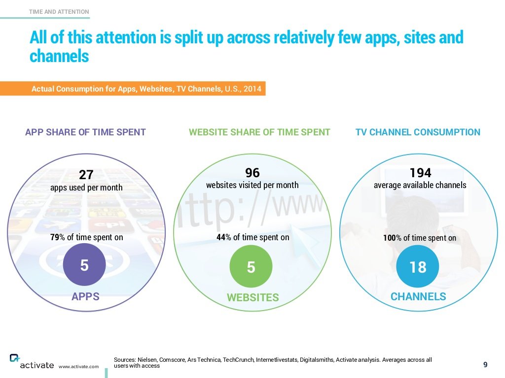
    Take a look at the chart below, taken from a recent presentation given by business strategist Michael Wolf at a recent Wall St. Journal conference, for some insights into these questions, and then as you have come to demand, some FREE commentary from me after the data.

    Interesting data, let's unpack it a little here and see what it might mean for HR/Talent/anyone trying to get attention in a busy world. 

    The average person uses 27 apps in a month, but about 80% of that time is spent in only 5 apps. I will offer up my top 5 - Gmail, Twitter, Zite (a news aggregator), Feedly (an RSS feed reader), and The Score (a sports news and scores app). But whatever your Top 5 apps may be, chances are good they dominate your time on your phone to a significant extent.

    This same self-selected narrowing of almost endless choices also is seen with the general internet, and with TV content. We have tons of options, almost too many, yet we end up gravitating and focusing on those very few choices we seem to enjoy and identify with the most. And again, those lists are pretty small. 

    What should this data make us think about in more general terms as we try to pry precious attention and eyeballs towards our bright shiny new things?

    1. We choose very little, but the 'pie' is so big, even a tiny sliver is huge. With the continued growth of market penetration of smart phones, broadband connections, and wifi everywhere - more and more time is being spent online in all of its forms. Your app or website or internet show or podcast doesn't have to break into anyone's Top 5 to still be a huge success. You just have to identify, target, and create value for that small group that will be open and ready for your message. The HR Happy Hour Show that Trish McFarlane and I do is a great example of this. We may not be 'Serial', but we have a fantastic and growing audience of HR and HR tech fans and have built a really cool thing.

    2. Habits are really hard to change. You, me, everyone - we check the same 5 apps, the same 8 websites, watch the same 10 TV channels week after week after week. If you can't easily get folks to change their consumption habits then you have to find a way to better integrate with these habits. No one hates email more than me, but I still spend more time in email every day than I care to, and I still get plenty of news and information from this old habit. So it makes sense to focus at least some on getting your message better read in email or in one of the other 'Top' apps today (LinkedIn, Medium, Quora, Snapchat, etc.), instead of creating something brand new that requires users to adopt a new habit. 

    3. Don't 'break' things that are working. Once you have an audience, or a set of fans/followers etc., you have to be careful not to mess around or experiment too much all at one time. It is hard enough to initially earn the attention of the audience you seek, it is even harder to have to try and earn them a second time. As your audience grows you want to be sure you are growing along with them, but not leaving them behind if that makes sense. I'd like to run 'Ranked' posts every day, but if I did I am pretty sure I would drive away just about everyone who I have spent 7 or 8 years trying to connect with. But the occasional Tom Cruise or Ranked post is fine I think.

    No one has time for all the choices that are now available to us on our phones, the web, and our TVs. That doesn't mean there is not any room or any opportunity for something new to break through, it just means that the ideas that can break through are rarer than ever, and the people that can conjure up these ideas are more valuable than ever.

    Ok that's it, I am out. Go back to the sites/apps you really enjoy. 

    Have a great week!

    Thursday
    Sep062012

    The Monthly Results Book - now just another app

    Ages ago I worked in a big company corporate finance department where our major group deliverable was something we called the 'Blue Book', a collection of charts, financial reports, and analyses of our division's monthly financial and operating results that was developed, compiled, printed, collated, (really eerie 'Office Space' flashback happening right now), bound up in you guessed it, blue report covers, and distributed to 50 or so leaders and executives across the organization.

    The Blue Book was our version of the truth, the single source for financial information for most of these business and operations leaders, most of whom carried around the most current version of the package in their briefcases as they commuted to the office or tucked under their arms as they attended the next in what seemed like, (and probably was), a series of interminable meetings at the office. It was all ver 1990's and if you know the Office Space re-set, then if you equated the Blue Book to the TPS reports from the movie, then you would not be too far off.

    From time to time we made some incremental changes to the Blue Book contents - we made some fancier charts - remember Harvard Graphics?, dropped a few reports we were pretty sure no one used, and once in a while tightened the distribution list to reflect organizational changes, after all the division financial results were strictly 'need-to-know' material. But we never really changed the manner or method of information dissemination or distribution. Each month we either hand-delivered the books to recipients who were at our HQ, or shipped them off in one of those formerly ubiquitous manila 'Inter-office mail envelopes'. No matter how much better we made the contents, (frankly not that much better), the packaging and delivery never changed, 30 or so pages, three hole punched, six sections, and the familiar blue report cover.

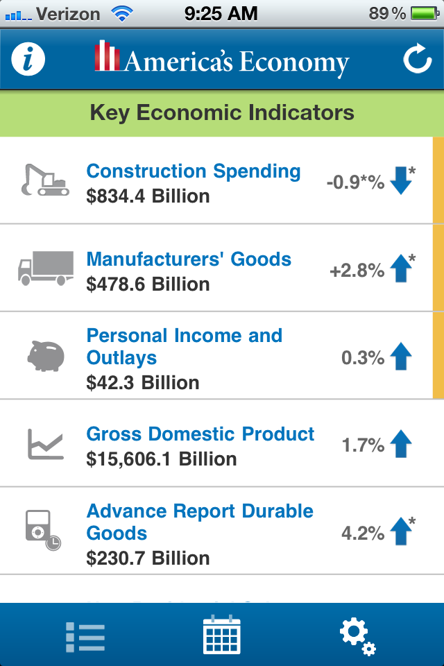
    I have not thought about the Blue Book in a long time, but it came to mind after I downloaded and checked out the 'America's Economy' app the was recently released by the US Census Bureau, (image on this post taken from the App). 

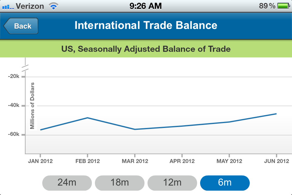
    The App provides real-time updates for 16 key economic indicators released from the US Census Bureau, the Bureau of Labor Statistics, and the Bureau of Economic Analysis. Things like employment and unemployment rates, manufacturing measures, international trade balance and flows, and more.

    It is a pretty neat, if simple little App, that allows anyone with access to a smartphone a quick and easy way to find, review, and with Twitter and Facebook integration, optionally share information to their networks.

    So if you have hung in with this (admittedly dull) post to this point you might be wondering what is the point really, besides talking about the America's Economy app and a boring tale from corporate days gone by?

    Here it is - I suspect that many of us are still distributing, communicating, and providing whatever passed for the modern version of our 'Blue Books' in much the same way we have been for years and years. Sure, you probably replaced the printed reports and binders with email and attached PDF files, or set up some kind of online platform or repository to house the data, but my guess is you have not yet been willing or able to change the way you think about sharing and disseminating information all that much.

    My guess is that your executives and managers don't have a simple little app like the America's Economy app where they can, with a couple of fast swipes and taps, see all the relevant data, charts, analyses, trends, etc. that they want and need to know. My guess is that they have to either chase the information, wait until they are in the 'right' place to access it, or perhaps even take decisions without the data.

    The age of the App means that for you, an enterprise service provider, that the bar will continue to climb, and the expectations for ease of use, real-time updates, and having important business information always in hand will only increase. If you have not yet been asked by your leaders questions like, 'That is a nice report, can I get it on my iPhone?', I bet that you will soon.

    And if you don't have a good answer then you might be asked 'Well, the monolith known as the US Government seems to be able to do it, what is your excuse?'

    Thursday
    Apr122012

    Spring Break #3 - Should all applications be mobile?

    Note: It is Spring Break week here in Western New York, (for the school-age kids anyway), and while I will still be working and traveling to Washington D.C. for a conference, this week will be busier than most. So this week on the blog I'll be mostly sharing some quick hits and short takes on things I spotted or found interesting. Actually, come to think of it, that is pretty much every week.  Anyway, if you are on Spring Break this week, I hope you have a great little vacation!

    --------------------------------------------------------------------------------

    Earlier this week I offered a quick (and not really orginal or novel) take on the Facebook-Instagram deal, where I pointed out that the really interesting part of the purchase was not the extraordinary purchase price, ($1B), for a company with no revenue and no real plans to create revenue, but rather that Instagram was able to build a user base of over 30 million with only about a dozen employees.  Sure, Instagram is a really simple, single-function type application, but to have that many users that quickly with an incredibly small team is really remarkable.

    So today's Spring Break series take is the second interesting angle on the deal, and that is the question of the diminishing importance of 'traditional', (i.e. sit down at a desktop or laptop, fire up an application or browser to use), type applications at all? If Instagram could build a $1B business completely on the iPhone, (I know they have an Android app now, but that was a very recent development), why would aspiring developeneurs think that building for anything but the iOS/Android platforms was a solid decision? 

    At least on the consumer side certainly, mobile platforms seem to increasingly be all that matters, Facebook itself acknowledged their risk and exposure to mobile by both their admission that they have not been able to monetize mobile access to Facebook, as well as with their Instagram buy. Recently Facebook head of mobile developer relations James Pearce said "Mobile is the epitome" of social. If Facebook were built today, it would be a mobile app."The numbers? Facebook currently has 425 million mobile users (compared to 825 million total users).

    So in a climate where the most popular social applications and networks are predominantly mobile-based, and in a time where these consumer-oriented applications continue to become tools used for business and enterprise purposes, I think it might be time to wonder if the next big breakthrough in enterprise or workforce technology won't be from creating fancy iPhone versions of the same old tools that employees are tired of using, but rather from the creation of something entirely new, built as a mobile application, with not one shred of concern about 'users working in the office on PCs', and none of the baggage that often accompanies creating 'mobile-friendly' versions of what we have always known.

    We have talked for years about the next 'Facebook for the enterprise', is it time to start talking about the next 'Instagram for the enterprise?'

    Happy Thursday!

    Wednesday
    Mar232011

    I've just checked in, now give me a hug

    Quick one as I spend the day meandering my way to the ERE Expo in San Diego, (I know, tough duty, it is expected to snow AGAIN here in Western, NY today).

    Last week I finally succumbed to a little peer pressure and signed up for Foursquare. I figured with the increasing number of events I have been attending, I finally had some interesting places to check in to, and to be virtually 'seen'. Even not being on Foursquare until last week, I had seen online evidence of many of my friends and acquaintances far superior social and professional lives and figured it was time for me to get in on some of that action. 'Look at me! I go to cool places too, darn it!'

    But as is the case with many of these delusions of grandeur, the reality has been quite a bit less exciting. If you have the misfortune to be my 'friend' on Foursquare, you have been treated to a steady stream of trips to the gas station, grocery store, and bagel shop. Big fun for sure.

    Leaving a digital trail of the mundane is the disappointing and depressing down side of these geo-location apps. But then I stumbled upon a random tweet (apologies, I just can't remember the source), linking to a new kind of geo-location app called 'Situationist', that offers at least the chance to augment the mundane with a bit of the absurd, and the extraordinary.

    Here's how the Situationist works:

    1. Load the Situationist app onto your iPhone (sorry Android and BlackBerry users), along with a photo

    2. When you are in proximity to other users of the Situationist app, you will be notified, and have the chance to interact with the other user in random 'situations' that you choose from a pre-seeded list on the app

    3. The 'situations' can be friendly; 'Hug me for five seconds exactly', or slightly more mischievous; 'Let me inspect the contents of your bag for bombs and such.'

    4. Users are allowed to request new 'Situations' be added to the app, but each one is vetted and approved before it is pushed out to the app and made available to the community

    5. Hilarity and intrigue ensue, as you have random and potentially almost surreal interactions with strangers.

    Why is this kind of app interesting, aside from the obvious humor?

    Well, I suppose the humor might be the extent of it, but I wonder if there isn't an element of curiosity and faux-danger at play in this kind of technology that has the capacity to elevate the routine to something really fascinating and unique. When I use Foursquare to check-in to the bagel shop, I can be assured the only interesting thing that might happen is that I may suddenly be gifted with a free (small) coffee, or have a brush with really micro celebrity if the (loser) mayor happens to be in the shop when I arrive.

    But if I was using the Situationist, or if Foursquare were actually fun, and the trip to the bagel shop was suddenly interrupted with someone wanting me to 'compliment them on their haircut', or to 'give them all the coins in my left front pocket'; well heck, I'd be more likely to show up and check in all over town.

    I know what you might be thinking - ewwww!!! No way I would use a geo-location app to encourage creepy strangers to hug me.

    You probably are too smart and careful for that. And much too savvy about how much information you openly share on the social web to buy-in to anything so crazy.

    Right?

    Postscript - I don't actually have an iPhone, so I can't check in anywhere using the Situationist yet. So tomorrow when I finally get to ERE Expo and check in on Foursquare, I am encouraging anyone who sees the check-in to approach me and offer to hug me for five seconds exactly. 

    Or three seconds if you are a little weird.

    Postscript II - How about a recruiting/networking version of the app? One that lets the passive job seeker send out that 'Hey, I am really interested in talking about a new gig, corner over near the bar and let's talk'.