Quantcast
Subscribe!


Enter your email address:

Delivered by FeedBurner


E-mail Steve
This form does not yet contain any fields.

    free counters

    Twitter Feed

    Entries in UX (14)

    Thursday
    May182017

    Google and the interface of everywhere

    Google's big I/O event happened this week, and in customary fashion the search and technology giant made a bunch of interesting product announcements and made public for the first time some brand new solutions and innovations. Folks in the HR/Recruiting space will largely be most interested in and perhaps concerned by Google's announcement that it intends to launch 'Google for Jobs', a consolidated job search tool (powered by Google's search technology at the core), for job seekers that will surface job listing from a number of sources like LinkedIn, Facebook, and CareerBuilder. And while that announcement certainly was interesting, and needs to be top of mind for folks who run or heavily promote their jobs on job boards like Indeed, to me, it was not the most interesting thing to come out of I/O.

    First, Google announced the forthcoming Lens app, a tool that essentially makes a smart phone camera more intelligent by allowing you to learn about a product by taking a picture of it, find out information about a performance by taking a photo of the name of the band, or connect to a wifi network by snapping a photo of the login and password information. This app is a nod to the increasing use of the camera/photo as not just a means of recording an image, but as a method for navigating the world and its objects and experiences around us.

    Second, Google announced additional places (beyond its Home device and its Pixel phone) and tools where its 'Assitant' app will be available - on iPhones for the first time, on more Android devices, and soon, in cars, refrigerators, and more. Google's near-term vision is to make Assistant available essentially everywhere, and to (ultimately), disconnect or break the bond between the smart phone, (and Android for that matter), and the Assistant capabilities.

    These two announcements combine to form the basis and the beginnings of a powerful service (Assistant), that eventually will seem "interface-less", or said differently, will be accessed via a variety of devices and methods - voice, images, touch screens, and sure, if you must, by typing commands into a keyboard. Who knows, maybe the next iteration of Google Glass, (remember that?), will be to largely function as a lens and continuous input stream to the Assistant. As you stroll around with Glass you can ask it for advice and information about where you are, the restaurant you are walking by, and who knows - maybe see a list of open jobs at the Cafe you are sitting in having a coffee.

    What is interesting about all this, to me, is the longer term implications it has for the tools and technologies that we use at the workplace. Consumer-driven technology innovation has been driving enterprise tech for a while now. You were using a smart phone or a tablet at home, before you ever did so for work. And I think the same thing will become true for this future world of the 'everywhere' interface to smart tools and services designed to help us navigate the world, and get things done.

    Smart phones exploded for work applications because (in part), we didn't want or need to be trapped to a desk and a computer in an office in order to get things done. Now, we are beginning to see what is coming 'next' - after the smart phone, when the technologies are all around us, in our ears, in the devices we interact with, and never more than a spoken 'Ok Google' away. What will be the first HR system to be fully integrated and accessible via voice, image, and even wearable tech? 

    I think it is tremendously exciting and fun. And way more interesting and powerful than a new website that aggregates online job listings. But if you have to talk about that, it is ok. I get it.

    Have a great day!
    Monday
    Jun272016

    Be careful when evaluating for user experience

    Over the weekend I read an interesting discussion online about one organization's software selection process, i.e., should we select solution 'A' or 'B'. In the end the company went with solution 'B', and the decision was largely based on the idea of 'user experience' or usability. The specific details don't matter here, (which is why I am not linking to the source), but it made me think that I should write about UX this week. And that made me think that I have written about UX a dew times before, and it might make sense to re-run a couple of those posts this week. So here goes - more from the archive on UX and usability....

    ----------------------------------------------------------------------

    From November 2014 - There's more to User Experience than usability

    Here is a quick take and a diagram on UX that I wanted to share on a cold, kind of snowy Wednesday in my part of Western NY, (and thankfully not too snowy, lake effect snow is a funny thing, one side of town can get buried in snow, while a mile away sees hardly anything at all).

    I was plowing through my Feedly last night, (while watching my Knicks fail, admirably however in Milwaukee), and I came across this really interesing piece on API design from the Nordic APIs site. 

    I know what you might be thinking: Really, you must have a terribly exciting life, reading about API design and watching basketball. And you would be right! It is terribly exciting. 

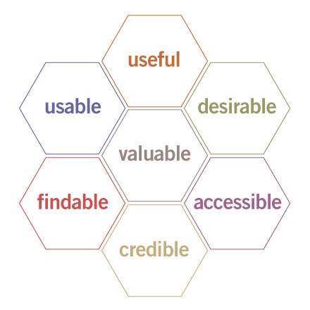
    You don't have to read the entire piece about API design, (I admit, it gets a little ponderous near the end if you are not really, really into APIs), but I wanted to share what I thought was the most interesting and perhaps relevant part of the piece, a diagram called the UX Honeycomb, originally developed by Semantic Studios. The diagram is meant to portray the facets or elements of User Experience, and as you will see, there is much more than 'usability' at play here.


    The point of the UX Honeycomb is to make sure that designers understand the various components that encompass UX, and to also emphasize the center element - 'Valuable'. So while for UX professionals, 'usability' remains important to overall UX, it is not by itself sufficient. And it is also a great reminder that the elements like 'useful', 'accessible', and perhaps most importantly for HR readers, 'credible' remain critical.

    And the way that the elements of the UX Honeycomb seem to have really close applicability to lots of what HR in general and HR technology projects in particular is the primary reason I wanted to share the diagram. Whether it is a traditional HR-led initiative like training, or performance coaching, or rolling out a employee wellness program, or a straight up HR systems implementation, evaluating your approach against these UX elements I think makes a ton of sense.

    Is what you are doing, or trying to get others to do, useful, usable, desirable, credible, valuable, etc.?

    I think you have to be able to check 'Yes' on just about every one of the elements on the UX Honeycomb no matter what the project is, in order to have a chance to capture the attention and the time of your users, employees, and leaders. I am going to keep the Honeycomb in mind moving forward, and I think you might want to as well.

    Anyway, that's it.

    Stay warm out there today.

    ---------------------------------------------------

    I probably should have updated that last line to say 'Stay cool out there today' - have a great week!

    Wednesday
    Jun082016

    The user interface is your voice

    Earlier this week Trish McFarlane and I did an HR Happy Hour Show and podcast based on the always interesting and influential Internet Trends Report from KPCB. On that show, we talked about some of the trends and ideas identified in the report (demographics, generational changes, and more), but one of the report's major themes that we did not discuss was the increase in capability and use of voice as a primary technology interface. Think Siri, Amazon's Echo and the like.

    The report spends a lot of time on this trend, (about 16 slides, almost 10% of the entire report), but I wanted to highlight just one of the slides, and then opine a bit about what this trend could imply for HR and workplace technologies going forward.

    Here's the money slide from the KPCB deck on the growth and potential of voice interfaces, then some FREE comments from me:

    Three quick takes on this chart and the voice interface trend overall...

    1. As the chart above shows, accuracy of these systems in terms of their ability to correctly recognize and interpret speech commands and instructions has been growing rapidly. And as these tools get better and better, users will take advantage of them more and more. Why? Talking is easier (and much faster), than typing or clicking. And convenience - think about when you are in your car, or making dinner in your kitchen, or eating a salami sandwich, (ok, maybe that is just my use case). Either way, as capability improves so will usage rates.

    2. While the primary use cases for voice interfaces and commands are largely personal, (these interfaces are primarily used for things like getting directions, making calls, sending texts, and the like), it is not a far stretch of the imagination to think that such a potentially widespread personal and consumer trend will work its way into workplace and organizational activities as well. Once your employees get used to using their voices to issue commands and requests for personal uses, it won't be long until they want to know why they can't navigate the online employee directory using voice, or ask the HRIS system to email them a PDF copy of their current benefits enrollments. Technology that takes hold of consumer consciousness almost always wants to enter the workplace as well. 

    3. Like wearable technologies like Google Glass and similar the initial workplace applications for voice interface technology might not be in so-called 'knowledge workers', but rather with front line and customer-facing workers like service techs, retail workers, or even in manufacturing and distribution. These are most likely the people that would benefit from increased computing capability that does not require them stopping what they are doing to manipulate a PC, table, or even a smart phone with their hands. We like to think that most tech advances benefit tech workers, but this might be a case where the best ROI comes from enabling field workers with the latest advances in tech.

    I think it is very interesting times in the voice interface space, and I wonder how long it will be until we see the first important breakthroughs in this area in the HR and workplace tech space.

    What say you?

    Friday
    Jan152016

    Why 'normals' are willing to adopt new technologies

    Quick shot for a busy Friday from a source that seems just about as far from HR and HR tech as possible, but I think offers a great reminder for anyone trying to effect a tech-driven change, HR or otherwise, on a group of people.

    If you follow the news at all then you will certainly be aware of the rapid technological advances and the seemingly profound changes on the horizon for the personal transportation industry, i.e., the car(s) that are likely at the end of your driveway, and your relationship with them.

    In short, the combination of the rapid improvement of self-driving auto technology (Google, Tesla, several other auto makers), an increase in the range, efficiency, and affordability in electric powered vehicles, (Tesla, GM), and the sudden but seemingly blanket coverage (at least in major cities), of 'ride-sharing' technology and services, (Uber, Lyft), has the potential to fundamentally change the methods and ownership of the means of personal transportation for millions, are changing the 'car' more than any time since the car replaced the horse. No one is sure exactly how all of these technological and sociological trends will collide and crash, and what the outcome will be, but most experts think that personal transportation will be markedly different in the next 20 years or so. 

    The reason I thought this was interesting today, and wanted to share on the blog, was a short observation about the user adoption of modern technology pulled from a recent essay on the changes in the personal transportation ecosystem and how these changes might play out on the stratechery blog titled Cars and the Future. Check the quote below, and think about what it suggests for ANY kind of change program that you or your team is trying to implement inside your organization. (emphasis mine)

    This generational pattern of adoption will, in the history books, look sudden, even as it seems to unfold ever so slowly for those of us in the here and now — especially those of us working in technology. The pace of change in the technology industry - which is young, hugely driven by Moore’s Law, and which has largely catered to change-embracing geeks - s likely the true aberration. After all, the biggest mistake consistently made by technologists is forgetting that for most people technology is a means to an end, and for all the benefits we can list when it comes to over-the-top video or a network of on-demand self-driving vehicles, change and the abandonment of long-held ideals like the open road and a bit of TV after supper is an end most would prefer to avoid.

    Only the most enthusiastic technophiles care at all about the technology itself and what that technology does.

    Everyone else cares only about what that technology can enable them to accomplish. It needs to help them do amazing new things, help them do the boring old things easier, faster, or cheaper, or otherwise leave them better off than they were before the introduction of the technology.

    Self-driving, on-demand, electric cars might be coming soon. But for people to adopt them en masse, they have to not just be a marvel of technology and engineering. They have to make people's lives better or they won't be adopted like the experts think.

    That same statement can be made for that new HR system you are thinking of implementing as well.

    Have a great weekend!

    Thursday
    Dec032015

    My favorite app is going away - 5 reasons why it was so great

    I knew this day was coming, but for quite some time I was able to delude myself into pretending it might not actually ever come to pass. But in the 'all good things must come to an end' department, I sadly share the news that news and discovery app Zite is shutting down, finally becoming completely absorbed into its acquirer, the similar-but-nowhere-near-as-good app Flipboard.

    For those who never knew Zite, it was simply the best, most interesting, most engaging of all the 'magazine-style' apps that seemed to emerge from everywhere in the last few years. In Zite, you would follow topics like 'Technology', 'Business' or 'Human Resources', and Zite would serve up relevant articles from a wide variety of sources - big mainstream sites, blogs, even really obscure blogs like this one. You could 'thumbs up' or 'thumbs down' an article and over time Zite would learn about your content preferences and show you more of the things you tended to like and fewer of the things you tended to dislike. Was its learning algorithm perfect? No. But was it pretty good? You bet. So much so that in the four or so years I have used Zite it is almost always the first app I look at every day to try and catch up on the topics that I am most interested in.

    While I pour one out in memory of my beloved Zite, let me share 5 reasons why the app was so great - lessons that I think are relevant not just for the narrow category of news apps, but for all kinds of workplace and consumer technology.

    Here goes...

    1. It was an app used by millions, but it seemed like it was built just for me

    Zite never 'made' me see anything it wanted me to see before I could get to the content I was interested in. It never made me follow a topic that I was not explicitily interested in. It never created some kind of 'sponsorsed' layer on top of the content I was looking for. It felt like a blank slate more or less, that I could build upon over time to get it to work like I wanted it to. I would guess that the 25 or so topics I was following in Zite were likely unique across millions of users. I mean, I was following 'Human Resources', 'Graphic Design', and 'Barbecue', among lots of other things. It just felt so personal.

    2. It was remarkably easy to use

    No effort, no training, no heavy lifting to get Zite to begin to add value. See an article you like? Tap 'thumbs up' and you will see more like that one. See a topic you like? Tap the tag for the topic and it is added to your list of topics you are following. And those two interactions are about all you needed to know to use Zite and get plenty of value in return. The folks at Zite seemed to show remarkable restraint in building and enhancing the app in order to keep it so easy to use. Great technology is sometimes defined by what capability is left out, just as much as what features are built in. 

    3. It got better the more I used it

    Over time, and 'learning' from the many, many times I tapped 'thumbs up' and 'thumbs down' on individual articles, Zite simply got better at presenting content that I was likely to be interested in viewing. It definitely evolved over the years to become really smart about the things I liked, what I did not like, and by the end of its life I found I was tapping 'thumbs down' very little. I never got sick of using it because it seemed to continue to get incrementally more valuable, despite not making many visible changes. 

    4. You could 'explore' and were challenged to discover new things

    The other app I use the most on my phone is my feed reader, Feedly. Feedly is a pretty awesome tool for consuming content, but it pales next to an app like Zite in one important way - Feedly only shows me content that I have explicitly asked it to show me when I subscribed to a specific RSS feed.  So it is great at giving me what I asked for, but not so great at turning me on to something new, something different, or at least a different take on a topic that it should know that I like. All of the things that Zite was really good at. The combination of Feedly and Zite gave me some overlap in terms of content, but together they worked well to bring me a great mix of viewpoints on subjects I was interested in. And many, many times Zite served up great content I would have never came across on my own. Literally all the time.

    5. Finally, you could jump in at any time without feeling like you have missed everything

    Feed readers, blogs, social networks that rely on the 'newsfeed' principle are all great, but all have one big shortcoming: if you have not checked them for awhile you fall impossibly behind. And it is really frustrating trying to get 'caught up'. Even Twitter recognized that by introducing the 'While you were away' updates in your timeline, (which I have found to be really useful, in case anyone cares). But with Zite, since it never operated on the 'timeline' paradigm, you could jump back in to the app, or a given topic in the app, and see what is new and interesting without the real or imagined pressure to get caught up. And in this age of information overload, who need another app or technology reminding us that WE ARE MISSING SOMETHING.

    Can you tell how bummed I am about Zite going away? It was an almost perfect app.

    The folks at Flipboard say that all the cool things and capabilities of Zite have not been fully incorporated in Flipboard, so I suppose I will give them the benefit of the doubt and try it out. But I am not optimistic.

    I am going to miss Zite, but hopefully what was great about Zite will find its way into more and more applications for work and for outside of work as well. By focusing on personalization, discovery, simplicity, usability, and productivity Zite in many ways created the blueprint for what great technology can do.

    And you know a technology was great when you are genuinely bummed to see it go.

    RIP Zite.