Quantcast
Subscribe!


Enter your email address:

Delivered by FeedBurner


E-mail Steve
This form does not yet contain any fields.

    free counters

    Twitter Feed
    Friday
    Dec042015

    Color of the Year 2016

    I continue to be completely, and probably irrationally fascinated with Pantone's 'Color of the Year' designation and process.

    In case you are unfamiliar (shock!), with Pantone and the Color of the Year designation here is all you need to know. Pantone is the world's leading authority on color, color systems, and publishes the industry standard definitions of colors. In other words that nice new orange shirt you just bought is not just 'orange' it is 'Pantone Persimmon Orange 16-1356 TPG'. Pantone provides guidelines and definitions for thousands of variations of colors, and it is the standard by which colors are classified.

    Each year the color experts at Pantone declare one specific shade the 'Color of the Year'. This specific color, (in 2015 it is 'Marsala' in case you did not know), is meant to be a kind of reflection of trends in art, design, fashion, movies, popular culture, and branding and often will subsequently become more common in actual products like clothing and jewelry as a result of the Color of the Year designation. So perhaps if you think back on 2015 and think you have seen a lot of Marsala around - a 'subtly seductive shade that draws you in with its embracing warmth', you have Pantone to thank or blame.

    So this week Pantone announced its choice for Color of the Year for 2016 and in a surprise the Color of the Year is actually two colors of the year - 'Rose Quartz' and 'Serenity', also known as sort of a light pink and light blue.

    The rationale behind the choice of two colors of the year, and these two shades in particular? 

    Here's what Pantone's color experts had to say about the selections:

    As consumers seek mindfulness and well-being as an antidote to modern day stresses, welcoming colors that psychologically fulfill our yearning for reassurance and security are becoming more prominent. Joined together, Rose Quartz and Serenity demonstrate an inherent balance between a warmer embracing rose tone and the cooler tranquil blue, reflecting connection and wellness as well as a soothing sense of order and peace.

    The prevalent combination of Rose Quartz and Serenity also challenges traditional perceptions of color association.

    In many parts of the world we are experiencing a gender blur as it relates to fashion, which has in turn impacted color trends throughout all other areas of design. This more unilateral approach to color is coinciding with societal movements toward gender equality and fluidity, the consumer's increased comfort with using color as a form of expression, a generation that has less concern about being typecast or judged and an open exchange of digital information that has opened our eyes to different approaches to color usage.

    So what, if anything, should any of us care about what Pantone says about culture, trends, society, fashion, and how we all are collectively feeling - expressed through the colors we are seeing and using more and more?

    I suppose the main thing to think about is right in the verbiage Pantone used to describe their thinking processes behind these selections. The words soothing, tranquil, reassurance, security, and wellness all show up in the first paragraph. Pantone is suggesting that the colors we will seek in 2016 will be ones like Serenity and Rose Quartz, hues that (if such a thing is possible), will help to make us feel better, safer, more secure, more at home perhaps.

    Recent news events from Paris to San Bernardino and a thousand places in between remind us all too often that the world continues to be a strange, mysterious, and sometimes scary place.

    The colors we choose say plenty about us, about who we are, how we feel, and perhaps how we want to feel.

    What do you think? Ready to rock plenty of Serenity and Rose Quartz in 2016?

    Have a great weekend! 
     

    Thursday
    Dec032015

    My favorite app is going away - 5 reasons why it was so great

    I knew this day was coming, but for quite some time I was able to delude myself into pretending it might not actually ever come to pass. But in the 'all good things must come to an end' department, I sadly share the news that news and discovery app Zite is shutting down, finally becoming completely absorbed into its acquirer, the similar-but-nowhere-near-as-good app Flipboard.

    For those who never knew Zite, it was simply the best, most interesting, most engaging of all the 'magazine-style' apps that seemed to emerge from everywhere in the last few years. In Zite, you would follow topics like 'Technology', 'Business' or 'Human Resources', and Zite would serve up relevant articles from a wide variety of sources - big mainstream sites, blogs, even really obscure blogs like this one. You could 'thumbs up' or 'thumbs down' an article and over time Zite would learn about your content preferences and show you more of the things you tended to like and fewer of the things you tended to dislike. Was its learning algorithm perfect? No. But was it pretty good? You bet. So much so that in the four or so years I have used Zite it is almost always the first app I look at every day to try and catch up on the topics that I am most interested in.

    While I pour one out in memory of my beloved Zite, let me share 5 reasons why the app was so great - lessons that I think are relevant not just for the narrow category of news apps, but for all kinds of workplace and consumer technology.

    Here goes...

    1. It was an app used by millions, but it seemed like it was built just for me

    Zite never 'made' me see anything it wanted me to see before I could get to the content I was interested in. It never made me follow a topic that I was not explicitily interested in. It never created some kind of 'sponsorsed' layer on top of the content I was looking for. It felt like a blank slate more or less, that I could build upon over time to get it to work like I wanted it to. I would guess that the 25 or so topics I was following in Zite were likely unique across millions of users. I mean, I was following 'Human Resources', 'Graphic Design', and 'Barbecue', among lots of other things. It just felt so personal.

    2. It was remarkably easy to use

    No effort, no training, no heavy lifting to get Zite to begin to add value. See an article you like? Tap 'thumbs up' and you will see more like that one. See a topic you like? Tap the tag for the topic and it is added to your list of topics you are following. And those two interactions are about all you needed to know to use Zite and get plenty of value in return. The folks at Zite seemed to show remarkable restraint in building and enhancing the app in order to keep it so easy to use. Great technology is sometimes defined by what capability is left out, just as much as what features are built in. 

    3. It got better the more I used it

    Over time, and 'learning' from the many, many times I tapped 'thumbs up' and 'thumbs down' on individual articles, Zite simply got better at presenting content that I was likely to be interested in viewing. It definitely evolved over the years to become really smart about the things I liked, what I did not like, and by the end of its life I found I was tapping 'thumbs down' very little. I never got sick of using it because it seemed to continue to get incrementally more valuable, despite not making many visible changes. 

    4. You could 'explore' and were challenged to discover new things

    The other app I use the most on my phone is my feed reader, Feedly. Feedly is a pretty awesome tool for consuming content, but it pales next to an app like Zite in one important way - Feedly only shows me content that I have explicitly asked it to show me when I subscribed to a specific RSS feed.  So it is great at giving me what I asked for, but not so great at turning me on to something new, something different, or at least a different take on a topic that it should know that I like. All of the things that Zite was really good at. The combination of Feedly and Zite gave me some overlap in terms of content, but together they worked well to bring me a great mix of viewpoints on subjects I was interested in. And many, many times Zite served up great content I would have never came across on my own. Literally all the time.

    5. Finally, you could jump in at any time without feeling like you have missed everything

    Feed readers, blogs, social networks that rely on the 'newsfeed' principle are all great, but all have one big shortcoming: if you have not checked them for awhile you fall impossibly behind. And it is really frustrating trying to get 'caught up'. Even Twitter recognized that by introducing the 'While you were away' updates in your timeline, (which I have found to be really useful, in case anyone cares). But with Zite, since it never operated on the 'timeline' paradigm, you could jump back in to the app, or a given topic in the app, and see what is new and interesting without the real or imagined pressure to get caught up. And in this age of information overload, who need another app or technology reminding us that WE ARE MISSING SOMETHING.

    Can you tell how bummed I am about Zite going away? It was an almost perfect app.

    The folks at Flipboard say that all the cool things and capabilities of Zite have not been fully incorporated in Flipboard, so I suppose I will give them the benefit of the doubt and try it out. But I am not optimistic.

    I am going to miss Zite, but hopefully what was great about Zite will find its way into more and more applications for work and for outside of work as well. By focusing on personalization, discovery, simplicity, usability, and productivity Zite in many ways created the blueprint for what great technology can do.

    And you know a technology was great when you are genuinely bummed to see it go.

    RIP Zite.

    Wednesday
    Dec022015

    You can learn plenty from a simple employee tenure chart

    Count of employees by years of tenure. Quite possibly the simplest workforce metric, (can we even call it a 'metric?'. I guess), that exists. And since it is so simple, really it is just counting up the number of employees at different levels of tenure like 1 year, 2 years, more than 10 years, etc., it probably can't tell us all that much about the conditions or capabilities of a large workforce right?

    Well maybe this simple metric can tell us a little more than we think. Take a look at the data below, and before you skip ahead to the rest of the post to see where the data is drawn from, ask yourself what this simple data set might say or at least suggest about the organization in question:

    EXPERIENCE

    NUMBER

    First year

              10

    Second year

              13

    Third year

                1

    Fourth year

                0

    Fifth year

                1

    6-9 years

             21

    10-15 years

             38

    16-20 years

             27

    21-27 years

            10

    Source: (see below)


    So what can we discern from the data above, on the tenure counts of a group of employees that do pretty much the same job inside a mid-sized organization?


    Obviously there is a visible 'gap' in experience levels across this group - there is a huge cluster of the total of 121 employees in the group (about 61%) having more than 10 years experience and another smaller, but not insignificant grouping having between 1 and 2 years experience, (about 20%). But in between these clusters at the extremes of experience? Not many employees at all. In fact there are only 2 out of 121 employees having between 3 and 5 years experience on the job - often the 'sweet spot' for proficiency in many roles, but more on that in a second.


    What might we then deduce about the potential issues that might face any organization, (and again, we will get to which specific organization data set represents soon), with this kind of 'hollowed-out' tenure distribution?


    I can think of at least three things, and I promise I am not trying to allow my knowledge of who this organization is to reach these observations:


    1. Something in this organization's recruiting/onboarding/mentoring/early development for new employees is not working. To have effectively about zero staff in the 3 - 5 years of experience cohort says you either are bringing the wrong type of people into the role, or are failing to get them up to speed to the point where they are succeeding within 3 years. The chart, simple as it is, can't tell us what exactly is wrong, but that certainly something is wrong.


    2. Although this is just a tenure chart, and not an 'age' chart, it doesn't require too much of a stretch to conclude that this organization is going to face a pretty serious issue with older workers either retiring or with them simply unable to perform in the role at a high level once they hit a certain age. There are pretty significant physical and fitness requirements for this role, making it not the kind of job that most people can continue in much past say 60 or so. This lack of balance in experience with the heavy skew towards 10 and 15 year plus employees is going to present acute issues in the next 3 - 5 years (and possibly beyond).


    3. An organization with this kind of tenure distribution probably has not kept up from a talent management and recruiting perspective with the increasing demands of the role. Like most jobs, the one held by the folks in this chart has become more complex in the last few years, has more scrutiny and pressure placed upon the people in the role, and the employees have more at stake in terms of money and prestige for the organization that employs them. In a nutshell, this job, while being around for about 100 years or so, has in the last 10 or so gotten much, much harder. And the 'gap' in the talent pipeline shows us that recruiting, development, and mentoring efforts have not kept up. Entire new classes of new hires are gone inside if 5 years.


    Ok, so who is this organization/group of employees who are reflected in the above chart?


    No one but the National Football League's on-field officials - the 'Zebras' that officiate and adjudicate the action on the fields of America's most popular professional sports league, the NFL.


    And increasingly, these on-field officials are in the news for all the wrong reasons - missed calls, bad calls, failure to recognize clearly concussed and barely vertical players after they are smashed in the head, and so on. This group of employees, as a group, have been performing poorly for some time now. And the talent pipeline as we see above does not indicate that things are about to get any better anytime soon.


    The big lessons for the rest of us?


    Pay attention to tenure. Sure, it is not the only or even the most important simple metric to think about. But if it takes 3 or 4 or 5 years for someone to really become expert at the job, and you have hardly any employees in those buckets, then you are going to have organizational performance issues. You will have too many folks on the downslope of their capability and too many who have not yet figured out what the heck is going on. And not enough folks heading up towards their peak.


    You are not always recruiting, developing, mentoring, and retaining to ensure high performance this week - sometimes you are doing all of those things to ensure high performance four years from now.


    And football is still dumb.


    Tuesday
    Dec012015

    Know what game you're playing

    Three separate but sort of related stories from the worlds of music, movies, and sports that all seem to point in the same direction, even if it might not seem so at first glance. First, the background information, and then the (painfully obvious) conclusion and argument for why these things matter to 'regular' folk like you and me.

    Music - Adele's '25' breaks sales records, plus Adele keeps '25' off of most music streaming services

    From CNN Money:

    Adele's latest and highly anticipated album '25' will not be available on music streaming services, according to an executive with knowledge of the release strategy.

    The New York Times, which first reported the streaming decision on Thursday, said Adele was personally involved in making it.

    Adele is one of a small number of A-list artists who can make potentially more money by foregoing sites like Spotify and Apple Music.

    "Adele is an anomaly. If she decided to release her album on cassette tapes, it would still be the biggest album of the year," an industry source said.

    The music label has indicated to streaming executives that "25" will stay off Spotify-like services indefinitely, but that calculation could change in the coming months.

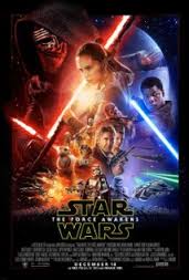
    Movies - 'Star Wars: The Force Awakens' breaks pre-sales records, plus 'Star Wars: The Force Awakens' will likely not be pre-screened for movie critics

    From The Verge:

    Normally when a movie studio decides not to screen a film for critics, it’s a sign of weakness. The film’s not working, so rather than let bad word of mouth hurt the opening weekend, the move is just to hide the problem from the moviegoing public as long as possible. But there’s nothing normal about the upcoming release of Star Wars: The Force Awakens, which according to recent reports isn’t screening for year-end awards consideration — and likely won’t be shown ahead of time to critics at all.

    What’s being hidden this time is the movie itself — and any spoilerific twists J.J. Abrams has cooked up. In an era of oversaturation, where it’s common for nearly every major joke and reveal to be spoiled by a movie’s trailers and marketing campaign, The Force Awakens has been a cinematic anomaly, parcelling out carefully chosen nuggets of information that have generated unprecedented levels of excitement without revealing much about what audiences will be seeing next month. For fans, it’s a welcome change that’s largely kept the notorious internet spoiler machine at bay — but for studios anxious to control how every facet of how a movie is perceived in order to maximize box office and hype, it could be the new blockbuster template

    Sports - 76ers Rookie Jahlil Okafor can't stay out of the news - street fights, speeding, fake ID at a bar, plus Okafor's current stats after 18 games (they're pretty good).

    From philly.com

    On the court, Jahlil Okafor had arguably the best start of any Eastern Conference rookie.

    However, his experiences off the court have been far from stellar.

    Four sources independently confirmed to The Inquirer that the 76ers center was pulled over on the Ben Franklin Bridge about three weeks ago for driving 108 m.p.h. The normal speed limit on the bridge is 45 m.p.h.

    The Sixers did not deny The Inquirer's report.

    Ok, three stories from three different component of pop culture, but all kind of instructive for us normals.

    None of us wants the 'rules' to apply to us. Or said differently, we like to think that we are so super talented so important or so irreplaceable that the rules shouldn't apply to us. Just like they don't seem to apply to Adele and Star Wars and NBA stars like Okafor.

    So how can we know if the rules, or at least most of them, should apply to us? Let's look at the above three examples for some guidance.

    1. From Adele - If the value you can create with your work is so unique and so hard to duplicate, then you can control how that work is going to be shared with the world, i.e., with more favorable terms and conditions than others in your field can demand. Adele's fans will buy full albums and CDs (like we all used to), where most other musical artists have to submit to the Spotifys and Apple Musics of the world in order to get their music to the fans (who don't want to pay anything). The entire music industry has been turned on its head in the last two decades, (when was the last time you bought a CD?), but for Adele, she can play the game by the old rules still because she creates value no one else can. 

    2. From Star Wars - If you have a direct line into the hearts and minds of your most important customers, and they will stick with you no matter what, like the fans of Star Wars have for the movie franchise, then you might have a case for the rules not applying to you. Star Wars does not need validation from movie critics, and if you don't need validation or approval of your work from middle management or the suits upstairs, then you have plenty of power. Gaining that kind of trust from customers is really rare and really valuable.

    3. From Okafor - If you have an incredibly rare and valuable set of skills, ones that are in extremely high demand and highly limited supply, then the rules might not apply to you. The list of people that can average 18 points and 8 rebounds in the NBA is very, very short. Like about 10-15 people in the world. If you are one of those 10-15 people then things are generally going to be pretty good for you.

    So should the rules apply to you, or that 'star' on your team?

    Well if you can create value like Adele, connect with your source of profit like Star Wars, or possess such a unique and almost impossible to replace set of skills like Okafor, then maybe the rules should not apply.

    But there are not many Adeles, Star Wars, or Okafors in this world it seems.

    Monday
    Nov302015

    Learn a new word: Face with tears of joy

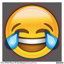
    At the risk of sounding a little too much like the 'get off of my lawn' old codger that I am fighting against becoming, please take a look at the image on the left, your Oxford Dictionaries 'Word of the Year' for 2015 and try hold back your tears for the future of humanity while you contemplate the same.

    The 'Word' of the Year for 2015 as you have certainly deduced is not really a word at all, but rather an emoji, and to be precise, it is the 'Face with tears of joy' emoji. And if the folks at Oxford are correct you have doubtless seen this particular emoji plenty of times this year as their research claims 'face with tears of joy' to be the most-used emoji of 2015. I guess 'smiley-face' is just so 2012. Note to self: I probably need to up my emoji game.

    Just why did Oxford Dictionaries go with an emoji, never mind this particular one as its Word of the Year? Let's take a look at the reasoning from the blog post announcing the selection:

    Emojis (the plural can be either emoji or emojis) have been around since the late 1990s, but 2015 saw their use, and use of the word emoji, increase hugely.

    This year Oxford University Press have partnered with leading mobile technology business SwiftKey to explore frequency and usage statistics for some of the most popular emoji across the world, and ๐Ÿ˜‚ was chosen because it was the most used emoji globally in 2015. SwiftKey identified that ๐Ÿ˜‚ made up 20% of all the emojis used in the UK in 2015, and 17% of those in the US: a sharp rise from 4% and 9% respectively in 2014. The word emoji has seen a similar surge: although it has been found in English since 1997, usage more than tripled in 2015 over the previous year according to data from the Oxford Dictionaries Corpus.

    Admit it, you have used an emoji(s) in some kind of 'business' correspondence in the last month or so. Even if it was not a full-fledged 'image' emoji, you have definitely dropped a :) (technically, an emoticon, not an emoji, but you get the idea), somewhere in an email or a text to a business contact. It is ok, I have to.

    And I suppose with recognition of the rise in popularity and increase in common usage of emojis by organizations like Oxford Dictionaries it is becoming a little less troubling to admit that you have been peppering emails and other messages with those cute little characters. And why not? A picture is worth a thousand words and all that, and NO ONE wants an email of a thousand words, or even half that.

    But the larger part of the story, and the reason why I have submitted 'Face with tears of joy' as the latest in the 'Learn a new word' series is that it reminds us (again, as if we needed reminding), that methods, manner, and styles of communication, even 'serious' communication, change and morph over time. We are not writing long-winded memos any longer, no one has tolerance for lengthy emails, voice mail is just about dead as a business tool, and so on. 

    With the growth in popularity of short messaging services, (SMS, WhatsApp, Facebook Messenger, Snapchat, etc.), the style of interaction on these services are changing and adapting to the medium. Throw in the seeming information overload/time crunch that almost every professional you know will claim these days, and the ability to convey complex information in the shortest, most succinct way possible is a skill that is at a premium.

    And since this post has already gone on too long for a post that is more or less about getting your point across more quickly, I will leave with this - it is probably time to step up your emoiji game. As much as I cry a little inside to say that.

    Have a great week!