Quantcast
Subscribe!


Enter your email address:

Delivered by FeedBurner


E-mail Steve
This form does not yet contain any fields.

    free counters

    Twitter Feed

    Entries in data (149)

    Friday
    Dec192014

    The Canary Trap, or, how to plug an information leak

    This is possibly, actually almost certainly, my favorite story of 2014. It involves basketball, information security, organizational intrigue, and espionage tactics. And it just might be a helpful example for you if you are faced with a 'leaker', i.e., someone on the team who can't seem to keep private and proprietary information private.

    So here is the story, recounted in this piece from Business Insider: The NBA Used an Espionage Trick Known as 'Canary Trap' to Catch Teams Leaking to the Media

    The National Basketball Association fined Detroit Pistons President of Basketball Operations Joe Dumars $500,000 in 2010 for leaking information to Yahoo! Sports reporter Adrian Wojnarowski, according to Kevin Draper of The New Republic.

    In order to catch the person responsible for the leak, the NBA set up a months long sting operation based on a common espionage method made popular in the Tom Clancy novel "Patriot Games." In that book, the protagonist Jack Ryan uses what he calls a "canary trap."

    According to Draper, when the NBA sent memos to teams, each team would get a slightly different version in which a few words or numbers would be changed. So when the memo, or information from the memo, was leaked to the media, the NBA would look for the small changes it had made to determine which team the leaks came from.

    Dumars was one of two executives caught "red-handed," according to Draper.

    Fantastic story. And probably useful as well, (at least for the more devious among us).

    But seriously, who has not run into this kind of a situation at least once or twice? You are working on a new and 'secret' project and somehow, some way news and information about the project manages to reach someone who you did not want to have such information. Or maybe it is a set of financials or headcount data projections that somehow end up in the hands of a manager from another group - before you were ready to release them.

    It may not seem like a big deal, especially in the modern era of transparency, aka 'oversharing', but I think sometimes it is a big deal.

    If you can't trust the people and the team to keep confidential information, well, confidential, then you can't really trust them with anything. And sometimes as a leader you have to root out the source of the leak, and The Canary Trap, while sounding straight out of a Bond movie, just might help you to do that.

    Try it sometime, even as an experiment. Give person 'A' one set of details, and a slightly different set to person 'B' and see which version, (if any), somehow gets leaked. Trust me, it will be fun.

    Ok, that is it for the week I am out - Have a great weekend!
    Thursday
    Dec182014

    The disconnect between the skills that get you hired and the jobs most workers have

    Wow, that was a long post title. Sorry. The post won't be that long at all, trust me.

    All I want you to do is look at two charts and then draw your own conclusions about the significance, if any.

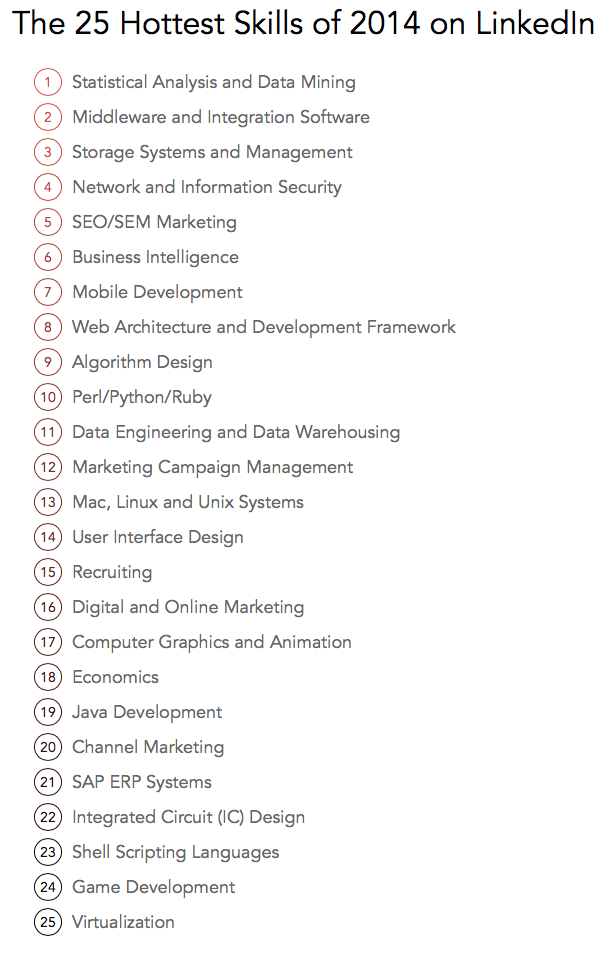
    The first, courtesy of the world's largest professional network, LinkedIn, who published some data they call 'The 25 Hottest Skills That Got People Hired in 2014', (from an analysis of member skills, employment changes, and recruiter interest on LinkedIn). 

    Here is the chart:

    Now for the second chart I'd like to bring to your attention, from the Bureau of Labor Statistics a look at the Top 10 occupations with the highest employment (dated from May 2013, so it is slightly older than the LinkedIn data, but it was the latest I could find after about 5 minutes of exhaustive research)

    Here goes:

    See any differences between what gets people hired, at least people on LinkedIn, and the kinds of jobs that are held by the largest numbers of people in the USA? These Top 10 occupations make up about 22% of overall US employment, in case you were wondering.

    Wonder how far down on the BLS list (and you can check the full list of occupations as defined by the BLS here), you have to go before you run in to 'Statistical Analysis and Data Mining', the top 'hot' skill for 2014 as per LinkedIn. I will save you a click and let you know that all the occupations that the BLS rolls up into 'Computer and Mathematical Operations', (where most of LinkedIn's Top Hot skills would likely map), account for about 3.7M workers, that is just under 3% of all the jobs in the country.

    Ok, since I said I was going to just show the charts and leave it up to you to think about, I better shut up.

    Have a fantastic day. And don't spend so much time on LinkedIn.

    Tuesday
    Dec162014

    UPDATE: The ADP Workforce Vitality Index

    Back at the HR Technology Conference in October, the folks at ADP introduced their latest measurement of the pulse and health of the American workforce and labor market, called the ADP Workforce Vitality Index.

    The Index is compiled by the professionals at the ADP Research Institute and provides quarterly measure of U.S. workforce dynamics that looks at key labor market indicators, such as employment growth, job turnover, wage growth and hours worked. This free report yields insights into workforce dynamics and trends than previously available -the index includes lots of key metrics on employment, workforce strategy and human capital management.

    Since HR Tech in October, most of the reporting on 'macro' labor market trends all seem to be signaling a tightening labor market, upward pressure on wages, and an environment where workers (at least the ones with the 'right' skills), have more and better options than they have had in years. 

    The ADP data seems to bear this out, with an increase in overall 'Vitality' (a measurement of the total wages paid to workers across a number of dimensions), across regions, industries, and income levels.

    Take a look at the latest report embedded below (Email and RSS subscribers may need to click through).

    Infographic: ADP Workforce Vitality Index Shows Real Wages Accelerating

    Overall, the data show real wages accelerating - the total real wages paid to the US private sector workforce, is Indexed to 110.6 in the third quarter of 2014 (2Q2011=100, Seasonally Adjusted), an increase of 0.77% from the previous quarter.

    There is plenty more to dig into in the ADP data, especially if you are a data geek like me, and more information and complete data sets that can be downloaded can be found here.

    One of the greatest potential benefits that the massive data sets that are available to the largest HCM solution providers make possible is the ability to analyze, synthesize, and derive insights from the aggregated data from thousands of employers and millions of employees. The ADP Workforce Vitality Index is a great example of this and hopefully, soon other providers with similarly robust HCM data sets will create their own unique reports and indices for use by HR and organizational leaders.

    Monday
    Dec152014

    LEAKED: Two observations from the Sony Pictures hack

    I am sure you have heard or read about the widespread hack and subsequent leaks of massive amounts of corporate information like email archives and other sensitive organizational (and HR) data at Sony Pictures.

    If you would like to be familiar, or at least caught up, a useful timeline of the hack and the leaks, (which appear to be ongoing), is here.

    Embarrassing email exchanges, written potshots being taken at various industry players, and even a dump (in the form of an Excel spreadsheet), of salary and other HR data for the organization's executives.

    A mess. And seemingly not going anywhere, not for a while anyway.

    So here are my two, thought about this for 10 minutes, observations for HR/Talent professionals from this brouhaha.

    1. It's time to stop thinking of Email as private, secured communication. I think since the rapid rise, and subsequent realization of the lack of privacy of public social networks like Twitter and Facebook, we somehow look at email, in comparison, and think it is private and secure. And while it should be, the Sony hack is just another example that reminds us that any communication in written, digital form is not ever 100% secure. We use Email so much, and in the large company environment it is so essential and ubiquitous, we have become beguiled to accept it as (mostly) private by default. And that is, in a word, insane. Forget about getting hacked by a malicious 3rd party - all it takes for your private, sensitive, possibly career-threatening email to get out into the world is one tiny error in the CC box, or one slip-up when forwarding something to John Jones and having it go to John Johnson instead. Lesson: Stop emailing so much (general). And talk to your leaders, managers, and employees about maybe picking up the phone once in a while.

    2. Employee and HR data in Excel spreadsheets is likely your single largest HR data-related risk area. Every single company has HR or Comp people with salary, bonuses, and other HR/Compensation data sitting in Excel spreadsheets on individual PCs and company servers. For smaller companies, this is usually out of necessity: Excel is the only tool available to them to do comp calculations and analyses. But even in larger companies that have powerful and sophisticated Compensation Planning tools, often these tools are used to simply dump Employee and Comp data into Excel for additional manipulation and even file sharing. The Comp planning systems are powerful and secure. Excel spreadsheets are powerful and highly insecure (ask Sony). Where should you insist your Comp data remain?

    We have spent literally years reminding our kids and each other that nothing that gets posted on Facebook or Instagram is really private.

    It is also time to remind ourselves and our employees that nothing posted anywhere is really private either.

    Have a great week!

    Thursday
    Dec042014

    CHART OF THE DAY: How we spend our time

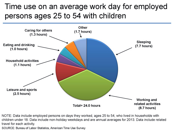
    Today's Chart of the Day comes from our friends at the Bureau of Labor Statistics from their recent American Time Use Survey, which collects information about the activities people do during the day and how much time they spend doing them.

    So what do most of us (employed people ages 25 - 54 who have kids under 18 at home) do all day, or at least all 'work' day? Here is the chart and some FREE comments (lamentations) from me after the data:

    A few things stand out really quickly from this data of the average 24-hour work day:

    1. While the average person sleeps just a shade under 8 hours a day, I don't know anyone that is likely to report that much sleep. It seems like most folks I know are maybe getting 6.5 or 7 hours a night. So the 7.7 seems really high, what do you think?

    2. The single largest slice of the average day, unsurprisingly, is work (and related activities including commuting from/to work), with 8.7 hours per day spent. That kind of seems in line to me although I bet if you ask around your circle of friends and colleagues most people will say they work more than that. I kind of think there could be some fudging in both the survey numbers and what folks talk about privately as well. We like to think we work more than we do, but come on, are you really grinding away 10 or 12 hours a day like you would like (certain) people to believe?

    3. The most interesting thing about the chart, and for many of us, also the most interesting thing about how we spend our time, is what we say we are doing when we are not at work or asleep. Taking out the 'responsible' stuff from the chart (taking care of others, household activities), and that still leaves something like 5 - 6 hours a day (remember, these are working days), of more or less 'free' time. No one I know will admit that they feel like they have that much free or leisure time each day. 

    I don't have any really prescient or even pithy conclusions to draw from this data except for just thinking about (and similar to what I blogged about earlier in the week), how I am spending my time and whether or not I am getting closer to the various goals I have.

    What do you think? How does your day stack up against this data?

    Have a great day.