Quantcast
Subscribe!


Enter your email address:

Delivered by FeedBurner


E-mail Steve
This form does not yet contain any fields.

    free counters

    Twitter Feed
    Thursday
    Mar122015

    CHART OF THE DAY: The decline of employer provided training

    Today's installment of the wildly popular CHART OF THE DAY series offers a selection from some light reading that you can perhaps spend some time with this coming weekend, the 300+ page long 2015 Economic Report of the President

    Nestled on page 147 of this tome, is the below chart - a look at trends in Employer-provided training and on-the-job training opportunities for the US labor force from the period 1996 - 2008 (the latest year this data was available). As always, take a look at the chart, then some witty, wry, and as always FREE commentary from me.

    The Chart:

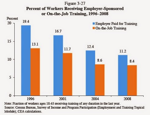
    As you can see from the data, both employer paid for and on-the-job training activity, as reported by workers, were both on the decline from 1996 to 2008. And even with 'old' data from 2008, it seems pretty defensible to argue the ensuing few years, the tail end of the recession and the ensuing years of halting economic recovery, that trends and declines in employer paid for training would not have reversed themselves.

    So, what do we make if this data? Here goes....

    1. No one has time or much tolerance for onboarding new people who have to be 'taught' very much, at least taught more general, and transferable from one employer to another type skills. Every job ad you see for say an Accounting Manager just about demands that the person actually already be an Accounting Manager to be considered to get hired as an Accounting Manager.

    2. When employers perceive workers to have fewer attractive options outside the organization, the pressure or impetus to invest in upskilling and employee career development tails off. While this is a pretty obvious conclusion, it does not diminish its significance. By 2008 firms, often by financial necessity, had backed way off training and development. That is a short term strategy and decision that can have much greater than expected consequences once times start to improve.

    3. Employee training continues to be 'someone else's problem' for many employers. It still is really easy for organizations to demand fully trained and capable candidates for any role prior to hiring, as the fears of costs of training become sunk if and when the employee leaves present a high burden for proponents of more employer provided training to overcome.

    4. As an employee, you remain, invariably, on your own. Keep yourself ready, keep current, be willing to pay for it yourself, since fewer and fewer employers are willing to invest in you.

    Ack, that was kind of cynical. Sorry.

    Happy Thursday.

    Tuesday
    Mar102015

    Users don't know what they want - but they know something

    How much, or little, should product designers and developers interact with potential users and customers of the products the designers and engineers are creating?

    It seems like a simple question, but if you think about it some and recall some of the famous perspectives on customer input into product development you find that the answers to this question tend to land on one of two extremes.

    On the one side, you have the Steve Jobs/Henry Ford take on customer needs and wants. Jobs more or less thought customers had no idea what they really wanted, and he (and Apple), had to create that want by building amazing products that met that need (that the users didn't know they had). Ford is famously quoted as saying that if he had asked customers what they wanted they would have replied 'faster horses', instead of reliable and affordable automobiles.Ford

    The other extreme, and one seen traditionally in lots of workplace kinds of technologies, is for developers and designers to build just exactly what customers request. This approach is mostly an outgrowth and evolution of internal IT shop's tendency to build custom applications based on a list of documented requirements from the end users. If the feature was in the requirements doc, it made it into the product. If not, then the capability didn't get built in the delivered product. And the IT response to downstream complaints was always, 'Well, it wasn't in the requirements.' 

    So what is the best, or most effective middle ground between Jobs/Ford (customers don't know anything) and the traditional IT (customers HAVE TO know exactly what they want) approaches?

    Maybe the best approach is summed up in this recent piece from the O'Reilly Radar site, 7 User Research Myths and Mistakes:

    The most common reason people give for not talking to users is that “users don’t know what they want.” While that’s sometimes true, it’s not a good reason for not talking to them. It’s just a good reason for not asking them to tell you exactly what they want.

    Instead, ask people about their problems. Ask them to tell you stories about how they use other products and how they make buying decisions. Ask them when they use specific products. Is it on the train? In the car? At their desks? At work? Ask them about their lives.

    Users might not be great at telling you what new product they’re definitely going to use, but they’re great at telling you about themselves, and that is a very good thing for you to understand if you’re making a product for them.

    That seems right to me - describing that sweet spot or middle ground between not giving a rip about what users think and the other extreme of expecting the users to tell you exactly what you should build for them.

    Keep this in mind the next time you sit down with some HR tech solution provider salesperson. How much do they ask you and your team about the problems you need to address? How much do they seem interested in what makes your organization work (and unique)?

    And how much do they like to talk about exactly what their product does?

    You are the user. You might not know everything. But you sure know something.

    Monday
    Mar092015

    Team PowerPoint vs. Team Excel

    What would you say is the preferred tool or mechanism for creating, sharing, and socializing information in your organization that is used to generate discussion and ultimately, decisions?

    While many of us (sadly) would probably default to 'Email' as the technology of choice, even heavy email cultures rely on 'real' office productivity applications for work products and communicating information. Excel and PowerPoint, assuredly, are two of the most common applications in use across organizations of all types. But which one of these two applications tends to dominate how business information and data are documented and shared can reveal plenty about how decisions are made and what kind of organizational culture prevails.

    Check the below excerpt from a recent piece on Digitopoly, a review of research into how competing teams at NASA (Team PowerPoint and Team Excel), created and shared data and information on robot technology used for experiments on space projects:

    On Team Excel, the robot has a number of instruments but separate teams manage and have property rights over those instruments. The structure is hierarchical and the various assignments the instruments are given are mapped out in Excel. By contrast on Team PowerPoint, no one team owns an instrument. Instead, all decisions regarding, say, where to position the robot are made collectively in a meeting. The meetings are centered around PowerPoint presentations that focus on qualitative trade-offs from making one decision rather than another. Then decisions are taken using a consensus approach — literally checking if everyone is “happy.”

    What is fascinating about this is that the type of data collected by each team is very different. On Team Excel where each instrument is controlled and specialised to its task, the data from them is very complete and comprehensive on that specific thing — say, light readings, infrared etc. On Team PowerPoint, there are big data gaps for each instrument but there appear to be more comprehensive deep analyses of particular phenomenon where all of the instruments can oriented towards the measurement of a common thing. This is a classic trade-off between specialised knowledge and deep knowledge. What is extraordinary is that they bake the trade-off into their organisational structure and also decision-making tools — literally emphasizing different apps in Microsoft Office.

    We probably don't consciously think too much about how the technology and tools choices we make can effect how the organization actually functions, what particular approaches and skills tend to dominate, and even what gets recognized and rewarded. In the example from the Digitopoly piece, an argument is made that both of these approaches, Team Excel with its focus on individual accountability and control, and Team PowerPoint that relied much more on shared accountability and the 'big picture', are needed and have value.

    Where we get into trouble, I think, is when one type of technology, say PowerPoint, becomes dominant or the de facto method in an organization for communicating information and as a decision support tool. It is by its nature, shallow, and it assumes that viewers and readers understand the details and deeper contexts about the subject matter that is typically just about impossible to convey in a slide deck.

    Similar arguments can be made on cultures where 95% of communication is over email, or tied up in impossibly complex Excel workbooks. 

    We often choose the easy or expected technology solution out of habit, or out of a kind of cultural allegiance. It is fascinating how these technology choices can impact much more than we think.

    Team Excel. Team PowerPoint. That really shouldn't be the choice. Team 'Right tool for the job' is. Choose wisely.

    Have a great week!

    Thursday
    Mar052015

    PODCAST - #HRHappyHour 205 - Health & Benefits Leadership Conference Preview

    HR Happy Hour 205 - The Health & Benefits Leadership Conference Preview

    Recorded Thursday March 5, 2015

    Hosts: Trish McFarlaneSteve Boese

    Guest: Jennifer Benz

    Listen to the show HERE

    This week on the HR Happy Hour Show, Trish and Steve were joined by Jennifer Benz, Founder and CEO of Benz Communications, and Program Chair for Human Resource Executive's Health & Benefits Leadership Conference, to be held April 8 - 10, 2015 at the Aria in Las Vegas.

    On the show, Jennifer shared some of the most important themes and challenges facing Benefits and HR leaders today - health care plan design and reform, employee wellness, (particularly financial wellness), and the importance of educating and effectively communicating with employees on important benefits, wellness, and welfare issues.

    The upcoming Health & Benefits Leadership Conference will help HR and Benefits leaders understand these challenges and trends, as well as provide insight and actionable ideas to take back to their organizations immediately. And in what has become a highlight in the young history of the Health & Benefits Leadership Conference, once again an exciting, 'Ignite' style Ideas and Innovators session will showcase the best, most leading edge, and provocative thinking on health, wellness, and benefits.

    '

    Benefits and related spending can be as much as 30% of compensation budget for many organizations. Understanding how, where, and for what goals you are investing such a considerable amount of budget is one of the top priorities for HR and Benefits leaders today. On the show, Jen shared a preview of how the Conference can and will help you as a leader in making these critically important organizational decisions - ones that impact employee engagement, reputation, and retention.

    We also lamented again (well, mostly Steve), about the terrible winter weather, Steve shared a slightly disturbing tale of a former neighbor and his snowblower, and Trish offered to talk about Benefits plan design with anyone at any time. We also talked about how cool the word 'formulary' is. 

    You can listen to the show here, or using the widget player below, (Email and RSS subscribers will need to click through, or go to the show direct link)

    Check Out Business Podcasts at Blog Talk Radio with Steve Boese Trish McFarlane on BlogTalkRadio


    Also, listeners of the show who attend the Health & Benefits Leadership Conference can use the registration discount code BOESE15 (all caps), to receive $75 off the current registration rate.

    As always, you can listen to the current and all the past shows from the archive on the show page here, on our HR Happy Hour website, and by subscribing to the show in podcast form on iTunes, or for Android devices using Stitcher Radio (or your favorite podcast app). Just search the iTunes store or your podcast app for 'HR Happy Hour' to add the show to your subscriptions.

    This was a great show, and many thanks to Jennifer for being a part of the fun. 

    Thursday
    Mar052015

    Grumpy, Chill, Hip, or Out-of-touch - Some new dimensions for your 9-box grid

    The classic talent evaluation/assessment/review/calibration process usually looks to position everyone in the group of interest (managers, members of a specific department, everyone having the same type of role), on a 9-box grid that uses 'Performance' and  Potential' as its axes.

    If you have been in the talent management game for more than say 6 months, you are no doubt familiar with the process of reviewing, assigning, and then taking actions based on where individuals fall on the 9-box. High performer with high potential to advance? Make sure he/she is being given challenging assignments, is being rewarded well, and knows you recognize their value and they have a bright future if they keep up their great work. Low performance and low potential? Maybe it is time to have a frank conversation about whether they remain a good fit in the organization, at least in their current role.

    But 'Performance' and 'Potential' are not the only ways or measurements by which to assess and rank a group of employees. In fact, these measurements might not even be the best way to assess a group. Click for a larger version

    Take a look at the chart to the right, (courtesy of NBA.com) - a 9-box-like (I know it only has 4 boxes, lay off), that plots the current set of 30 NBA head coaches using 'Grumpy <---> Chill' on the horizontal axis, and 'Hip <---> Out of Touch' on the vertical.

    How does one go about assessing Grumpy vs. Chill, or Hip vs. Out of Touch?

    Well, here is how the NBA.com piece explains the distinctions?

    Grumpy-Chill -- Does the coach seem like a generally cheerful person? Then he's going to be more on the chill side. If he's cantankerous, he's going to be on the grumpy side. This one is pretty self-evident.

    Out of Touch-Hip -- This is a little more confusing, since it incorporates coaching strategies, how they relate to players and a wealth of other things. If the coach runs an outdated offense that shuns threes and emphasizes long twos, he's going to end up on the out of touch side. If he can't seem to reach his players, that's also out of touch. But if he's running a "key and three" offense or really understands how to deal with today's players, he'll be on the hip side.

    It wouldn't be that hard to make a couple of minor tweaks to the axes and dimensions on the NBA coaches 4-box in order to make it relevant to just about any kind of organization, and in particular, its managers. Grumpy and Chill are pretty much universal concepts no matter what the industry. And grumpy doesn't necessarily equate to 'bad', depending on the context. As for Hip and Out of Touch, this is also a pretty universal continuum. Instead of assessing managers on basketball concepts, just replace them with your organization's version of what constitutes 'hip'. It could be new ways of organizing teams, adoption of new technology, acceptance of variable work styles and preferences - you get the idea. Like most organizations want some kind of a blend of folks on the traditional 9-box, so to you'd likely want at least some Grumpy leaders and maybe a couple that are 'Out-of-touch', as they probably help to remind everyone that 'new' is not always 'better'.

    I love the idea of using different, (and hopefully valuable), lenses through which to look at the world. Performance and Potential are good, and have a place in talent evaluation certainly. But they are not the only two dimensions that can be useful in describing people, and they definitely might not be the best ones. 

    In fact, if I was a front-line worker thinking about joining an organization, or choosing my next assignment, I would be much more interested in where my new manager sits on the Grumpy/Chill/Hip/Out-of-touch matrix than on some Performance Vs. Potential grid.

    I actually am not thinking about where I would self-assess on the 'Grumpy/Hip' matrix.

    Definitely more on the Grumpy side.  But I swear I am pretty hip...