Quantcast
Subscribe!


Enter your email address:

Delivered by FeedBurner


E-mail Steve
This form does not yet contain any fields.

    free counters

    Twitter Feed

    Entries in chart (85)

    Wednesday
    Feb252015

    CHART OF THE DAY: There's Just 5 Million Open Jobs in the USA

    Here's your latest Chart of the Day, courtesy of my two favorite online data sources, the Bureau of Labor Statistics, (specifically the Job Openings and Labor Turnover Summary, or JOLTS report), and the FRED data analysis and visualization tool.

    First, the chart, then some FREE commentary from your humble scribe:
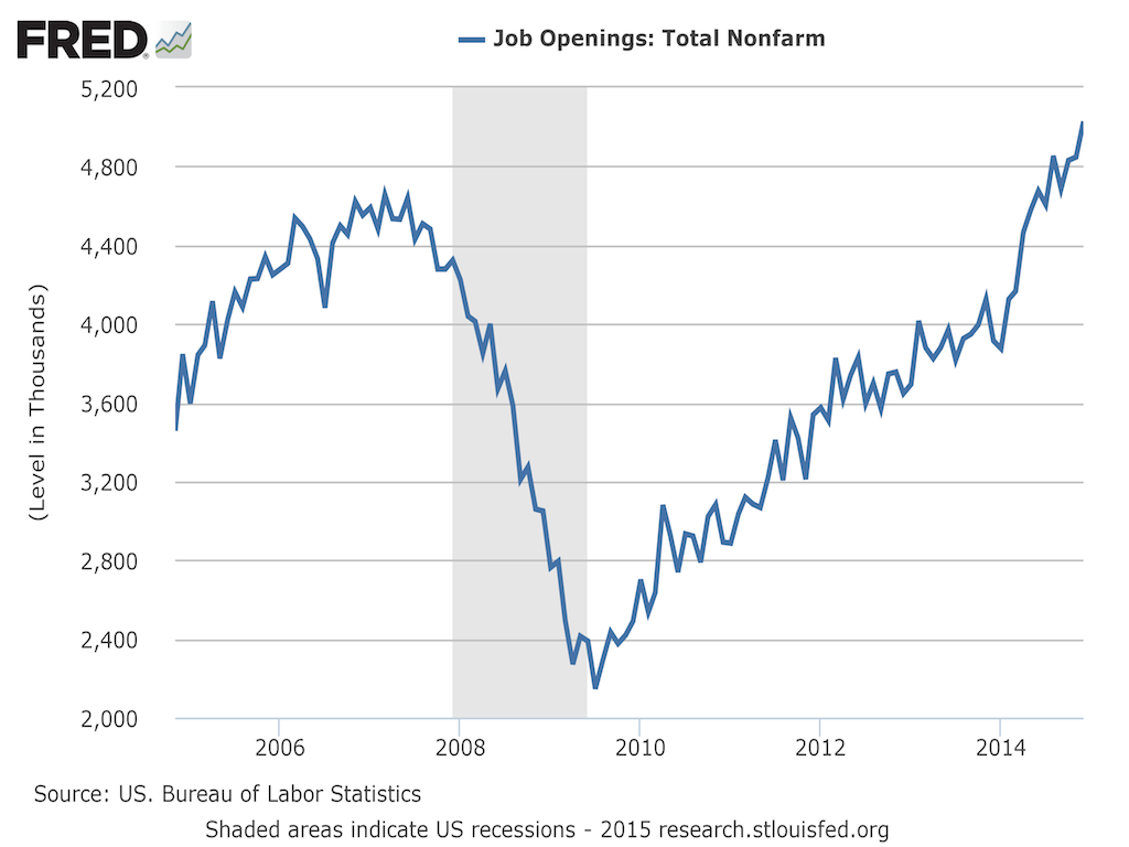
    1. First, the actual numbers - there were 5.028 million job openings in the US on the last business day of December 2014, the highest number since December 2001.

    2. The chart shows a pretty much straight up and to the right climb in job openings since early 2009, meaning talk of the recession and the labor market disruptions it caused are really seeming far, far behind us

    3. This increase in openings is driving organizations like Walmart to raise wages for many of its workers - for a wide range of industries, and geographies, (including previously 'low worker power' ones like retail), the balance of that power is shifting. 

    4. Average weekly earnings for Production and Non-farm employees are climbing as well, not as fast as jop openings, but certainly on the same trajectory.

    So what does this mean for you, Mr. or Ms. HR pro?

    Probably nothing new, or at least nothing you have not been hearing about and likely experiencing in the last 18 months or so. 

    Lots more noise in the system to get your company and your opportunities noticed in a much more crowded market of available jobs.

    Many fewer un- and under-employed individuals around that might not always been qualified for your openings, but at least were a source of steady candidate flow. At the depths of the recession, there were about 7 unemployed workers for every job opening. Today that ratio is less than 2/1.

    You, having a harder time coming up with explanations/excuses to your leadership and hiring managers who (traditionally) are much slower to accept these changes in the labor market and the ensuing power shifts. I recommend forwarding to them the Walmart story above, with a subject line that says 'See, even Walmart is having a hard time finding and keeping people'.

    Long story short, we entering year 6 of an extended recovery/tightening of the labor market. Talent is in shorter supply, opportunities are everywhere, the Dow and the S&P 500 are at record highs, and the people you need to find, attract, and retain are well, harder to find, attract, and retain.

    Have fun, it's a jungle out there.

    Tuesday
    Jan202015

    CHART OF THE DAY: What does it take for content to get noticed?

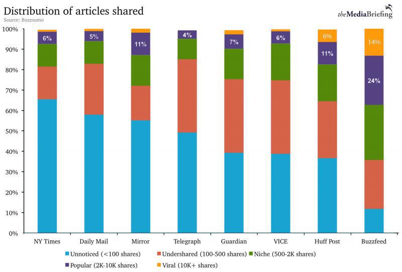
    Really interesting piece, (with accompanying chart that I will re-share below), on the GigaOM site on how social and online sharing is now truly the way readers (and potential customer and job candidates) discover content.

    The gist of the article was to point out that while they might like to think they are not in the same business as Buzzfeed, even more 'respected' publishers like the New York Times have to compete with the Buzzfeeds of the online world using modern metrics that describe success in online content creation - namely social shares (Twitter, LinkedIn, Facebook, etc.).

    Check out the chart below, (Email and RSS subscribers may need to click through), then some FREE commentary from me after the data:

    1. It is pretty obvious that for these big publishers, the bar for labeling a piece of content a 'social' success is really pretty high - at least 2K shares. Think about what you and your company might be sharing on social networks from your corporate blog or posting your open jobs on LinkedIn or Twitter. Two thousand shares of piece of content is a ton of shares, yet by the standards of the modern web, that barely starts to get you noticed. Less than 100 social shares leaves your content essentially 'unseen'.

    2. Unless, of course, it is 'seen' by the exact, right people. And that means most of us (me too, just look at the number of RTs of this post for example), have to really understand how to determine, classify, target, and attempt to engage a specific target market of interest in order to have success. There is almost no way any of us 'normals' are ever going to approach mass social virality like the masters of the modern web (Buzzfeed, HuffPo) can. If you post a job on Twitter and it is not RT'ed does it even exist?

    3. For the HR Tech spin on things, if you have employed a social sharing strategy for your jobs and employer brand building content, but you are not utilizing one of the several HR tech tools on the market that provide the capability to track, analyze, and help you determine actual results (clicks, shares, applicants, hires), for your jobs content, then you probably need to consider that investment in 2015. Since the easy and most common measure of success on the social web, absolute number of 'shares', is almost always going to leave you in the 'unnoticed' bucket, you need to find a way to 'prove' your social strategy is actually working. And the only way to do that is to better understand what happens to those lonely tweets after you send them out into the big, scary, social web.

    Happy Tuesday. Hope this post breaks out of the 'unnoticed' category.

    Wednesday
    Jan072015

    CHART OF THE DAY: Is today a good day?

    Is today a good day? A bad day? Or just a typical, run-of-the-mill kind of day? 

    Maybe it is still too early to tell.

    But the answer someone is likely to give to the 'Is today a good day?' question could be highly dependent in which country you live. Take a look at today's CHART OF THE DAY, courtesy of the fine people over at Pew and taken from their Spring 2014 Global Attitudes survey, and of course some FREE commentary from me after the chart.

    It may seem odd or counter-intuitive, but many of those in the poorer countries surveyed were more likely than those in richer nations to say that the day, and this is just a randomly selected day, was a good one.

    When looking at this question by national income, there is a slightly negative correlation between respondents reporting that the day is a good one and their country's per capita GDP. The USA being the major outlier on this measure. The USA has the highest GDP per capita among the countries surveyed by Pew and these American respondents were more likely to rate a day as particularly good than people in other rich nations. But across the board in almost all the surveyed countries, the most common response to this question is that the day was just “typical.”

    Kind of interesting, even if it is hard to know what, if anything to make of it. On the one hand it is noteworthy that with the exception of the USA, the relative wealth (as expressed in per capita GDP), doesn't seem to predict general happiness, (or at least contentedness). But the fact that across the world most people's are just 'meh', seems more interesting.

    Think about your typical day. Today even. 

    Good, bad, or 'meh'. 

    How about yesterday? The day before?

    When was your last really, really good day?

    I hope it is today.

    Happy Wednesday.

    Thursday
    Jan012015

    REPRISE: Whose Labor Market is it Anyway?

    Note: The blog is taking some well-deserved rest for the Holidays (that is code for I am pretty much out of decent ideas, and I doubt most folks are spending their holidays reading blogs anyway), and will be re-running some of best, or at least most interesting posts from 2014. Maybe you missed these the first time around or maybe you didn't really miss them, but either way they are presented for your consideration. Thanks to everyone who stopped by in 2014!

    The below post first ran back in July as a part of the CHART OF THE DAY series and was a great example (in convenient chart form) on a subject I hit quite a few times in 2014 - the tightening labor market and its impacts and talent and work. Long story short: In 2014 the candidates strengthened their control of the market and HR/Talent pros can't ignore that fact any longer.

    Happy 2015.

    ----------------------------------------------------------------------------------

    Whose Labor Market is it Anyway?

    There is a simple answer to that question, really. 

    The candidates run the current labor market, at least for large, (and growing) swath of managerial, professional, and technical roles. 

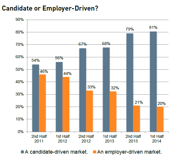
    Check out this week's Chart of the Day, a look at how recruiters see the labor market - candidate driven or employer driven,  courtesy of the MRI Network's latest recruiter sentiment study, (as always, some pithy commentary from me after the chart)

    Wow - pretty simple and clear to see how at least this group of surveyed MRI Network recruiters have seen the labor market shift pretty dramatically in just two and a half years.

    From late 2011, when the sentiment was that that the power and leverage in recruiting was about an even split between candidate and employer, to one where now these recruiters see about a 4x advantage for the candidates, this shift will have some pretty profound implications for many HR/talent pros.

    Quite simply, offers to candidates with desirable, in-demand skill sets are going to have to get sweeter, and they are going to have to happen faster. Digging in to the MRI data you see that the primary reason candidates can't be closed is that they have accepted a different job offer. Sure, there are plenty of factors at play here, but the lesson is that just like in the market for desirable real estate in New York or San Francisco, the market for top candidates is likely to be super-competitive, with candidates holding signifcant leverage and multiple offers.

    One more nugget from the data - candidates accepting counter-offers to remain with their current employer are rising. Whether or not it makes sense to even make counter-offers is definitely subject to debate, but the fact that if you don't at least consider the practice for your in-demand talent, you are likely going to find yourself having to replace at least some of that talent sooner than you might have liked. 

    Looking back over this data, and the last few Charts of the Day I have posted and it continues to become more clear - job openings are up, employees are more willing to jump for a better opportunity, the competition for candidates is getting more fierce, and the strategy and tactics you were using as recently as 2011 probably are not going to work in labor markets where the best candidates have all the power.

    Have fun and be careful out there.

    Thursday
    Dec042014

    CHART OF THE DAY: How we spend our time

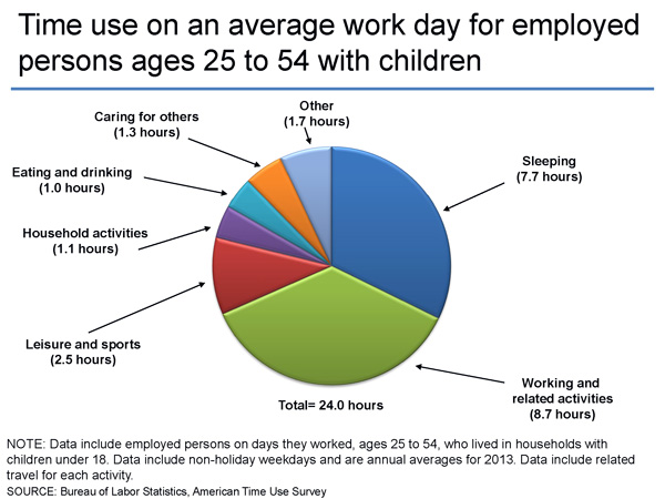
    Today's Chart of the Day comes from our friends at the Bureau of Labor Statistics from their recent American Time Use Survey, which collects information about the activities people do during the day and how much time they spend doing them.

    So what do most of us (employed people ages 25 - 54 who have kids under 18 at home) do all day, or at least all 'work' day? Here is the chart and some FREE comments (lamentations) from me after the data:

    A few things stand out really quickly from this data of the average 24-hour work day:

    1. While the average person sleeps just a shade under 8 hours a day, I don't know anyone that is likely to report that much sleep. It seems like most folks I know are maybe getting 6.5 or 7 hours a night. So the 7.7 seems really high, what do you think?

    2. The single largest slice of the average day, unsurprisingly, is work (and related activities including commuting from/to work), with 8.7 hours per day spent. That kind of seems in line to me although I bet if you ask around your circle of friends and colleagues most people will say they work more than that. I kind of think there could be some fudging in both the survey numbers and what folks talk about privately as well. We like to think we work more than we do, but come on, are you really grinding away 10 or 12 hours a day like you would like (certain) people to believe?

    3. The most interesting thing about the chart, and for many of us, also the most interesting thing about how we spend our time, is what we say we are doing when we are not at work or asleep. Taking out the 'responsible' stuff from the chart (taking care of others, household activities), and that still leaves something like 5 - 6 hours a day (remember, these are working days), of more or less 'free' time. No one I know will admit that they feel like they have that much free or leisure time each day. 

    I don't have any really prescient or even pithy conclusions to draw from this data except for just thinking about (and similar to what I blogged about earlier in the week), how I am spending my time and whether or not I am getting closer to the various goals I have.

    What do you think? How does your day stack up against this data?

    Have a great day.