Quantcast
Subscribe!


Enter your email address:

Delivered by FeedBurner


E-mail Steve
This form does not yet contain any fields.

    free counters

    Twitter Feed

    Entries in chart (85)

    Monday
    Aug112014

    CHART OF THE DAY: Hoping it doesn't rain

    Today's Chart Of The Day comes courtesy of the Federal Reserve Board's recent and definitely interesting Report on the Economic Well-Being of U.S. Households in 2013.

    The report, an in-depth look at the state of the American consumer/citizen in 2013 across a wide range of topics (debt, savings, job readiness, confidence in the economy, etc.), has a plethora of great insights and data sets about the economy and I probably could have picked about 15 different charts/tables to call out here.

    But the one I was most interested in is below, having to do with American's readiness or ability to withstand economic hardship like a job loss or a major (and costly) health crisis. Turns out, many of us are not at all prepared for those situations. Here is the data, then some comments as per usual from me:

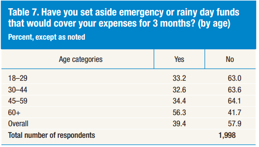
    Wow, well over half of the survey respondents, (survey group and methodology here), report that they have not saved or set aside a 3-month emergency fund as a hedge against a sudden or unexpected loss of income. That is pretty bad, and even worse still when you think that many financial planner/advisor types will push their clients to have a 6-month rainy day fund at all times.

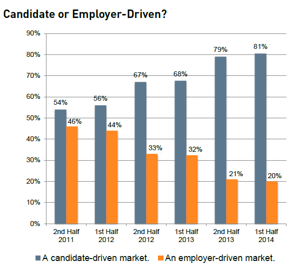
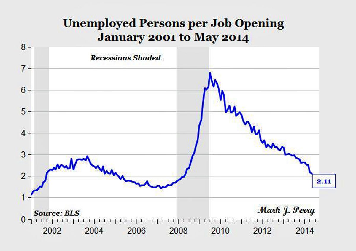
    While many of the macro-economic indicators have begun to show an improving economy, (unemployment rate, ratio of unemployed to job openings, even most of the major stock market indices), this kind of a statistic on the relative lack of preparedness for unexpected financial distress reminds us that the effects of the recession are much longer lasting than we perhaps like to think.

    If your employees are at all closely aligned with these results, then that means that perhaps half of them are much closer to personal financial crisis than they should be. And that is kind of a drag, and kind of a heavy burden to be carrying around. It also can make people 'play it safe' a little too much, over-compensating against any perceived risk in their decision making, as they get consumed with fear of losing their income if they were to get sacked for making the 'wrong' decision.

    I think people probably perform better when they are excited at their jobs, not when they are afraid to lose them.

    Have a great week!

    Thursday
    Jul242014

    CHART OF THE DAY: Whose Labor Market is it Anyway?

    There is a simple answer to that question, really. 

    The candidates run the current labor market, at least for large, (and growing) swath of managerial, professional, and technical roles. 

    Check out this week's Chart of the Day, a look at how recruiters see the labor market - candidate driven or employer driven,  courtesy of the MRI Network's latest recruiter sentiment study, (as always, some pithy commentary from me after the chart)

    Wow - pretty simple and clear to see how at least this group of surveyed MRI Network recruiters have seen the labor market shift pretty dramatically in just two and a half years.

    From late 2011, when the sentiment was that that the power and leverage in recruiting was about an even split between candidate and employer, to one where now these recruiters see about a 4x advantage for the candidates, this shift will have some pretty profound implications for many HR/talent pros.

    Quite simply, offers to candidates with desirable, in-demand skill sets are going to have to get sweeter, and they are going to have to happen faster. Digging in to the MRI data you see that the primary reason candidates can't be closed is that they have accepted a different job offer. Sure, there are plenty of factors at play here, but the lesson is that just like in the market for desirable real estate in New York or San Francisco, the market for top candidates is likely to be super-competitive, with candidates holding signifcant leverage and multiple offers.

    One more nugget from the data - candidates accepting counter-offers to remain with their current employer are rising. Whether or not it makes sense to even make counter-offers is definitely subject to debate, but the fact that if you don't at least consider the practice for your in-demand talent, you are likely going to find yourself having to replace at least some of that talent sooner than you might have liked. 

    Looking back over this data, and the last few Charts of the Day I have posted and it continues to become more clear - job openings are up, employees are more willing to jump for a better opportunity, the competition for candidates is getting more fierce, and the strategy and tactics you were using as recently as 2011 probably are not going to work in labor markets where the best candidates have all the power.

    Have fun and be careful out there.

    Tuesday
    Jul152014

    CHART OF THE DAY: Unemployed workers per job opening

    The latest Job Openings and Labor Turnover Survey (JOLTS) was released last week by the Bureau of Labor Statistics and it showed that US job openings as of May 2014 stood at about 4.6 million, up from 4.5 million in April.

    Taking the JOLTS openings data and combining it with gross unemployment data (also from the BLS), and you get the chart below that shows the trend over time in the ratio of unemployed workers per job opening. Take a look at the chart, (from Business Insider) and then some comments from me below.

    1. The latest ratio of unemployed workers to job openings is 2.11, the lowest level since early 2008, and extremely lower than the post financial crisis high water mark of almost 7 in mid-2009. 

    2. The trend seems to suggest a continued lowering of this ratio, as increased hiring will likely be only partially offset by more entrants into the labor marker, (students leaving school, folks getting coaxed back into the labor market due to improving prospects).

    3. As an HR/talent pro, you might start finding for more jobs a relative reduction in the number of applicants for your open positions. Unless you are offering so-called 'good' jobs, have a compelling employer value proposition, or have a proven pipeline of candidates, there will be, at least in aggregate, fewer available people for your jobs. 

    4. As a consequence of this labor market tightening, your Econ 101 book will tell you that wages are going to have to begin rising more steeply. Again, this is what the economists predict, but for you, all Economics is local. If indeed you are finding it difficult to attract adequate numbers of qualified candidates, then you are going to have to take a long, hard look at the compensation you are offering for these roles. More and more categories of workers are going to at least perceive they have more leverage, (same goes for existing employees too).

    5. With fewer unemployed people per job in the labor pool, it is going to be paramount, even for many entry-level jobs, that you get better at identifying talent from competitors and companies in adjacent industries in order to maximize your candidate flow. It could be the days of simply posting a job online, or placing a Help Wanted sign in the window simply to get the candidates you need are disappearing.

    OK, that is it on this from me. What do you think, are you seeing the markets for your open jobs getting tighter?

    Monday
    Jun302014

    CHART OF THE DAY: The Changing Age Pyramid

    I know I have posted a few times previously on the how the population in general is getting older on average, and how of course as an after-effect of this general trend we will begin (if we have not already), to see our workforce getting older as well. But risking overkill on the subject, I wanted to share a really cool GIF (a first for the CHART OF THE DAY here), on what this graying of the population looks like over time, courtesy of a cool visualization from The Atlantic.

    Take a look at the GIF below (try not to get dizzy), of the standard population pyramid that charts the percentage of a population by age group, and you can get a feel for how this aging trend is playing out. Of course as always, a few FREE comments from me after the chart. Email and RSS subscribers may need to click through.

    Pretty neat, right? And you can see in the darker colored rectangles moving up the chart the effects (and the size) of the Baby Boom generation that comes on to the scene in about 1950 or so, and over time climbs the population pyramid while fundamentally changing its shape from a classic pyramid with larger percentages of younger folks forming the base, into more of a rectangle.

    What are the most important workplace implications of an increasingly aging population?

    1. The obvious one - we will have more older workers in our organizations than in the past. This will be not just because people will want or will have to work later in life than in the past, it will be a matter of necessity, as the available candidate pools for jobs will age right in step with the general population. HR pros and recruiters will have to look at say 50+ year-old candidates with a different perspective. These folks might typically have 10-15 more working years left than a similar candidate would have in the recent past.

    2. Work and workplaces will have to adapt to more older workers. That could mean redesigning work stations and processes to make them more older-worker friendly, modifying work schedules to accommodate some older workers need or desire for lighter schedules, and taking a more thoughtful approach to things like benefits programs and design to better meet older workers expectations. It seems likely that the more successful organizations will not just recognize this trend, they will make strategic decisions to better position themselves to thrive in this new paradigm.

    3. Increased rate of retirements. Although many older people will continue to work later in life, of course many will not, and most organizations can expect to see a rise in the rate of retirements as the baby boom finally begins exiting the workforce en masse in the next few years. This is kind of the most basic or first step in any workforce planning exercise, and if you have not already taken a look at the important functional areas, important skill sets, and localized regions of your workforce and taken an initial estimate of replacement needs due to anticipated increased retirements, then you probably need to start that project today. For many skills and locations, an uptick in retirements combined with a shallow candidate pool will place a strain on your ability to keep staff at needed/desired levels to meet your business objectives.

    That's it - I'm out. Thanks for playing along with the Chart of the Day on a Monday.

    Have a great week!

    Sunday
    Jun222014

    CHART OF THE DAY: Special #SHRM14 Handbag Edition

    The convergence was just too irresistible to fight: the week of the SHRM Annual Conference (where on Wednesday in the SHRM version of the 'Session Time of Death', Trish McFarlane and I will be presenting), I run across a story and chart about HR ladies' traditional favorite accessory maker, Coach.

    Turns out, times are getting a little tough for Coach - in the last couple of years it has seen it's sales growth evaporate, its stock price essentially miss the entire bull market, and the emergence of increased competition from companies like Michael Kors and Tory Burch.

    Today's chart, courtesy of Bloomberg Businessweek, shows the percentage change in same-store sales (a really important data point in retail), for Coach and its principal rival for the arms of HR ladies everywhere, Michael Kors.

    Pretty ugly if you are a fan of Coach, (or a stockholder). Kors has been killing it while Coach seems to be in the beginnings of their death spiral.

    Times are certainly changing, I guess - whatever allure Coach had for many years seems to be waning and companies like Kors and Tory Burch and Kate Spade are the new must-haves.

    What in fact do I know about any of these trends in women's fashion and accessories?

    Hardly anything. But I have owned and loved a series of Coach men's wallets over the years, so I suppose I should think about making a future replacement purchase as insurance - just in case in three years when my current wallet is about needing to be retired there will be no more Coach to speak of. The relationship a man has with his wallet is a pretty important one, second only to the one he has with his butcher I would think. So put me on the record as hoping Coach figures it out.

    If you are heading to SHRM, have fun - look around and see if you can spot this changing of the guard so to speak as you wander the halls and the Expo.

    Have a great week!