Quantcast
Subscribe!


Enter your email address:

Delivered by FeedBurner


E-mail Steve
This form does not yet contain any fields.

    free counters

    Twitter Feed

    Entries in data (149)

    Monday
    Dec122016

    CHART OF THE DAY: Manufacturing Output and Employment

    I am sure you have seen something in the news about President-Elect Trump's negotiations with the United Technologies owned Carrier Corp to eliminate or at least reduce Carrier's plans to close and/or reduce manufacturing operations in Indiana, and shift production, (and create jobs), in Mexico.  After a bunch of back and forth, (and back and forth), and some finger pointing from both sides, it does appear that Trump's efforts will at least for the time being, keep some of these operations and jobs in the USA.

    I don't really want to get into the politics part of this story, but rather want to present some data (from the fantastic St. Louis Fed FRED site), that reminds us that companies packing up and moving manufacturing operations from the US to other, less-expensive places is only part of the reason why US manufacturing jobs continue to be pressured. 

    Here's the data showing US manufacturing output, (left axis, and indexed to 2009) and US manufacturing employment (right axis) - then some FREE comments from me after the data.

    Apologies if some of the fine details of the chart are a little hard to read, but the key things I think to take away from this data are these:

    1. Manufacturing employment has been on a steady downward trend since 1980s, with the steepest declines starting in around 2001 (which coincides with an increase in offshoring activity to China and other places); and then again during the financial crisis and recession of 2008. But with the exception of recession-driven dips, manufacturing output has been increasing since the 1980s and is now near its pre-financial crisis level.

    In other words, US manufacturers have continued to increase output, and pretty dramatically post-recession, while employing fewer workers.

    2. So while outsourcing and offshoring are at least partially to 'blame' for the loss of US manufacturing jobs, those causes can't be the only or even probably the primary driver of manufacturing job loss. Increasing output, with fewer workers means one thing - improvements in manufacturing productivity that have to be attributed to technology, automation, robots, etc. US (and global) manufacturers are simply getting better and more efficient at producing goods, particularly electronics, cars, even steel. Technology gains will continue pressure organizations to 'keep up' with competitors and seek to reduce labor costs via automation.

    3. While Mr. Trump's efforts with Carrier probably should be commended, we also should not be beguiled that these kinds of one-off decisions are likely to cause any kind of meaningful or lasting turnaround in the long-term trend of manufacturing job declines. As fast as a thousand ot two jobs might be saved by the application of political pressure, it is also extremely probable that technology/automation will jump in to ratchet up the continued pressure on manufacturers to get even more productive.

    Finally, maybe it is time that we start to look a little differently about manufacturing jobs as somehow 'better' or more desirable than other types of jobs. There will always be manufacturing in the US, but as these trends show, it will almost certainly continue to decline as a percentage of the labor force.

    Technology-driven shifts in aggregate employment just happen. How many farmers do you know, if you get my meaning. We have to learn as a country and as individuals, to adapt.

    Have a great week!

    Tuesday
    Nov292016

    CHART OF THE DAY: Managing the algorithms

    It must be 'Algorithm Week' on the blog, given that yesterday I posted a piece about how HR folks need to consider carefully how algorithms and other intelligent technologies are introduced into HR and talent management practices. 

    Keeping with that theme, today's Chart of the Day is also about algorithms, more specifically about how the overall role and responsibility of HR and HR leaders might shift as more intelligent technologies are introduced into workplaces. The chart comes to us from an MIT Technology Review briefing paper titled 'Asia's AI Agenda: How Asia is speeding up global artificial intelligence adoption', a look at how the increased adoption of automation and other 'smart' technologies are going to impact work, workplaces, and too, the practice of HR.

    The entire paper is interesting, but for today's chart I wanted to share what MIT's survey of Asia HR leaders revealed about how these HR leaders see their roles changing along with the changing workplace (and workforce).

    Here's the chart, then some FREE comments from me after the data:

    Three quick takes...

    1. First off, it is really interesting, (and I think really encouraging), that more than 87% of HR leaders in the survey realize that these new technologies are going to have a 'major impact' on the role of the HR leader moving forward. The first step in the grieving process is acceptance, (actually, I am not sure if that is true, but don't have the time to look it up, so just pretend it is true anyway), so it is a good sign that the vast majority of these HR leaders are at least cognizant if not accepting that advances in automation and smart tech are going to change the HR role. 

    2. Next, it is also interesting, (if possibly a little naive), in that fully two-thirds of these surveyed HR leaders see that their roles will expand to encompass the 'overall productivity' of both people and the machines and other intelligent technologies that are increasingly being introduced into their workplaces and processes. I have to admit to being a little surprised that so many HR respondents seem ready or at least willing to get into the 'machine management' business.

    3. What that does imply however, is that these HR leaders wanting to expand the traditional talent management role to include machine management as well are going to have to develop an entire new set of expertise and skills, (not to mention some baseline understanding of this technologies), that have as far as I can tell never been a part of HR or talent management in the past.  I am not sure if 'managing' the machines and algorithms is going to be easier or harder than managing people, (if I had to bet, I am going with 'easier'), but either way it will require an expansion of the traditional HR role beyond what most if not all HR leaders are prepared for.

    Check out the paper from MIT if you want to learn more. Really interesting stuff on how business and HR are thinking about the increasing incorporation of automation and algorithms in the workplace.

    Thursday
    Nov102016

    CHART OF THE DAY: Election edition

    Wow, what a crazy few days. 

    I was thinking about most of the CHART OF THE DAY posts I have run over the last couple of years and I realized that they have been, as far as I can remember, all really positive reflections of an improving US economy. 

    Charts about record levels of job openings, charts about declining unemployment rates, and like today's chart that I will share in a moment, near-historic high rates of voluntary job separations, aka, 'Quits'. But no matter the chart, it has been for the most part, 'good' news.

    You know what, let's just get on with the chart, courtesy of your pals at the BLS, and then some semi-related comments and observations after the data. And probably some more charts too.

    1. The 'Quits' rate, i.e. the percentage of the workforce that voluntarily left their jobs sat at 2.1% in September, just a tick below the data series all time high level of 2.3% back in September 2005. Quits have been at or above 2.0%, many observers threshold for what defines a confident labor market, for a little over a year now. Said differently, the labor market seems attractive enough for more people to voluntarily quit their jobs with the expectation that a new, probably better, job can be more easily found.

    2. The 'Quits' rate usually tracks pretty closely, at least directionally, with overall wage growth. And wages have been going up. Heck, here is another chart showing the year-over-year change in average hourly wages going back to 2009.

    Wage increases in general help to encourage folks to move on, more confident in their ability to not only find a new job, but one with better pay and benefits as well. Like I said above, generally good economic news and data that has been trending positive for several years now.

    3. Want more data to chew on while still thinking about Tuesday's results? Ok, let's toss in the standard unemployment rate chart, while not a perfect indicator of the health of the labor market, at least the one that is most well-known and followed:

    Post-recession unemployment hit it's high of 10% in October 2009 and in the seven years since has meandered downward by half to its current level of 4.9%. There are some arguments over what unemployment rate constitutes so-called 'full' employment, but most economists would peg it in the range between 4% and 6%. Said differently, there is less slack in the labor market today than any time in the last 10 years.

    My anecdotal evidence backing up the strength and tightness of the labor market is seen at my local dry cleaner, who has had a 'Help Wanted' sign up in the window pretty much every day in the last 2 years.

    Sure, there are elements of the labor market that don't paint as encouraging a picture (labor force participation rate being one big one, increasing time-to-fill time is another, as it suggests skills mismatches in the labor force), but overall, it is hard to look at the data and not conclude that since the depths of the recession in 2008, that the labor market and the overall economy are light years better than in those bad times.

    4. Want some other data that is not directly related to the labor market but still provides a window view to the strength and health of the economy? How about the S&P 500 , the broad barometer of the performance/value of large company stocks and a pretty decent overall proxy for 'the market'. Here is the last 5 years or so of the S&P 500 Index to take a look at:

    That is a pretty nice 5 year run if you had some money sitting in an S&P 500 index fund for the last few years. It is even better of you push the window back to start at the bottom of the recession in 2008 or so, but the charting tool I found was not that flexible, and I think you get the point anyway. If you were fortunate enough to still have investable funds at the end of the recession, you probably feel pretty decent about how those investments performed.


    So getting back to the surprising results from Tuesday, and buying in to (which I do), that political maxim of 'It's the economy, stupid', then what accounts for the startling repudiation of the status quo, and the rejection of the continuation, more or less, of the policies of the last eight years of recovery and growth?

    I suppose the core can be found in another maxim, this one about progress, technology, and the future.

    The science fiction author William Gibson once said "The future has already arrived. It's just not evenly distributed yet."

    Let's look at one last chart that kind of channels the Gibson quote and also suggests possible reasons why in spite of all this good economic news, (as I write this the Dow Jones and the S&P 500 just closed a stone's throw from their all time record highs, reversing an anticipated market plunge in the hours just after the election results were clear):

    Going back a ways, and certainly before the last decade, the 'spoils' of a growing economy have increasingly gone to a smaller percentage of folks in the US. There are probably hundreds of reasons why this has been the case, but in terms of making a decision about a candidate, a party, a platform, and an expected (or hoped for) future, none of the underlying reasons really matter. What matters is that for many, many people, the recovery of the better part of the last decade, the stock market comeback, and improving overall economic security and prosperity have passed them by.

    And it is easy for the folks like me and maybe some of you, and certainly the powers that be in both major parties, and the media, and the corporate big shots, and the hedge fund guys, and the Silicon Valley tech bros, and all the people who think they run things to have forgotten about that, or just to have ignored it completely. After all, most of the people we know are doing ok. Most of our friends seem really secure.  No one we talked to said they voted for the other guy.

    I think that what we did learn on Tuesday night, or at least one of the things we learned, is that for millions and millions of people most of the economic recovery has simply not happened. Their jobs, if they are employed, are worse than the ones they used to have. They have less job security than ever before. They are increasingly unprepared to do many of the 'new' kinds of jobs that might improve their situation. And every day some 23 year-old Stanford grad invents some new technology that has the potential to automate, disaggregate, and 'productize' with an app or a algorithm the kinds of work they used to rely upon to take care of themselves and their families. Self driving cars are going to be awesome, right? Unless you are a bus, taxi, or commericial truck driver. If you have one of those jobs, well, good luck.

    I am stupid and I do think it's the economy. And I think until we all figure out ways to have this incredible, amazing, technologically wonderful future more evenly distribted we will remain a country very divided. 

    But even as we struggle with figuring it all out if nothing else the results Tuesday should ensure that we no longer continue to ignore or wish away these problems.

    Friday
    Oct212016

    REMINDER: LinkedIn is still not the real world

    In what has become an annual tradition on the blog, as beloved as the lighting of the Rockefeller Center Christmas tree, the running of the bulls in Pamplona, or me passing out on the sofa in a turkey/stuffing coma each Thanksgiving, I wanted to offer my quick reminder that the world of LinkedIn has only a partial, if not passing, resemblance to the real world of work, workplaces, and the kinds of jobs most people have.

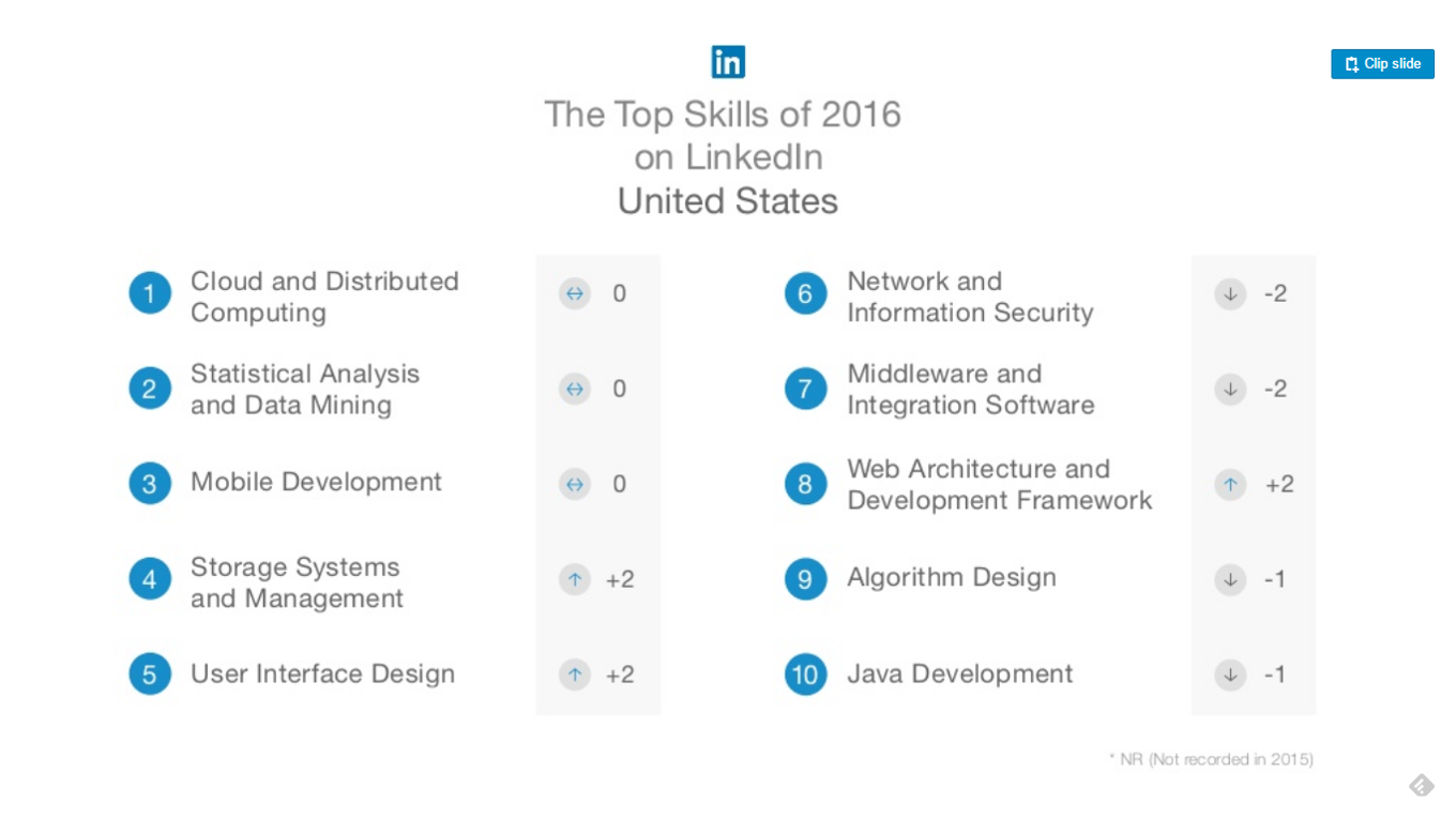
    What prompts this regular reflection and reminder? As in years past, (here is what I wrote about this last winter), LinkedIn has released what they call 'The Top Skills That Can Get You Hired in 2017', based on their data set of member profiles, job posting activity, and their assessment of the candidate skills that were more likely to generate recruiter interest and hiring activity. They publish this list of 'top' skills both globally, and for a selection of countries and more or less the narrative that follows is something along the lines of 'If you want to get hired next year, you should try to acquire one (or more) of these skills.'

    Here is the list of these 'top' skills for the USA for 2017, per LinkedIn:

    As has been the case in the last couple of years, these 'hot' skills are dominated by the latest in IT trends and innovations. Cloud computing, user interface, algorithm design, etc., are all skills (and roles), that have certainly seen an increase in employer demand, and is often reported, can be difficult to find in candidates. So simple supply (which is not enough), and demand, (which continues to increase), for these skills naturally make them 'hot' and the folks that possess them remaining in demand.

    Makes sense. Good to know. Interesting to think about if you are just starting your career and want to have at least some level of comfort about your chances of employment.

    But as I like to point out, and did the last time LinkedIn shared with us what was 'hot',  these skills, or said slightly differently, the kinds of jobs that require these skills, still make up a really, really small percentage of overall employment in the USA, and are not the ones that the vast majority of people are doing.

    Here's the latest data that is available from our pals at the Bureau of Labor Statistics on 'Major Occupational Groups as a Percentage of Employment', (from 2015):

    Did you see the grouping for 'Computer and Mathematical', where the majority of jobs that required most of the 2017 LinkedIn 'hot' skills would typically reside?

    It is down towards the bottom of the graph just after 'Personal care and service' and before 'Healthcare support'. If you go to the actual BLS data, 'Computer and Mathematical' makes up 2.9% of all jobs in the USA, about the same as it has been the last couple of years.

    Even allowing for the fact that some of the 'hot' skills would be in demand in other general employment categories, is still stands to reason that just about all of the jobs where these skills are being sought out for represent, still, a sliver of the US labor market, and do not reflect the jobs that the vast majority of people are actually doing, (and will be doing for some time).

    Sure, it is trendy to think that the LinkedIn skills represent the future of work, and perhaps they probably do, and I would encourage anyone, especially younger folks to think about pursuing them,  but these skills don't really represent the 'present' of work, not in a substantial way anyway.

    LinkedIn is a fantastic business, a staggering success, and not at all like the real world where the overwhelming majority of workers reside.

    Have a fantastic weekend And don't spend so much time on LinkedIn.

    Wednesday
    Oct192016

    CHART OF THE DAY: All the places you can't stop emailing

    Today's CHART OF THE DAY comes to us courtesy of the folks at Adobe, who recently shared some results from their second annual consumer email survey

    As you may have already expected, after taking a side-eyed glance at your out of control Inbox, our collective Inbox is , well, out of control.

    Per the Adobe survey, the typical white collar worker is spending 17% more  time on email compared to last year, and despite this increase in time spent with email, (and email volume), almost half of all workers expect a response to a work-related email in less than one hour. Aside, if you are one of those people who expect that kind of responsiveness, I think I hate you. And you certainly hate me.

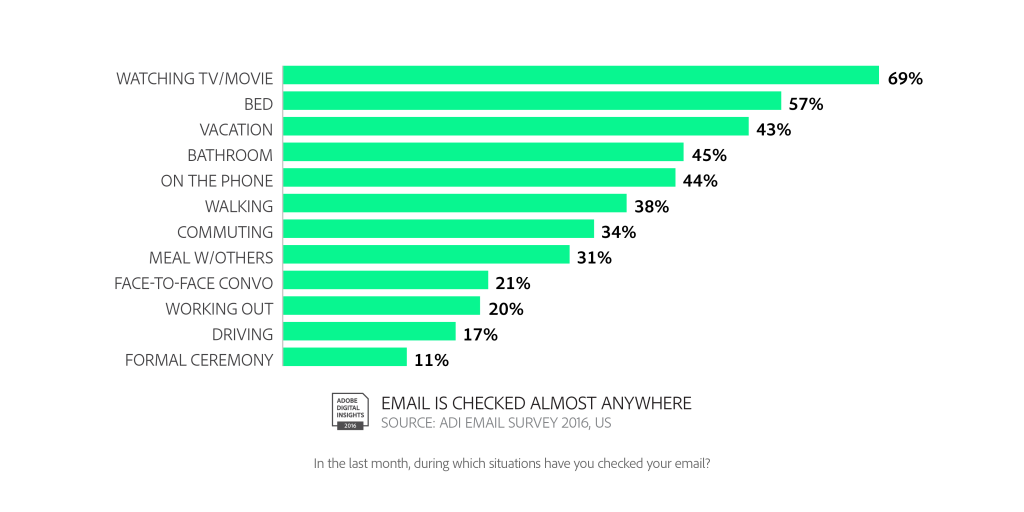
    There are quite a few other interesting nuggets in the Adobe survey, but the one chart I wanted to share is below, which shows how our disturbing attachment to email consumes us, and infringes on everything we do. Check out the data, (kids, cover your eyes), then some FREE comments from me after the data.

    That we can't stop checking/responding to email while watching TV or even in bed isn't all that shocking any longer. But some of the other venues (driving, formal ceremonies, in the bathroom) where at least a good number of folks admit to email use are more more unsettling.

    Sorry, I just need to step away from my best friend's wedding/nephew's baptism/grandma's funeral in order to respond to this email. It will just be a second, I promise. And please remember how many folks are all over their email and smartphones in the bathroom the next time a group of people ask you if you wouldn't mind taking a group picture of them with one of their phones. Gross.

    One last data point to share from the survey - people have become so addicted to email that many are actively having to 'detox' from the siren call of their inboxes. Nearly half of folks, 45%, have taken an email detox lasting an average of 5.3 days and report feeling 'liberated' and 'relaxed' from these detox efforts.

    I know I swore I would quit writing/complaining about email. But here I go again. Just like you swore you wouldn't check your email on date night or at junior's soccer game.

    I, like you, just can't help it. We are addicted.

    Happy Wednesday.